Financial Services Proposal & Quote Landing Page
Underwrite is a modular card-grid landing page template built for financial services proposal and quote automation platforms. It pairs a Tech Glass visual identity with an Industry Report creative direction, guiding insurance brokers, wealth managers, and commercial lenders toward an app download. Animated stat panels, scroll-triggered workflow diagrams, and vertical-specific case cards make the ROI case before the primary call to action appears.
by Rocket studio
Quick summary
Underwrite is a single-page, card-grid template designed for financial services proposal and quote automation tools. It uses a void-black and phosphor-green Acid Digital palette, animated data visualizations, and an evidence-first scroll flow to convert analytical buyers into app downloads. Every section earns the click before asking for it.
Who this template is for
This template is built for teams that sell complex financial services software to professionals who live inside dense, multi-tool workflows. If your platform shortens the distance between raw data and a signed proposal, this page speaks directly to your buyer.
- Independent insurance brokers managing multiple carrier portals and tight quote deadlines
- Wealth management associates who hand-format pitch decks before Monday prospect meetings
- Commercial lending officers who lose deals because quotes arrive too late
What problem this template solves
Financial services professionals trust data more than marketing copy. A generic SaaS landing page does not match how these buyers think. They want benchmarks, process comparisons, and proof that the tool works in their specific vertical before they give up an email address.
- Standard templates lack the evidence density that analytical buyers expect before committing
- Generic layouts cannot communicate the value of an automated proposal pipeline at a glance
- Most pages ask for a download before proving that the current process is costing real deals
What you get with this template
You get a fully structured, single-page layout that builds a credibility arc from the first scroll to the final conversion point. Every section is purpose-built for a financial services audience that needs to be convinced by evidence, not enthusiasm.
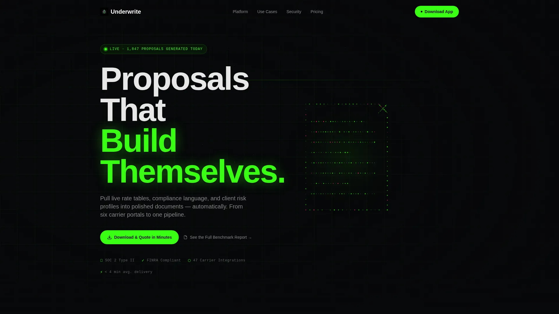
- A Dark Full-Bleed header with a particle-assembly animation and the headline "Proposals That Build Themselves"
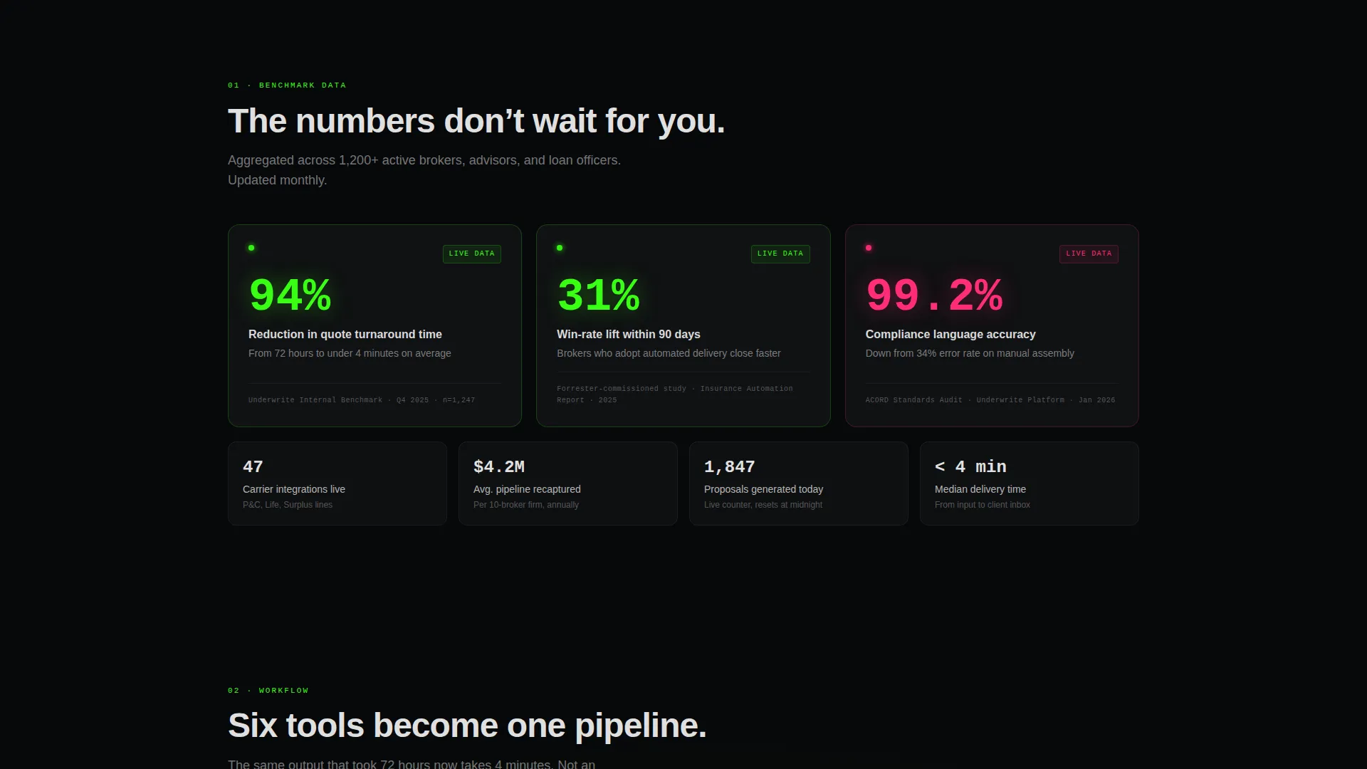
- Three stat panel cards with live-counter animations citing named research on quote turnaround, win-rate lift, and compliance error reduction
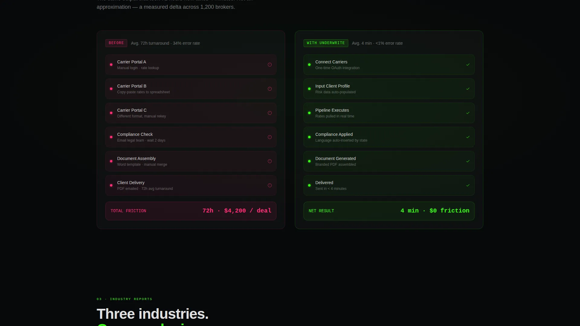
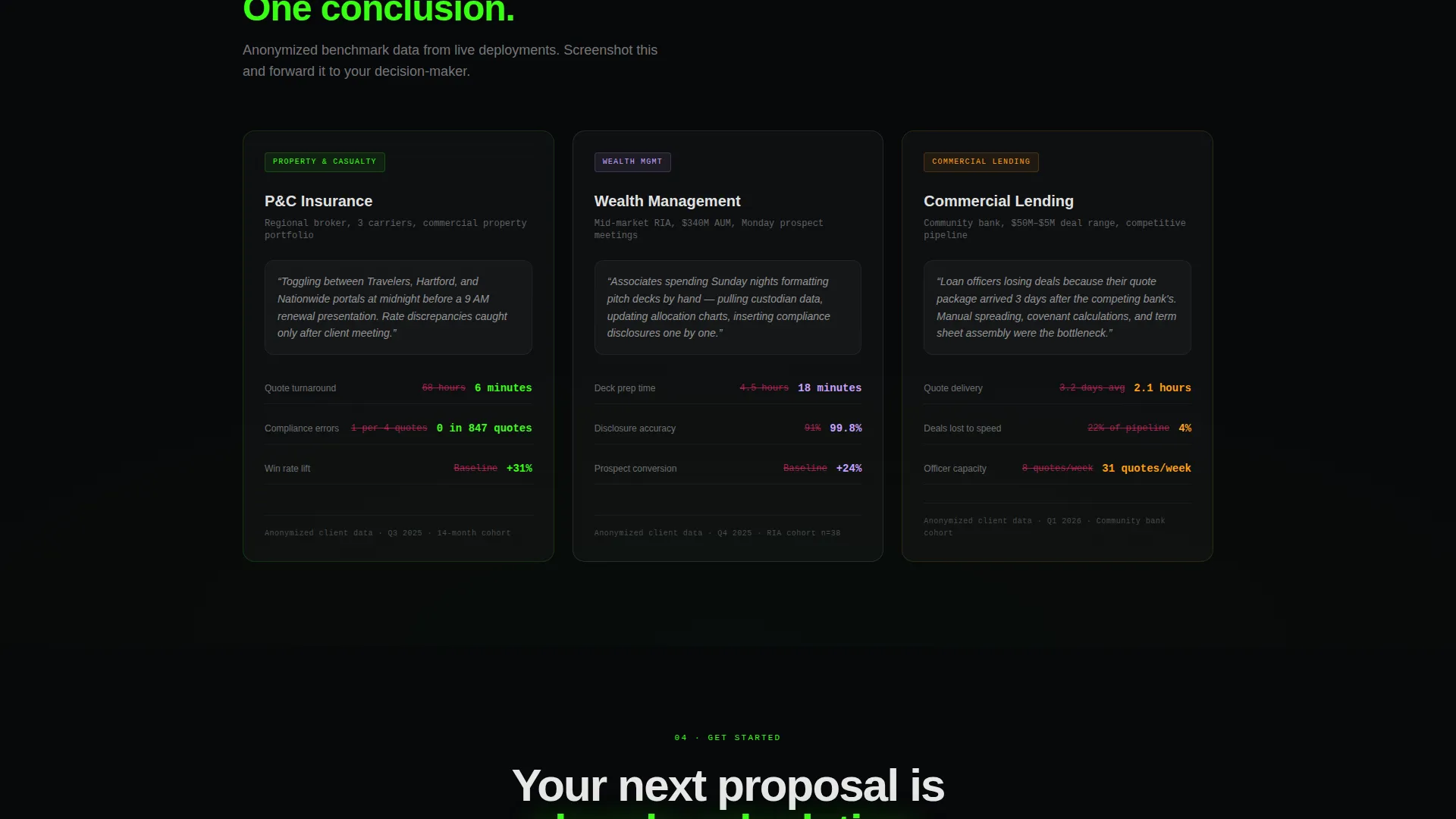
- Scroll-triggered before-and-after workflow diagrams and vertical-specific case cards for property and casualty insurance, wealth management, and commercial lending
Feature list
This template is built around components that match the way financial services buyers evaluate software. Each feature is designed to reduce friction and build conviction in sequence.
Animated Particle Header Scene
The header opens on a pure black viewport where a proposal document assembles itself from scattered luminous particles, like a holographic blueprint snapping into focus. A thin neon-green wireframe grid pulses beneath it, and the headline appears in crisp white type once the animation resolves.
Live-Counter Stat Panels
Three modular stat cards animate upward on load, displaying average quote turnaround times, win-rate lifts, and compliance error reduction figures. Each panel cites named research, giving analytical buyers a screenshot-worthy data point before they read a single line of body copy.
Scroll-Triggered Workflow Diagrams
Two workflow diagrams animate as the visitor scrolls. The first shows a six-tool disconnected process with red friction markers. The second resolves into a single green-checkpoint pipeline, making the value shift immediately visible without requiring any explanation.
Vertical-Specific Case Cards
Three industry case cards cover property and casualty insurance, wealth management, and commercial lending. Each card reads like a micro-report, with named metrics and anonymized client scenarios that let buyers recognize their own situation and forward the evidence to a decision-maker.
Fixed Phosphor-Green call to action Button
After the first scroll, a phosphor-green pill button labeled "Download and Quote in Minutes" locks to the bottom of the viewport. It stays visible throughout the scroll without blocking content, ensuring the conversion path is always one tap away.
Platform-Detection Download Modal
Tapping the primary call to action opens a minimal modal that detects the visitor's platform (iOS, Android, or Desktop) and presents a single work-email field. The secondary path inside the same modal offers access to a gated benchmark report, capturing leads who are not yet ready to install.
Page sections overview
| Section | Purpose |
|---|---|
| Full-Bleed Header | Introduce the platform with an animated proposal assembly scene and the primary headline |
| Stat Panel Row | Display three live-counter data cards citing research on turnaround, win rate, and error reduction |
| Workflow Diagram Row | Animate the before-and-after process comparison on scroll to show pipeline consolidation |
| Case Card Row | Present vertical-specific micro-reports for insurance, wealth management, and lending buyers |
| Fixed call to action Button | Keep the primary download action visible throughout the entire scroll journey |
| Download Modal | Collect a work email and route the visitor to app download or the gated benchmark report |
Design & branding system
The visual identity is built on the Acid Digital color system and rendered through a Tech Glass theme. Every element is calibrated to feel like a live financial terminal, not a marketing brochure.
- Void black (#07080A) backgrounds, phosphor green (#39FF14) for hover states and primary actions, and signal magenta (#FF2D78) reserved for deadline counters and compliance warnings
- Frosted glass card panels at 5 percent opacity over dark backgrounds, with hairline borders that catch the green on hover
- White typography at 90 percent opacity for primary text and 50 percent for secondary labels, keeping contrast sharp without feeling clinical
Mobile & speed optimization
The card-grid layout is modular by design, so individual panels reflow cleanly across viewport sizes. The fixed call to action button and modal are built to function on both touch and pointer input without layout conflicts.
- Modular card columns collapse to single-file stacks on smaller screens, preserving the evidence-first reading order
- The platform-detection modal presents a simplified single-field input that works on mobile keyboards without scroll interruption
How this template helps you convert
The conversion architecture is built on a single principle: prove ROI before asking for anything. By the time a visitor reaches the download modal, they have already seen three industries worth of evidence that their current workflow is costing them closed deals.
- The stat panel row delivers benchmark data immediately after the header, anchoring the visitor's attention with specific, citable numbers before any product claims appear.
- The fixed phosphor-green button and dual-path modal reduce friction at the decision moment by letting each visitor choose their own entry point, whether that is a direct app download or the gated benchmark report.
Other information about this template
This template is built inside a technology category focused on financial services software. It is designed for founders, product marketers, and growth teams who need a landing page that matches the sophistication of their platform and the skepticism of their buyers.
- The Industry Report creative direction means every section is structured to feel like proprietary research, not a product pitch
- The card-grid (modular) template style means individual section rows can be reordered or replaced without rebuilding the full page
- The App Download landing-page direction means the entire scroll arc is engineered toward a single primary conversion action, with a secondary lead-capture path for visitors earlier in their decision process
Theme
Tech Glass
Creative direction
Industry Report
Color system
Acid Digital
Style
Card Grid (Modular)
Direction
App Download
Page Sections
Animated Particle Assembly Header
Live-counter Research Stat Cards
Scroll-triggered Workflow Diagrams
Vertical Case Card Micro-reports
Fixed Phosphor-green Call to Action Button
Platform-detection Download Modal
Related questions
Who is this template designed for?
Can I customize the stat panel data and case card metrics?
What makes the conversion flow different from a standard software template?
Does the modal support both app download and lead capture simultaneously?
Is the fixed call to action button visible throughout the entire page?



