Unite — Sophisticated Wedding Planning Landing Page Template
Vow is a drag-and-drop wedding email template landing page built for couples and coordinators who want every message to feel as considered as the wedding itself. From RSVP reminders to rehearsal dinner invites, the card-grid layout showcases each template variant with iridescent motion design, an interactive inbox preview, and a Problem-to-Solution scroll arc that turns browser visitors into confident buyers.
by Rocket studio
Quick summary
Vow is a modular, card-grid landing page for a drag-and-drop wedding email template system. It serves engaged couples, wedding coordinators, and design-focused planners who want polished email communications that match the care they put into every other wedding detail. The page demonstrates the product by being the product, using live previews and animated transitions throughout.
Who this template is for
This landing page speaks directly to the people who feel the gap between a beautiful wedding and a plain, forgettable email update. If the save-the-date took hours to perfect, the emails that follow should match that standard.
- Newly engaged couples drowning in generic email defaults who want something that feels intentional
- Wedding coordinators managing communications across multiple couples at once
- Design-savvy planners who treat every touchpoint, including inbox messages, as part of the overall aesthetic
What problem this template solves
Generic email tools were not built for weddings. The result is RSVP reminders that read like office memos, rehearsal dinner invites with clip-art borders, and mobile-broken Canva exports that embarrass the sender. Vow replaces that gap with a purpose-built email template experience.
- Couples lose trust from guests when the emails feel careless compared to the invitations
- Coordinators waste time reformatting defaults for every new client couple
- There is no standard drag-and-drop system designed specifically for the full wedding email sequence
What you get with this template
This landing page is a fully structured, single-page experience built around the Vow email template product. Every section is designed to show, not just tell.
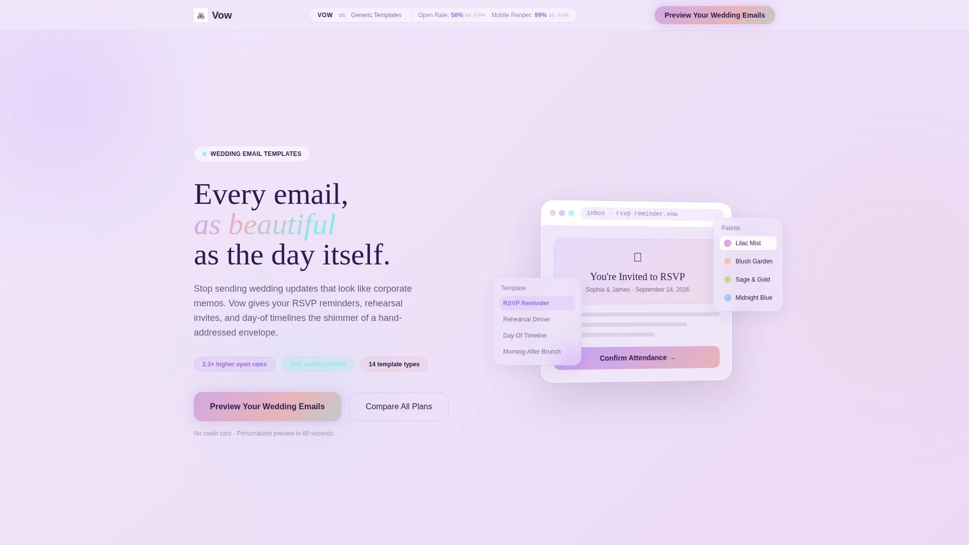
- An interactive inbox preview in the header that lets visitors swap color palettes and toggle between template variants in real time
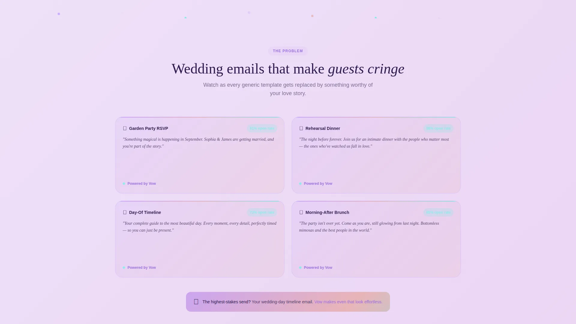
- A Problem-to-Solution scroll arc with animated flip-card transitions that replace ugly generic emails with Vow templates row by row
- A persistent comparison bar, a personalized preview modal, and a three-tier pricing table with an iridescent highlight on the recommended plan
Feature list
This landing page includes purpose-built components that work together to demonstrate the product before any purchase decision is made.
Live Interactive Email Preview
The header features a functioning wedding email template rendered inside a simulated inbox frame. Visitors can swap color palettes, toggle between the Rehearsal Dinner and RSVP Reminder variants, and watch entrance animations play in real time. The device frame rotates five degrees on mouse movement for a parallax depth effect.
Animated Problem-to-Solution Grid
The scroll arc opens with a grid of recognizable, low-quality wedding email formats shown as cards with counters. As the visitor scrolls, each card flips to reveal a Vow template replacing it. The flip-card animation escalates toward the wedding-day timeline email, the highest-pressure send in any sequence.
Sticky Comparison Bar
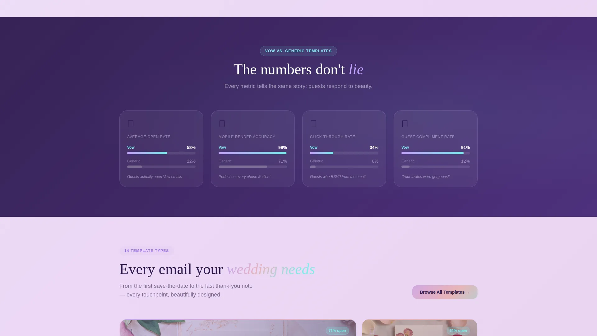
A persistent bar at the top of the page frames the entire experience as a head-to-head contrast. Split metrics for open rates, click-throughs, mobile render accuracy, and guest compliment frequency appear across modules, reinforcing the value argument at every scroll point.
Personalized Preview Modal
The primary call-to-action button opens a two-field modal asking for the couple's first names and wedding date. The system instantly generates a personalized template preview sent to their inbox, giving visitors proof of quality before they commit.
Testimonial Cards at Rhythm Points
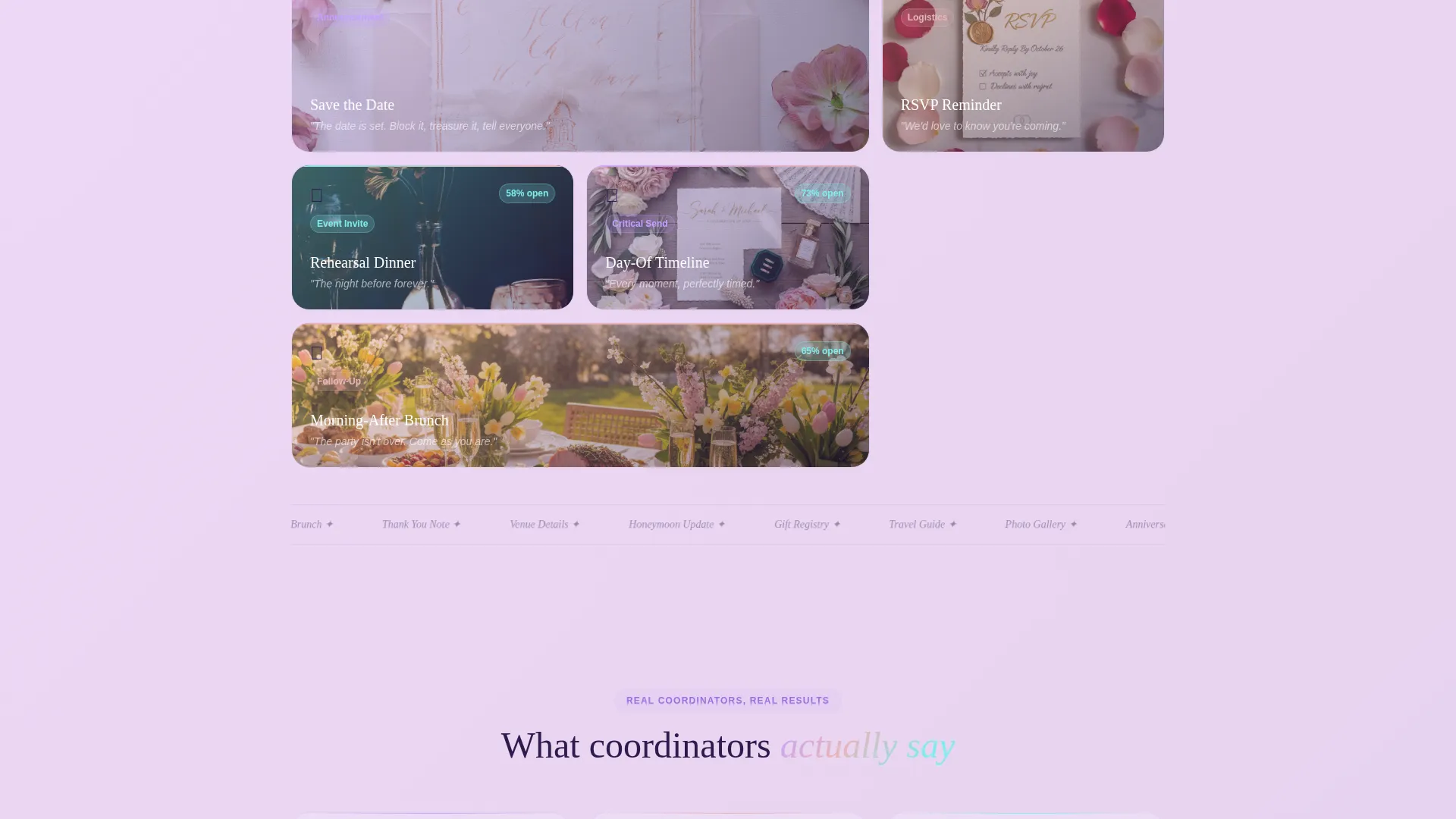
Real coordinator testimonials interrupt the grid at measured intervals. Each card quotes a specific open-rate improvement, grounding the emotional tone of the page in concrete, coordinator-sourced results.
Three-Tier Pricing Table
A structured pricing section presents three plan options in a clear comparison layout. The middle, recommended tier glows with the iridescent color treatment, drawing the eye naturally to the suggested choice without aggressive sales language.
Page sections overview
| Section | Purpose |
|---|---|
| Interactive Inbox Header | Live email preview with palette swap and variant toggle |
| Sticky Comparison Bar | Persistent open-rate and metric contrast across scroll |
| Problem Grid Cards | Ugly-email examples with counters to establish stakes |
| Flip-Card Transition Row | Animated card swap replacing problems with Vow templates |
| Testimonial Interrupts | Coordinator quotes with specific open-rate references |
| Wedding-Day Climax Card | Highest-stakes template reveal to close the arc |
| Preview call to action Modal | Two-field form generating a personalized inbox preview |
| Pricing Table | Three-tier plan comparison with iridescent middle card |
Design & branding system
The visual identity follows a Dynamic Motion theme using an AI Iridescent color system. The palette feels like oil on a soap bubble: warm and cool tones shift simultaneously, never settling on a single hue.
- Core colors include shifting pearl white (#F0E6FA), holographic lilac (#C4A1FF), liquid rose gold (#E8B4B8), deep amethyst ink (#2D1B4E) for body text, and prismatic teal (#7FECEC) for hover states and active buttons
- Backgrounds sit in a pearl-white-to-lilac gradient range; cards float on frosted glass surfaces with subtle aurora borders
- Every interactive element carries a micro-shimmer that responds to cursor movement, reinforcing the idea that the landing page itself behaves like the email templates it sells
Mobile & speed optimization
The card-grid layout and modular structure are designed to translate cleanly across screen sizes. Interactive elements are built to remain functional and visually coherent on smaller displays.
- Frosted glass cards and gradient backgrounds are applied in a way that preserves legibility on mobile viewports
- The parallax device frame and flip-card animations are structured so they degrade gracefully when motion is reduced or screen space is limited
How this template helps you convert
Every design and content decision on this page is made to move a hesitant visitor toward action. The page earns the click by demonstrating the product rather than describing it.
- The interactive header lets visitors experience the template quality before reading a single line of marketing copy, reducing skepticism at the first scroll point.
- The Problem-to-Solution arc builds emotional stakes by showing familiar failures first, making the Vow template feel like a relief rather than an upsell, and the personalized modal closes the loop by delivering proof directly to the visitor's inbox.
Other information about this template
This landing page is built as a single-page, section-led experience using a Card Grid (Modular) template style. It is categorized under the Technology and Wedding Digital Presence intersection, designed specifically for the wedding email newsletter template niche.
- The template style supports drag-and-drop customization, making it accessible for coordinators who are not developers
- The "Compare All Plans" secondary path links from the main call-to-action area to the pricing table, giving budget-conscious visitors a low-pressure alternative route
- The page is scoped as a landing page, not a multi-page website, keeping the visitor focused on a single conversion path throughout
Theme
Dynamic Motion
Creative direction
Problem→Solution Arc
Color system
AI Iridescent
Style
Card Grid (Modular)
Direction
Comparison/Versus
Page Sections
Live Interactive Email Preview Header
Animated Flip-card Problem Arc
Sticky Comparison Bar
Personalized Preview Modal
Coordinator Testimonial Cards
Three-tier Pricing Table
Related questions
Who is this landing page template built for?
Can I customize the color palette in this template?
What does the interactive header actually show visitors?
How does the personalized preview modal work?
Is this a single-page template or a multi-page website?



