Home Services LMS Landing Page Template
Upskill is a bold brutalist landing page template built for home services learning management platforms. It combines a dark dashboard hero, head-to-head comparison matrices, and live-data density sections to show operations managers exactly what they are missing. The design is sharp, data-forward, and built to convert through a free gap-report qualifier rather than a traditional demo form.
by Rocket studio
Quick summary
Upskill is a single-page landing page template for home services training platforms. It pairs a glowing dashboard hero with a structured feature comparison layout that pits old training methods against the platform. Every section is designed to feel like a command center, data-dense, brutally honest, and built to move operations managers toward a free gap-report call to action.
Who this template is for
This template is built for software founders and product teams selling learning management systems to the trades industry. It speaks directly to the day-to-day chaos that field service companies face when training is spread across binders, spreadsheets, and group chats.
- Operations managers at plumbing or HVAC franchises running large technician teams across multiple territories
- Electrical contractors who need faster apprentice onboarding and verifiable certification records
- Home services software companies positioning their platform against paper-based or outdated training methods
What problem this template solves
Training management in home services is fragmented. Compliance deadlines get missed, certification records live in filing cabinets, and onboarding takes longer than it should. This template frames that problem visually and immediately, then positions the platform as the solution.
- Scattered training materials, safety checklists, and onboarding videos have no single home
- Compliance tracking via spreadsheet creates audit risk and expiration blind spots
- Skill verification relies on word-of-mouth rather than documented, photo-backed proof
What you get with this template
You get a fully structured landing page that leads with a data-rich dashboard hero and builds trust through visual proof. Every section is purposeful, pulling the visitor from problem recognition to action without friction.
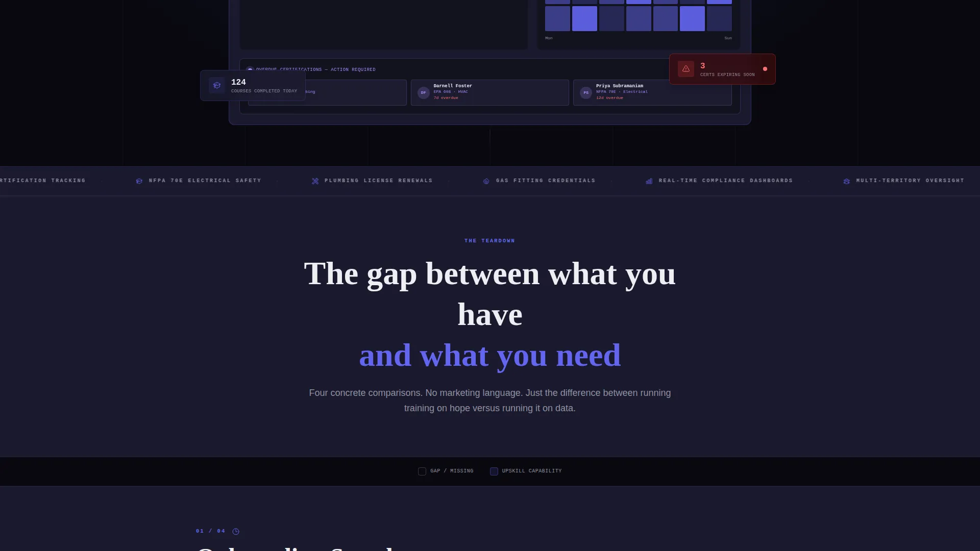
- A dark full-bleed header featuring a glowing dashboard screenshot with real-looking metrics and flagged certification alerts
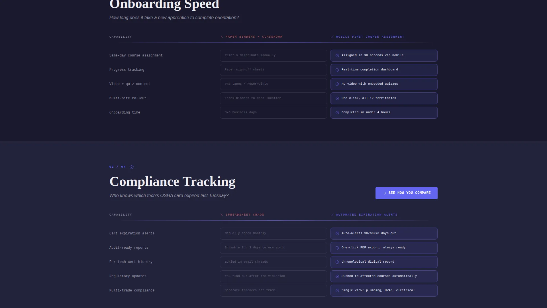
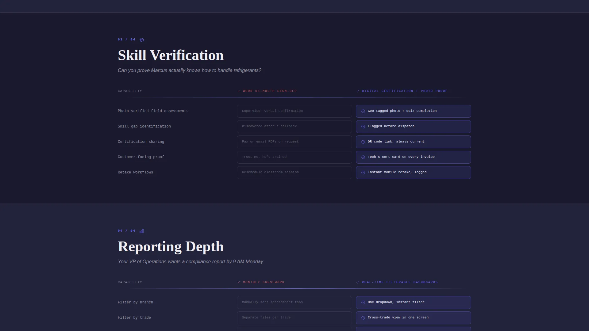
- Four comparison matrix slabs showing old-way versus platform-way across onboarding, compliance, skill verification, and reporting
- A two-step qualifier form that delivers a personalized gap report by email, plus a secondary modal video path for undecided visitors
Feature list
This landing page template is organized around clarity, contrast, and conversion. Each built-in element serves a specific role in moving a skeptical operations manager toward commitment.
Glowing Dashboard Hero Section
The header is a void-black full-bleed canvas. A dashboard screenshot floats at center-frame, lit from within, displaying 847 active technicians, a 93 percent compliance rate, a regional course-completion heat map, and three overdue certifications flagged in ultraviolet. No stock photography interrupts the effect.
Four-Slab Feature Comparison Matrix
Four horizontal concrete-slab sections each contain a comparison grid. Indigo-filled cells indicate platform capability. Hollow outlines mark gaps in the old approach. The four slabs cover onboarding speed, compliance tracking, skill verification, and real-time reporting. The visual contrast makes the argument before a word is read.
Comparison Conversion call to action Path
The primary call to action, "See How You Compare," appears after the second matrix slab and repeats as a sticky bar on mobile. Clicking opens a two-question qualifier: a technician-count slider from 10 to 500 plus, and a dropdown for current training method. Submitting delivers a personalized gap report by email instantly, with no demo call and no credit card required.
Secondary Modal Video Path
A "Watch the 90-Second Teardown" button offers a lower-commitment entry point. It autoplays a brutalist-cut product video inside a modal overlay, giving undecided visitors a quick, visual proof of the platform without asking them to submit data first.
Live-Data Density Section
The scroll ends with a section displaying anonymized real account metrics. This data-density block reinforces platform credibility with actual numbers rather than marketing claims, closing the page on a foundation of proof.
Page sections overview
| Section | Purpose |
|---|---|
| Dark Dashboard Hero | Anchors attention with a glowing product screenshot and bold headline |
| Bold Headline Block | States the core problem and platform promise in brutalist type |
| Matrix Slab One | Compares onboarding speed: paper binders versus mobile-first course assignment |
| Matrix Slab Two | Compares compliance tracking: spreadsheet chaos versus automated expiration alerts |
| Primary call to action Block | Places "See How You Compare" with two-question gap-report qualifier |
| Matrix Slab Three | Compares skill verification: word-of-mouth versus digital certification with photo proof |
| Matrix Slab Four | Compares reporting: monthly guesswork versus real-time filterable dashboards |
| Live Data Section | Displays anonymized platform metrics to prove real-world scale and results |
| Secondary Video call to action | Offers modal product video for visitors not ready to submit contact data |
| Sticky Mobile Bar | Repeats primary call to action as persistent bottom bar throughout mobile scroll |
Design & branding system
The visual identity follows a Bold Brutalist theme. The palette is built around darkness and violet light, evoking a server rack running at full capacity in the middle of the night.
- Core colors: void black (#09090F) as the base, deep slab gray (#1A1A2E) for stacked horizontal content bands, electric indigo (#6366F1) for calls to action and interactive fills, and ultraviolet (#A78BFA) for progress indicators and hover glows
- Typography uses massive, heavy brutalist type for headlines and chalk white (#EEEEF2) for all body text, with no decorative ornamentation
- Layout relies on thick horizontal gray slabs that separate content zones like poured concrete formwork, creating visual weight without imagery
Mobile & speed optimization
The template is designed to translate its data-heavy desktop layout cleanly to smaller screens. The sticky call to action bar on mobile ensures the primary conversion path is always within reach during the scroll.
- The sticky bottom bar keeps "See How You Compare" visible throughout the entire mobile experience without interrupting the comparison grid reading flow
- Comparison matrix slabs are structured for vertical stacking on narrow viewports, keeping old-way versus new-way contrast legible at any screen width
- The modal video trigger is touch-friendly, giving mobile visitors a clean path to the product teardown without leaving the page
How this template helps you convert
This template is designed around a Comparison/Versus conversion model. Instead of asking for trust upfront, it builds the case incrementally through visual proof and data contrast, then asks for a micro-commitment.
- The comparison matrix layout quantifies the visitor's current pain before the call to action appears, making the offer feel like a logical next step rather than a sales pitch
- The two-step gap-report qualifier lowers friction by delivering immediate value by email, removing the barrier of a scheduled demo call and keeping conversion momentum high
- The secondary modal video path catches visitors who are not ready to share their data, keeping them engaged and on the page rather than bouncing without a touchpoint
Other information about this template
This template is well-suited for any learning management system product targeting the skilled trades, field services, or multi-location workforce training markets. It can also support broader workforce development platforms that need to communicate compliance tracking, certification management, and onboarding efficiency to a non-technical buyer audience.
- The template style is a Dashboard/Data Grid layout, making it a strong fit for any software product where showing the interface builds more trust than describing it
- The header concept follows a Dark Full-Bleed plus Glow approach, which works across SaaS categories where a product screenshot is the strongest proof asset
- The creative direction is a Feature Matrix teardown, meaning the persuasion structure naturally fits any platform competing against legacy or manual alternatives

Theme
Bold Brutalist
Creative direction
Feature Matrix
Color system
Electric Indigo
Style
Dashboard/Data Grid
Direction
Comparison/Versus
Page Sections
Dark Full-bleed Dashboard Hero
Four-slab Comparison Matrix
Two-step Gap Report Qualifier
Secondary Modal Video Path
Sticky Mobile Call to Action Bar
Live-data Density Close Section
Related questions
Who is the primary buyer persona this template targets?
Does this template require a demo call to convert visitors?
Can I use this template for a learning management system outside of home services?
What makes the comparison matrix layout effective for this audience?
Is the gap-report qualifier form included in the template?



