Retail LMS Landing Page Template | Void & Violet
Upskill is a scroll reveal landing page template built for retail learning management platforms. It guides floor associates from real training problems to a compelling app download in one purposeful scroll. The Void & Violet color system, a trust-building logo bar, and phone-first lesson previews make the pitch feel as fast and focused as a pre-shift briefing.
by Rocket studio
Quick summary
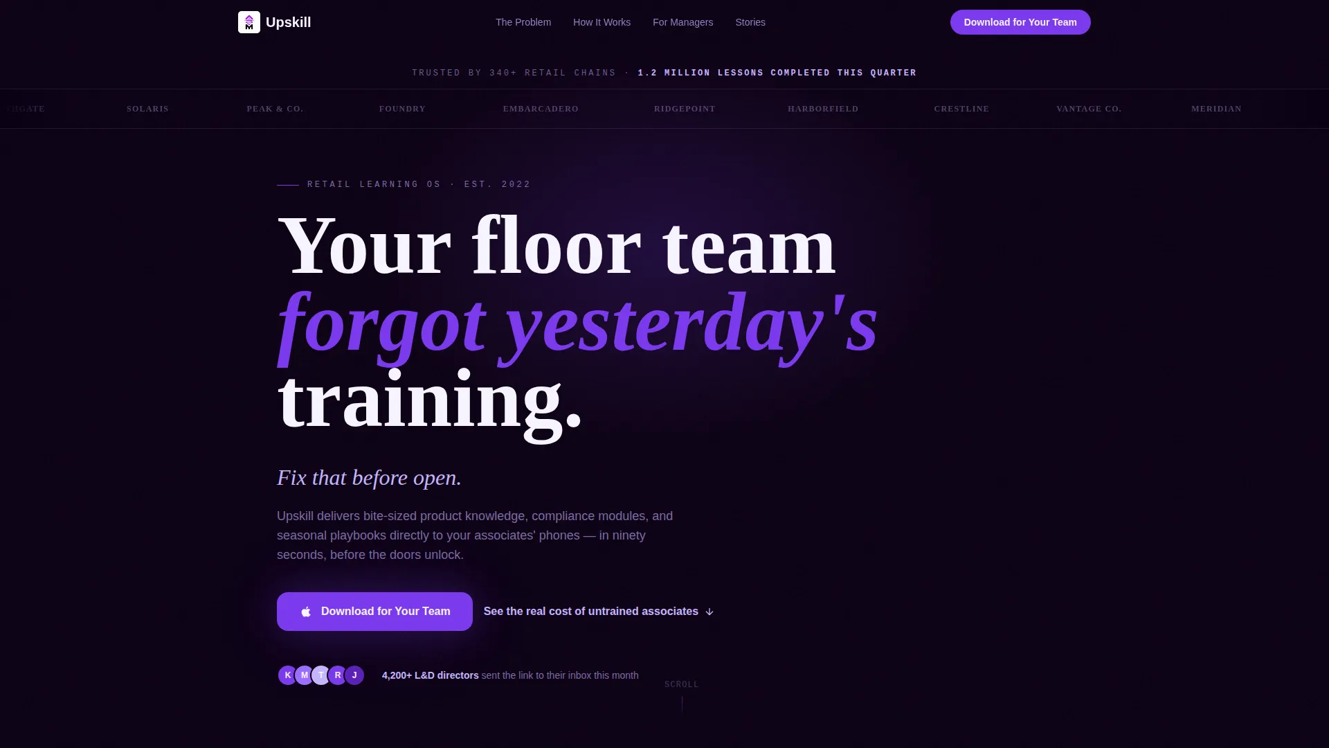
Upskill is a single-page, scroll-driven landing page template for retail training platforms. It opens with a logo ribbon and a scale stat, then takes the visitor through a Problem→Solution Arc that ends at an app download call to action. Every section is designed to feel as purposeful as tapping a name badge before the selling floor opens.
Who this template is for
This template is built for teams that need to get retail training in front of people fast. It speaks directly to decision-makers who manage large, distributed workforces and who know that thick manuals are not working.
- Regional retail chains operating fifty or more store locations
- Franchise operators onboarding seasonal and holiday staff under tight deadlines
- Learning and development directors ready to replace binder-based training with a mobile-first platform
What problem this template solves
Floor associates forget yesterday's training. Audits fail. Customer satisfaction scores drop. The cost of an undertrained team is visible in shrinkage figures and complaint rates, yet most landing pages for training tools bury those numbers under vague feature lists.
- Untrained staff drive measurable losses in shrinkage, audit scores, and customer satisfaction
- Holiday and seasonal onboarding in under forty-eight hours is nearly impossible with legacy materials
- Retail managers lack a fast, credible way to demonstrate the platform's value to a skeptical L&D buyer
What you get with this template
You get a fully structured, scroll reveal landing page that builds trust, surfaces real pain, and closes on a clear app download action. Every section is purposeful and tied directly to the retail training buyer's decision journey.
- A horizontally scrolling logo bar with a headline stat and oversized violet headline copy
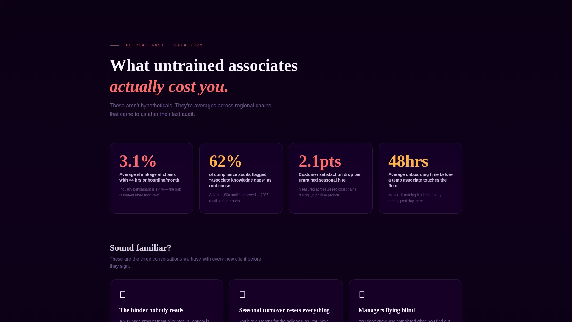
- A dark, data-heavy problem section with scroll-triggered number reveals, followed by a violet divider that transitions to a bright solution arc
- App Store and Google Play download badges paired with a single-field email input for sending the link to an L&D inbox
Feature list
This template is built around a tight set of section types and visual mechanics that work together to move a retail training buyer from recognition to action.
Scroll Reveal Progressive Layout
Each section enters the viewport as the visitor scrolls down. The pacing mirrors the deliberate rhythm of a pre-shift briefing, keeping attention focused on one idea at a time.
Problem Arc Data Section
A full-bleed void black section reveals shrinkage percentages, failed audit counts, and customer satisfaction drops as numbers fade in on scroll. Tension builds before the solution is introduced.
Violet Divider Transition
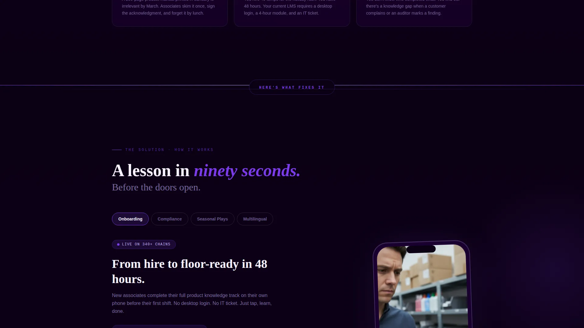
A sweeping violet line crosses the full viewport width to signal the shift from problem to solution. The palette inverts at this point, moving from dark backgrounds to white lesson-preview cards.
Phone-in-Hand Lesson Previews
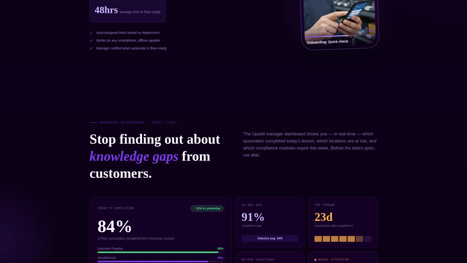
App screenshots show a lesson being completed in ninety seconds on a single hand-held phone screen. Each preview section visually solves one specific problem raised earlier in the page.
Logo Bar Header
A horizontally scrolling ribbon of retail brand silhouettes sits above the stat "1.2 million lessons completed this quarter." Trust and scale are established in under two seconds without a hero image.
App Download Call to Action
The closing section leads with "Download for Your Team" alongside App Store and Google Play badges. A single-field email input offers an alternative for L&D directors who want to forward the link.
Page sections overview
| Section | Purpose |
|---|---|
| Logo Bar Header | Establishes trust and scale with scrolling brand logos and a quarterly lesson stat |
| Headline Block | Delivers the core value statement in oversized violet type with no competing hero image |
| Problem Data Section | Reveals real cost metrics on scroll to build tension and buyer recognition |
| Violet Divider | Signals the visual and narrative shift from problem to solution |
| Onboarding Speed Section | Shows how fast associates can complete a lesson on a phone held in one hand |
| Compliance Tracking Section | Demonstrates how the platform handles audit-ready compliance modules |
| Multilingual Content Section | Addresses language barriers common in large, diverse retail workforces |
| Manager Dashboard Section | Previews visibility tools available to store and regional managers |
| App Download call to action | Closes with download badges and a single email input field |
Design & branding system
The Void & Violet color system gives this template a look that feels like a smartphone screen glowing in a stockroom. It is intimate, modern, and unmistakably digital without feeling over-designed.
- Deep void black (#0B0014) anchors full-bleed backgrounds in the problem arc sections, electric violet (#7C3AED) drives buttons and progress indicators, soft twilight lavender (#C4B5FD) softens secondary text and card borders, and interface white (#F5F3FF) opens breathing room for lesson previews and metric callouts
- The Directory & Discovery theme keeps the layout structured and scannable, letting each section stand on its own visual weight without competing with the next
- Typography uses oversized violet headline treatment in the hero block, with clean white and lavender body copy maintaining strong contrast across dark and light backgrounds
Mobile & speed optimization
Every section in this template was designed around a phone held in one hand. The lesson preview screenshots, the scroll reveal pacing, and the call to action layout all assume the visitor is a busy retail manager or L&D director checking the page between tasks.
- Phone-screen-sized app mockups demonstrate the product in its natural environment, reinforcing mobile credibility at every solution section
- The single-field email input and paired app download badges keep the closing action frictionless and thumb-friendly on small screens
- Scroll reveal animations are scoped to section-level entry points, keeping transitions smooth without overloading the visual experience
How this template helps you convert
The page is engineered as a single decision journey. By the time the visitor reaches the call to action, they have already seen the platform working on a real phone screen across multiple section previews.
- The logo bar and stat line establish credibility instantly, so the visitor continues scrolling with confidence rather than skepticism.
- The problem arc makes the cost of inaction personal and specific, using real retail metrics to create recognition before the solution is introduced.
- Each solution section pairs a named problem with a visible product moment, so the app download feels like the natural next step rather than a cold ask.
Other information about this template
This template fits naturally within the retail software and retail learning management system space. It is equally useful for teams building their first mobile training platform page and for established platforms refreshing a dated landing page.
- The template style is Scroll Reveal (Progressive), meaning sections animate into view as the visitor scrolls rather than loading all at once
- The creative direction follows a Problem→Solution Arc, a structure well suited to buyers who already feel the pain but have not yet committed to a solution
- The header concept is a Logo Bar, which works particularly well for platforms that serve recognizable multi-location retail clients
- The landing page direction targets an App Download outcome, with both App Store and Google Play badge placements built into the closing section
- The theme is Directory & Discovery, keeping the layout organized and content-forward without sacrificing visual impact
Theme
Directory & Discovery
Creative direction
Problem→Solution Arc
Color system
Void & Violet
Style
Scroll Reveal (Progressive)
Direction
App Download
Page Sections
Scroll Reveal Progressive Layout
Problem Arc Data Section
Violet Divider Transition
Phone-in-hand Lesson Previews
Logo Bar Header
App Download Call to Action
Related questions
Who is this template designed for?
Can I adapt the problem arc data section with my own metrics?
Does the template include real app screenshots or placeholder visuals?
Is the logo bar suitable if I cannot display real brand logos?
What is the call to action structure at the bottom of the page?



