Uptime - Reliable SRE Landing Page Template
Uptime is a bento grid landing page template built for site reliability engineering tools. It leads with an interactive SLO Budget Calculator that delivers real value before asking for a signup. The design uses a Data Command aesthetic with near-black backgrounds and iridescent accents. Every section is engineered to move SRE leads, platform engineers, and engineering VPs toward a free-tier click-through.
by Rocket studio
Quick summary
Uptime is a single-page, bento grid landing page template for a site reliability engineering platform. The header is an interactive SLO (Service Level Objective) Budget Calculator. Below it, capability cards unfold like an operator's war room. The visual identity is dark, iridescent, and terminal-precise. The entire page is optimized for a frictionless click-through to a free-tier product signup.
Who this template is for
This template is built for teams and founders in the reliability engineering space who need to speak directly to a technical audience. It communicates credibility and precision without relying on generic product screenshots or vague benefit claims.
- SRE leads managing large microservice fleets who want a landing page that speaks their language from the first scroll.
- Platform engineers and engineering VPs who need a page that translates reliability metrics into business impact, fast.
- Indie developers or product teams launching a site reliability engineering tool that needs to earn trust before asking for a signup.
What problem this template solves
Technical buyers are skeptical. They ignore landing pages that lead with marketing copy and bury the product. They need to feel the tool working before they commit to a signup flow. Standard templates are not built for this expectation.
- Generic hero sections waste the most valuable real estate on the page on taglines instead of demonstrating product value.
- SRE and platform engineering audiences will not engage with vague capability claims or stock imagery of server racks.
- Converting a deeply technical visitor requires low friction and immediate relevance, not a form wall or a lengthy scroll before a call to action appears.
What you get with this template
You get a complete, ready-to-customize bento grid landing page designed specifically for a site reliability engineering product. Every section has a clear job, and the layout guides visitors from problem awareness to signup click without any unnecessary friction.
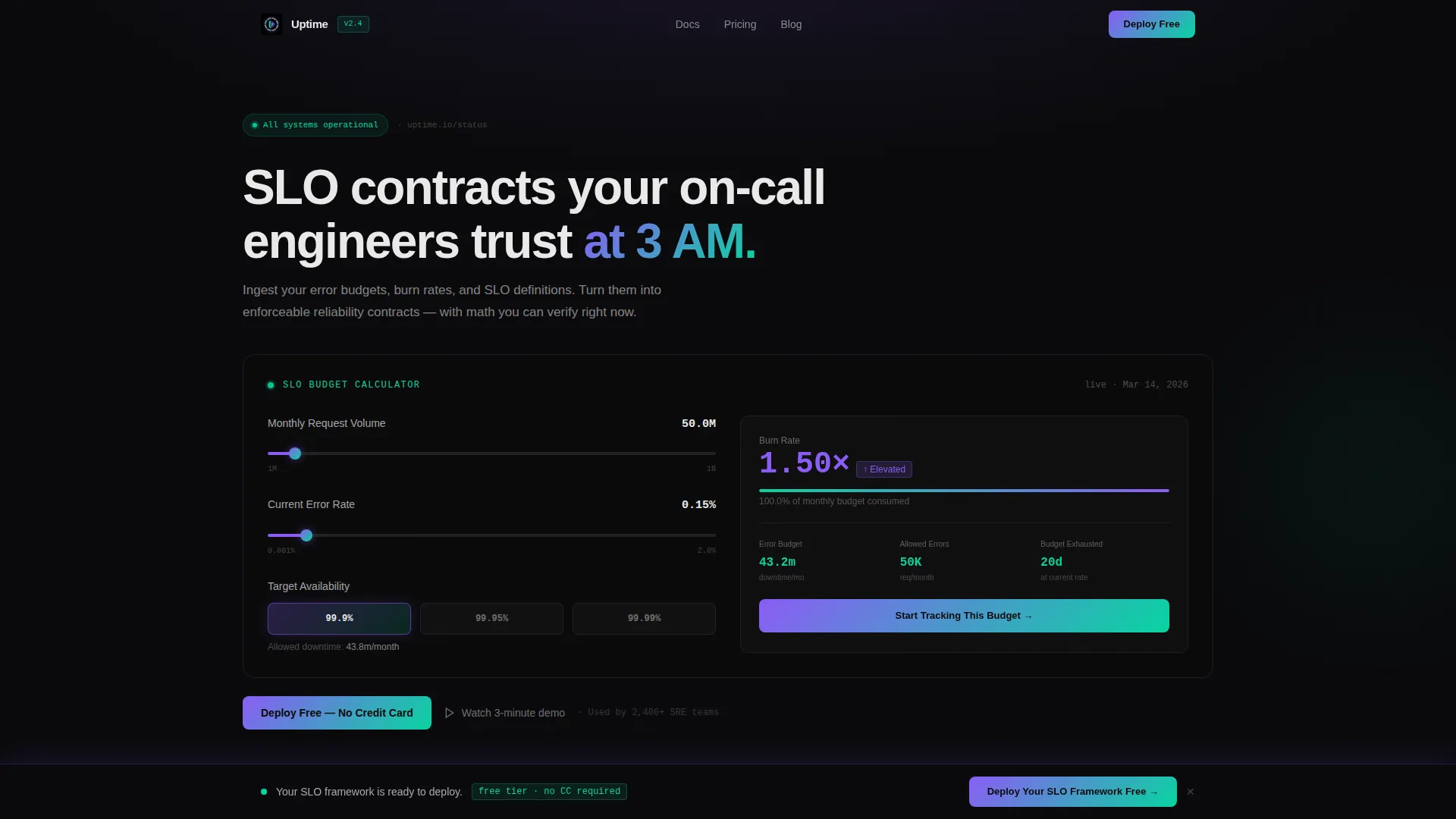
- An interactive SLO Budget Calculator in the header that accepts slider inputs and renders live output inside a bento card styled like a Grafana panel.
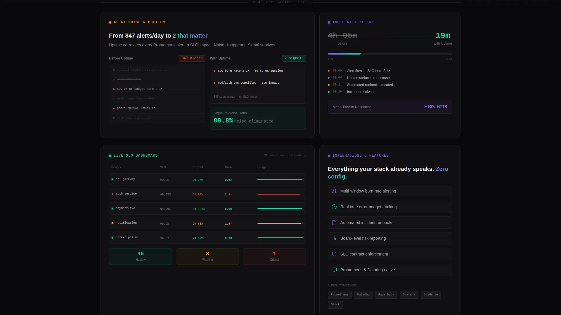
- A bento grid of capability cards below the fold, each self-contained and escalating in narrative depth from problem to proof.
- A persistent bottom bar that appears after 40 percent scroll depth, surfacing a direct signup call to action without interrupting reading flow.
Feature list
This template is built around a specific set of components and behaviors that serve the site reliability engineering use case. Each feature below is present in the template as described in the source brief.
Interactive SLO Budget Calculator
The header card is a fully interactive calculator. Visitors input monthly request volume, current error rate, and target availability (99.9 percent, 99.95 percent, or 99.99 percent). The output renders remaining error budget in both minutes and requests, projected burn rate, and days until budget exhaustion. All values animate in real time as sliders move, inside a bento card styled to feel like a live monitoring panel.
Contextual In-Card Call to Action
After the calculator produces its output, a "Start Tracking This Budget" call-to-action button appears inside the results card. It carries the visitor's entered values as URL parameters to the signup page. This makes the transition feel like continuing work rather than starting a new commitment.
Escalating Bento Grid Narrative
The scroll below the calculator unfolds as a structured bento grid. Individual cards cover alert noise reduction with a before-and-after signal-to-noise ratio view, an incident timeline animation collapsing from four hours to nineteen minutes, and a live-updating SLO dashboard mockup with burn rate vectors. The grid reads as a progressive argument: problem, solution, proof.
Persistent Signup Bottom Bar
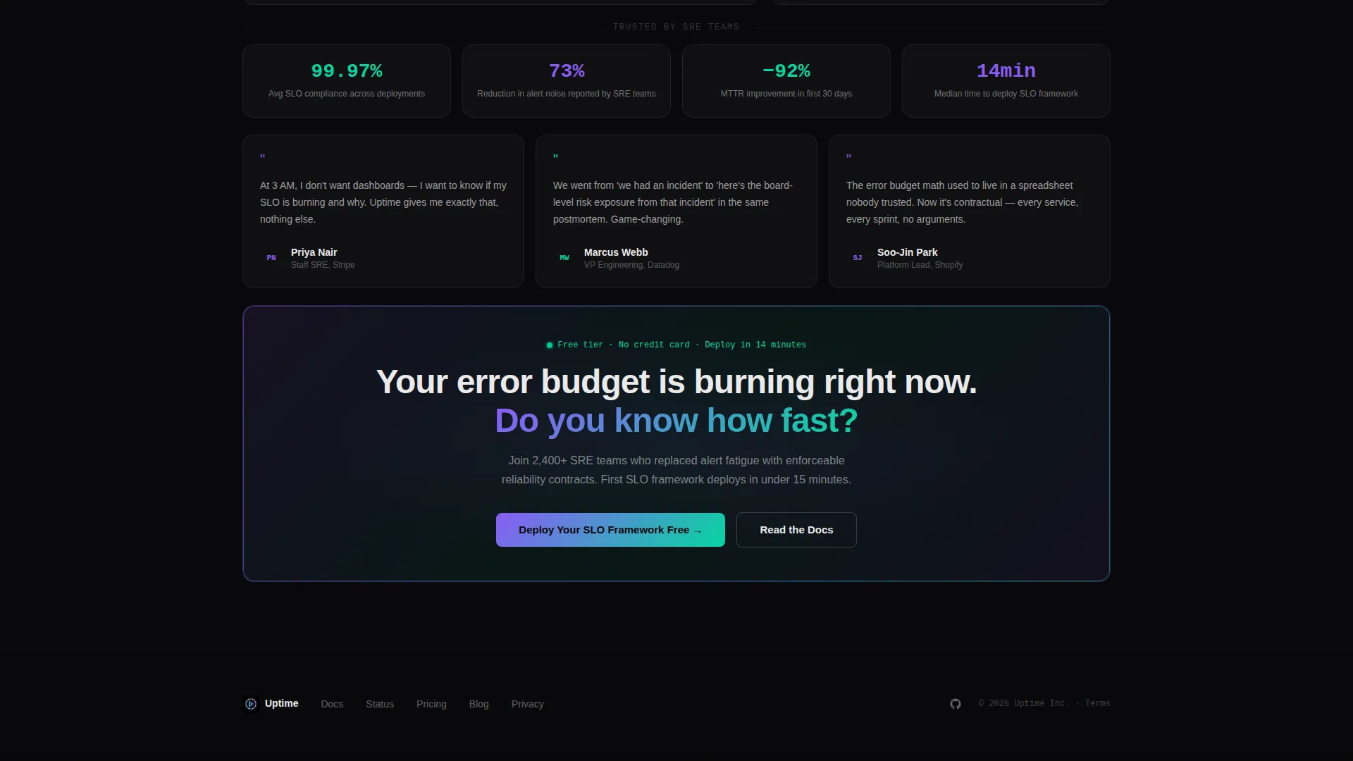
After the visitor scrolls past 40 percent of the page, a bottom bar surfaces with a "Deploy Your SLO Framework Free" call to action. It stays visible without blocking content, providing a constant low-friction path to signup throughout the rest of the page experience.
Purposeful Micro-Animations
Motion in this template is intentional and minimal. Numbers count up on card entry. Status indicator dots pulse. The incident timeline collapse plays as a single directed animation. Nothing is decorative. Every motion carries information and reinforces the sense that the system is live and healthy.
Data Command Visual System
The layout uses near-black backgrounds with subtle iridescent gradients that shift as sections enter the viewport. Holographic violet (#8B5CF6) signals computed insights. Shimmer cyan (#06D6A0) marks healthy thresholds. Interactive elements catch a violet-to-cyan gradient on hover. The palette is designed to feel like a GPU-rendered terminal where the data itself appears to glow.
Page sections overview
| Section | Purpose |
|---|---|
| SLO Budget Calculator | Interactive header tool delivering immediate, personalized reliability metrics |
| In-Card Signup call to action | Contextual action appearing inside calculator results, pre-filled with visitor inputs |
| Alert Noise Card | Before-and-after bento card showing signal-to-noise ratio improvement |
| Incident Timeline Card | Animated card collapsing a four-hour incident to nineteen minutes |
| SLO Dashboard Card | Live-updating mockup displaying burn rate vectors and threshold status |
| Persistent Bottom Bar | Sticky signup prompt activating after 40 percent scroll depth |
Design & branding system
The visual identity follows a Data Command theme built on the AI Iridescent color system. The aesthetic is inspired by a GPU-rendered terminal where every metric is green and the engineer knows exactly why.
- Core palette: void black (#09090B) for backgrounds, holographic violet (#8B5CF6) for computed insight accents, shimmer cyan (#06D6A0) for healthy threshold indicators, and signal white (#EAEAEA) for primary text.
- Iridescent gradient backgrounds shift subtly as sections enter the viewport, giving the page a live, oil-on-water quality without relying on heavy visual effects.
- Every interactive surface catches a violet-to-cyan gradient on hover, making clickable elements feel active with implied telemetry rather than static decoration.
Mobile & speed optimization
The bento grid layout is structured to adapt naturally to smaller viewports. Card-based design inherently supports responsive reflow without breaking narrative order. Micro-animations are minimal and purposeful, which keeps the motion layer lightweight across devices.
- Bento grid cards reflow into a single-column stack on mobile, preserving the escalating narrative from calculator to proof without horizontal scrolling.
- Slider-driven calculator inputs are designed for touch interaction, keeping the header tool fully usable on mobile screens.
- Animations are triggered on card entry rather than on a continuous loop, limiting unnecessary rendering overhead during scroll.
How this template helps you convert
This template is built around a click-through conversion model. There is no form on the page. The entire design reduces friction to a single decisive click, and each stage of the layout moves the visitor closer to that moment.
- The interactive calculator delivers personalized reliability output before asking for anything, earning attention through immediate utility and making the first interaction feel like using the product.
- The in-card contextual call to action appears only after the visitor has engaged with the calculator, making the signup prompt feel like a natural next step rather than an interruption.
- The persistent bottom bar sustains conversion opportunity throughout the full page scroll without blocking content, ensuring a path to signup is always visible regardless of where the visitor pauses.
Other information about this template
This template is designed as a single landing page and is well suited for product launches, feature announcements, and free-tier acquisition campaigns in the site reliability engineering space. It can support teams building or marketing a site reliability engineering tool and framework who need to communicate directly with a deeply technical audience.
- The template style is Bento Grid, and the creative direction is Calculator or Tool First, meaning the product value demonstration precedes any marketing copy.
- The header concept is a Calculator or Estimator, replacing a traditional hero section entirely with an interactive, value-delivering tool.
- The landing page direction is Click-Through, optimized to carry visitor context as URL parameters into the signup flow, reducing perceived friction at the point of conversion.
- This template fits the Technology category and the Site Reliability Engineering Technology subcategory, making it a strong fit for platforms focused on error budget management, burn rate monitoring, SLO enforcement, and on-call reliability workflows.

Theme
Data Command
Creative direction
Calculator/Tool First
Color system
AI Iridescent
Style
Bento Grid
Direction
Click-Through
Page Sections
Interactive SLO Budget Calculator
Contextual In-card Signup Call to Action
Escalating Bento Grid Narrative
Persistent Bottom Bar Call to Action
Purposeful Micro-animations
Data Command Visual Identity
Related questions
Does this template include a working calculator or just a visual mockup?
Is there a form on this landing page?
Can I adapt the color system for a different brand?
Who is the intended visitor for this landing page?
How does the contextual call to action work?



