Intelligent PIM Landing Page Template
Catalog is a dashboard-style landing page template built for a decentralized product information manager. It features a live data grid header, a feature matrix with micro-animations, a comparison table, and a freemium conversion flow. Designed for e-commerce ops leads, supply chain architects, and marketplace integrators who need one authoritative product record across every sales channel.
by Rocket studio
Quick summary
Catalog is a single-page landing page template designed for a decentralized product information manager. It opens with a perspective-angled data grid showing live channel sync, then walks visitors through core capabilities via an animated feature matrix, a side-by-side comparison table, and a frictionless inline signup flow aimed at freemium conversion.
Who this template is for
This template was built for technical and operational teams managing product data at scale. It speaks directly to the people who feel the daily cost of fragmented product records across multiple sales channels.
- E-commerce operations leads managing SKU data across platforms like Shopify, Amazon, and WooCommerce who are stuck in spreadsheet-driven workflows
- Supply chain architects at mid-market brands that have grown beyond what their enterprise resource planning system's product module can handle
- Marketplace integrators who need a single source of truth to push accurate product data to dozens of endpoints simultaneously
What problem this template solves
Product data fragmentation is one of the most expensive and invisible problems in modern commerce. When there is no central, trusted record, teams waste time reconciling conflicts, channels go out of sync, and no single person can say with confidence what the canonical version of a product record actually is.
- Teams managing the same SKU across multiple channels end up with conflicting attributes, outdated descriptions, and inconsistent pricing with no clear resolution path
- Existing enterprise resource planning systems and legacy product information management platforms create vendor dependency and single points of failure that slow down every update
- Integrators pushing data to many endpoints have no reliable way to confirm propagation or resolve conflicts without manual intervention
What you get with this template
You get a complete, production-ready landing page layout that communicates the value of a decentralized product information manager from the very first scroll. Every section is purposeful and sequenced to build trust before asking for anything.
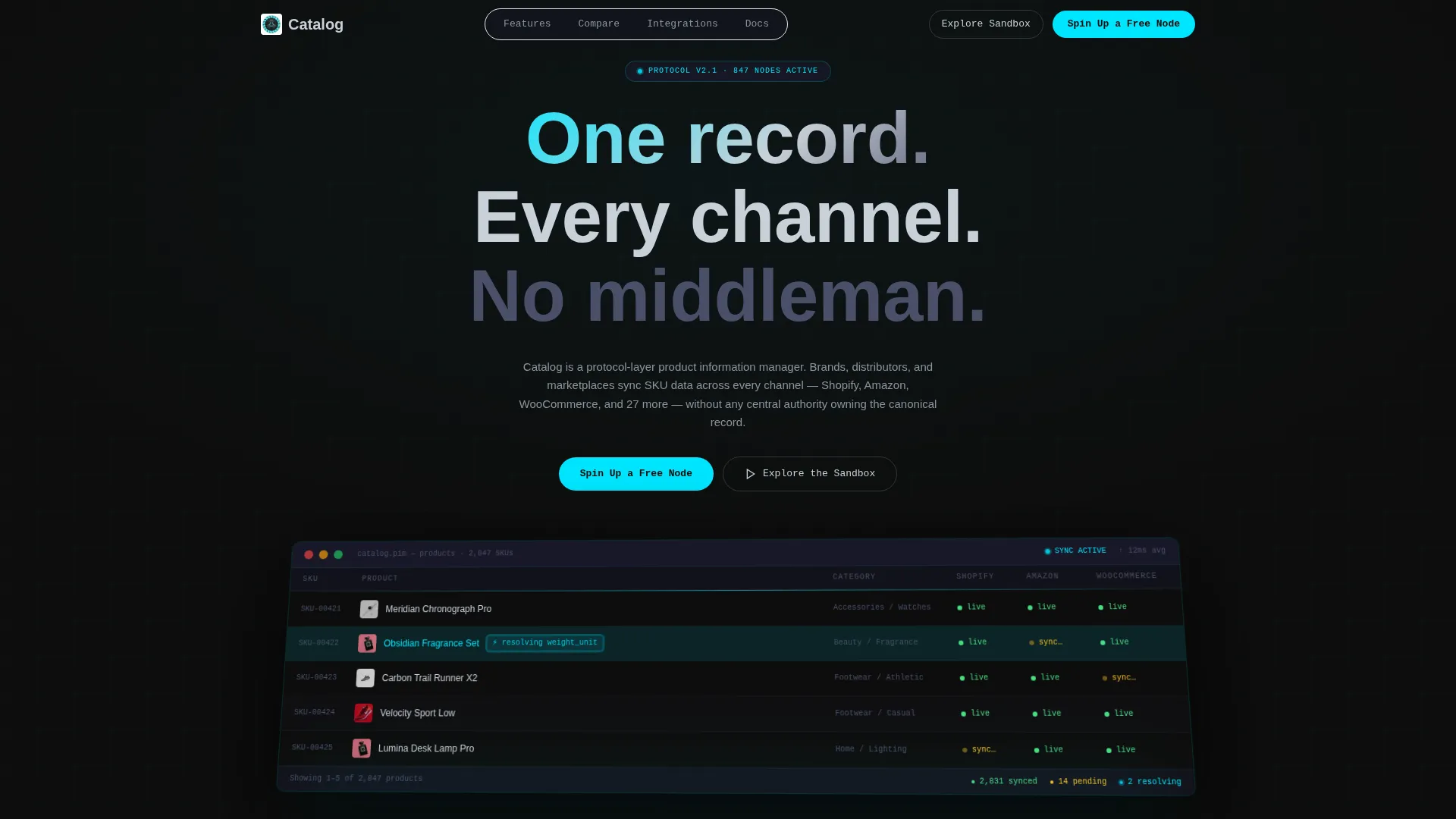
- A full-width dashboard preview header with a perspective-angled data grid showing product rows, channel-status columns, and a live-sync conflict resolution highlight
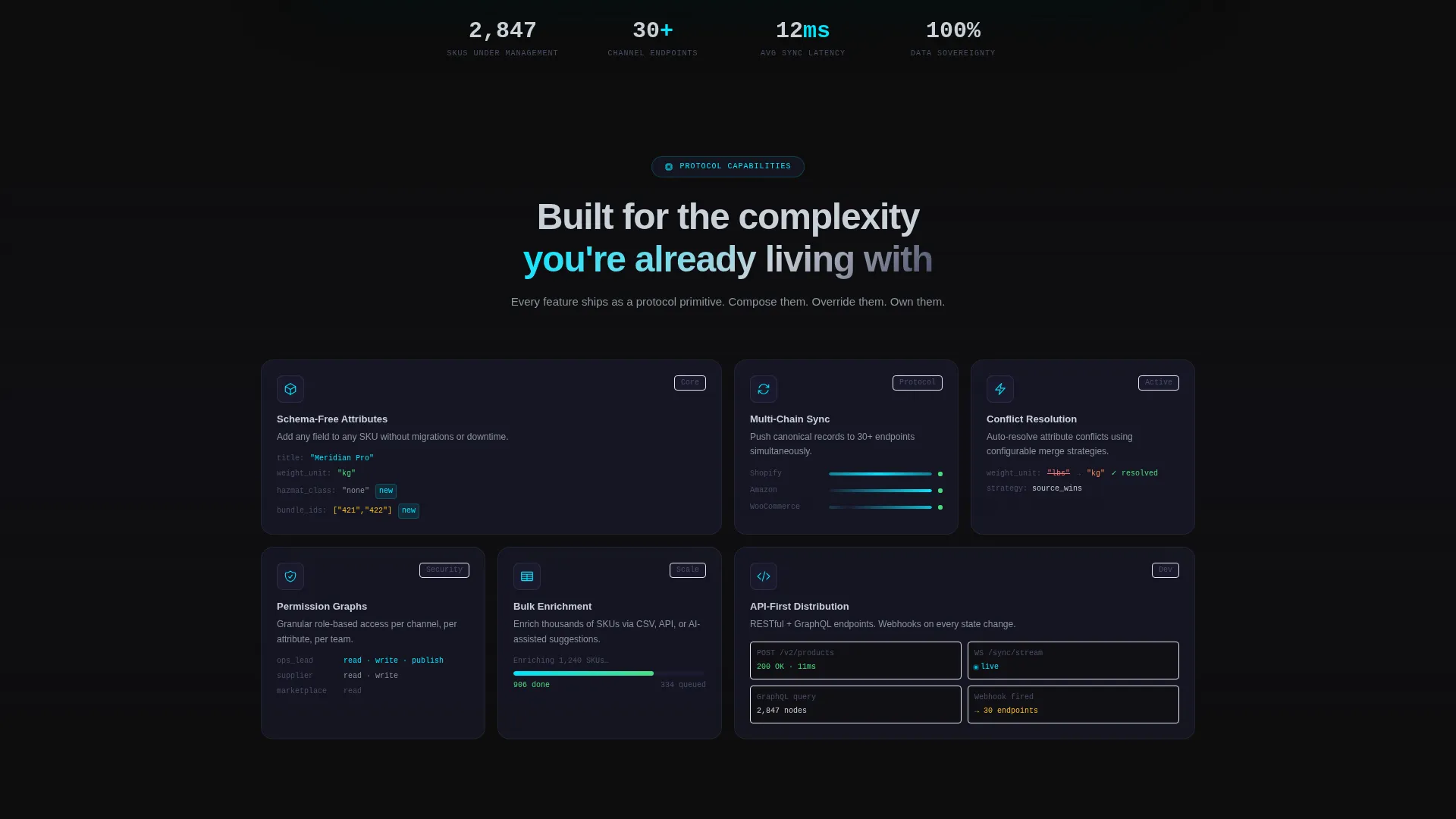
- An animated feature matrix presenting six core capabilities, each in its own card with an icon, one-line description, and a micro-animation
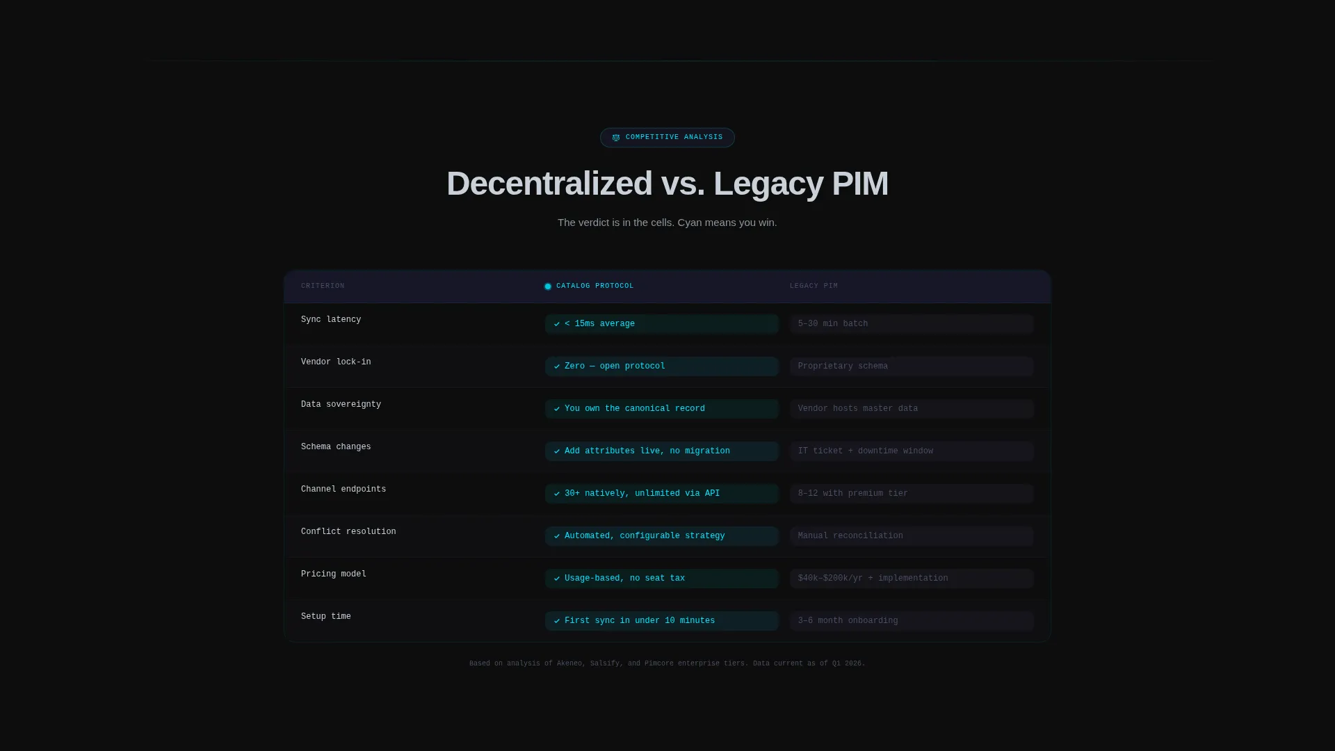
- A comparison table pitting the decentralized approach against legacy platforms, an inline freemium signup form, and a no-signup sandbox link
Feature list
This template delivers a tightly sequenced set of interactive and visual components, each grounded in the product's core capabilities.
Live Dashboard Preview Header
The header renders a pixel-accurate, perspective-angled data grid mid-sync. Product rows show thumbnails, titles, categories, and channel-status columns. Pulsing green dots indicate real-time propagation to multiple channels, and one row is highlighted in cyan to show an attribute conflict being auto-resolved. The effect puts the product's value in front of the visitor before a single line of copy is read.
Animated Feature Matrix
Six capability cards sit in a tight grid below the header. Each card contains an icon, a one-line description, and a live micro-animation showing the feature in action. The cards cover schema-free attributes, multi-chain sync, conflict resolution, permission graphs, bulk enrichment, and API-first distribution. The matrix rewards skimming and scales to more detailed proof as the visitor scrolls.
Decentralized versus. Legacy Comparison Table
A side-by-side comparison table contrasts the decentralized product information management approach against legacy platforms. Comparison dimensions include latency, vendor lock-in, and data sovereignty. Cells are color-coded in electric cyan versus graphite so the verdict reads instantly without requiring the visitor to parse dense text.
Inline Freemium Conversion Flow
The primary call to action, "Spin Up a Free Node," appears pinned in the top navigation and repeats after the feature matrix and comparison table. Clicking opens an inline signup form collecting work email, company name, and a channel-count selector. A secondary path labeled "Explore the Sandbox" links to a read-only demo environment requiring no signup, giving hesitant visitors a low-friction entry point.
Escalating Technical Scroll Architecture
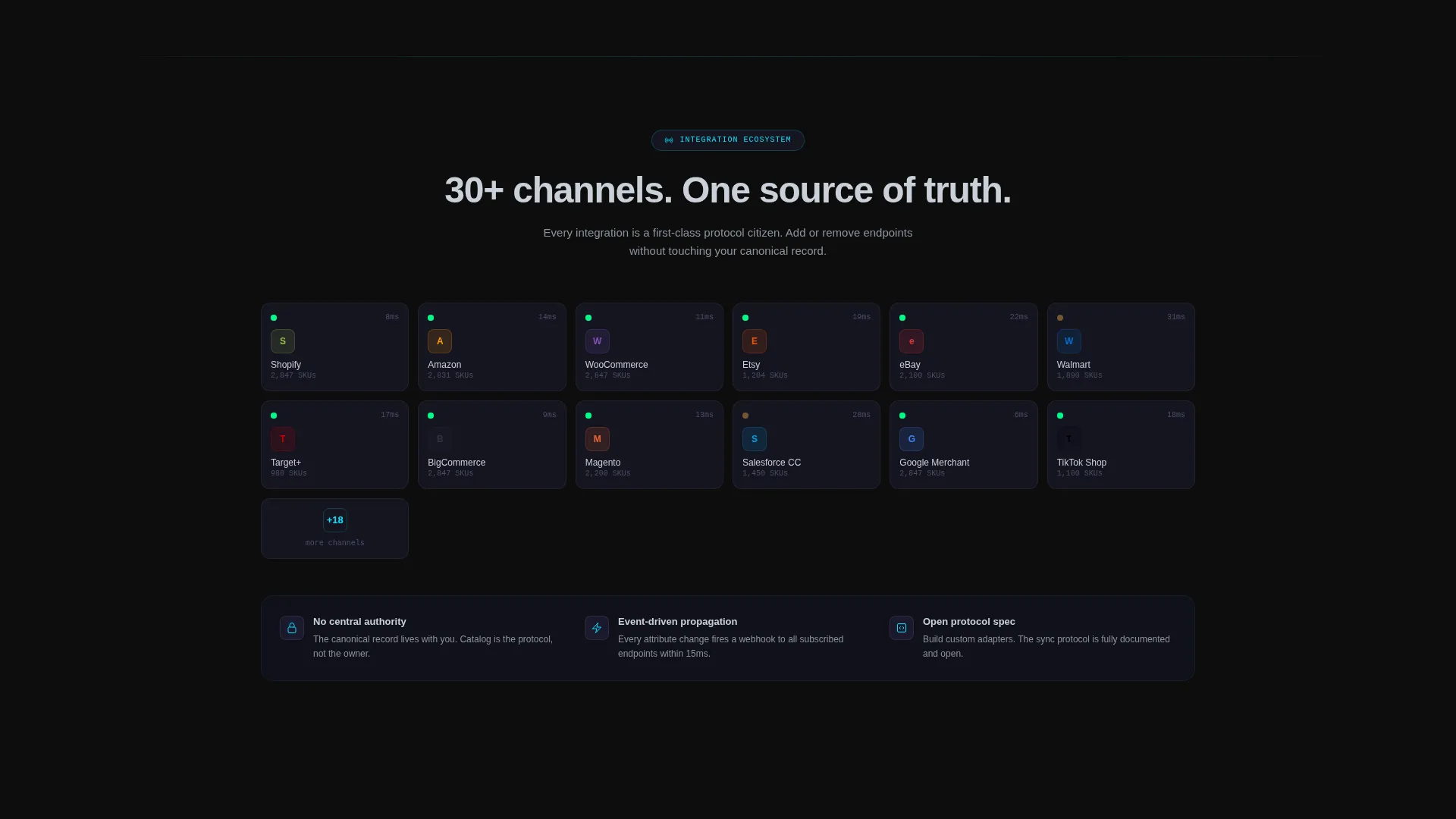
The page is structured so each scroll section adds a denser layer of proof. The journey moves from individual features to the integration ecosystem to security architecture. This rewards the technically motivated visitor who keeps reading while keeping the opening sections accessible to ops-focused buyers who just want to see the product work.
Page sections overview
| Section | Purpose |
|---|---|
| Dashboard Preview Header | Show the product mid-sync to prove the concept instantly |
| Headline Fade-In | Anchor the value proposition above the data grid |
| Feature Matrix Grid | Present six core capabilities as scannable, animated cards |
| Integration Ecosystem | Demonstrate breadth of channel and endpoint coverage |
| Security Architecture | Add technical depth for architects and integrators |
| Comparison Table | Contrast decentralized versus legacy PIM on three dimensions |
| Primary call to action Block | Repeat the "Spin Up a Free Node" signup after comparison |
| Inline Signup Form | Capture work email, company name, and channel count |
| Sandbox Entry Link | Offer a no-signup demo path for cautious visitors |
Design & branding system
The visual identity follows a Directory and Discovery theme built on a Carbon Fiber color system. Every design choice serves legibility and status communication, with zero decorative elements that do not carry meaning.
- Core palette: deep carbon black (#0D0D0D) for backgrounds, woven graphite (#1A1A2E) for surface layers, titanium mid-tone (#4A4E69) for secondary elements, and cool chrome (#C9D1D9) for text and structural highlights
- Electric cyan (#00E5FF) is reserved exclusively for interactive states, live-sync indicators, conflict-resolution highlights, and primary call-to-action elements, so every cyan glow carries a specific functional signal
- The overall aesthetic evokes the inside of a server rack at 2 AM: matte dark surfaces, purposeful status lights, and a perspective-angled data grid that creates visual depth without relying on gradients or decorative illustration
Mobile & speed optimization
The template is structured to translate the dashboard aesthetic cleanly to smaller screens without losing the visual intensity that makes the desktop experience compelling. Complexity scales down gracefully.
- The perspective-angled data grid in the header adapts to a flattened, vertically scrollable layout on mobile, preserving the channel-status columns and sync indicators in a readable format
- Feature matrix cards reflow into a single-column stack on narrow viewports, keeping the icon, one-liner, and micro-animation intact per card
- The inline signup form and call-to-action elements are sized and spaced for touch interaction, ensuring the freemium conversion path remains accessible on any device
How this template helps you convert
The page is built around one principle: show the product working before asking for anything. Every design and copy decision reinforces that principle, and the conversion flow follows naturally from it.
- The dashboard preview header acts as the pitch itself. Visitors see a live-looking data grid resolving a real conflict before they read a headline, which builds credibility in the first three seconds of the visit.
- The escalating scroll architecture layers feature proof, integration breadth, and competitive comparison in sequence. By the time the visitor reaches the "Spin Up a Free Node" call to action, they have already seen enough evidence to act.
- The no-signup sandbox link removes the final objection for visitors who are not ready to commit. It converts curious prospects into product-qualified leads without requiring a single form field.
Other information about this template
This template is designed for teams in the decentralized enterprise software space where trust in the product must be established visually before any conversion ask is made. A few additional details worth knowing:
- The template style is a Dashboard and Data Grid layout, which makes it well-suited for any protocol-layer or API-first product that benefits from showing live data states
- The Directory and Discovery theme and Carbon Fiber color system are designed to resonate with technical buyers who evaluate tools by how mature and operable they look
- The channel-count selector in the inline signup form (1 to 5, 6 to 20, and 20 or more) serves as a lightweight qualification step, helping the product team segment trial users from the first interaction
- This landing page can support teams considering alternatives to centralized product information management systems, including scenarios where data sovereignty and the absence of a single controlling authority are requirements
Theme
Directory & Discovery
Creative direction
Feature Matrix
Color system
Carbon Fiber
Style
Dashboard/Data Grid
Direction
Freemium/Trial
Page Sections
Live Dashboard Preview Header
Animated Feature Matrix Grid
Decentralized Versus. Legacy Comparison Table
Inline Freemium Signup Form
No-signup Sandbox Entry Path
Escalating Technical Scroll Structure
Related questions
Who is this landing page template designed for?
What conversion actions does this template support?
Can this template work for other technical SaaS products?
What does the comparison table measure?
Does a visitor need to sign up to explore the product?



