Storage Membership Platform Landing Page Template
Vault is a dark-themed, split-screen landing page template built for self-storage membership platforms. It uses a glowing indigo dashboard aesthetic to showcase occupancy data, rate trends, and market intelligence. The layout is designed for click-through conversion, guiding regional operators and acquisitions analysts toward a membership signup with compelling, partially revealed data visualizations.
by Rocket studio
Quick summary
Vault is a single-page, split-screen landing page template for storage membership platforms. It pairs a deep terminal-black visual identity with electric indigo data visualizations to create a dashboard-grade first impression. The layout is built around a click-through flow that shows just enough real market intelligence to earn the next step.
Who this template is for
This template is made for teams marketing a self-storage intelligence or membership platform. It speaks directly to the operators and analysts who need a professional, data-forward first impression.
- Regional self-storage operators managing five to thirty facilities who need a credible web presence for their platform
- Acquisitions analysts and regional managers at real estate investment trusts who evaluate performance data regularly
- Membership platform founders targeting mid-market storage professionals who have outgrown basic tools
What problem this template solves
Most storage technology landing pages look like generic SaaS sites. They fail to communicate the depth of the data product behind them. Vault solves this by making the data itself the hero of the page.
- Operators and analysts arrive expecting another bland feature list, but instead see their exact metrics reflected back at them
- The information-gap technique, where charts are cropped and tables cut off early, keeps visitors curious and motivated to click through
- There is no form to fill out on this page, removing friction and letting the click do the qualifying work
What you get with this template
Vault delivers a fully structured, single-page layout that follows an industry-report scroll narrative. Every section is designed to build trust and raise stakes before asking for a commitment.
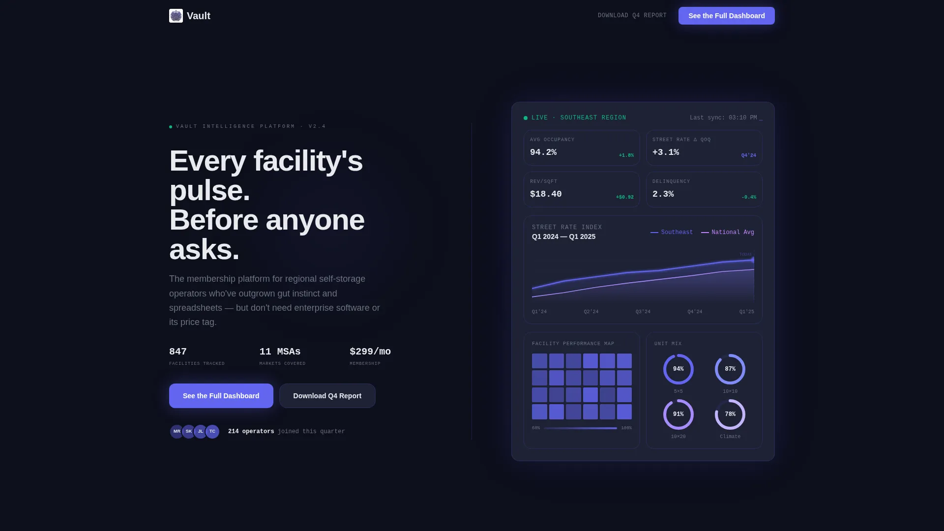
- A dark full-bleed header featuring glowing occupancy dashboards, indigo line charts, heat maps, and unit-mix donut charts
- Split-screen content sections pairing data visualizations on the left with sharp editorial analysis on the right
- A persistent bottom call-to-action bar that appears after 60 percent scroll depth, plus a primary call-to-action placed after the second data section
Feature list
This template ships with a focused set of layout and conversion components drawn directly from the brief.
Dark Full-Bleed Dashboard Header
The header fills the entire viewport in deep terminal black (#0D0F1C). An occupancy dashboard fades in from the darkness, showing indigo line charts tracing rate trends, a softly pulsing facility heat map, and unit-mix donut charts animating to their final positions. Real-looking data labels such as "Southeast Region: 94.2% Occupied, Street Rate +3.1% QoQ" make the header feel like a live system, not a mockup.
Split-Screen Industry Report Layout
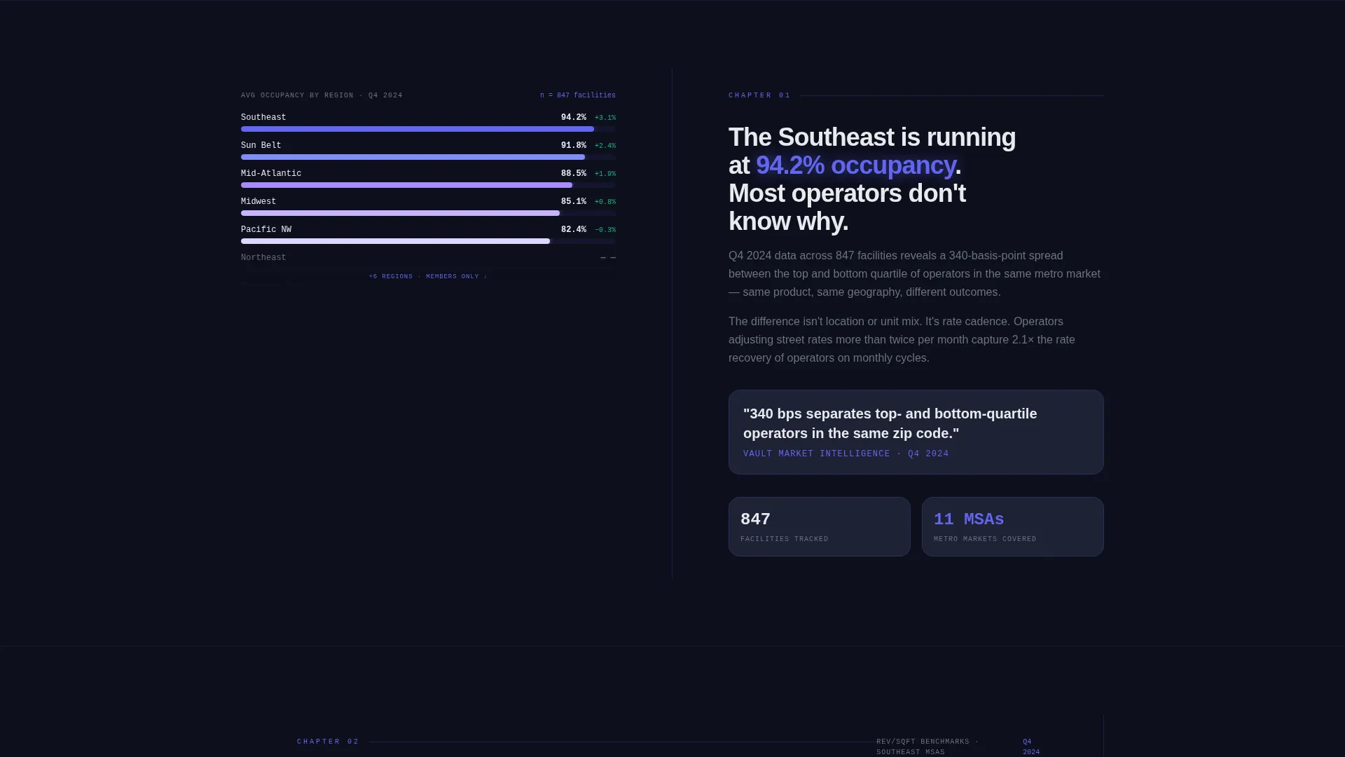
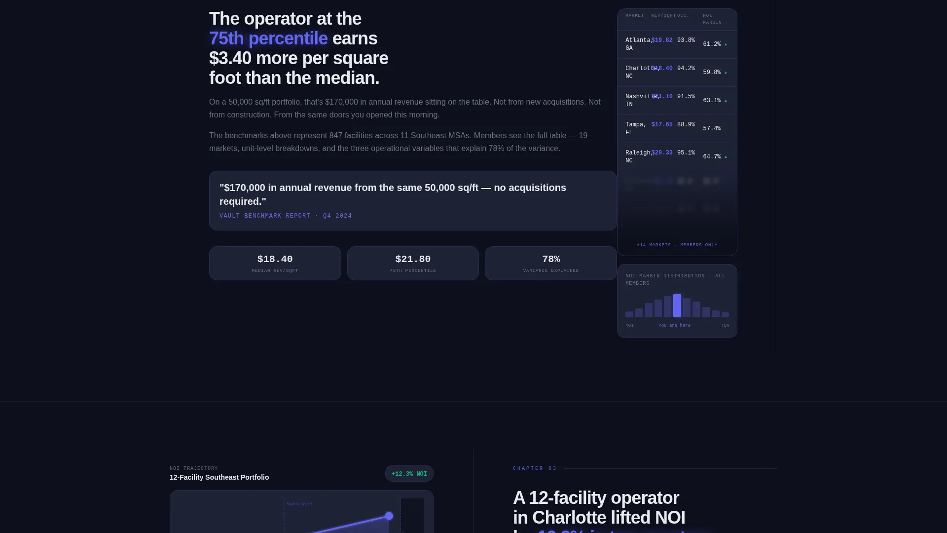
Each scroll section uses a strict 50/50 split. The left side holds a key data visualization, including revenue per square foot benchmarks, seasonal demand curves, and competitor rate positioning charts. The right side delivers sharp editorial prose with pull-quote statistics glowing in indigo, creating the feel of a proprietary research report.
Information-Gap Conversion Mechanics
Every chart is slightly cropped. Every data table stops at row five. Every trend line ends one quarter before the current date. This deliberate incompleteness creates an information gap that motivates visitors to click through to the full dashboard rather than leaving satisfied.
Dual Call-to-Action System
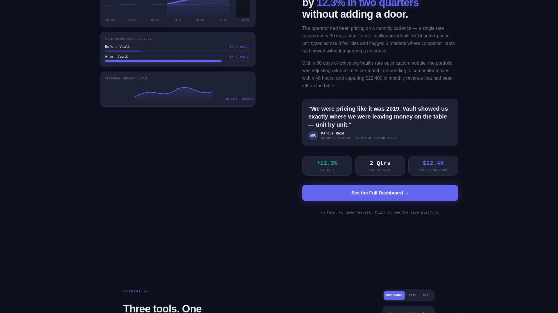
The primary call-to-action, "See the Full Dashboard," appears after the second data section and repeats as a persistent bottom bar once scroll depth reaches 60 percent. A secondary call-to-action, "Download the Q4 Storage Report," captures email addresses from visitors who are not ready to commit yet.
Sequential Scroll Narrative Structure
The page is structured as a four-chapter report. It opens with a market overview, moves into operational benchmarks, presents a rate optimization case study showing a 12 percent net operating income lift, and closes with the member-only tools that produced the result. Each section raises the stakes before the final click prompt.
Electric Indigo Data Visualization Style
All charts, heat maps, and metric callouts use the Electric Indigo color system. Glowing indigo accents on a cool slate card surface make every data point feel urgent and alive. The palette is designed for extended screen time, combining deep blacks with precise color signals for readability under all lighting conditions.
Page sections overview
| Section | Purpose |
|---|---|
| Full-Bleed Header | Introduce dashboard aesthetic and hook attention with live-feeling occupancy data |
| Market Overview Split | Present regional market context and establish platform credibility |
| Operational Benchmarks Split | Show revenue per square foot and seasonal demand data to build trust |
| Rate Optimization Case Study | Demonstrate a 12 percent net operating income lift with member-only tools |
| Member Tools Reveal | Introduce the platform features that generated the case study result |
| Primary call to action Block | Drive click-through to membership signup with "See the Full Dashboard" |
| Persistent Bottom Bar | Reinforce the primary call-to-action after 60 percent scroll depth |
| Secondary call to action Strip | Capture emails with the "Download the Q4 Storage Report" offer |
Design & branding system
The visual identity is built around a Dashboard Pro theme using the Electric Indigo color system. The palette is designed to feel like a Bloomberg terminal rebuilt by a gaming studio.
- Core palette: deep terminal black (#0D0F1C) for backgrounds, electric indigo (#6366F1) for glowing data points and interactive accents, cool slate (#1E2235) for card surfaces, and crisp signal white (#E8EAED) for typography and axis labels
- No stock photography or lifestyle imagery appears anywhere; the entire visual language is built from data, charts, and typographic hierarchy
- Pull-quote statistics are styled in indigo to create visual contrast and draw the eye to the most persuasive numbers on each panel
Mobile & speed optimization
The split-screen layout is structured to reflow cleanly on smaller screens without losing the dashboard atmosphere or the conversion sequence.
- On mobile, each 50/50 split stacks vertically so data visualizations appear above their corresponding editorial analysis
- The persistent bottom call-to-action bar is designed to remain visible without obstructing content on smaller viewports
- The dark color palette reduces perceived visual weight on screen, keeping the layout feeling fast and focused even on image-heavy sections
How this template helps you convert
Vault earns the click rather than asking for it. The page is engineered so that every section increases a visitor's desire to see what comes next.
- The information-gap design, where data is always slightly incomplete, creates genuine curiosity that only a membership signup can resolve, making the primary call-to-action feel like a natural next step rather than a sales push.
- The secondary email-capture call-to-action provides a lower-commitment path for analysts and managers who need internal approval before signing up, keeping them in the funnel without a hard ask.
Other information about this template
Vault is a single landing page template, not a multi-page site. It is built for one purpose: moving the right visitor to the next step in a membership funnel.
- The template is categorized under Technology and the Storage Digital Presence subcategory, making it suitable for platforms targeting the self-storage industry
- The click-through flow is designed so no form appears on the landing page itself; the form lives on the downstream membership signup page with plan selection
- The four-chapter scroll narrative can be adapted to reflect a platform's own benchmark data, case study metrics, and tool screenshots without changing the underlying layout structure
- This template fits the niche of a storage membership site where the product is market intelligence, occupancy tracking, and rate optimization tools delivered through a member dashboard
Theme
Dashboard Pro
Creative direction
Industry Report
Color system
Electric Indigo
Style
Split Screen (50/50)
Direction
Click-Through
Page Sections
Dark Full-bleed Dashboard Header
Split-screen Industry Report Layout
Information-gap Conversion Design
Dual Call-to-action System
Four-chapter Scroll Narrative
Electric Indigo Data Visualization Style
Related questions
Does this template include a signup form on the landing page?
Can I replace the placeholder data and charts with my platform's real numbers?
Who is this landing page template designed for?
What does the secondary call-to-action do?
Can the four-chapter scroll structure be adapted to a different narrative?



