Vault — Inventory Management Landing Page Template
Stockpile is a hub-and-spoke landing page template built for SaaS inventory management platforms. It opens with a live-simulated micro-dashboard above the fold, guides visitors through a feature matrix anchored by a sticky side nav, and drives clicks toward a free inventory audit or personalized demo, all inside a dark Void and Violet visual system that makes your data glow.
by Rocket studio
Quick summary
Stockpile is a single-page, anchor-navigated landing page template designed for SaaS inventory management products. It opens on a functioning micro-dashboard, walks visitors through a structured feature matrix, and closes every section with a clear call to action. The dark Void and Violet palette gives the page a mission-control feel that matches the product's precision.
Who this template is for
This template is built for SaaS founders, product marketers, and growth teams who sell inventory management software to operations-heavy buyers. If your platform replaces spreadsheets or fills gaps that basic e-commerce tools leave behind, this layout speaks directly to your audience's daily frustrations.
- Operations managers at mid-market e-commerce brands who are overwhelmed by manual inventory tracking
- Logistics directors at third-party logistics warehouses juggling multi-client stock across several facilities
- Supply chain leads at direct-to-consumer brands that have outgrown their current native tooling
What problem this template solves
Selling inventory software is hard because buyers have seen too many vague demos and generic feature lists. They need to feel the product working before they trust it. Most landing pages describe the platform; this template lets visitors interact with it.
- Visitors arrive skeptical and leave before reading a single feature claim
- Generic hero sections fail to show the actual software experience above the fold
- Long feature pages without navigation cause drop-off before buyers reach the decision point
What you get with this template
You get a complete, conversion-focused landing page layout that puts the product experience first and earns the click through interactivity rather than persuasion copy alone. Every section is purposefully sequenced to move a skeptical operations buyer from curiosity to confidence.
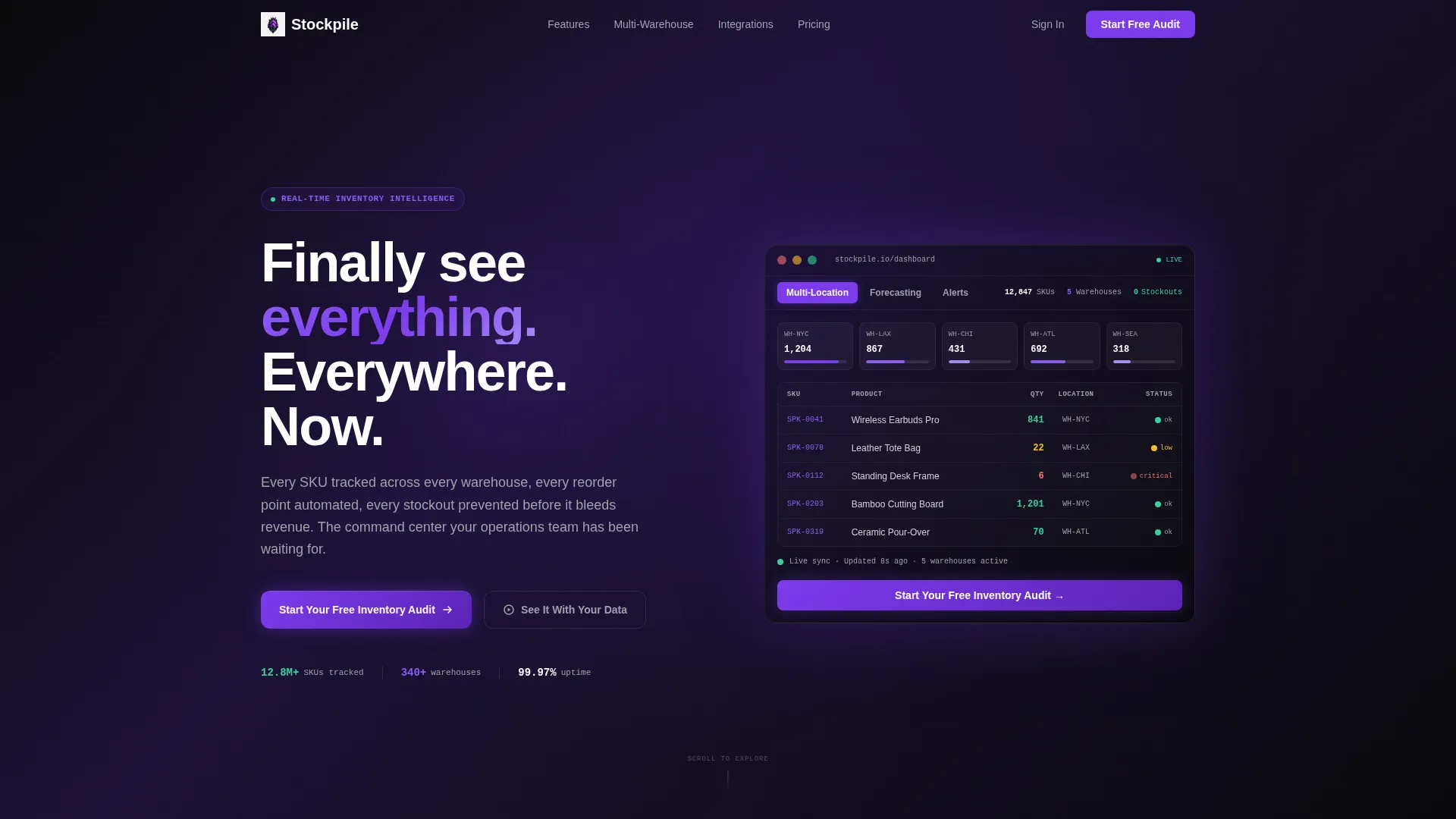
- An interactive micro-dashboard header with clickable tabs for Multi-Location, Forecasting, and Alerts views
- A sticky left-rail anchor navigation with five feature spokes that act as a structured discovery hub
- A sticky bottom call-to-action bar and two distinct conversion paths routed to signup and demo booking
Feature list
This template is built around a specific set of interactive and structural components drawn directly from the product brief. Each one serves a deliberate role in reducing buyer hesitation.
Interactive Header Micro-Dashboard
The above-the-fold section embeds a live-simulated dashboard showing ticking stock-keeping unit counts, a flashing reorder alert, and a warehouse heatmap. Visitors can click tabs labeled Multi-Location, Forecasting, and Alerts to watch the dashboard update in real time. The product itself is the hero element.
Hub-and-Spoke Anchor Navigation
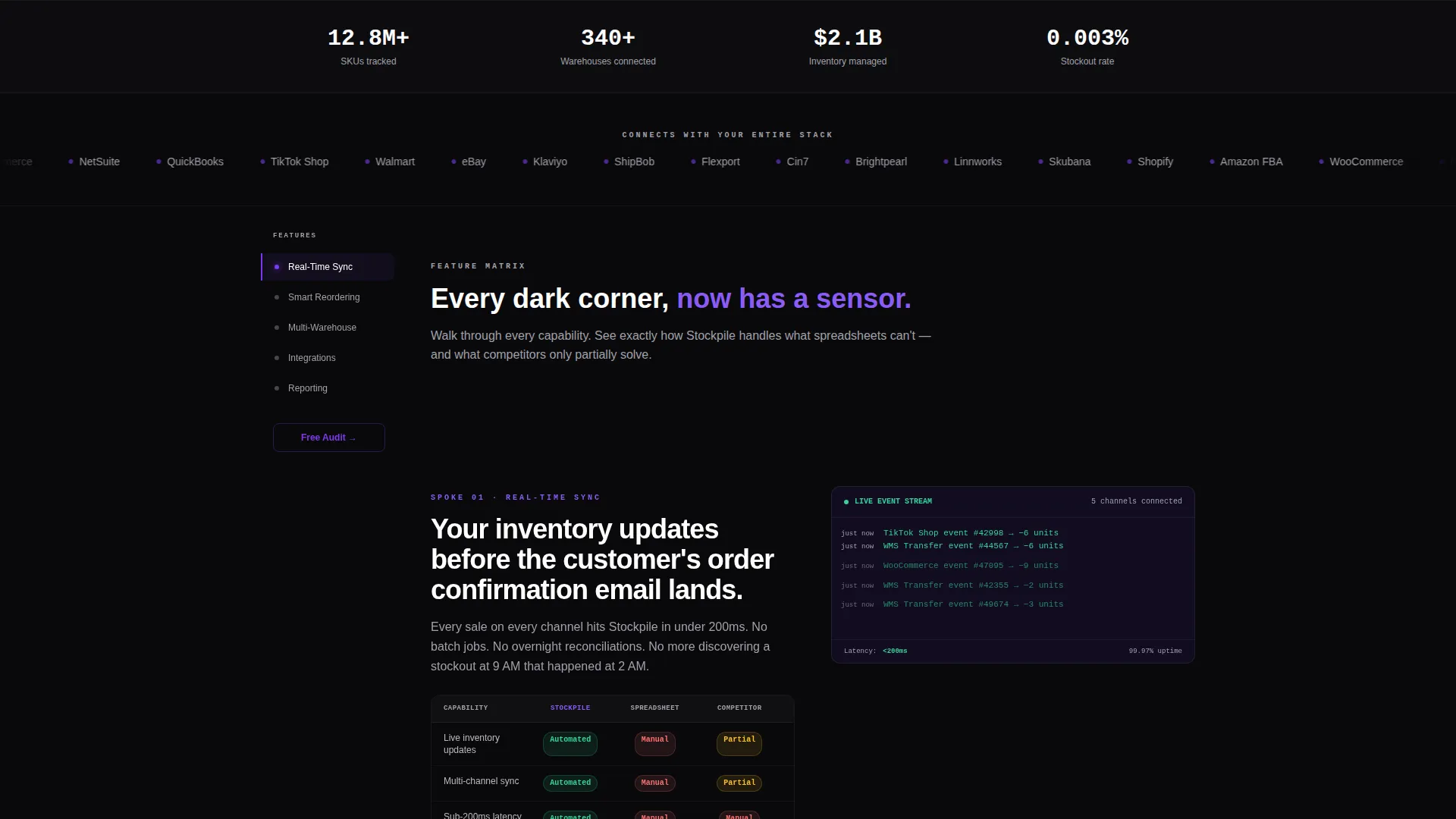
A sticky left-rail navigation pins five feature spokes to the page: Real-Time Sync, Smart Reordering, Multi-Warehouse, Integrations, and Reporting. Each spoke label scrolls the visitor directly to its matching section. This turns a long-scroll page into a scannable discovery hub.
Feature Matrix Comparison Cards
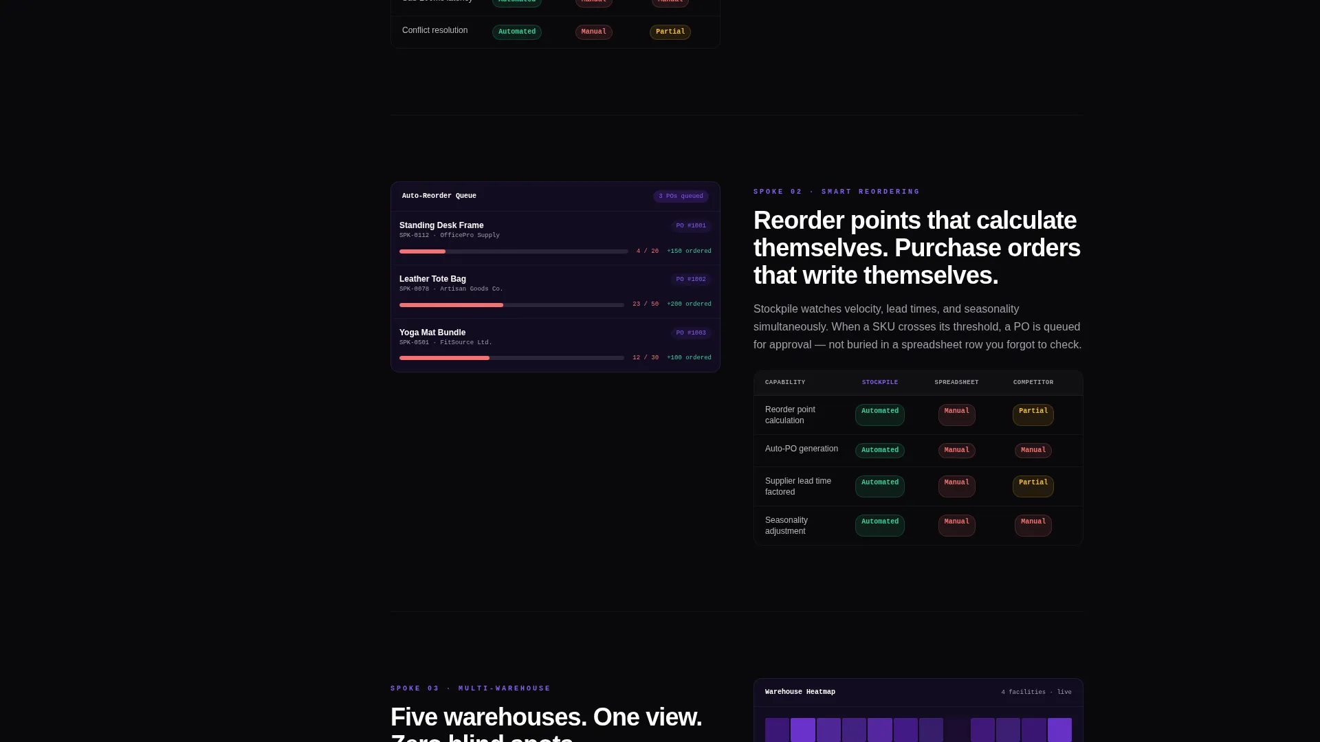
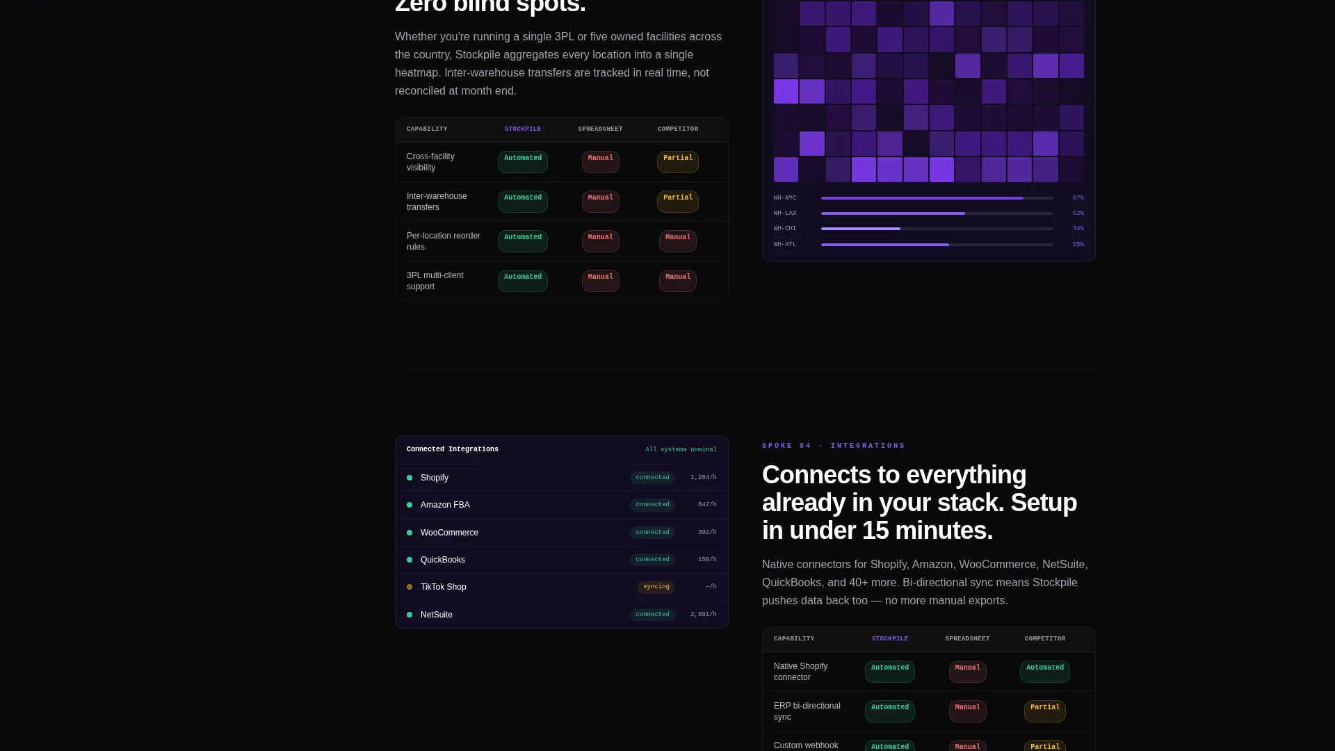
Each spoke section is built as a comparison-rich feature card. The capability description sits on the left, a mini animated interface mockup sits on the right, and a single comparison row shows how the platform handles that capability versus spreadsheets versus unnamed competitors. Tags read manual, partial, or automated rather than using competitor logos.
Dual Call-to-Action System
The primary call to action, "Start Your Free Inventory Audit," appears first inside the interactive header and repeats as a sticky bottom bar after the second spoke. A secondary call to action, "See It With Your Data," invites visitors to book a personalized demo. There is no form on this page; both buttons route outward to their respective flows.
Escalating Feature Narrative
The feature matrix is sequenced deliberately. It begins with basic real-time tracking and escalates toward predictive forecasting. Each section is written so that the previous way of working feels increasingly inadequate by comparison. The scroll builds a case for switching, not just a list of capabilities.
Void and Violet Data Visualization Accents
Dashboard previews and animated mockups use a restricted accent palette. Positive metrics display in data-green, interactive states and hover effects pulse in electric violet, and all backgrounds stay in absolute void black or deep interstellar purple. This visual discipline makes each data point feel intentional and trustworthy.
Page sections overview
| Section | Purpose |
|---|---|
| Interactive Header Dashboard | Immerses visitors in live-simulated product data above the fold |
| Anchor Nav Rail | Gives visitors instant access to any feature spoke from any scroll position |
| Real-Time Sync Spoke | Demonstrates live inventory tracking capability with animated mockup |
| Smart Reordering Spoke | Shows automated reorder logic versus manual and partial alternatives |
| Multi-Warehouse Spoke | Presents multi-location inventory management across facilities |
| Integrations Spoke | Covers platform connectivity claims with comparison tags |
| Reporting Spoke | Highlights forecasting and analytics capabilities with visual mockup |
| Sticky Bottom call to action Bar | Keeps the primary conversion action visible after the second spoke |
| Secondary Demo call to action | Offers a low-commitment path to a personalized product walkthrough |
Design & branding system
The visual identity follows a Directory and Discovery theme executed through the Void and Violet color system. The palette is built to feel like a mission control room at night, where dark backgrounds make every data point glow with purpose.
- Core colors: absolute void black (#09090B) for backgrounds, deep interstellar purple (#1A1035) for surface layers, electric violet (#7C3AED) for active states and hover effects, and cool phantom gray (#A1A1AA) for secondary text and dividers
- Typography uses white for primary headings and body copy, phantom gray for supporting labels, and data-green (#34D399) exclusively for positive metrics inside dashboard previews
- Interactive states pulse in electric violet across every hover, toggle, and selected navigation element, creating a consistent visual signal language throughout the page
Mobile & speed optimization
The layout is structured for readability and usability across screen sizes. The anchor navigation and sticky call-to-action bar adapt to smaller viewports without losing their functional roles.
- The sticky left-rail anchor nav collapses appropriately on mobile so it does not compete with content space
- Animated dashboard mockups and comparison cards are designed to remain legible at reduced widths
- The sticky bottom call-to-action bar stays persistent on mobile, keeping the primary conversion action within thumb reach at all times
How this template helps you convert
This template is designed around a single conversion philosophy: let visitors touch the product before asking them to commit. Every structural decision reduces the perceived risk of clicking through.
- The interactive micro-dashboard in the header gives visitors an immediate product experience, replacing passive reading with active exploration before they scroll a single pixel
- The feature matrix comparison cards make the alternative approaches feel visibly inadequate, building a strong rational case for the platform without relying on marketing claims alone
- The dual call-to-action system offers two commitment levels, a self-serve audit and a guided demo, so visitors can choose the next step that matches where they are in their buying decision
Other information about this template
Stockpile is categorized under Technology, specifically within the SaaS Software and SaaS subcategory, with a niche focus on SaaS inventory management. It was designed to serve the intersection of a Feature Matrix creative direction, Interactive Preview header concept, Hub and Spoke template style, Click-Through landing-page direction, and Directory and Discovery theme.
- The template is a single-page, anchor-navigated layout and is not a multi-page website structure
- The intersection match score for this template's category, subcategory, and niche alignment is 13 out of a possible range, indicating a tightly focused use case
- The Void and Violet color system was selected specifically to reinforce the mission-control aesthetic that resonates with operations and logistics buyers who trust data-dense interfaces
Theme
Directory & Discovery
Creative direction
Feature Matrix
Color system
Void & Violet
Style
Hub & Spoke (Anchor Nav)
Direction
Click-Through
Page Sections
Interactive Micro-dashboard Header
Sticky Anchor Navigation Rail
Feature Matrix Comparison Cards
Dual Call-to-action System
Escalating Feature Narrative
Void and Violet Visual System
Related questions
Can I edit the dashboard preview content to match my actual platform data?
Does this template include the signup or demo booking flow?
Can the feature matrix comparison tags be customized?
Is this template suitable for a single-warehouse platform?
What makes this template different from a generic SaaS landing page?



