Vector - Powerful Database Landing Page Template
Vector is a modular card-grid landing page template built for open-source vector database projects. It pairs a dark terminal aesthetic with a structured, evidence-first layout that walks technical visitors through benchmark data, indexing architecture, and integration code before asking for anything. The result is a single-page experience that earns trust fast and drives both deployment and sign-up conversions.
by Rocket studio
Quick summary
Vector is a single-page, card-grid landing page template designed for open-source vector database projects. It uses a dark terminal color system, benchmark-first content blocks, and a dual conversion path to turn skeptical engineers into active users. Every section is self-contained, skimmable, and dense with technical signal.
Who this template is for
This template is built for technical builders who need to present a vector database project with credibility and precision. It speaks the language of infrastructure engineers without dumbing anything down.
- Machine learning engineers running retrieval-augmented generation pipelines who need to evaluate query performance at a glance
- Platform teams assessing whether a self-hosted embedding store can replace their current full-text search setup
- Startup founders and chief technology officers who want to showcase an open-source database with a self-hosted deployment path
What problem this template solves
Most open-source database project pages bury the evidence. Visitors arrive, skim a vague hero section, and leave before they ever see a benchmark or a code snippet. This template inverts that pattern.
- Benchmark cards appear in the first content row, so performance data lands before any sign-up ask
- Architecture diagrams and integration code snippets are built into the card grid, giving technical visitors the context they need to evaluate quickly
- The dual call-to-action layout separates deployment-ready users from contributors, so neither audience feels ignored
What you get with this template
You get a fully structured landing page layout built around a modular card grid. Each section is self-contained and designed to carry one focused idea.
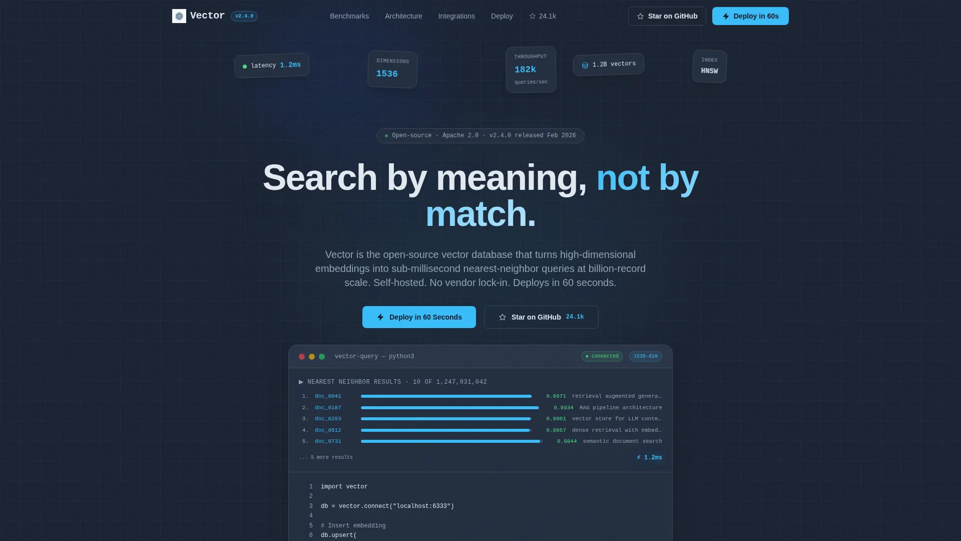
- A full-width product screenshot header with a headline, a terminal-style Python code snippet, and a primary call-to-action button
- Three rows of content cards covering benchmark comparisons, indexing architecture diagrams, and framework integration code blocks
- A sticky conversion bar, a final anchor call-to-action section, and a minimal cloud sign-up form that asks only for email and preferred region
Feature list
This template ships with a set of purposefully designed components. Each one supports the goal of presenting a technical product clearly and converting the right visitor at the right moment.
Full-Width Screenshot Header
The header displays a pixel-sharp product screenshot of a query console mid-execution. It shows a vector search returning ten nearest neighbors with distance scores, a latency stamp of 1.2ms, and an embedding dimension badge reading 1536. A subtle isometric grid sits behind the screenshot to imply the vector space. The headline "Search by meaning, not by match" sits above in chalk white, with a three-line Python insert-and-query snippet directly below.
Benchmark Comparison Card Row
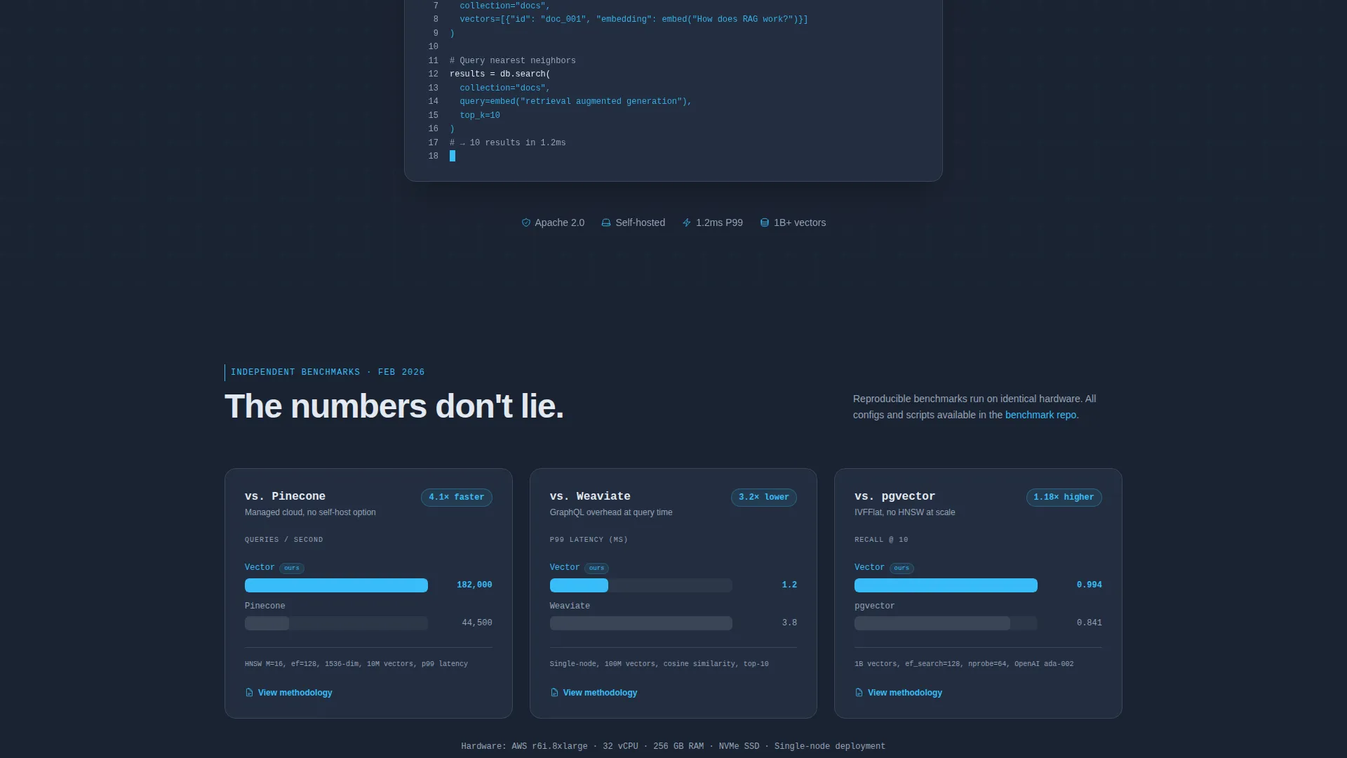
The first card row presents three side-by-side benchmark cards. Each card compares query throughput using a bar chart rendered in sky blue. The visual format is designed to be screenshot-worthy, so visitors can share the data in team channels without leaving the page.
Architecture Diagram Card Row
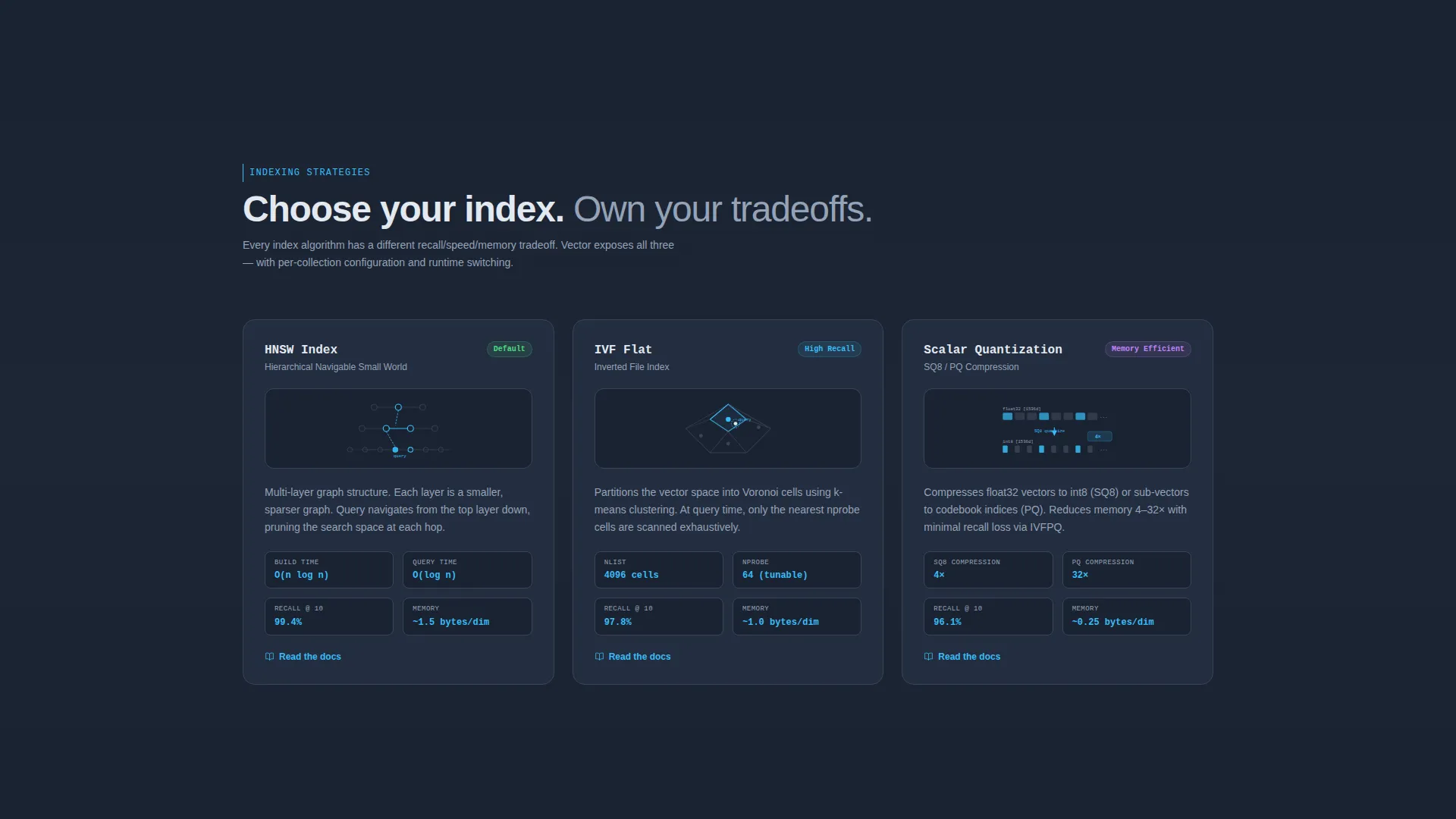
The second card row covers indexing strategies. Each card presents a minimal diagram of a different approach, including Hierarchical Navigable Small World graph indexing, Inverted File indexing, and vector quantization. The diagrams are clean and technical without requiring a full reading of external documentation.
Integration Code Snippet Cards
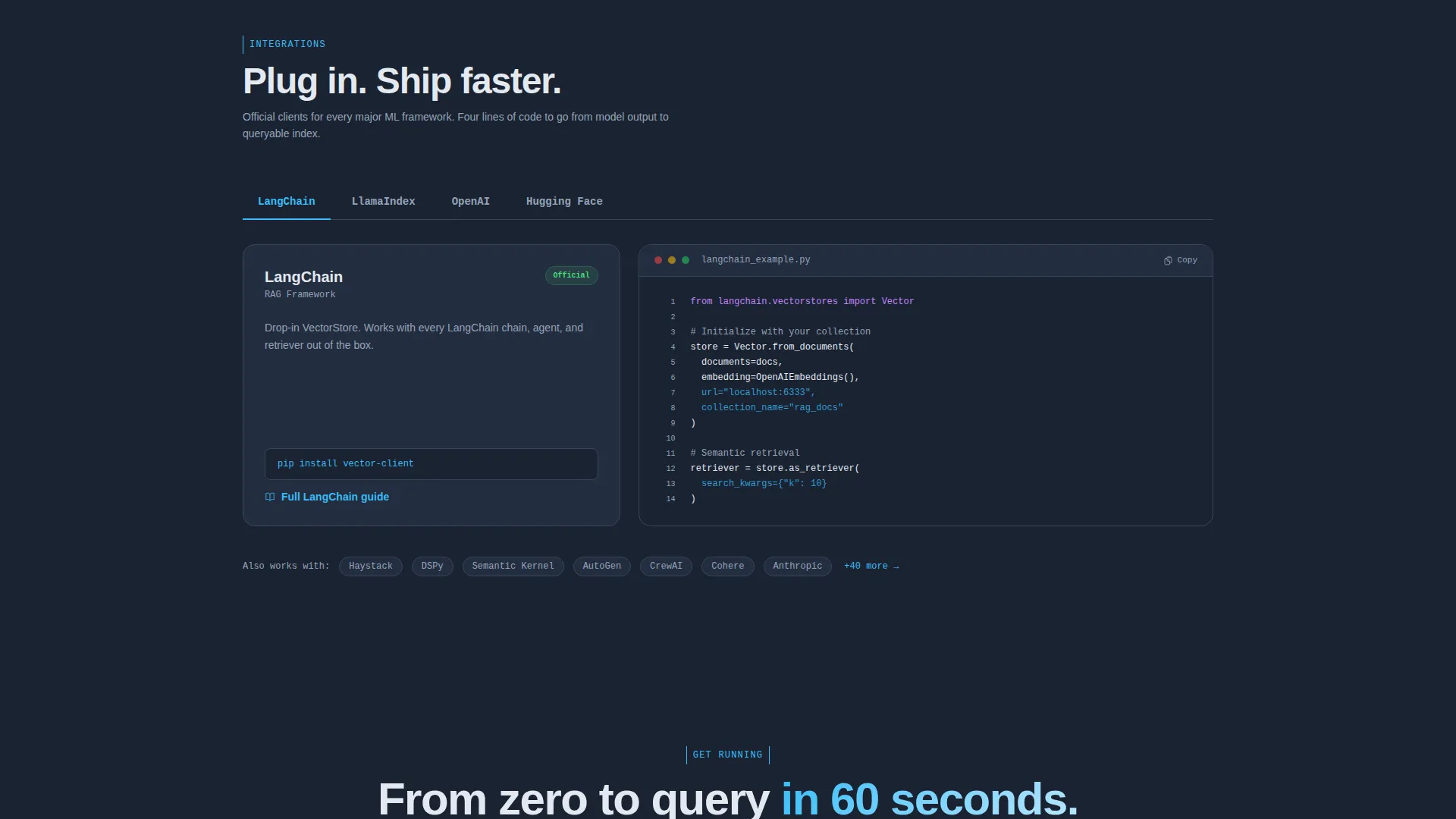
The third card row shows framework integration examples. Each card contains a four-line code block demonstrating how the database connects to a specific tool. The layout keeps each integration self-contained and immediately readable.
Dual Call-to-Action System
The primary call-to-action, "Deploy in 60 Seconds," links to a Docker one-liner and a managed cloud sign-up. It appears in the header, floats as a sticky bar after the first scroll, and anchors the final section. A secondary ghost-bordered button, "Star on GitHub," sits beside it for contributors who are not yet ready to deploy.
Minimal Cloud Sign-Up Form
The sign-up form inside the final section asks for only two inputs: email address and preferred deployment region. There is no credit card field and no company size dropdown. This low-friction design keeps the barrier to trial as small as possible.
Page sections overview
| Section | Purpose |
|---|---|
| Screenshot Header | Establish product credibility with a live query console capture and headline |
| Benchmark Card Row | Show query throughput comparisons with bar chart visuals |
| Architecture Card Row | Explain indexing strategies with minimal technical diagrams |
| Integration Code Cards | Demonstrate framework compatibility with four-line code examples |
| Sticky Conversion Bar | Keep the primary call-to-action visible throughout the scroll |
| Final Anchor Section | Close with a direct deployment prompt and minimal sign-up form |
Design & branding system
The template uses a Data Command visual theme built on a Slate and Sky color system. The palette feels like a monitoring dashboard at night: dark enough to work in for extended sessions, with blue signals that draw the eye to the data points that matter.
- Background and surface colors include deep terminal slate (#1B2332) for the page base, mid-gray infrastructure tone (#3A4556) for borders and dividers, and card surfaces set to #232D3F
- Sky blue (#38BDF8) activates on every interactive element including hover states, active tab indicators, benchmark numbers, and call-to-action buttons
- Body text is chalk white (#E2E8F0) for readability against dark surfaces, keeping every line of copy legible without straining contrast
Mobile & speed optimization
The card grid layout is built to reflow cleanly across screen sizes. Each card module is self-contained, which makes stacking on smaller viewports straightforward without losing the density of information.
- Cards collapse into a single-column scroll on mobile, preserving benchmark data and code snippets in a readable format
- The sticky conversion bar remains visible on mobile scroll, keeping the primary call-to-action accessible at any point in the page
- The minimal sign-up form with only two fields reduces input friction on touch devices
How this template helps you convert
The conversion strategy is built around earning trust before asking for anything. Technical visitors are skeptical by default, so the layout leads with evidence and delays the ask until the visitor is already convinced.
- Benchmark cards in the first content row give engineers a concrete reason to keep reading before any form or button appears, building confidence through data rather than claims
- The dual call-to-action system routes deployment-ready users to the Docker one-liner and cloud sign-up while giving contributors a clear path to the repository, so conversion is defined broadly enough to capture both audiences
Other information about this template
This template is specifically designed for open-source vector database projects that need to communicate performance and developer trust on a single page. It is a strong fit for projects that compete on benchmark transparency and self-hosted flexibility.
- The template style is Card Grid (Modular), making it easy to add or remove individual card blocks without restructuring the full layout
- The Industry Report creative direction means each card carries a single claim with supporting evidence, which aligns well with how technical audiences evaluate infrastructure tools
- The Freemium and Trial conversion direction is reflected in the no-credit-card sign-up form and the prominent free deployment path
- The header concept is a Product Screenshot, which grounds the page in real product behavior rather than abstract illustration
- Projects built on frameworks such as LangChain, LlamaIndex, and embedding model providers like OpenAI and Hugging Face are represented in the integration card row, making the template relevant to the current retrieval-augmented generation ecosystem
Theme
Data Command
Creative direction
Industry Report
Color system
Slate & Sky
Style
Card Grid (Modular)
Direction
Freemium/Trial
Page Sections
Full-width Product Screenshot Header
Benchmark Comparison Card Row
Architecture Diagram Card Row
Integration Code Snippet Cards
Dual Call-to-action Conversion System
Minimal Two-field Sign-up Form
Related questions
Is this template designed for a single page or multiple pages?
Can I add or remove card blocks without redesigning the full layout?
What does the sign-up form collect?
Does the template include real benchmark data or just the visual structure?
Who configures the deployment link behind the primary call-to-action button?



