Velocity — Mission-Critical IT Landing Page Template
Uptime is a bento grid landing page template built for IT services membership sites. It opens with an animated dashboard header packed with live-looking data, flows into an interactive ROI calculator, and proves membership value before the visitor commits. The dark, NOC-inspired design and persistent call-to-action buttons guide IT professionals from curiosity to sign-up.
by Rocket studio
Quick summary
Uptime is a single-page bento grid template designed for IT services membership sites. It pairs a cinematic dashboard header with a working ROI calculator, interactive tool previews, and two strategically placed calls to action. The layout earns trust by letting visitors use real tools before buying.
Who this template is for
This template is built for operators who sell practical IT knowledge and tools to working professionals. It speaks directly to people who understand infrastructure, accountability, and the cost of wasted time.
- Solo sysadmins managing ticket queues at mid-market companies who need a credible membership landing page
- Managed service provider (MSP) owners building repeatable service stacks and selling packaged expertise
- Internal IT directors who need to justify tooling budgets and demonstrate ROI to finance stakeholders
What problem this template solves
Most membership landing pages ask visitors to trust a sales pitch before seeing any real value. IT professionals are skeptical by nature. They want proof, not promises. This template solves the trust gap by letting visitors interact with actual tools before they reach a pricing decision.
- Visitors bounce before converting because the page shows features instead of demonstrating them
- IT buyers need to quantify value in hours saved and cost offset, not vague efficiency claims
- Membership sites often hide all content behind the paywall, giving cautious buyers no reason to commit
What you get with this template
You get a fully structured bento grid landing page that functions as a working product preview. Every section doubles as a sample of membership content, so visitors experience the value before they click through.
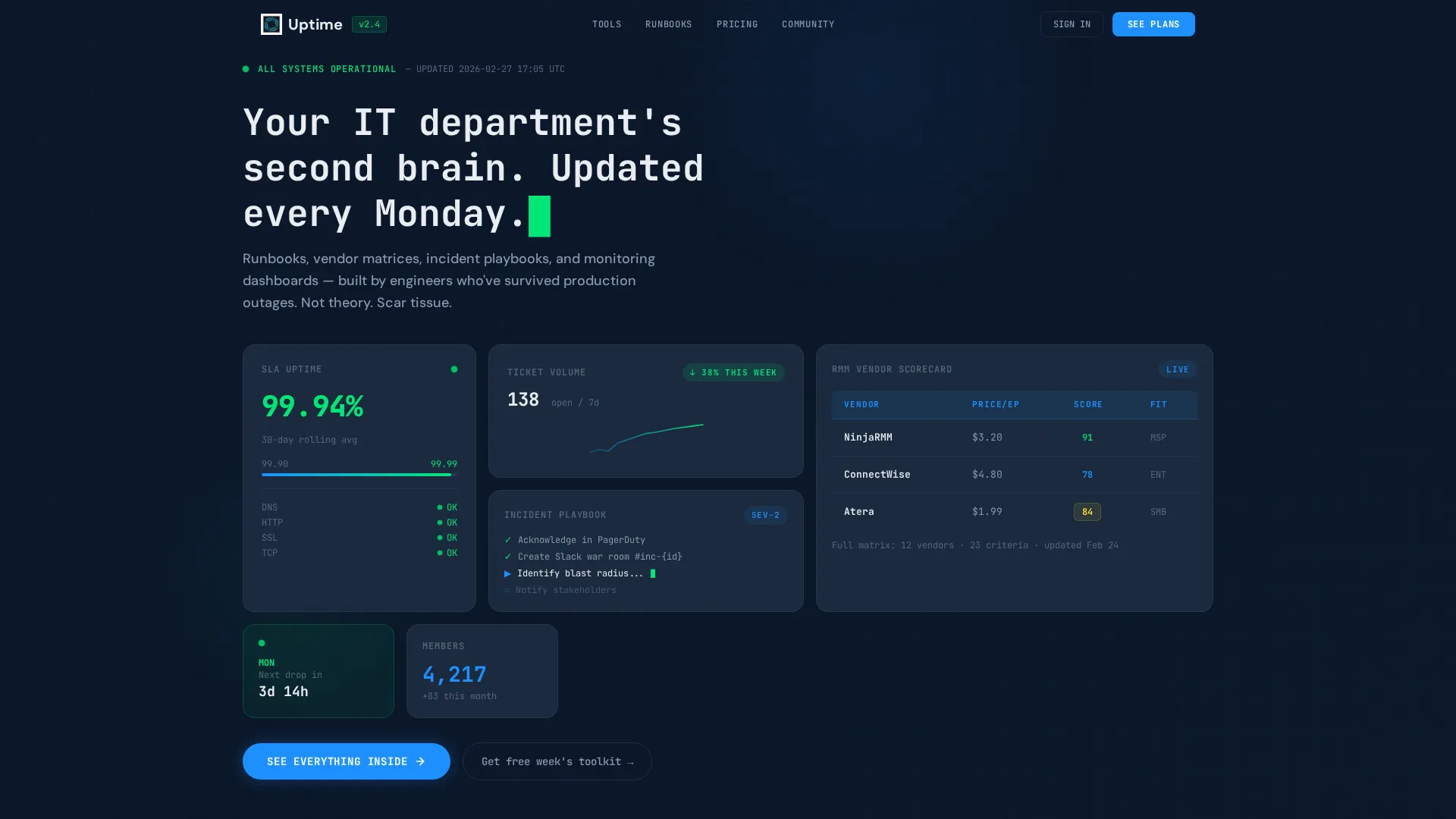
- An animated dashboard header with live-looking uptime metrics, sparklines, vendor scorecards, and a typewriter headline
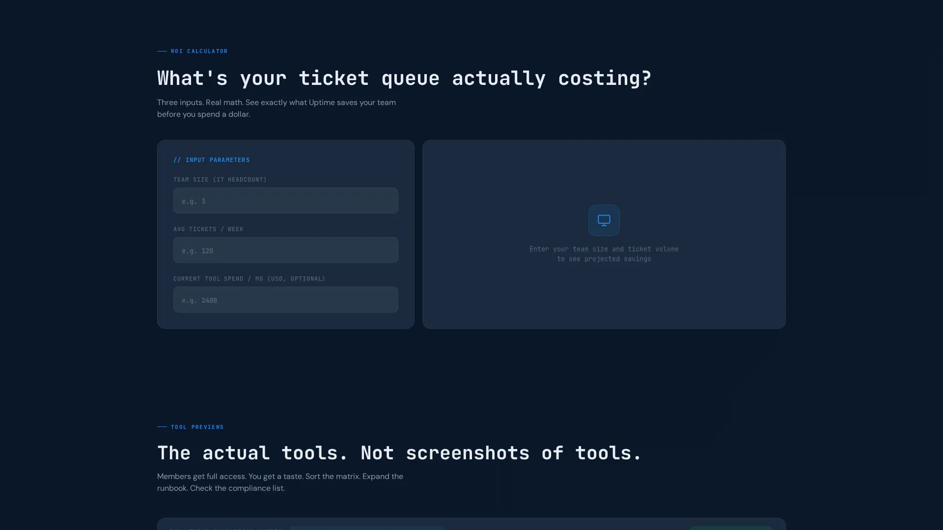
- An interactive ROI calculator that renders projected hours saved and cost offset instantly as an animated bento card
- Persistent and contextual calls to action placed at conversion-ready moments throughout the scroll
Feature list
This template includes purpose-built interactive sections. Each one is designed to demonstrate the membership product rather than just describe it.
Animated Dashboard Header
The full-width header renders as a working bento grid pre-populated with live-looking data. An uptime percentage ticks at 99.97%, a ticket volume sparkline trends downward, a vendor scorecard compares three remote monitoring and management tools, and a partially visible incident playbook card shows a blinking cursor. Numbers increment, progress bars fill, and status dots pulse green using micro-animations.
Interactive ROI Calculator
Positioned immediately below the header, the calculator accepts three visitor inputs: team size, average tickets per week, and current tool spend. It instantly renders projected hours saved and cost offset as an animated bento card that snaps into the grid. The output card includes a contextual call to action linking directly to the membership plans page.
Sortable Vendor Comparison Matrix
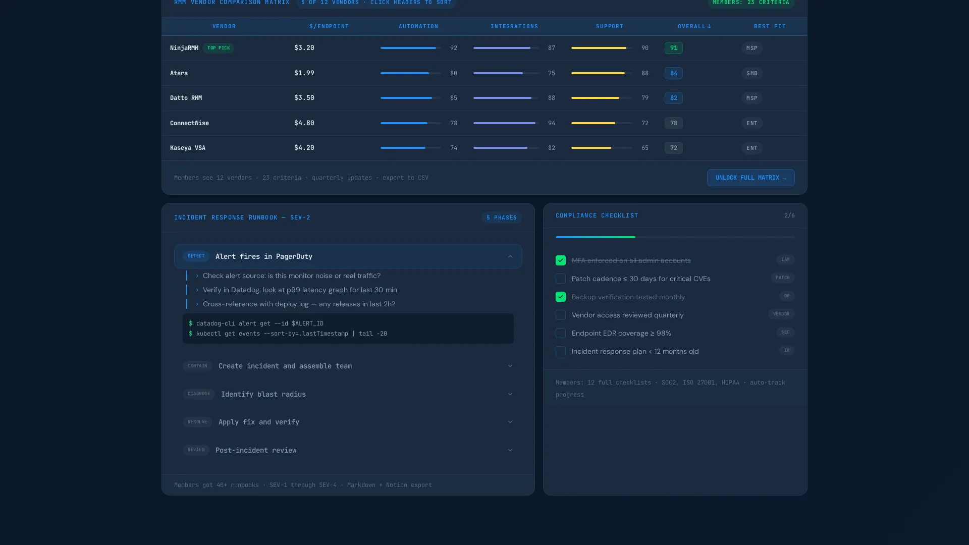
A sample vendor comparison matrix lets visitors sort and evaluate tools before they join. This section previews one of the core membership deliverables and signals that the content inside is practical and structured, not padded with opinion.
Expandable Runbook Preview
A sample runbook with expandable steps lets visitors see the format and depth of documentation included in the membership. Each step expands inline, showing the level of detail working engineers expect from a runbook template.
Compliance Checklist with Toggle States
A compliance checklist section includes toggle states visitors can interact with directly on the page. This interactive preview communicates the operational quality of the membership toolkit without requiring a sign-up.
Dual Call-to-Action System
A persistent pulse-green primary button labeled "See Everything Inside" anchors to the bottom of the viewport and grows more prominent after the calculator interaction. A secondary single-field email capture labeled "Get This Week's Free Toolkit" serves visitors who are not yet ready to reach the pricing page.
Page sections overview
| Section | Purpose |
|---|---|
| Dashboard Header | Animated bento grid with live-looking uptime data, sparklines, and typewriter headline |
| ROI Calculator | Three-input tool that renders projected hours saved and cost offset instantly |
| Vendor Comparison Matrix | Sortable sample matrix previewing membership tool evaluation content |
| Runbook Preview | Expandable sample runbook demonstrating documentation depth and format |
| Compliance Checklist | Interactive toggle checklist previewing operational toolkit quality |
| Email Capture | Single-field secondary call to action for visitors not ready to view pricing |
| Persistent call to action Bar | Viewport-anchored primary button that intensifies after calculator use |
Design & branding system
The visual identity follows a Dynamic Motion theme built on a Midnight Blue color system. Every color choice is functional, not decorative. The palette reads like a network operations center at 2 AM.
- Deep terminal navy (#0A1628) forms the primary background, muted slate (#3A4A5C) surfaces card containers, and active system blue (#1E90FF) highlights interactive tiles and hover states
- Pulse green (#00E676) is reserved exclusively for live-status indicators and primary call-to-action buttons, keeping visual hierarchy clean and intentional
- Typography uses a monospace style for the typewriter headline, reinforcing the command-line aesthetic and matching the expectations of a technical audience
Mobile & speed optimization
The bento grid layout is structured to adapt across screen sizes without sacrificing the interactive experience. Tiles reflow to maintain readability on smaller viewports while keeping the core interactions accessible.
- Bento grid tiles stack and reflow responsively so the dashboard header and calculator remain functional on mobile screens
- Micro-animations are lightweight by design, using subtle increments and pulse effects rather than heavy video or large asset loads
- The persistent call-to-action button remains anchored to the viewport on both desktop and mobile, keeping the conversion path visible throughout the scroll
How this template helps you convert
This template is engineered around a single principle: earn the click before asking for it. Every scroll depth delivers a new interactive reason to stay and commit.
- The ROI calculator creates a personal, data-backed reason to convert. When visitors see their own numbers reflected in projected savings, the membership stops feeling like an expense and starts feeling like a decision.
- The persistent pulse-green button stays visible throughout the entire page experience. Its increased prominence after calculator interaction catches visitors at their highest moment of intent, reducing the gap between interest and action.
Other information about this template
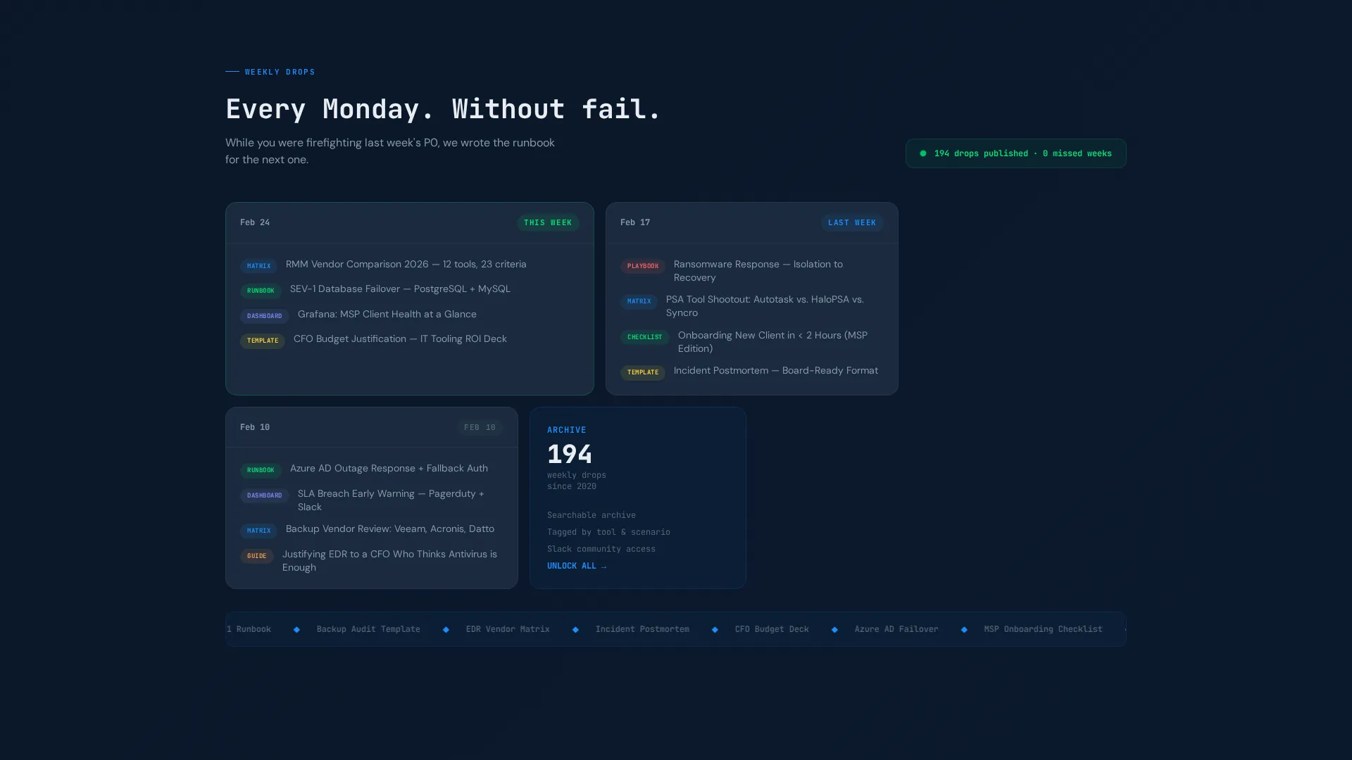
This template is built specifically for the IT services membership site niche and pairs well with communities that publish weekly operational content such as runbooks, incident response playbooks, and vendor evaluation tools.
- The template style is Bento Grid with a Dynamic Motion theme, making it well suited for technology-category pages where data density and interactivity signal product quality
- The header concept is a Dashboard Preview, a format that resonates with buyers who spend their days in monitoring tools and expect interfaces that reflect operational reality
- The creative direction is Calculator and Tool First, meaning the page leads with utility rather than marketing language, which aligns with the decision-making habits of technical buyers
- The landing page direction is Click-Through, guiding visitors toward a membership pricing page rather than closing a transaction directly on this page
Theme
Dynamic Motion
Creative direction
Calculator/Tool First
Color system
Midnight Blue
Style
Bento Grid
Direction
Click-Through
Page Sections
Animated Dashboard Header
Interactive ROI Calculator
Sortable Vendor Comparison Matrix
Expandable Runbook Preview
Dual Call-to-action System
Compliance Checklist with Toggles
Related questions
Who is this landing page template designed for?
What makes this template different from a generic membership landing page?
Is the ROI calculator a real functioning component?
What calls to action are included in this template?
Can I customize the colors and copy in this template?



