Complete Speech Recognition Technology Professional Website Template
Transcribe is a bold brutalist landing page template built for a speech recognition newsletter and community. It uses a split-screen layout to move visitors from frustration to conviction, showcasing real transcription failures alongside community-driven solutions. The midnight blue and signal cyan palette, monospaced headlines, and app download flow make it immediately credible to engineers and technical product teams.
by Rocket studio
Quick summary
Transcribe is a single-page landing page template designed for a speech recognition newsletter and technical community. It runs a 50/50 split-screen layout, a bold brutalist visual identity, and a problem-to-solution scroll arc that earns the app download before asking for it. The template speaks directly to engineers, product managers, and computational linguists who live inside voice pipelines.
Who this template is for
This template is built for technical communities and niche newsletters where the audience demands signal over noise. It suits builders who want a landing page that feels as sharp as the product it represents.
- Machine learning engineers who debug automatic speech recognition models and need a community they can trust
- Product managers scoping voice-first interfaces for healthcare, legal, or customer service environments
- Computational linguists and researchers who work at the intersection of acoustic models and production pipelines
What problem this template solves
Generic newsletter landing pages fail technical audiences. They rely on stock photography, vague promises, and soft calls to action that do not match the expectations of engineers evaluating a new information source.
- Visitors arrive skeptical and leave unconvinced because the page never proves the content is worth their time
- App download flows lose potential users who cannot judge quality before committing to an install
- Brutalist and technically styled templates are rare, leaving voice technology products visually misrepresented
What you get with this template
You get a focused, high-credibility landing page that guides a technical visitor from initial doubt to confident download. Every section is designed to reduce friction and build trust through demonstrated content quality.
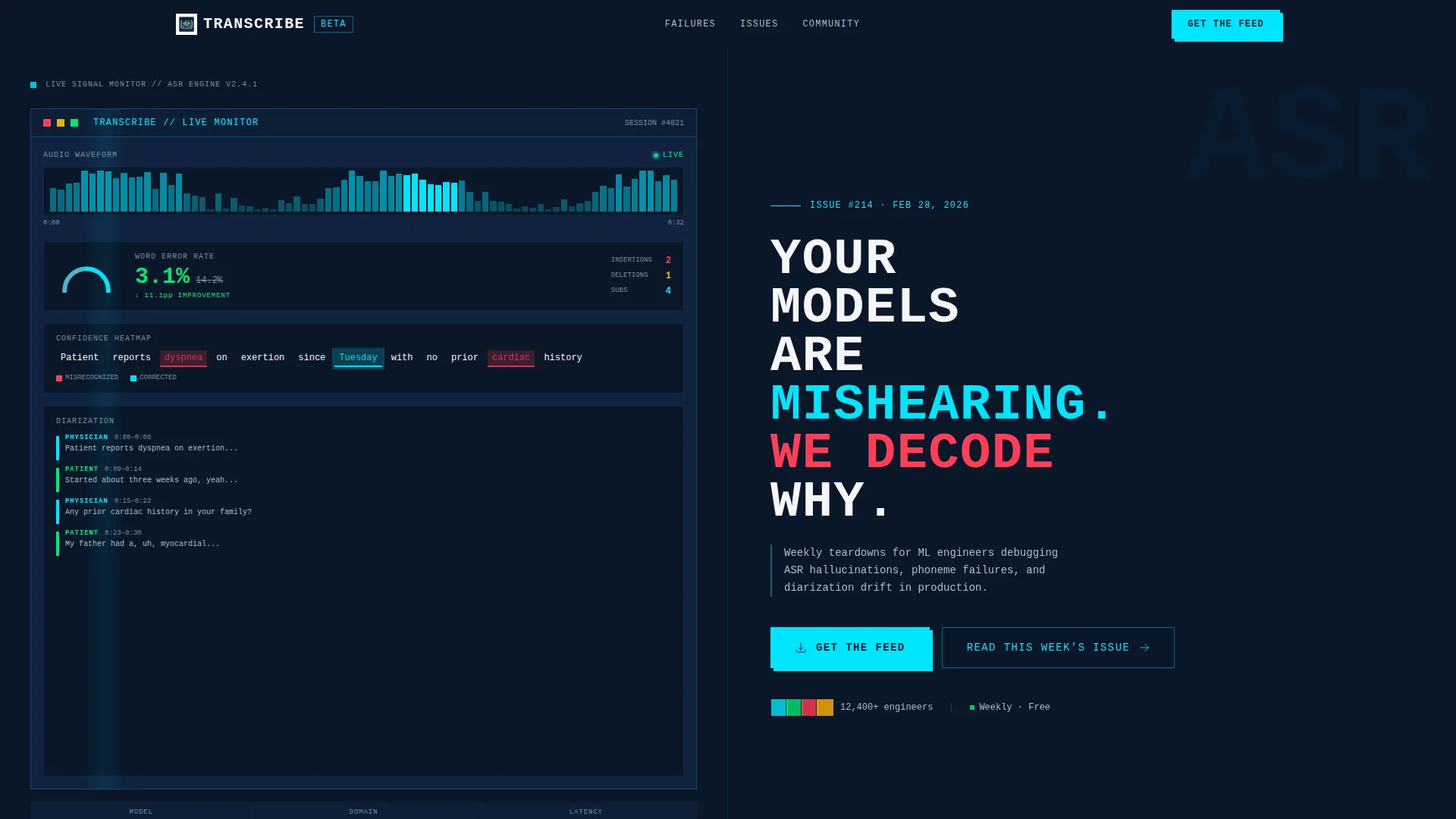
- A split-screen header with a live-styled speech analytics dashboard preview on the left and a brutalist headline block on the right
- A problem-to-solution scroll arc featuring real transcription failure comparisons, community solution previews, and three inline newsletter excerpt samples
- A primary app download call to action with platform-detect buttons for iOS and Android, a secondary free web preview path, and a final anchor block with a device mockup and QR code
Feature list
This template ships with purpose-built sections and interaction concepts grounded in the source brief. Each component serves the single goal of earning a confident app download from a technically literate visitor.
Split-Screen Header with Dashboard Preview
The header divides the viewport into two equal panels. The left panel displays a live-styled speech analytics interface: a scrolling waveform, a real-time word error rate gauge dropping from 14.2 percent to 3.1 percent, and a confidence heatmap where misrecognized words glow red and corrections pulse cyan. The right panel holds the brutalist headline and the primary call to action.
Transcription Failure Comparison Section
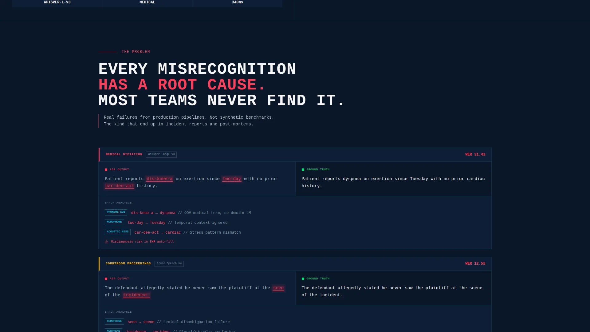
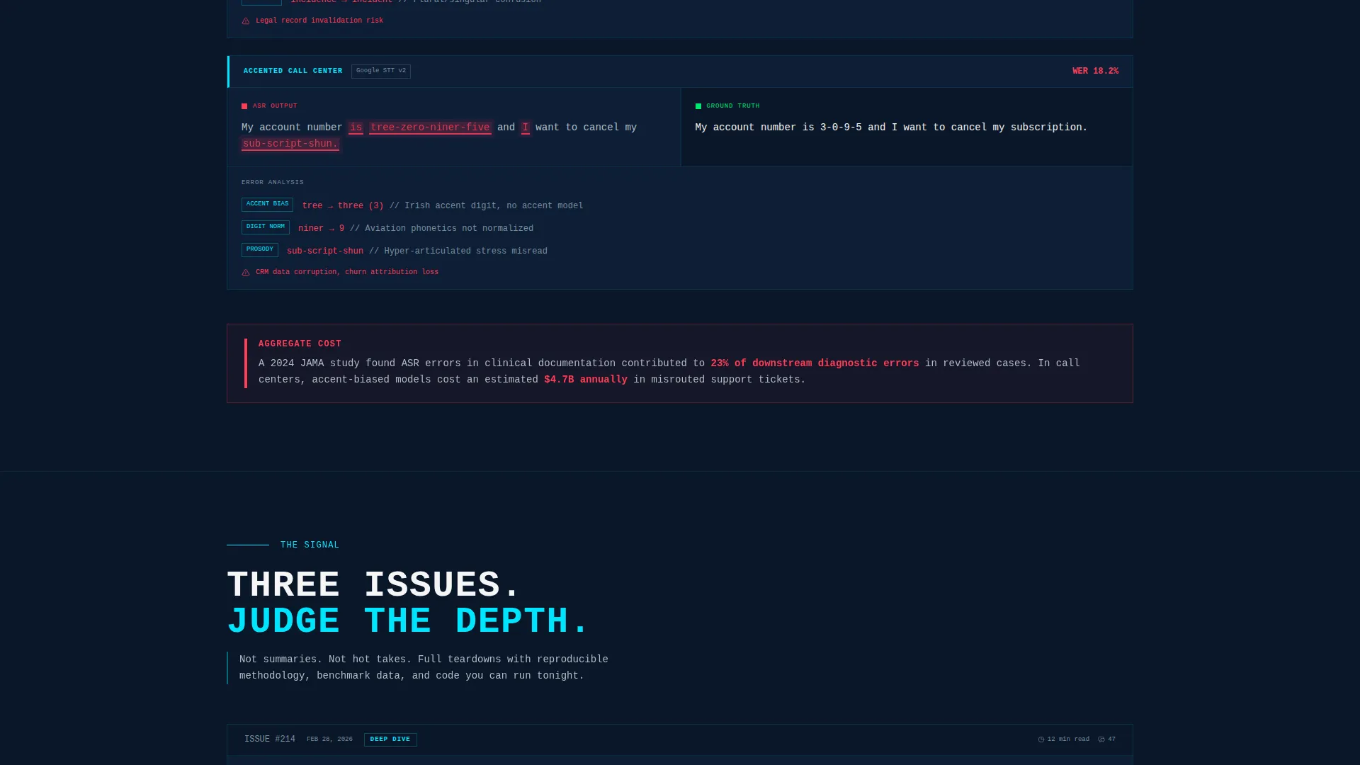
The first scroll section opens on documented pain. Real-world transcription failures are displayed side by side. The garbled model output sits on the left; the corrected ground truth sits on the right. Source domains include medical dictation, courtroom proceedings, and accented call-center audio.
Community Solution Preview
After the failure comparisons, the page pivots to the community's output. App screenshots preview threaded discussions, curated weekly digests, and audio playback annotations. This section visually demonstrates what the newsletter delivers rather than just describing it.
Inline Newsletter Excerpts
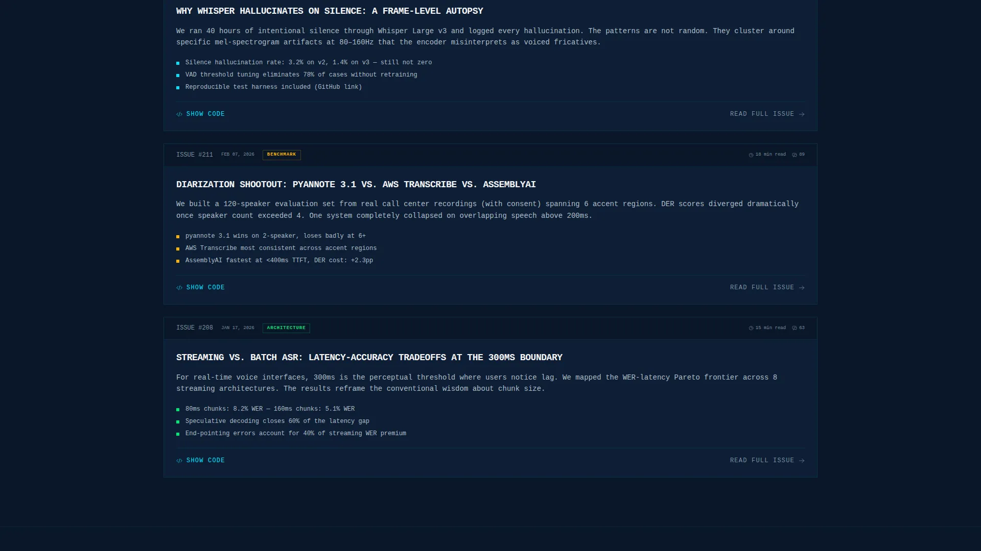
Three real newsletter excerpts appear mid-scroll before any download request is made. They showcase benchmark comparisons, architecture deep-dives, and weekly teardowns. The excerpts exist specifically to prove content quality and reduce commitment friction.
Platform-Detect App Download call to action
The primary call to action reads "Get the Feed" with platform-detect buttons that swap automatically between iOS App Store and Android. A secondary path labeled "Read This Week's Issue" offers a free web preview. This dual-path approach accommodates visitors at different commitment levels.
Final Anchor Block with QR Code
The bottom of the page closes with a device mockup and a scannable QR code for instant download. This block anchors the scroll and gives mobile and desktop visitors a fast, frictionless path to the app.
Page sections overview
| Section | Purpose |
|---|---|
| Split-Screen Header | Establish credibility and present the primary call to action alongside the dashboard preview |
| Transcription Failure Comparison | Open on real pain by showing garbled outputs versus corrected ground truth side by side |
| Community Solution Preview | Pivot from problem to solution with app screenshots of discussions and digests |
| Newsletter Excerpt Samples | Prove content depth with three inline excerpts before the download ask |
| Primary App Download call to action | Drive conversions with platform-detect buttons and a secondary free preview path |
| Final Anchor Block | Close the page with a device mockup and QR code for scan-to-download |
Design & branding system
The visual identity is built on a midnight blue color system that feels like a spectrogram rendered on a bunker wall. Every design decision is deliberate and technically expressive.
- Color palette: deep terminal navy (#0A1628) dominates all backgrounds; signal-active cyan (#00E5FF) fires on buttons, waveform visualizations, and hover states; concrete slab gray (#B0BEC5) carries body text and secondary labels; hard white (#F5F5F5) is reserved for oversized headline type
- Typography: headlines are set in oversized, uppercase, wide-tracked monospaced brutalist type that reads like a terminal readout slamming into the viewport
- Visual style: no gradients, no rounded corners; raw edges and hard shadows throughout; the waveform and heatmap elements use cyan spikes against dark navy planes for a spectrogram-inspired aesthetic
Mobile & speed optimization
The template is structured to translate its desktop split-screen drama into a coherent single-column flow on smaller screens. The visual hierarchy is preserved through type scale and color contrast rather than relying on side-by-side layout.
- The 50/50 split stacks vertically on mobile so the dashboard preview and headline block each fill the full viewport width in sequence
- Platform-detect call to action buttons adapt to the visitor's device, surfacing the correct app store link without requiring manual selection
- The QR code anchor block remains visible and functional on desktop while the mobile flow routes directly through the detected platform button
How this template helps you convert
Every structural decision in this template is made to reduce hesitation and move a skeptical technical visitor toward a confident download.
- The problem-to-solution arc builds stakes before offering any answer, so visitors arrive at the call to action already convinced they need what the community provides
- The three inline newsletter excerpts act as proof of value mid-scroll, letting visitors evaluate content quality before committing to an app install
- The dual call to action structure gives high-intent visitors a direct download path while giving cautious visitors a zero-commitment web preview option, capturing both segments
Other information about this template
This template is categorized under Technology, specifically within the Speech Recognition Technology subcategory. It is designed for the speech recognition newsletter and community niche where technical credibility is the primary trust signal.
- The bold brutalist theme is a deliberate departure from soft SaaS aesthetics, making the template stand out in a category dominated by rounded, gradient-heavy designs
- The creative direction follows a problem-to-solution arc, a narrative structure that mirrors how engineers actually process new information tools before adopting them
- The header concept is a dashboard preview, not a hero image, which signals to technical visitors that the product is data-driven and analytically oriented
- The landing page direction prioritizes app download as the conversion goal, with a secondary web preview path designed to reduce friction for first-time visitors
Theme
Bold Brutalist
Creative direction
Problem→Solution Arc
Color system
Midnight Blue
Style
Split Screen (50/50)
Direction
App Download
Page Sections
Split-screen Header with Dashboard Preview
Transcription Failure Comparison Section
Community Solution Preview
Inline Newsletter Excerpt Samples
Platform-detect App Download Call to Action
Final Anchor Block with QR Code
Related questions
Who is this landing page template designed for?
Can I use this template to promote a newsletter without an app?
What makes the design different from a typical newsletter template?
Does the template include real newsletter content?
Is the split-screen layout fixed, or can I adjust the sections?



