Vow - Unapologetic Wedding Landing Page Template
Vow is a bold brutalist wedding landing page template built for design-forward couples who refuse generic. It leads with raw data, concrete typography, and a split-screen layout that proves competence before asking for a commitment. Two form fields and a date picker are all it takes to claim your date and launch a wedding site that looks engineered, not decorated.
by Rocket studio
Quick summary
Vow is a single-page brutalist wedding landing page template that replaces floral aesthetics with cold data and confident design. Built on a Carbon Fiber color system and a bold split-screen structure, it speaks directly to couples who value craft. The page drives lead generation through a two-field form that feels as considered as the first line of a wedding invitation.
Who this template is for
This template is built for couples who find most wedding website templates visually timid. If your aesthetic references lean toward concrete architecture, editorial design, or gallery typography rather than watercolor florals, Vow was made for you.
- Design-forward couples working in creative fields who want a site that reflects their actual taste
- Wedding industry professionals or studio owners offering brutalist or editorial wedding site builds to clients
- Anyone who wants a wedding landing page that leads with data and earns trust before asking for a sign-up
What problem this template solves
Most wedding website templates default to soft palettes, cursive fonts, and stock photography of wildflowers. That visual language excludes a growing audience of couples who want something deliberately different. Vow removes that friction entirely.
- Generic templates force design-conscious couples to compromise their visual identity before the wedding even starts
- Floral and pastel layouts communicate the wrong tone for couples whose aesthetic is bold, typographic, and minimal
- Weak page structures bury the product and lead with decoration rather than proof of quality
What you get with this template
You get a fully structured single-page layout that makes the product and the data do the persuasion. Every section is purposeful, every typographic choice is intentional, and the lead capture form is as stripped-back as the design itself.
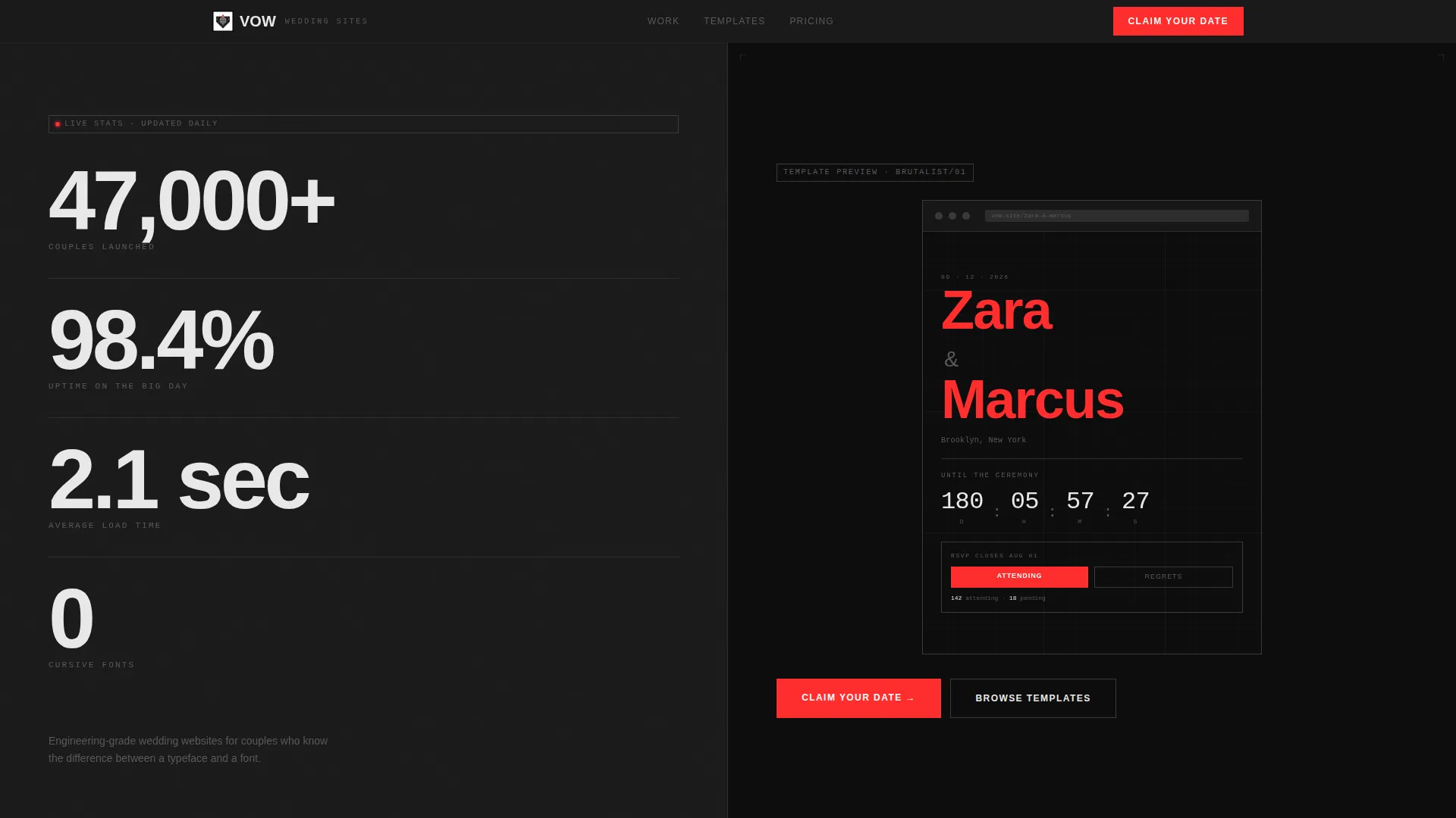
- A 50/50 split-screen landing page with a Stats/Metrics header wall, alternating data-insight sections, and a two-field lead generation form at the bottom
- A Carbon Fiber color system using matte black, graphite, titanium white, and signal red reserved for interactive elements and couple name highlights
- Condensed grotesque typography set at editorial scale, including a 220-point knockout name block and a raw countdown timer inside the template preview panel
Feature list
This section covers the core built-in capabilities delivered by the Vow template as described in the source brief.
Split-Screen Stats Header
The header divides the viewport into two equal panels. The left side displays enormous stacked numerals in condensed grotesque type, presenting performance figures that establish immediate credibility. The right panel shows a brutalist template preview with the couple's names set in 220-point knockout type alongside a countdown timer and a minimal RSVP block.
Industry Report Scroll Cadence
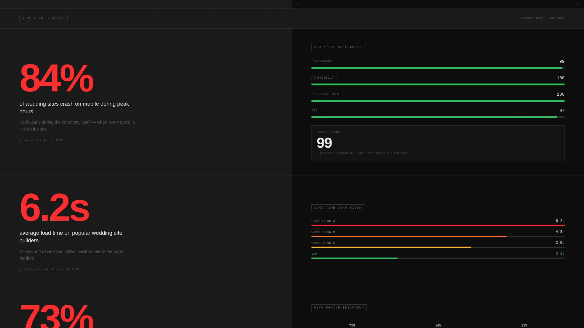
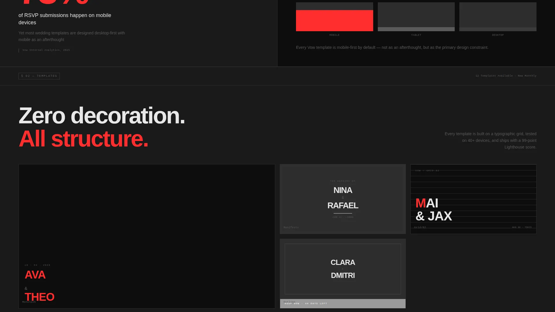
Each section below the header follows a data-left, demo-right format. The left panel presents a specific data insight related to wedding site performance or user behavior. The right panel shows a live template demonstration that directly validates the claim on the left.
Signal Red Interactive System
The accent color, signal red (#FF2D2D), is reserved exclusively for buttons, hover states, and the couple's name treatment. This restraint makes every interactive element feel deliberate and high-stakes. The "Claim Your Date" primary call to action inherits this treatment at full visual weight.
Two-Field Lead Capture Form
The lead generation form uses exactly two inputs: a combined partner names field with an ampersand pre-filled, and a wedding date picker. A secondary path labeled "Preview a Demo Site" generates a live brutalist mockup using the names entered, lowering the barrier to commitment significantly.
Escalating Narrative Structure
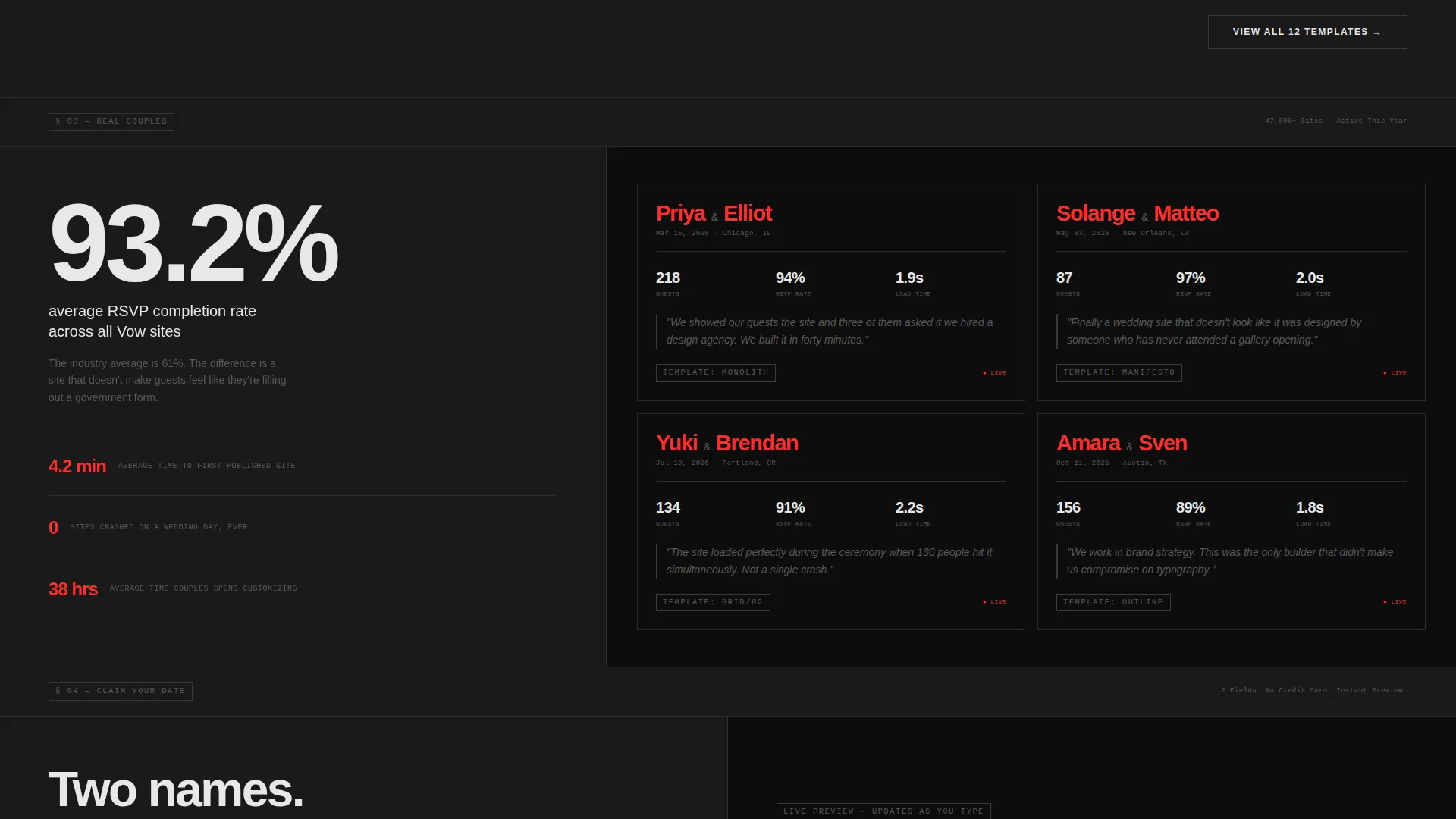
The page follows a problem-to-evidence-to-proof arc. It opens with a problem statement backed by data, moves into evidence sections with live demonstrations, and closes with social proof using real couples, real screenshots, and real guest counts. The structure reads like a well-typeset annual report arguing a single clear thesis.
Carbon Fiber Branding System
The full color system uses four values: matte black (#1A1A1A) dominates all surfaces, graphite weave (#2D2D2D) provides section separation, titanium white (#E8E8E8) handles all body text and headlines, and signal red (#FF2D2D) fires on every button and hover state. The result is monolithic, tactile, and aggressively elegant.
Page sections overview
| Section | Purpose |
|---|---|
| Stats Metrics Header | Establish credibility with stacked performance numerals and a brutalist template preview |
| Data Insight Panels | Pair industry data on the left with live template demos on the right across multiple scroll sections |
| Problem Statement Block | Open the narrative with a mobile-crash data point that frames the core problem |
| Evidence Section | Present Lighthouse-style performance evidence alongside a matching template demonstration |
| Social Proof Block | Show real couples, real screenshots, and real guest counts to close the credibility arc |
| Lead Generation Form | Capture partner names and wedding date with a two-field form and a demo preview option |
Design & branding system
The visual identity is built around restraint and weight. Nothing decorates a surface that does not need it. The typography does the emotional work that other templates offload to photography.
- Carbon Fiber color system: matte black (#1A1A1A) on all surfaces, graphite weave (#2D2D2D) for section breaks, titanium white (#E8E8E8) for all text, and signal red (#FF2D2D) locked to interactive elements and name treatments only
- Condensed grotesque typeface used at editorial scale throughout, with the 220-point knockout couple name block as the typographic centerpiece of the preview panel
- Exposed grid structure and zero decorative illustration: no hero photography, no floral clip art, no cursive fonts anywhere in the layout
Mobile & speed optimization
The template's structure is designed to translate cleanly across screen sizes without sacrificing the visual weight that defines its identity. The split-screen format adapts responsively so each panel reads clearly on smaller viewports.
- The 50/50 split-screen layout stacks vertically on mobile, preserving the data-then-demo reading order without losing the brutalist proportions
- The two-field form is intentionally minimal, which keeps the lead capture experience fast and frictionless on touch devices
- No hero imagery or decorative photography means the page carries no unnecessary visual payload on load
How this template helps you convert
Vow earns the conversion by building trust through data before making any ask. The form commitment is kept deliberately small so the final step feels natural rather than heavy.
- The Stats/Metrics header leads with specific performance figures that establish competence immediately, so visitors arrive at the form already persuaded rather than skeptical.
- The "Preview a Demo Site" secondary path lets visitors generate a live mockup using their own names, creating a personal stake in the output before they formally submit anything.
- The "Claim Your Date" call to action paired with only two form fields makes the lead capture feel like writing the first line of an invitation rather than filling out a registration form.
Other information about this template
Vow is positioned at the intersection of the Technology category and the Wedding Digital Presence subcategory. It is designed specifically for the wedding website template niche and carries a Bold Brutalist theme classification. The template style is Split Screen (50/50), the header concept is Stats/Metrics, the creative direction follows an Industry Report cadence, and the landing-page direction is Lead Generation. The color system is classified as Carbon Fiber.
- The Intersection Match Score for this template is 13, placing it within a clearly defined niche where bold design and digital wedding presence overlap
- The template is suitable for use on platforms that support custom HTML and CSS-based landing page deployment
- Vow can support a variety of wedding-adjacent use cases beyond the couple-facing flow, including studio portfolio pages or wedding vendor lead capture pages that share the same design-forward audience
Theme
Bold Brutalist
Creative direction
Industry Report
Color system
Carbon Fiber
Style
Split Screen (50/50)
Direction
Lead Generation
Page Sections
Split-screen Stats Header
Industry Report Scroll Cadence
Signal Red Interactive System
Two-field Lead Capture Form
Carbon Fiber Branding System
Escalating Narrative Structure
Related questions
Is this template suitable if we are not designers?
Can we see our own names in the template before committing?
Does this template use hero images or photographs?
How minimal is the lead capture form?
What makes Vow different from a typical wedding website template?



