Most sites still break on phones because mobile was treated as an afterthought. Fix tap targets, page speed, and responsive structure, or build with Rocket.new, where every site ships mobile-ready from the first generation.
You open your own SaaS landing page on a phone for the first time in weeks. The sign-up button is half off-screen. The navigation menu takes two taps just to appear, and the pricing table requires horizontal scrolling to see the last column. The page itself took nearly six seconds to load on a coffee-shop WiFi connection.
On a laptop, that same site looked polished. Over half of all web traffic now comes from mobile devices, with Statista reporting 51.48% globally as of Q2 2026. That means most people visiting your site are seeing the broken version, not the one you designed.
This is written for founders, product managers, and marketers who recognize the problem but are not sure where to start fixing it. The starting point matters: this is not a design task you hand off to someone. It is a product decision that affects how people experience what you have built.
Why Does Mobile Friendliness Matter for Your Business?
The business case for mobile friendliness goes past user comfort. It directly affects whether people find your site in the first place.
-
Google uses the mobile version of your site for indexing and ranking. Since mobile first indexing became the default, Google's crawler looks at the mobile version of your page, not the desktop version. If your mobile site is missing content, has broken elements, or loads slowly, your seo rankings take the hit, even if the desktop site looks fine. Google's mobile first indexing documentation confirms this is not optional.
-
Bounce rates climb when mobile friendliness is poor. Visitors who land on a mobile site that requires pinching, zooming, or horizontal scrolling tend to leave within seconds. For businesses that rely on search results to bring in traffic, a high bounce rate signals to search engines that the page is not giving people what they need.
-
Mobile seo is now table stakes. Google's algorithm considers page speed, mobile usability, and Core Web Vitals when ranking web pages. Sites that ignore mobile friendliness are not just giving users a bad time. They are actively losing position to competitors who got this right.
If you are making product decisions for your company, the data is clear. Mobile usage is not a secondary channel. For most businesses today, it is the primary one.
What Are the Most Common Mobile Experience Failures?
Most mobile experience problems fall into a few predictable categories. The frustrating part is that many of them are invisible when you only test on a laptop or desktop.
| Failure | What the User Sees | Root Cause |
|---|---|---|
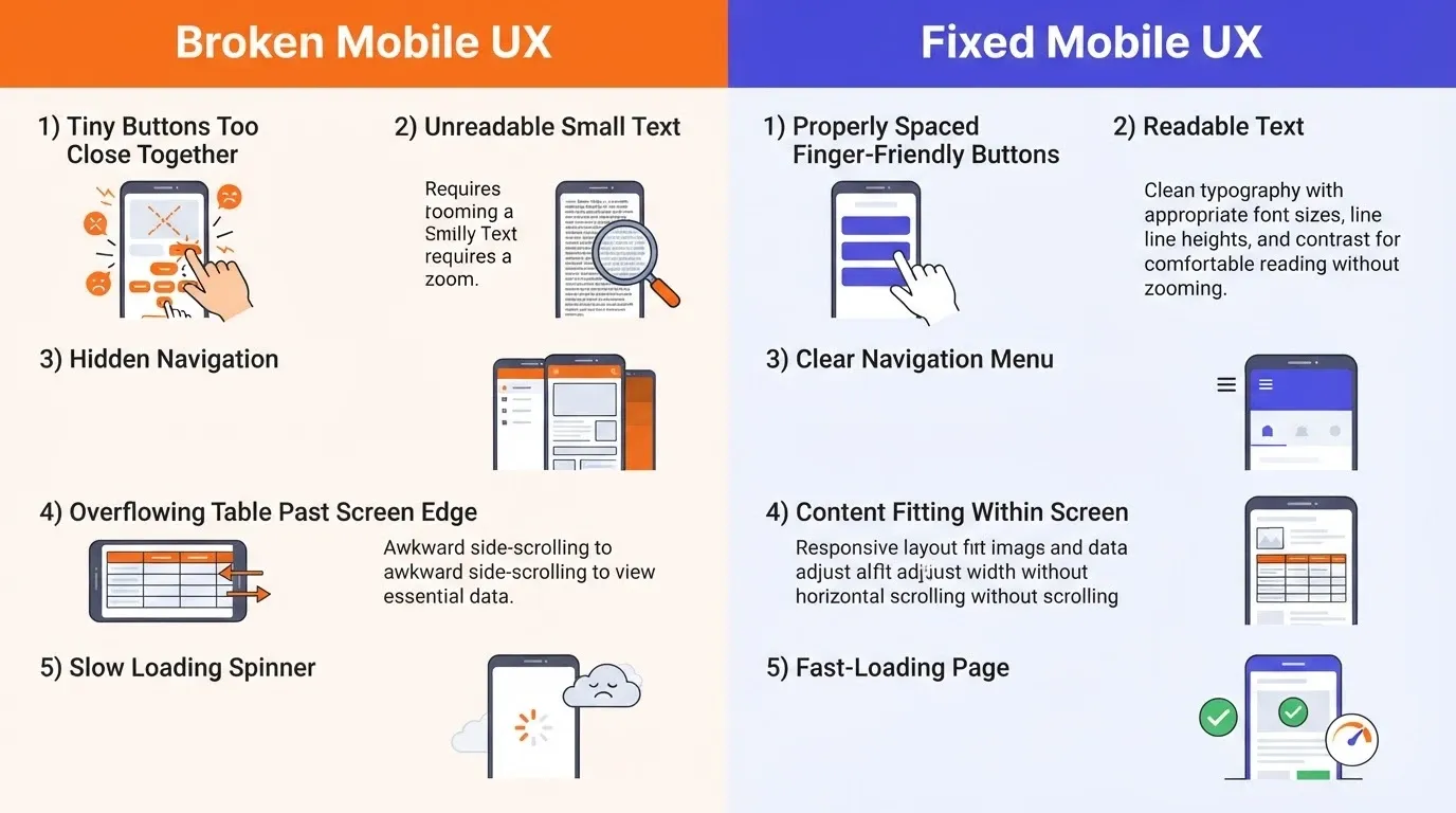
| Tiny tap targets | Buttons and links too close together; wrong item gets tapped | Fixed pixel sizing with no minimum touch area |
| Unreadable text | Font sizes that require zooming on small screens | Absolute font sizes instead of relative units |
| Broken navigation | Hamburger menu that does not respond or hides key pages | Navigation not tested on mobile phones |
| Overflowing content | Tables, images, or forms that push past the mobile screen edge | Fixed-width elements with no responsive grid |
| Slow load times | Page takes five or more seconds on mobile data | Unoptimized images, heavy JavaScript, no lazy loading |
The common thread here is that these are not random bugs. They are the result of building for one screen size and hoping it works everywhere else.
If your product is built with tools that only preview on desktop, you are likely shipping several of these problems without realizing it.
Tap Targets, Forms, and Text That Break on Smaller Screens
The details matter more than most people expect. On a mobile screen, your finger is the cursor, and that changes everything about how design elements need to work.
-
Tap targets need at least 48 pixels of space. Google recommends a minimum of 48x48 CSS pixels for any interactive element. Anything smaller and users hit the wrong button, especially with a thumb on a small phone. Making buttons finger friendly is not a nice-to-have; it is a usability requirement.
-
Forms need to be rethought for mobile. Input fields that work fine on a desktop can cause real problems on phones. Auto-zoom triggered by font sizes under 16px, dropdowns that are hard to scroll through, and submit buttons pushed below the fold all create friction that makes people leave before they fill out a single field.
-
Use rem units instead of fixed pixel values. Rem units scale proportionally with the user's browser settings, keeping text readable across different screen sizes. Fixed pixel values do not adjust, so font sizes that look fine on a laptop become tiny on a mobile screen.
-
Always include the viewport meta tag. Without the viewport tag, browsers on mobile phones render your page at a desktop width and shrink it down. That is why some sites look like miniature versions of themselves on a phone, and that is a problem you can fix in one line of code.
Getting these finger friendly details right is what separates a site that technically loads on a phone from a mobile friendly site that actually works for the person using it.
How Do You Audit Your Site Without Specialist Tools?
You do not need to hire a consultant or buy specialized software to find mobile problems. A few methods using tools you already have will reveal the most important issues.
Start with your own phone. Open your site on a real mobile device and try to complete the most important actions: sign up, read the pricing page, fill out a form, navigate to a specific section. If anything feels slow, hard to tap, or requires zooming, note it down. That is what your visitors experience every time they land on your site.
Use Chrome DevTools to simulate devices. In Google Chrome, right click anywhere on your page, select Inspect, then click the device toggle icon. This lets you resize the browser window to simulate different screen sizes and device types. It is not a perfect substitute for real-device testing, but it catches layout problems quickly and lets you preview how specific elements look on a smaller screen.
Run Google's mobile friendly test. Enter your URL into Google's PageSpeed Insights or the mobile friendly test tool. You will get a report that flags specific elements that fail on mobile devices, along with Core Web Vitals scores. Interaction to Next Paint replaced First Input Delay as a Core Web Vital, so check how your site performs on that metric too.
Check your SEO and discoverability reports. If your site is built with a platform that offers built-in audit tools, use them. These often catch issues like missing viewport tags, unoptimized images, and poor heading hierarchy that affect both mobile friendliness and search performance.
This audit process takes about an hour for most sites. The point is not to find every issue in one pass. It is to build a clear checklist of what is actually broken before spending time or money on fixes.
What Does Responsive Design Actually Mean in Practice?
Responsive design is a term most people have heard, but the practical meaning often gets lost. It is not about making things smaller. It is about building a site that adapts its layout, content structure, and design elements to whatever device the visitor is using.
If you are a PM or founder deciding how your product gets built, responsive design is an architecture decision you make before development starts. It means your web design uses:
-
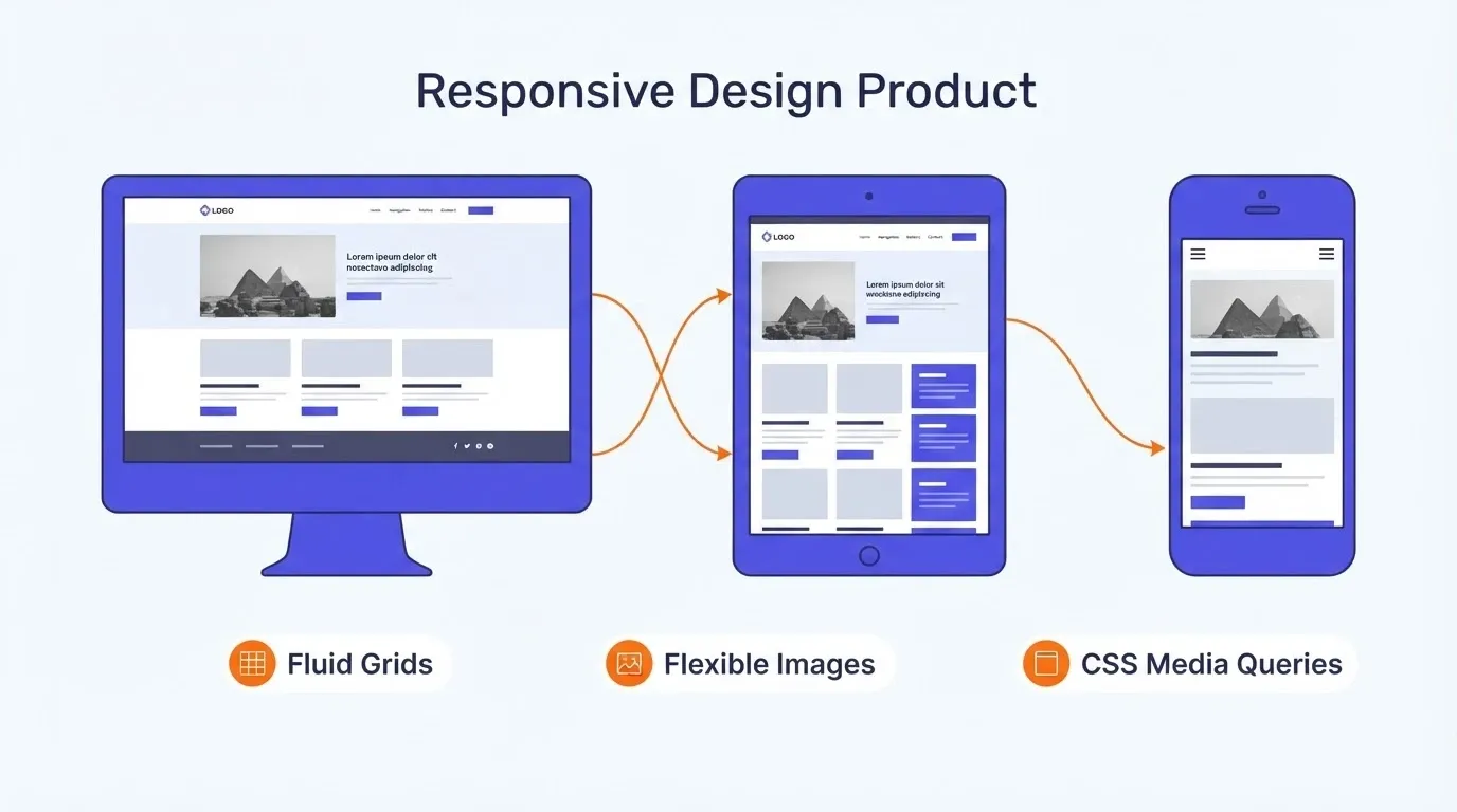
Fluid grids that scale proportionally instead of fixed-width columns
-
Flexible images that resize within their containers without overflowing
-
CSS media queries that adjust layout and font sizes at specific breakpoints for different devices
-
Relative units like rem, em, and percentages instead of fixed pixels for spacing and sizing
The result is a single codebase that renders properly on different screen sizes, from a large desktop monitor to a small smartphone display. Unlike building separate mobile and desktop versions of your site, responsive design gives you one site that works everywhere.
"Mobile devices require software development teams to focus on only the most important data and actions in an application. There simply isn't room in a 320 by 480 pixel screen for extraneous, unnecessary elements. You have to prioritize."- Luke Wroblewski, Mobile First
The key insight here is that responsive is a build decision you make before writing a single line of code, not a fix you apply after launch. If your site uses tools that bake responsive structure into the build process, you skip the entire retrofitting step.
Why a Mobile First Approach Changes Everything
The traditional approach is to design for desktop first, then figure out how to make it fit on small screens. Mobile first design flips this completely.
When you start with the mobile screen, you are forced to decide what actually matters. A desktop layout can hide weak priorities behind whitespace and multiple columns. A mobile layout cannot.
-
Content hierarchy becomes non-negotiable. On a phone, every element competes for the same narrow viewport. If your headline, CTA, and navigation all fight for space, the user loses.
-
Performance gets baked in from the start. Mobile first design naturally encourages lighter assets, simpler layouts, and fast load times because you are designing for the most constrained environment first. You build lean, then add for larger screens.
-
Scaling up is easier than scaling down. Taking a clean, focused mobile layout and adding space on larger screens is straightforward. Going the other direction means cutting, hiding, and reorganizing elements that were designed for a wider view.
This mobile first approach changes how you think about the site from the start, not as a retrofit. You would not build a physical store and forget the entrance for over half your customers. The same logic applies to your website.
How Does Page Speed Affect the Mobile Experience Differently?
Speed matters everywhere, but the impact on mobile devices is significantly different from desktop. And this is something most product teams underestimate.
-
Cellular connections are slower and less stable. A page that loads in 1.5 seconds on a home WiFi connection might take five to six seconds on a 4G network in a crowded area. Mobile users are often on variable connections, which means website speed directly determines whether they wait or leave.
-
Mobile processors handle JavaScript differently. Heavy JavaScript bundles that parse fine on a laptop can cause noticeable delays on mid-range smartphones. The device is doing more work with less computing power, and users feel it in every tap and scroll.
-
Fast load times are a ranking signal. Google has been clear that page speed affects search rankings, particularly for mobile queries. Core Web Vitals, including Largest Contentful Paint and Interaction to Next Paint, are measured on real user devices, not lab conditions.
There are a few ways to improve mobile performance right now:
-
Compress and optimize images. Serve photos in modern formats like WebP, and use responsive image attributes so mobile phones do not download desktop-sized files. Image compression alone can cut page weight by half or more.
-
Add lazy loading. Images and videos below the fold do not need to load until the user scrolls to them. This cuts initial page weight and gets the above-the-fold content on screen faster.
-
Minimize JavaScript. Audit your scripts and remove anything that is not needed for the first screen render. Code splitting helps by loading only what is required for the current view.
-
Use a CDN. Content delivery networks serve your files from locations close to the user, cutting latency for visitors in different regions around the world.
Website speed is not just a technical performance metric. For mobile users on slow connections, it is the difference between a site that works and a site that might as well not exist.
Why Rocket.new Solves Mobile Problems Before They Start
Everything this article has covered, the broken tap targets, the missing responsive structure, the slow load times, the manual auditing, comes from the same root cause. Most website builder platforms and traditional workflows treat mobile as a separate step you add after building for desktop.
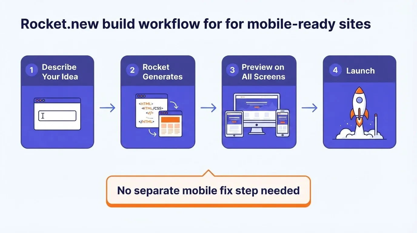
Rocket.new works differently. Every site and app that Rocket generates is mobile-ready from the first generation. There is no separate mobile fix process because the output already adapts to different screen sizes, uses proper font sizes, respects finger friendly tap targets, and ships with performance tuning built in.
Here is what that means in practice:
-
No responsive theme hunting. With a WordPress site or a similar website builder, you start by choosing a responsive theme, then testing whether it actually works on mobile phones and tablets. Rocket.new produces responsive structure as part of the build output, not an add-on you select from a theme library.
-
No extra plugins for mobile friendliness. WordPress sites often require additional plugins to handle image compression, lazy loading, mobile navigation, and mobile friendly design adjustments. Rocket.new includes these capabilities without extra configuration or setup. No code experience is required.
-
Built-in performance from the start. Every build uses clean, production-grade code that avoids the bloat typically causing slow mobile experiences. You do not need to spend hours cutting JavaScript or compressing assets manually because the output is already tuned for fast load times across devices.
-
Preview across screen sizes instantly. The editor lets you preview your site on different devices during the build process, so you catch issues before launch rather than after visitors start complaining. This is a website building experience where mobile is not an afterthought.
The difference is not that Rocket.new has a mobile feature. The difference is that mobile friendliness is the default, not an extra step. Traditional builders require you to make your site mobile friendly after the fact. Rocket.new gives you a mobile friendly site from the moment you describe what you want to create.
If you have spent time debugging mobile layouts on a WordPress site, retrofitting a desktop site for small screens, or managing plugins that promise mobile improvements, the value is clear. Launch your project on Rocket.new and skip the entire problem. When the right tools handle responsiveness from the ground up, mobile friendliness stops being a project and starts being the baseline.
Mobile Experience Is a Product Decision, Not a Design Task
The founder from the opening of this article already had a site. What was missing was not design talent or a bigger budget. It was the decision to treat mobile as a build requirement from the start, not a patch applied after the analytics showed the problem. Every section here, the audit, the responsive architecture, the speed work, points back to the same thing. This is a build-time decision.
The right tools make mobile friendliness the default, not a project. When your site works on every screen from the first generation, you stop fixing and start building what actually matters for your users and your business.
Rocket.new produces sites and apps that work on every screen from the first generation. Describe what you want, and Rocket handles responsive structure, performance, and mobile design from the start. Start building at Rocket.new
Table of contents
- -Why Does Mobile Friendliness Matter for Your Business?
- -What Are the Most Common Mobile Experience Failures?
- -Tap Targets, Forms, and Text That Break on Smaller Screens
- -How Do You Audit Your Site Without Specialist Tools?
- -What Does Responsive Design Actually Mean in Practice?
- -Why a Mobile First Approach Changes Everything
- -How Does Page Speed Affect the Mobile Experience Differently?
- -Why Rocket.new Solves Mobile Problems Before They Start
- -Mobile Experience Is a Product Decision, Not a Design Task