Most SaaS sites lose mobile visitors before a single signup happens. The fix starts with treating mobile as a marketing plan decision, not a design afterthought. Rocket.new builds every page responsive from the first prompt.
Why does a SaaS product with five-star reviews still lose half its mobile signups? The answer is not the product itself. It is the marketing strategy behind how that product reaches people on their phones.
More than half of all web traffic now comes from mobile devices, and average SaaS CAC increased roughly 14 to 18% between 2024 and 2025. High-growth SaaS companies spend 50% or more of their revenue on sales and marketing efforts. When that spend drives traffic to pages that break on a phone screen, the marketing plan is burning money on arrival.
This blog walks through the decisions, common mistakes, and the build process that connect your marketing strategy to what actually happens when a visitor opens your page on a mobile device.
What Does Mobile Traffic Actually Cost SaaS Companies?
The bounce rate gap between desktop and mobile
When a mobile visitor taps an ad, clicks a social media link, or follows an email campaign to your site, the first three seconds decide everything. Pages that load in under three seconds keep most visitors. Pages that take five seconds or longer lose over half of them.
This gap becomes a direct hit on your marketing plan when you realize your best campaigns are sending the highest-intent traffic to the worst experience.
-
Conversion rate difference: Mobile conversion rates in SaaS often run one-third to one-half of desktop rates, and most of that gap is caused by layout and speed problems, not intent differences
-
Customer acquisition cost: Every mobile visitor who bounces raises your effective customer acquisition cost because you paid to get them there
-
Target audience mismatch: If your target audience skews mobile (most do), your marketing strategy is under-delivering on its largest segment
-
Business objectives at risk: Growth goals, pipeline targets, and revenue plans all take a hit when 60% of traffic converts at half the rate
So the cost is not abstract. It shows up in every marketing channel report and every campaign performance review.
First impressions on a phone screen
A mobile visitor forms a judgment in under two seconds. If the text requires zooming, if the CTA button sits too close to another element, or if the navigation menu collapses into something unrecognizable, the visitor leaves. No business plan, no marketing goals, and no amount of ad spend can overcome a broken first impression.
The marketing plan that does not account for this is a plan with a hole in it. Teams that recognize this early can start shipping an MVP in days and testing mobile performance before a full marketing strategy rollout.
Where Do Most SaaS Sites Break on Mobile Devices?
Mobile failures are not rare exceptions. They are the default outcome when a SaaS site is built desktop-first and never properly adapted for smaller screens.
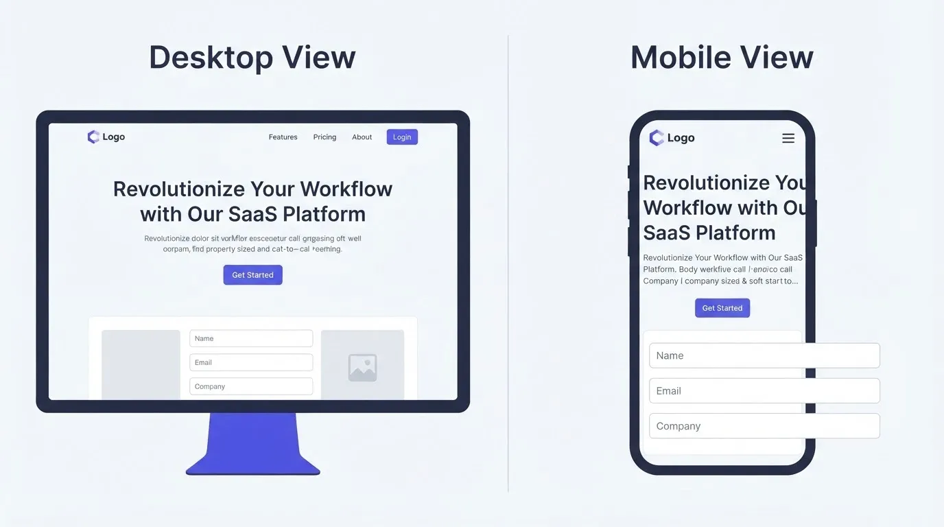
Text and layout that force users to zoom
The most common mobile failure is also the most basic. Paragraph text set at 14px or smaller on a phone screen forces the visitor to pinch and zoom just to read your value proposition. Fixed-width containers that worked at 1440px overflow on a 390px screen. Marketing messages that looked sharp on desktop become unreadable walls of tiny text on mobile.
Buttons and forms built for a mouse
A mouse cursor is precise. A thumb is not. Buttons smaller than 44x44 pixels become nearly impossible to tap accurately. Form fields that sit too close together cause incorrect taps, and forms that push content off-screen on mobile abandon the user mid-action. Your marketing activities drove the visitor to this form. The form drove them away.
Navigation that vanishes on small screens
Desktop navigation bars with seven or eight links often collapse into a single hamburger icon on mobile. The problem is not the icon itself. It is that many SaaS sites hide critical paths like pricing, demo request, and documentation behind that icon with no visual cue that they exist. The target audience who came from a specific marketing campaign now cannot find the page they need.
| Failure Type | What Users See | Root Cause | Business Impact |
|---|---|---|---|
| Text zoom required | Tiny unreadable copy | Fixed font size, no responsive scaling | Visitors leave within seconds |
| Untappable buttons | Missed clicks, wrong taps | Buttons under 44px, tight spacing | Conversion drop on forms and CTAs |
| Form overflow | Fields cut off at screen edge | Fixed-width form containers | Abandoned signups and demo requests |
| Hidden navigation | Cannot find pricing or features | Collapsed nav with no labels | Lost mid-funnel prospects |
| Slow image loading | Blank sections, layout shifts | Uncompressed desktop-sized images | Higher bounce rate from mobile ads |
These failures are not edge cases. They show up in the revenue-focused SaaS metrics for 2026 as pipeline quality problems, because the traffic was qualified but the page was not.
How Do You Audit a SaaS Site for Mobile Issues?
Running a mobile audit is a form of market research on your own product. You do not need paid software or a dedicated QA team to find the biggest problems.
Browser developer tools anyone can use
Every modern browser includes a device emulation mode that lets you preview your site on dozens of screen sizes. Open Chrome DevTools, toggle the device toolbar, and cycle through popular phone models. This is a fast way to conduct market research on your own pages.
-
Check each key page: Homepage, pricing, signup form, blog, and any landing page tied to active marketing campaigns
-
Tap every interactive element: Buttons, links, form fields, dropdowns - if your thumb cannot reach it cleanly, neither can your customer
-
Watch for horizontal scroll: Any page that scrolls sideways on a phone screen has a container or image wider than the viewport
-
Note font sizes below 16px: Anything smaller will trigger zoom on most mobile browsers
Manual checks on real devices
Emulators are a strong first step, but testing on actual phones reveals problems emulators miss. Battery-saver mode throttles processing. Slow cellular data exposes load time issues that Wi-Fi testing hides. The gap between emulated and real-world mobile performance is where marketing plans break.
Frame this audit as a competitive analysis exercise. Run the same checks on two or three competitors. Build a simple SWOT analysis around mobile experience: where your site is strong, where it is weak, where competitors are struggling (that is your opportunity), and where poor mobile performance threatens your business objectives.
If your site runs on a platform you picked based on desktop priorities, now is a good time to evaluate choosing a landing page builder that handles mobile from the start.
What Does Responsive Design Actually Mean in Practice?
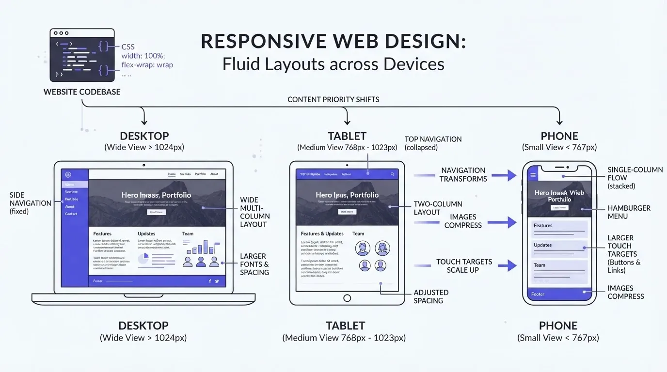
Responsive design is one of the most misunderstood terms in digital marketing. It is more than CSS media queries that shrink content to fit a smaller screen.
Content priority and progressive disclosure
A truly responsive marketing page reorganizes information based on what matters most to the visitor at that screen size. On a phone, the headline, core value proposition, and primary CTA should appear without scrolling. Secondary details, comparison tables, and social media proof can come later.
This is called progressive disclosure, and it matters to your marketing strategy because the visitor's attention span on mobile is shorter. If your marketing messages are buried below the fold on a phone, they might as well not exist.
"Optimise for mobile-first experiences. With 60%+ mobile traffic, responsive design with tap-friendly buttons is non-negotiable for conversion." - Lukas Otompasis, LinkedIn
Touch targets, spacing, and interaction patterns
Responsive design also means rethinking interaction patterns. Hover states do not exist on touchscreens. Dropdown menus triggered by mouse hover fail completely on phones. Buttons need generous padding.
SaaS market data from Mailmodo shows that as of 2024 there are approximately 30,800 SaaS companies globally, and the ones that capture mobile users are the ones whose marketing channels (social media, email campaigns, content marketing) all lead to pages built for touch.
When traffic from social media marketing campaigns, email marketing sends, and search engine results lands on your site, it arrives on a phone screen more often than not. Setting up campaign pages fast with responsive behavior baked in means your digital marketing spend connects to pages that actually work.
Why Performance Hits Harder on Mobile Than Desktop
Speed is a marketing budget problem, not just an engineering concern. Every second of load time on mobile directly erodes the return on your campaign spend.
Network and hardware constraints on mobile
Desktop users typically connect through Wi-Fi or ethernet with stable bandwidth. Mobile users connect through cellular networks with variable latency and throttled speeds. A page that loads in 1.5 seconds on desktop might take 4 to 6 seconds on a 4G connection. That difference is not a minor annoyance. It is a resource allocation problem for every marketing plan that drives mobile traffic.
Image and script weight your users feel
Uncompressed hero images sized for retina desktop displays can be 2 to 5 MB each. On a phone with limited data or a slower processor, that single image stalls the entire page. JavaScript bundles that run smoothly on a desktop with 16 GB of RAM can freeze a mid-range phone for seconds.
-
Resource allocation tip: Treat image compression and code splitting as marketing budget items, not just engineering tasks
-
Measurement: Track mobile-specific load times alongside your marketing campaign metrics - a campaign with a strong click-through rate but poor mobile page speed wastes spend
-
ROI framing: Reducing mobile load time by one second can improve conversion rates by 10 to 20%, which is a direct lift to your marketing plan ROI
When your marketing tactics include paid social media, search engine marketing, or content promotion, the performance of the destination page on mobile determines whether that investment was worthwhile.
Building for Every Screen Size from the First Prompt
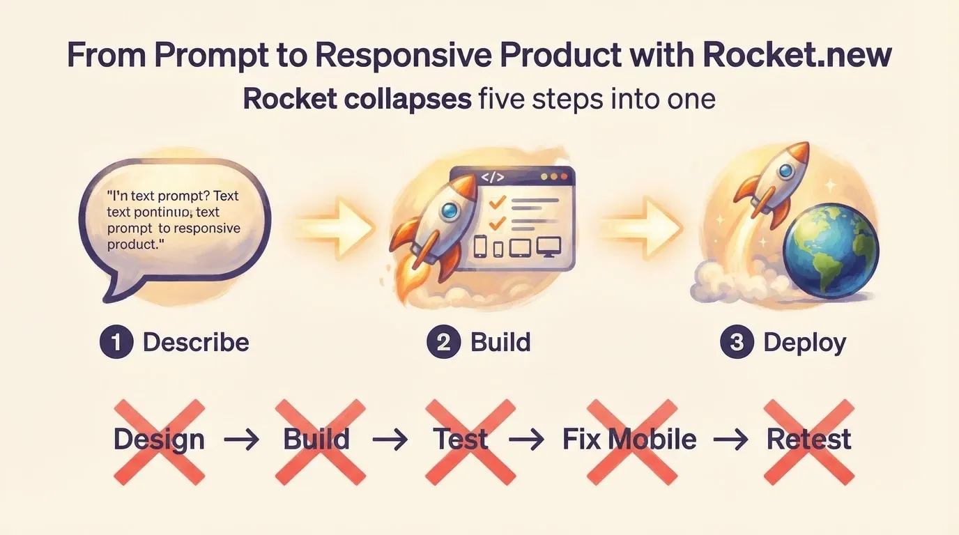
The traditional way to handle mobile is a multi-step retrofit. Design for desktop, build it, test on phones, find problems, patch them, retest. That cycle adds days or weeks to every campaign launch.
Responsive output without a separate mobile process
Rocket.new works differently. You describe your page or app in plain language, and the build comes out responsive by default. Every element, from navigation to forms to CTA buttons, is sized and spaced for touch on the build environment on Rocket. There is no separate mobile version to maintain.
The marketing plan template you create for a campaign can include the landing page as a same-day deliverable instead of a multi-week project. Your strategic marketing process stays on schedule because the mobile gap simply does not exist.
What manual mobile process costs vs building mobile-native
Traditional responsive development involves a designer, a front-end developer, QA testing across devices, and iteration cycles for each fix. For a growing SaaS startup, this is time and budget pulled directly from marketing activities and campaign management.
-
Rocket.new generates pages that pass mobile audits on first deploy, so your team can focus on campaign management and content creation instead of CSS debugging
-
Marketing automation tools connect to Rocket-built pages directly, keeping your strategic marketing process streamlined in a single workflow
-
Your effective marketing plan stays on schedule because the page is live and mobile-ready the same day you write the brief
This is not about replacing your development team. It is about removing the mobile gap from the marketing plan entirely. When every campaign page works on every screen from day one, your marketing strategy gets a structural advantage that compounds with every launch. Rocket.new is a full platform for founders who want to streamline the path from plan to live product.
Making Mobile a Standing Item in Your Marketing Reviews
Mobile experience is not something you fix once and forget. Market dynamics change, new devices ship, and your marketing campaigns evolve. Add mobile-specific metrics to your regular marketing strategy reviews.
Metrics that show mobile health
-
Mobile conversion rate vs desktop: Track this split for every landing page tied to a marketing campaign
-
Mobile bounce rate by channel: Social media campaigns, email marketing sends, and paid search all deliver different mobile audiences
-
Mobile page speed scores: Use Google PageSpeed Insights or Lighthouse as part of your quarterly review
-
Key performance indicators (KPIs) tied to mobile: Customer retention on mobile, customer lifetime value from mobile-acquired users, and mobile-specific website traffic trends
Quarterly mobile checkpoints
Add a mobile experience review to your quarterly planning process. Check whether marketing trends or new marketing channels have shifted your audience device mix. Update mobile conversion targets as part of your business goals review. This turns mobile from a reactive fix into a data driven part of your marketing strategy.
The difference between teams that treat mobile as a standing agenda item and teams that treat it as a one-time design project shows up in conversion rates, customer acquisition cost, and ultimately in whether marketing campaigns deliver the business outcomes they were designed to achieve.
Ship What Works on the Screen Your Users Hold
Your mobile visitors are not a secondary audience. They are most of your audience. A marketing plan that ignores how pages perform on phones is spending money to send people to a broken experience.
The difference between a SaaS team that grows and one that stalls is often not the product, the pricing, or even the marketing budget. It is whether the pages their marketing strategy drives traffic to actually work on the screen the visitor is holding.
Rocket.new builds every page and app responsive from the first prompt. Stop retrofitting mobile and start building for every screen. Try it at rocket.new.
Table of contents
- -What Does Mobile Traffic Actually Cost SaaS Companies?
- -The bounce rate gap between desktop and mobile
- -First impressions on a phone screen
- -Where Do Most SaaS Sites Break on Mobile Devices?
- -Text and layout that force users to zoom
- -Buttons and forms built for a mouse
- -Navigation that vanishes on small screens
- -How Do You Audit a SaaS Site for Mobile Issues?
- -Browser developer tools anyone can use
- -Manual checks on real devices
- -What Does Responsive Design Actually Mean in Practice?
- -Content priority and progressive disclosure
- -Touch targets, spacing, and interaction patterns
- -Why Performance Hits Harder on Mobile Than Desktop
- -Network and hardware constraints on mobile
- -Image and script weight your users feel
- -Building for Every Screen Size from the First Prompt
- -Responsive output without a separate mobile process
- -What manual mobile process costs vs building mobile-native
- -Making Mobile a Standing Item in Your Marketing Reviews
- -Metrics that show mobile health
- -Quarterly mobile checkpoints
- -Ship What Works on the Screen Your Users Hold