Diabetes Telehealth Landing Page Template
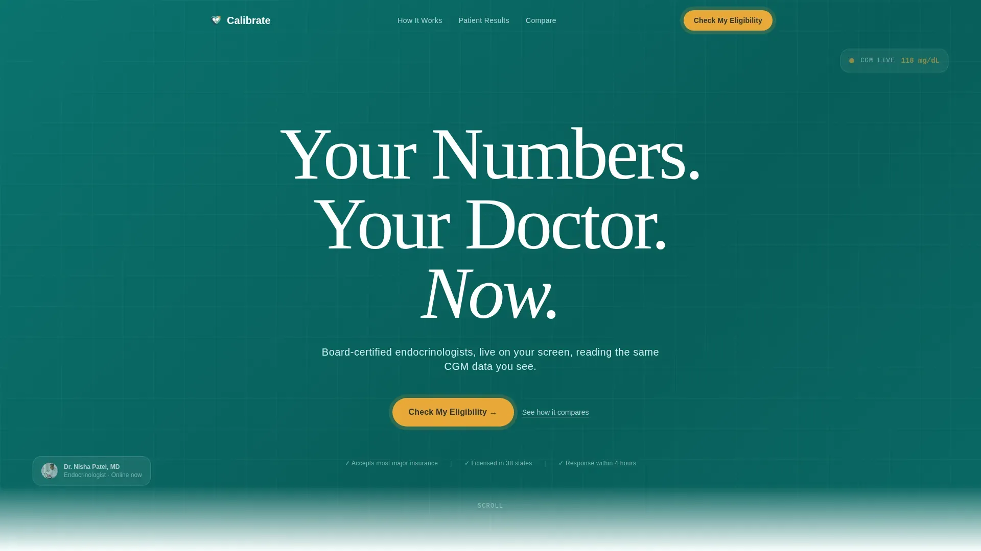
Calibrate is a diabetes telehealth landing page template built for virtual endocrinology clinics. It pairs a bold centered headline, a patient-quote-driven comparison table, and a progressive eligibility form to move visitors from first scroll to booked appointment. The design uses deep teal, seafoam, and amber to feel clinical and calm at once.
by Rocket studio
Quick summary
Calibrate is a single-page lead generation template for diabetes telehealth services. It opens with a full-viewport headline on deep teal, flows into a comparison table anchored by real patient quotes, builds trust through a testimonial mosaic, and closes with a three-step eligibility form. The result is a page that earns the click before it asks for it.
Who this template is for
This template is built for virtual endocrinology practices and diabetes telehealth providers who need a high-trust, conversion-focused landing page. It works especially well for clinics serving patients who feel underserved by generalist care.
- Diabetes telehealth startups launching their first patient-facing page
- Established virtual clinics replacing an outdated or cluttered patient portal page
- Healthcare marketing teams building a lead generation funnel for specialist consultations
What problem this template solves
Most diabetes patients arrive online already exhausted. They have seen conflicting advice, waited months for dosage changes, and struggled to find a specialist who reads their continuous glucose monitor (CGM) data in real time. A generic clinic website does not fix that frustration. This template does.
- It replaces feature bullets with patient voices, so new visitors feel recognized before they read a single claim
- It removes the ambiguity of "how does this work" by showing a clear three-step process from CGM sync to protocol adjustment
- It gives non-ready visitors a lower-friction path through the secondary email capture, so no lead is lost
What you get with this template
You get a fully structured, single-page layout that covers every stage of the patient decision journey. From the first headline to the final form step, every section has a defined purpose and a ready-to-use content structure.
- A hero section with a centered serif headline, a seafoam subline, and a primary amber call-to-action button
- A comparison table with embedded patient quotes, a testimonial mosaic with A1C before-and-after cards, and a How It Works section
- A progressive three-step eligibility form plus a secondary email-capture path for the A1C guide download
Feature list
This template ships with purpose-built components drawn directly from the project brief. Each one plays a specific role in moving a hesitant patient toward booking.
Quote-Anchored Comparison Table
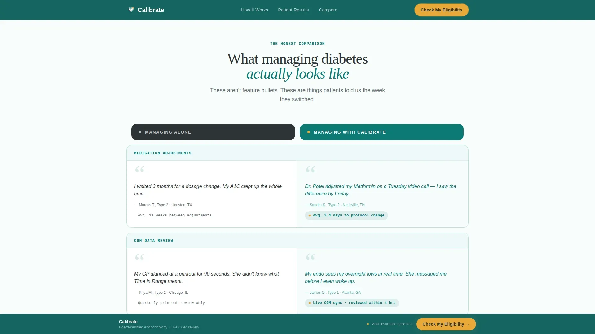
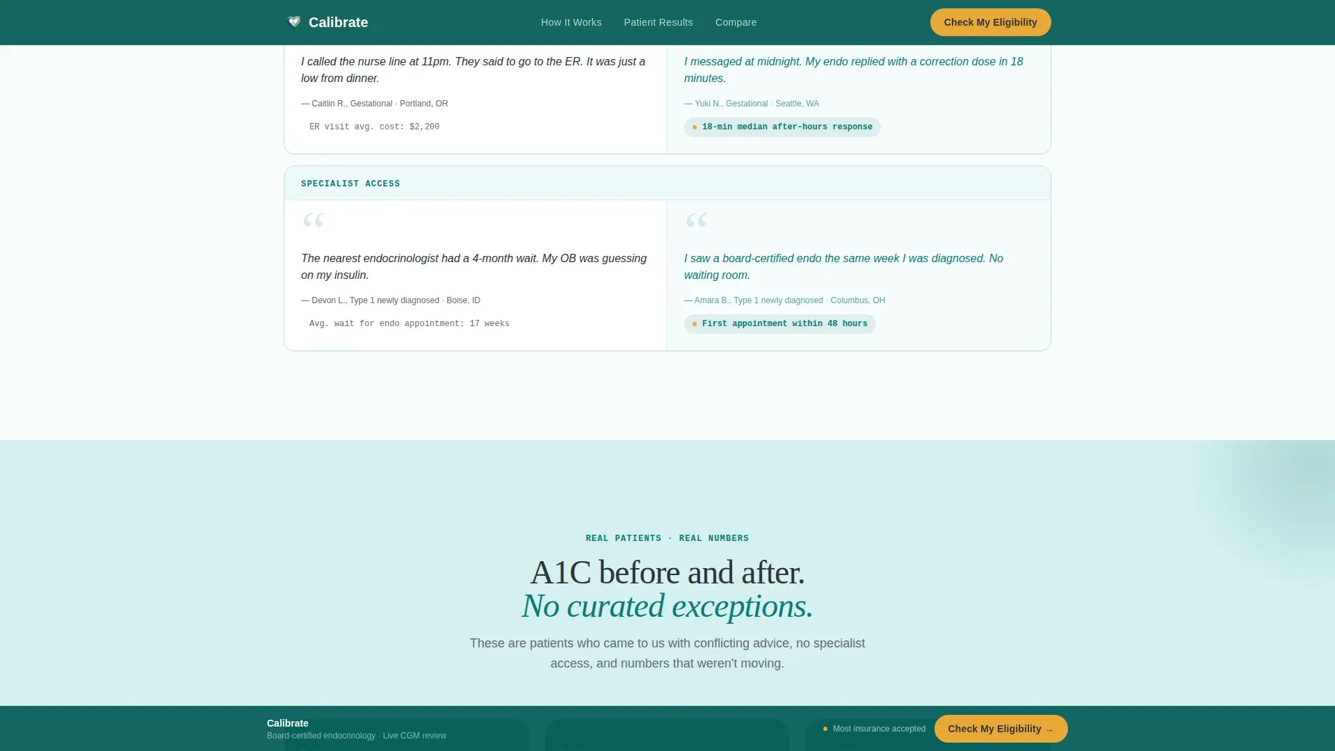
Each row in the "Managing Alone versus. Managing with Calibrate" table is paired with a real patient quote instead of a plain feature bullet. This grounds the comparison in lived experience and makes the value gap feel personal, not promotional.
Progressive Three-Step Eligibility Form
The form opens as a modal and walks the visitor through three focused steps: insurance provider and state, diabetes type and current management approach, then name, email, and preferred appointment window. Routing logic directs each submission to the right specialist type.
Testimonial Mosaic with A1C Cards
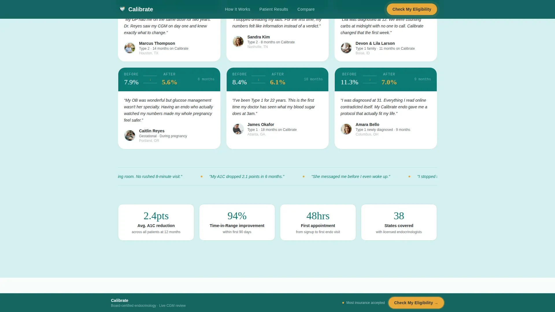
Below the comparison table, patient stories build in density as the user scrolls. Single quotes give way to video thumbnails, then A1C before-and-after cards showing patient names and time on the platform, then a full viewport face grid.
Sticky Amber Bottom Bar
After the first scroll, a slim fixed bar appears at the bottom of the screen. It carries the primary call-to-action button so the booking prompt is always one tap away without interrupting reading.
Secondary Email Capture Path
Visitors who are not ready to book can download the A1C comparison guide by submitting only their email address. This secondary path keeps softer leads in the funnel without pressuring them toward a full form.
How It Works Section
A clean three-step sequence explains the patient journey: sync your CGM data, a specialist reviews it, and your protocol is adjusted before your next meal. The section removes the "what happens next" hesitation that often stops conversions.
Page sections overview
| Section | Purpose |
|---|---|
| Hero headline area | Establishes trust and urgency with a full-viewport centered headline and amber call-to-action |
| Comparison table | Shows the gap between unmanaged care and specialist-led care using embedded patient quotes |
| Testimonial mosaic | Builds social proof through layered patient stories, A1C cards, and a face grid |
| How It Works | Explains the three-step CGM-to-adjustment process in plain language |
| A1C Guide capture | Offers a low-commitment email-only path for visitors not ready to book |
| Eligibility form | Completes the conversion with a progressive three-step modal form |
| Minimal footer | Provides horizontal navigation links in a clean, uncluttered layout |
Design & branding system
The visual identity follows a Healing Space theme. The palette is clinical enough to build trust and warm enough to feel human. Every color has a single assigned job and does not drift from it.
- Deep teal (#0B7A75) anchors the hero, all headers, and data visualization elements; seafoam (#D4F0EF) washes across section backgrounds to create open breathing room between content blocks
- Charcoal slate (#2D3436) holds all body text for strong readability; warm amber (#E8A838) is reserved exclusively for call-to-action buttons and glucose-range highlights, so it always signals action
- Typography pairs Fraunces, a clean oversized serif with generous letter-spacing, for display headlines, with DM Sans for all body and form text
Mobile & speed optimization
The template is built mobile-first because the target audience checks health information on their phones, often late at night between meals. Every layout decision prioritizes thumb-friendly tap targets and single-column stacking on small screens.
- The sticky bottom bar and the amber call-to-action button are sized and positioned for one-handed mobile use
- Scroll-reveal animations and staggered entry effects are set to medium intensity, keeping the experience lively without draining battery or causing jank on mid-range devices
- Static sections use server-rendered components while the eligibility form and sticky bar are handled as client components, keeping the initial page load light
How this template helps you convert
The page is structured around a principle: let other patients make the case before you ask for anything. By the time a visitor reaches the eligibility form, they have already seen a full comparison table, a dense mosaic of patient outcomes, and a clear process explanation.
- The quote-anchored comparison table removes skepticism row by row by replacing marketing claims with patient language, making the value of specialist-led diabetes management feel earned rather than advertised
- The progressive eligibility form reduces drop-off by breaking a potentially intimidating medical intake into three short, logical steps, each one feeling like a natural next question rather than a demand
- The secondary A1C guide capture ensures that visitors who leave the main form still enter the funnel, giving the clinic a second touchpoint to nudge them back when they are ready
Other information about this template
This template is designed specifically for the United States healthcare context. All form fields, date formatting, and insurance-related copy follow United States conventions including MM/DD/YYYY date format and USD pricing references.
- The footer uses a horizontal flow layout (Pattern 3) keeping the bottom of the page minimal and professional, consistent with a clinical brand identity
- Animation behavior is set to medium intensity with scroll reveals and stagger effects; the amber call-to-action button carries a pulse animation to draw attention without being aggressive
- The template is structured for a diabetes telehealth service landing page and can be adapted for related specialties in virtual endocrinology or glucose management care
Theme
Healing Space
Creative direction
Testimonial Mosaic
Color system
Teal Catalyst
Style
Comparison Table
Direction
Lead Generation
Page Sections
Quote-anchored Comparison Table
Progressive Three-step Eligibility Form
Layered Testimonial Mosaic
Sticky Amber Call-to-action Bar
Secondary A1C Guide Email Capture
How It Works Process Section
Related questions
What type of diabetes patients is this landing page designed for?
How does the three-step eligibility form work?
Is there a path for visitors who are not ready to book an appointment?
Can I customize the patient quotes and A1C cards in this template?
What makes this template different from a generic healthcare landing page?



