Provider Directory Landing Page Template
A curated dermatologist directory landing page built for patients who are done scrolling through impersonal insurance portals. The zigzag layout introduces board-certified providers one at a time, pairing each card with editorial context and real patient quotes. Every card ends with a warm call-to-action button routing visitors directly to booking.
by Rocket studio
Quick summary
This is a single-page dermatologist provider directory designed to match patients with board-certified dermatologists through layered trust. The zigzag layout, editorial asides, and patient testimonials work together to build confidence before every click. Visitors land on a human voice, scroll through vetted providers, and leave through a booking button.
Who this template is for
This template is built for healthcare directories, dermatology practices, and patient-matching platforms that want to present providers with warmth and specificity rather than raw list volume. It suits anyone replacing an impersonal portal experience with something that feels personally recommended.
- Dermatology directory founders connecting patients to vetted, subspecialty-matched providers
- Practice groups wanting a curated, trust-first introduction to their dermatologists
- Health platform designers building a patient-friendly alternative to insurance portal searches
What problem this template solves
Patients searching for a dermatologist face the same frustrating experience: a portal returns dozens of names with no context, no subspecialty clarity, and no human signal. The result is paralysis, not action. This template replaces that noise with a calm, editorial flow that earns each scroll before asking for a click.
- Overwhelm from insurance portals that list names without meaningful context or patient proof
- Lack of trust signals that help patients feel confident choosing a specific provider
- No clear path for visitors who are not yet ready to book but are willing to engage
What you get with this template
You get a fully structured, single-page directory layout built around the Expert Panel creative direction. The design uses an alternating zigzag rhythm that introduces one provider at a time, each framed by real patient sentiment and editorial copy. The page closes with a soft skin quiz prompt for visitors who need a gentler entry point.
- An oversized testimonial card header that opens with a real patient voice in editorial serif type
- Alternating provider blocks, each showing subspecialty, years of practice, insurance accepted, and one patient-written sentence
- Editorial asides between provider pairs that explain board certification, skin types, and mole monitoring in plain language
Feature list
A short paragraph introduces the features below. Each one is drawn directly from the template brief and reflects a concrete, built-in capability you can see and use on day one.
Testimonial Card Header
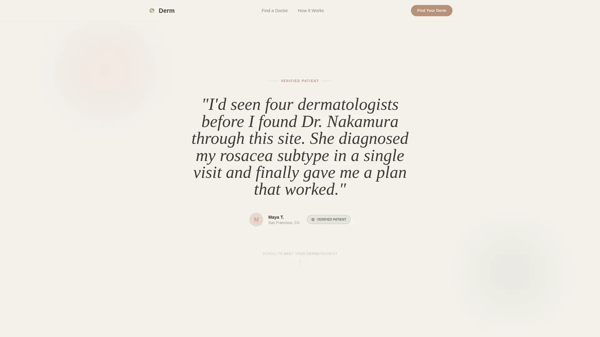
The header is a single oversized pull quote rendered in large editorial serif type on a fog-white field. A small avatar circle, first name and last initial, city, and a verified-patient badge sit below the quote. No stock photography is used anywhere in this section.
Zigzag Provider Cards
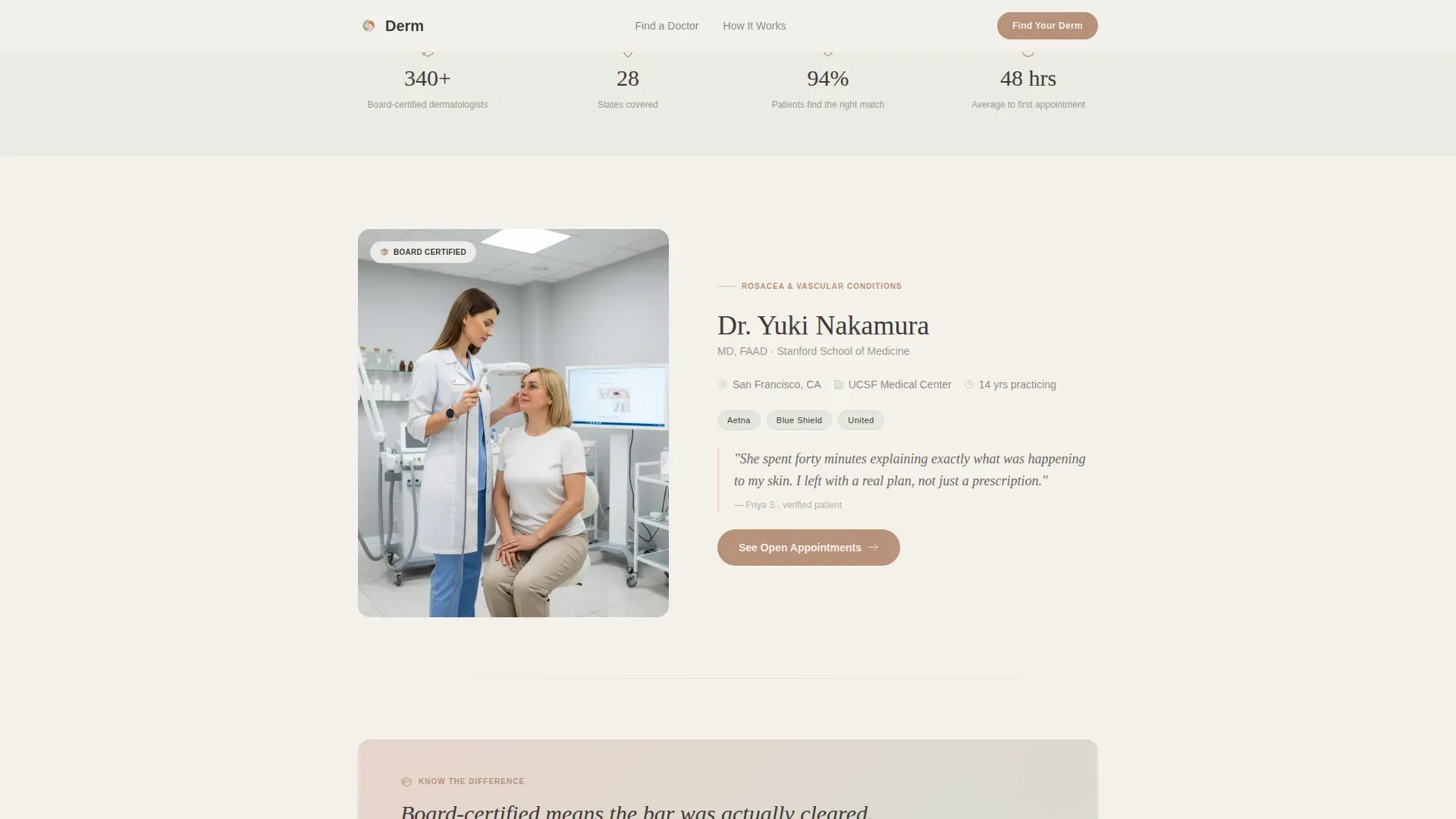
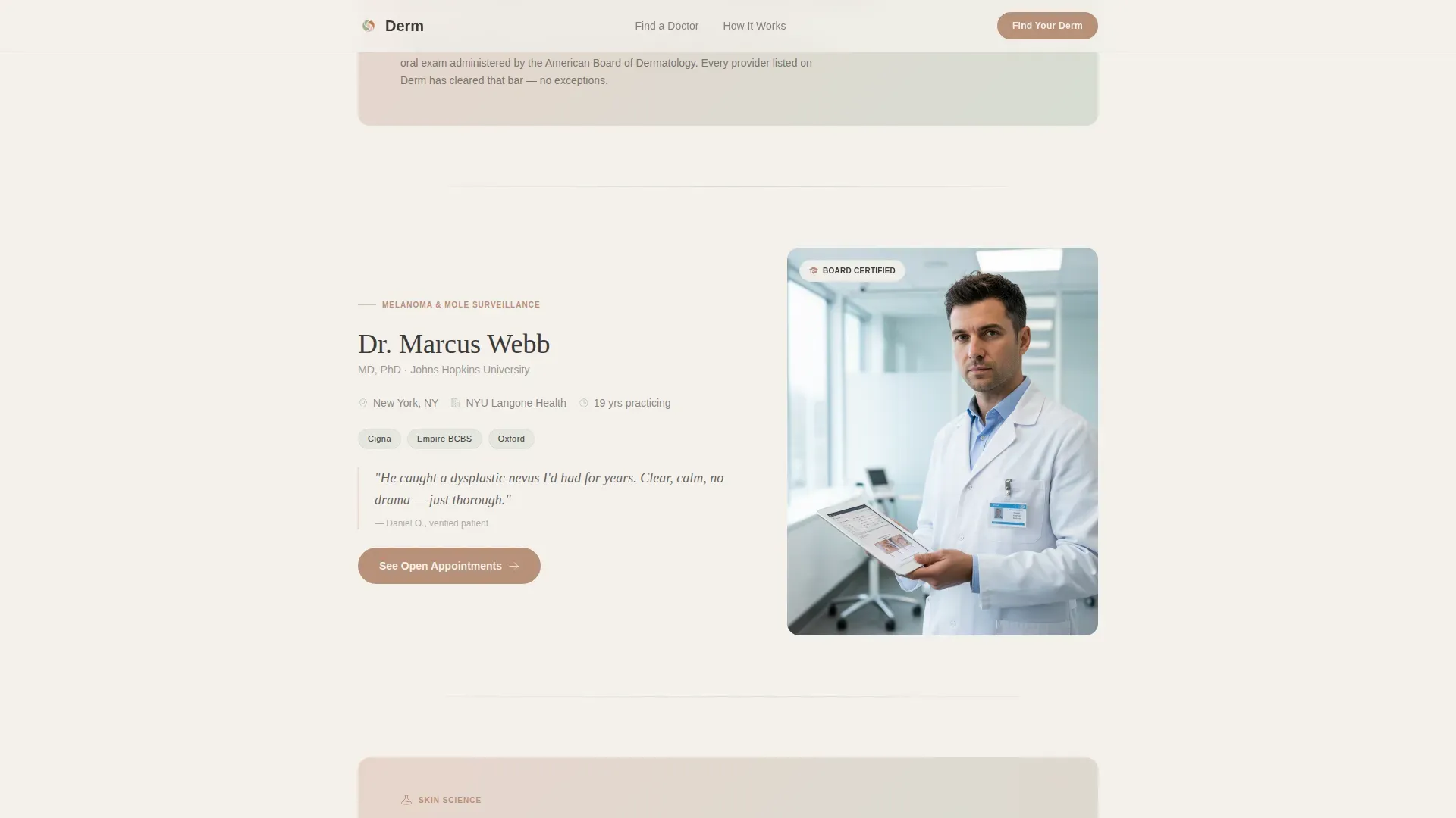
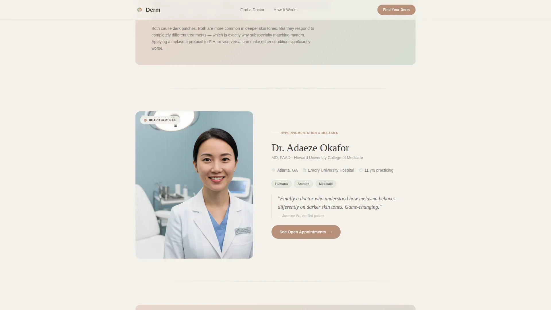
Providers alternate left and right down the page. Each card surfaces the dermatologist's subspecialty, years practicing, insurance accepted, and one patient-written sentence about their manner. A warm terracotta "See Open Appointments" button ends every card and routes to that provider's individual booking page.
Editorial Asides
Between every two provider blocks, a brief editorial section appears. These short passages explain concepts such as board-certification distinctions, skin-type considerations, and mole monitoring. The rhythm rewards curiosity and builds intellectual trust before the next provider is introduced.
Skin Quiz Call-to-Action Section
A soft closing section below the final provider block offers a secondary path for undecided visitors. The prompt invites them to take a skin quiz rather than leave. This section pairs the quiz prompt with trust signals to keep hesitant visitors engaged.
Sticky Mobile Bottom Bar
On mobile, a persistent bottom bar stays visible throughout the scroll. It carries the skin quiz prompt as a secondary path for visitors who are browsing but not yet ready to choose a specific provider.
Organic Flow Visual System
The full page uses the Soft Mist color palette and a two-typeface pairing of Fraunces for editorial headings and DM Sans for body and interface text. Scroll reveals, staggered fades, and subtle parallax on provider photos are built into the template's animation layer.
Page sections overview
| Section | Purpose |
|---|---|
| Testimonial Card Hero | Opens with a real patient pull quote to establish emotional proof immediately |
| Provider Block One | Introduces Dr. Chen with photo left, subspecialty details, and booking button |
| Board Certification Aside | Explains board-certified distinction in plain, reassuring editorial language |
| Provider Block Two | Introduces Dr. Nakamura with photo right, patient quote, and booking button |
| Skin Types Aside | Raises skin-type considerations to build contextual relevance before next provider |
| Provider Block Three | Introduces Dr. Osei with photo left, mole monitoring context, and booking button |
| Mole Monitoring Aside | Addresses mole-change concerns with calm, factual editorial copy |
| Quiz and Trust Close | Soft closing section with skin quiz prompt and supporting trust signals |
| Footer | Horizontal flow footer pattern with supporting navigation and brand information |
Design & branding system
The template uses the Organic Flow theme paired with the Soft Mist color system. Every color choice prioritizes calm clarity over clinical sterility, making the page feel like a trusted editorial recommendation rather than a medical form.
- Palette: fog white (#F4F1EC), barely-there sage (#D6DDD3), blush undertone (#E8D5CC), warm charcoal (#3D3A38) for text, and muted terracotta (#B8907A) for accent links, hover states, and call-to-action buttons
- Typography: Fraunces serif for editorial headings and pull quotes, DM Sans for body copy and interface labels
- Visual tone: no stock photography, no hero illustration, generous white space, and an unhurried magazine-quality rhythm throughout
Mobile & speed optimization
The template is built with a mobile-first approach. The sticky bottom bar is the most visible example of this priority: it keeps the skin quiz option accessible without disrupting the scroll experience on small screens.
- Sticky bottom bar on mobile surfaces the secondary quiz path without interrupting provider card browsing
- Scroll reveals and staggered fade animations use a medium intensity level, keeping motion purposeful rather than distracting
- Server Components handle static content sections, keeping JavaScript use minimal across the page
How this template helps you convert
Conversion here is built on layered credibility rather than a single aggressive prompt. The page earns each click by giving visitors something valuable before it asks them to act.
- The testimonial card header delivers immediate emotional proof, so visitors feel understood before they read a single provider detail.
- Editorial asides between provider blocks build intellectual trust by teaching something specific about dermatology at each pause point.
- Every provider card ends with a direct booking button, and the mobile sticky bar captures visitors who are curious but not yet decided.
Other information about this template
This template is designed specifically for the dermatologist provider directory niche within the broader Health and Medical category. It sits at the intersection of patient trust-building and clear provider discovery, making it well suited for US-based directory platforms serving cities such as New York, San Francisco, Chicago, and Atlanta.
- Content is localized for English-language, US geography, and USD-denominated service contexts
- The footer uses the Horizontal Flow pattern and supports standard navigation and brand information
- Animation intensity is set to medium, with scroll reveals, staggered fades, and subtle parallax on provider photos
- The template supports three named provider slots out of the box, each with its own subspecialty, insurance, and patient-quote field
- No on-page form is used; all conversion paths lead to individual provider booking pages or the skin quiz prompt
Theme
Organic Flow
Creative direction
Expert Panel
Color system
Soft Mist
Style
Zigzag/Alternating
Direction
Click-Through
Page Sections
Oversized Testimonial Card Header
Zigzag Provider Card Layout
Editorial Asides Between Providers
Skin Quiz Closing Section
Sticky Mobile Bottom Bar
Soft Mist Design System
Related questions
Can I add more than three provider cards to this template?
Does this template include an on-page booking form?
Who is this dermatologist directory landing page built for?
Can the color palette and typography be customized?
Is this template suitable for a single dermatology practice?



