Trusted Eye Care Landing Page Template
Clarity is a sidebar companion landing page template built for optometry practices that want to turn late-night symptom searches into booked appointments. It pairs a scrollable eye condition library with a fixed sidebar navigator, a warm clinical design, and a lead-capture flow that earns trust before it ever asks for a click.
by Rocket studio
Quick summary
Clarity is a single-page landing page template designed for optometrists who want to do more than list their services. It gives every visitor a calm, organized reference that explains their specific eye concern in plain language, then moves them naturally toward booking an exam. The design is warm, unhurried, and built around the patient's question first.
Who this template is for
This landing page template speaks directly to eye care practices that want a smarter way to connect with the patients already searching for answers online. It fits practices of any size that treat a mix of refractive, retinal, dry eye, pediatric, and emergency conditions.
- Optometrists and eye care clinics that want a dedicated condition library page on their website
- Practice managers looking to generate more qualified leads from organic search traffic
- Eye clinic teams who want a landing page that educates potential patients before asking them to book
What problem this template solves
Most eye clinic websites list conditions in a dense block of medical text. Visitors arrive with a specific symptom, feel overwhelmed, and leave without taking any action. The conversion rates on those pages stay low because the page never actually answered the question that brought the person there.
Clarity solves this by treating the landing page as a guided reference. It answers the visitor's question fully, then positions the appointment as the obvious next step. That sequence builds trust in a way that a services list never can.
- Potential patients bounce when a page leads with booking before it leads with understanding
- An eye care clinic landing page that explains conditions in plain language keeps visitors reading longer
- A disorganized website design makes it hard for users to find the specific condition they are worried about
What you get with this template
This landing page template includes every section and component described in the source brief. You get a complete, ready-to-customize page that works as both a content marketing asset and a lead generation tool for your eye clinic.
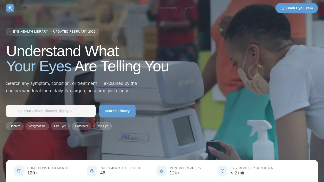
- A half-page hero with a phoropter photograph and a compelling headline that speaks to the visitor's concern
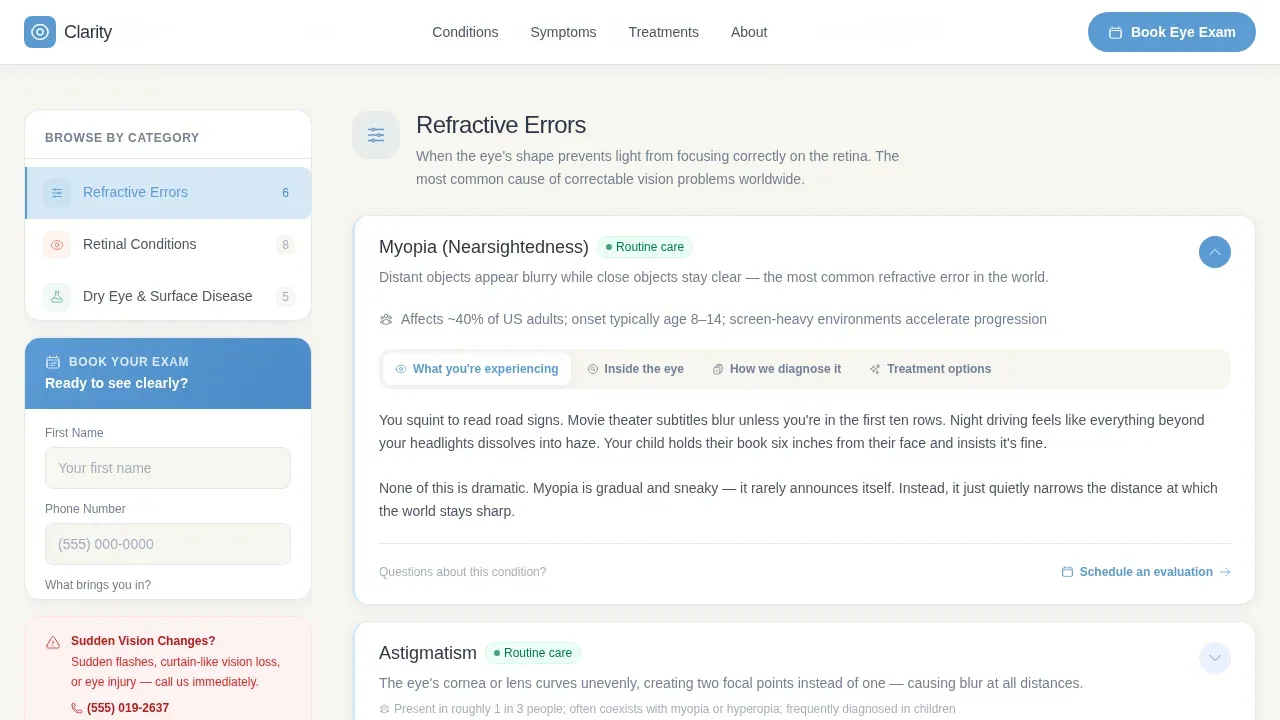
- A fixed sidebar with five condition category links that highlight progressively as users scroll through the main content column
- Two conversion paths: a persistent "Book Your Eye Exam" call to action in the sidebar and a "Download Our Vision Guide" email capture after the third condition section
- A social proof section with patient testimonials and doctor credential details
- A full-width final booking section and a minimal footer
Feature list
This template is built around a set of specific features that work together. Each one supports the clear goal of turning a researching visitor into a scheduled patient.
Fixed Sidebar Condition Navigator
The sidebar stays visible as users scroll through the entire page. It lists five condition categories: Refractive Errors, Retinal Conditions, Dry Eye and Surface Disease, Pediatric Vision, and Emergency Symptoms. The active category highlights automatically as the visitor scrolls, so they always know exactly where they are in the library. This design element keeps the most important information within reach at every point in the reading experience.
Accordion Condition Entries
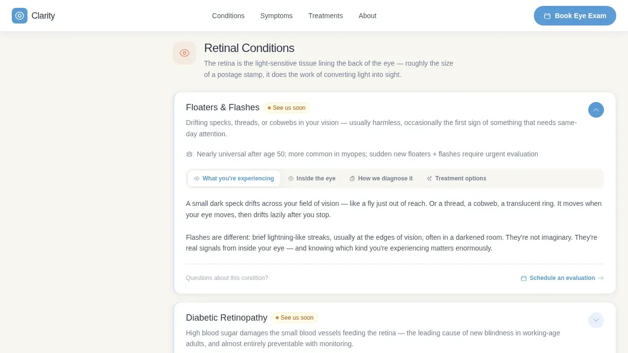
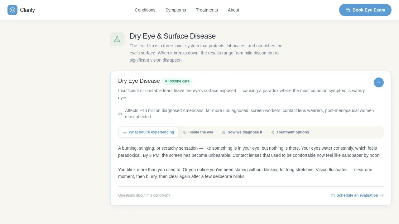
Each condition entry in the main content column unfolds in a consistent four-part rhythm. The entry covers what the visitor is experiencing, what is happening inside the eye, how the condition is diagnosed, and how it is treated. This structured layout makes it easy for users to scan quickly or read deeply, depending on what they need. The process is predictable, which builds confidence in the practice's expertise.
Hero Section with Real Clinical Image
The hero image is a half-page photo and text composition. The left side holds a warm-lit photograph of an optometrist adjusting a phoropter lens. The right side presents the main headline "Understand What Your Eyes Are Telling You" in slate, followed by a single explanatory sentence. Using real photos of an actual clinical moment, rather than generic stock smiles, sets a tone of genuine expertise from the first second on the page.
Dual Conversion Path System
Two call to action buttons serve two different visitor mindsets. The "Book Your Eye Exam" button is pinned to the bottom of the fixed sidebar and is always visible without interrupting reading. The "Download Our Vision Guide" path appears mid-page after the third condition section and captures an email address in exchange for a downloadable guide. Together, these two paths help convert both ready-to-book visitors and those still in research mode.
Lead Capture Form with Condition Dropdown
The sidebar booking form collects a first name, a phone number, and a dropdown selection. The dropdown is populated with the same five condition categories shown in the sidebar, so the visitor's research flows directly into their stated reason for the appointment. This small detail creates a seamless handoff from content to contact, and it gives the practice useful context before the first call.
Social Proof and Credentials Section
The social proof section features specific patient testimonials written with condition context, not generic praise. Doctor names and credentials appear alongside the testimonials. Trust indicators like these are essential for healthcare landing page design because they reassure visitors that the practice has genuine experience with their specific problem before they decide to book.
Page sections overview
| Section | Purpose |
|---|---|
| Hero Photo + Text | Opens with a clinical image and compelling headline to set tone |
| Stats Strip | Floating bar of key practice numbers to establish credibility quickly |
| Fixed Sidebar Nav | Persistent category links that highlight as users scroll the library |
| Condition Library | Main scrollable content column with accordion condition entries |
| Vision Guide Capture | Mid-page email form for research-mode visitors not yet ready to book |
| Social Proof | Patient testimonials with condition context and doctor credentials |
| Final Booking Section | Full-width cerulean call to action section for appointment conversion |
| Minimal Footer | Clean footer with essential links and contact details |
Design & branding system
The visual identity follows a Soft Gradient theme built on a Slate and Sky color system. Every design landing decision is made to feel warm and clinical at the same time, avoiding the cold sterility of a typical medical website.
- Slate (#4A5568) is used for body text and navigation links; pale sky wash (#E8F0FE) bleeds softly into white across section backgrounds; cerulean (#5B9BD5) carries every interactive element; warm pearl (#F7F5F0) is the resting page background
- Typography pairs Plus Jakarta Sans for headings with DM Sans for body text, both clean, sans-serif, and readable at clinical scale
- Gradients shift vertically from pearl to sky wash so subtly that users register comfort before they register color, and cerulean graphic elements act as the consistent signal for every clickable action
Mobile & speed optimization
The landing page is built desktop-first to support the fixed sidebar layout, but it collapses gracefully on smaller screens. Mobile users get the same information in a format that fits their device.
- On mobile, the fixed sidebar converts to a collapsible accordion so users can still navigate condition categories without losing screen space
- Scroll-reveal animations use IntersectionObserver so the page only animates what is visible, keeping the experience smooth without overloading the browser
- Minimal JavaScript is used for scroll tracking and sidebar state, keeping the page focused and fast for users on any device
How this template helps you convert
A landing page is a standalone web page created specifically for a single, focused goal. This template keeps that goal clear: turn a worried visitor into a booked patient. A focused layout with minimal distractions helps lower your cost per lead and can significantly push conversion rates above the industry average of 3.2%.
- The fixed sidebar and accordion entries guide visitors through the library in simple steps, so they stay on the page longer and arrive at the booking form with their question already answered, which is the foundation of higher conversion rates
- Two call to action buttons serve two distinct visitor mindsets at the same time, capturing both ready-to-book patients and those who need one more touchpoint through the Vision Guide download before they are ready to sign up
- Social proof, doctor credentials, and plain-language condition entries work together to build trust before the page ever asks for contact details, which is what separates a high-performing landing page design from one that simply looks professional
Other information about this template
This template is a strong source of inspiration for any eye care practice that wants its website to do more meaningful work. The page template was designed with the specific challenges of healthcare content marketing in mind. Below are additional details worth knowing before you start your project.
- The clarity trusted eye condition library landing page template is the specific design used for this sidebar companion landing page, and it can be customized to reflect your practice's brand identity, color choices, and messaging
- Landing page templates like this one simplify the process of creating high-converting pages because the structure, hierarchy, and conversion logic are already built in, so you save significant setup time on your project
- The template supports different versions of the condition library through its accordion system, so you can add or remove condition entries without redesigning the page
- Patient-friendly headlines and bullet points within each condition entry keep content written at a plain-language reading level, which is essential for users who may already be anxious about a symptom
- All call to action buttons and links are spaced with ample room around them so that users with reduced motor control can interact with the page comfortably
- The page is structured so that the most important information for any given condition is always visible above the fold within each accordion entry, keeping the experience easily accessible for every visitor
- Instructor profiles and doctor credential blocks follow the same visual pattern as the testimonial cards, so the page feels consistent whether you are highlighting professional services or sharing patient stories
- Using high quality images that reflect real clinical moments, rather than posed stock photography, is one of the most effective ways to build credibility on a healthcare landing page, and this template is designed around real photos from the start
- The template's design elements are built to accept easy access to customization at the section level, so your team can update colors, swap images, and adjust copy without rebuilding from scratch
- A/B testing different versions of the call to action copy or the hero image is straightforward because the page template isolates each component clearly
- The website design follows a clean design philosophy where each section has one job, and unnecessary content is removed so that potential customers always know where to focus
Theme
Soft Gradient
Creative direction
Step-by-Step Guide
Color system
Slate & Sky
Style
Sidebar Companion
Direction
Lead Generation
Page Sections
Fixed Sidebar Condition Navigator
Accordion Condition Entry Format
Dual Conversion Path System
Clinical Hero Image Layout
Social Proof and Credentials Section
Lead Capture Form with Condition Dropdown
Related questions
Can I customize the condition categories in the sidebar?
Does this template include the booking form and email capture?
Is this template suitable for a solo optometrist practice?
How does the active sidebar category update as I scroll?
Can this landing page support my practice's search visibility?



