Periodontist Insurance & Billing Landing Page Template
Perio is a split-screen landing page template built for periodontal billing resource hubs. It pairs real denial scenarios with corrected claim strategies across scroll-triggered sections, walks office managers and solo-practice periodontists through CDT code documentation, and captures leads with a value-first email offer after three proven content moments.
by Rocket studio
Quick summary
Perio is a single-page billing resource template designed for periodontal practices. It opens with a stats wall that frames the denial crisis, then walks visitors through three denial-and-fix pairs before asking for anything in return. The layout earns trust with real code examples and narrative language, then converts with a downloadable guide offer.
Who this template is for
This template is built for the people closest to the billing desk in a periodontal practice. It speaks directly to the daily frustrations of claim rejections and reimbursement delays.
- Office managers and front-desk coordinators handling Explanation of Benefits denials
- Solo-practice periodontists writing off scaling and root planing reimbursements
- Billing staff who need clear documentation guidance for osseous surgery and bone grafting claims
What problem this template solves
Periodontal billing is one of the most denial-heavy areas in dental insurance. Practices lose revenue not because the work was not done, but because the documentation does not match what payers require. This template addresses that gap directly.
- Denial codes like D4210 and D4260 go unchallenged because staff lack the right narrative language
- Patients ask whether bone grafting is covered, and no one at the front desk has a confident answer
- Reimbursement delays stretch past 47 days when pre-authorization steps are missed or incomplete
What you get with this template
The template delivers a complete content-led landing page structure. Every section is purpose-built to educate first and convert second.
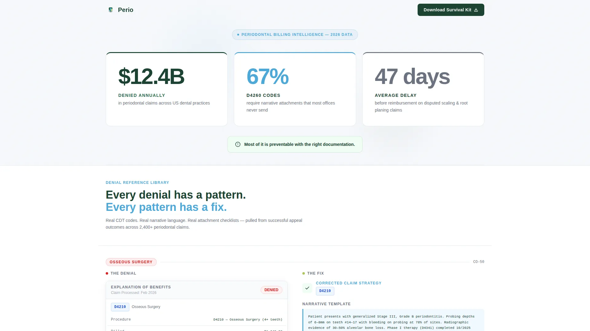
- A full-width stats wall with three oversized metric panels that frame the billing problem immediately
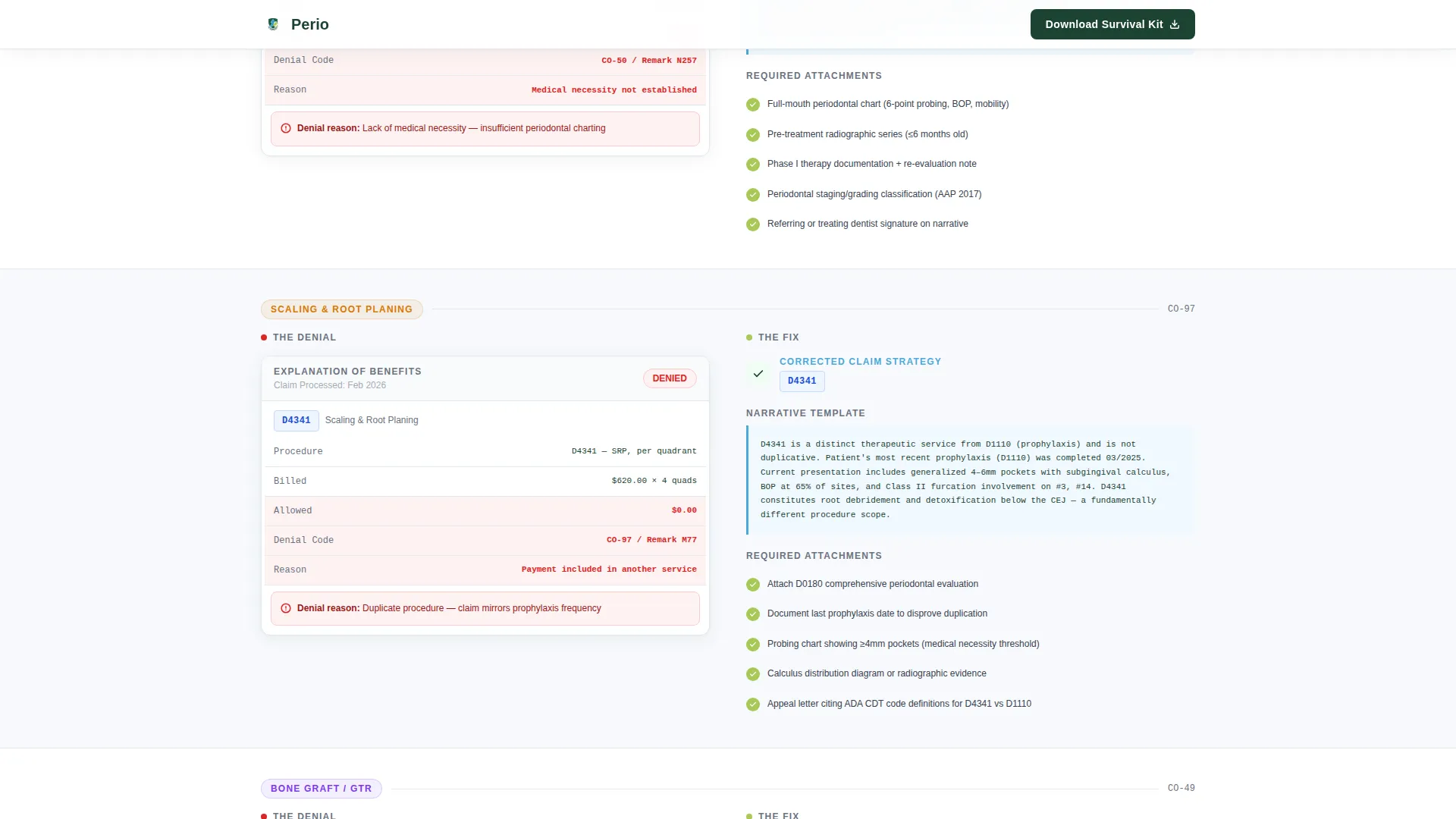
- Three split-screen denial-and-fix pairs covering osseous surgery, scaling and root planing, and bone grafting
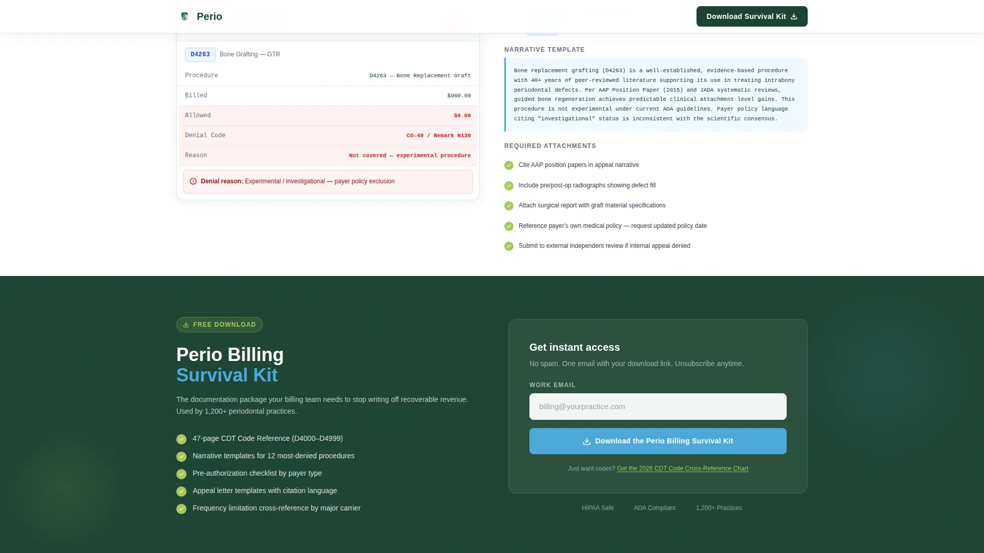
- A primary email capture form tied to the "Perio Billing Survival Kit" download, placed after the third value moment
- A secondary conversion path with an inline link for the CDT Code Cross-Reference Chart
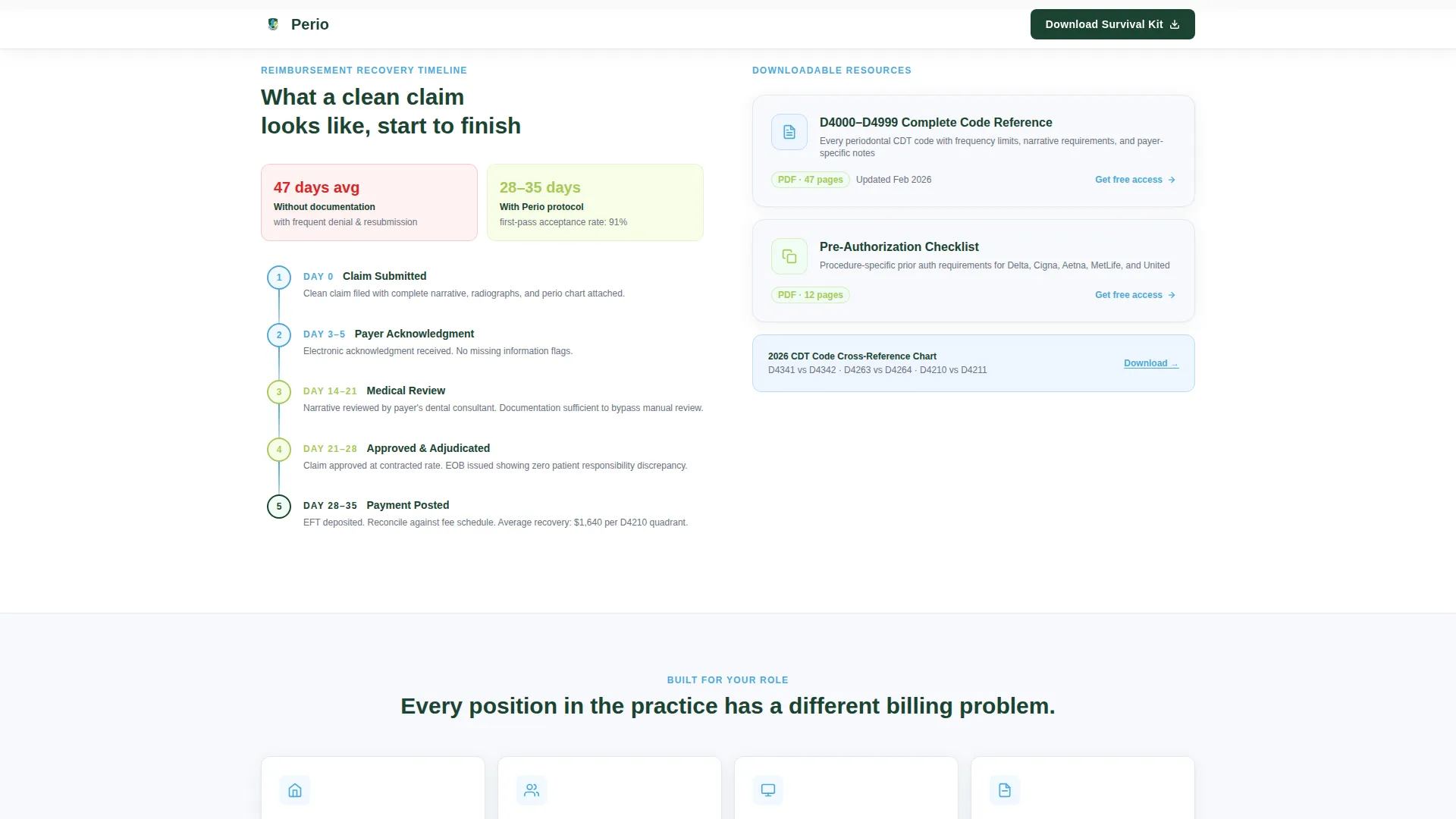
- A reimbursement recovery timeline paired with a downloadable resource in an inverted split layout
- A mobile sticky bottom bar that surfaces the primary call to action after 40 percent scroll depth
Feature list
This section highlights the core capabilities built into the Perio template.
Stats-First Impact Header
Three oversized metric panels fill the full viewport width. Each panel presents a specific industry figure: total annual denied periodontal claims, the percentage of D4260 codes requiring narrative attachments, and the average reimbursement delay. A single diagnostic line below the numbers frames the message before the visitor scrolls.
Denial-and-Fix Split Panels
Each scroll step pairs an Explanation of Benefits mockup on the left with a corrected claim strategy on the right. The right panel includes the proper Current Dental Terminology code, a narrative template snippet, and an attachment checklist. Three denial types are covered: osseous surgery, guided tissue regeneration, and implant maintenance.
Value-First Email Capture
The email capture form appears only after three denial-and-fix pairs have been shown. A single email field and a clear call-to-action button offer the Perio Billing Survival Kit download. The placement ensures visitors have already received real value before being asked to convert.
Inverted Recovery Timeline Panel
Midway through the page, the split layout reverses. The left side shows a reimbursement recovery timeline. The right side presents a downloadable resource. This section reinforces the template's teach-before-ask rhythm.
Mobile Sticky Call-to-Action Bar
On mobile devices, a fixed bottom bar appears once a visitor reaches 40 percent scroll depth. It surfaces the primary download offer without interrupting the reading flow on smaller screens.
Scroll-Triggered Reveal Animations
Sections animate into view as the visitor scrolls. Staggered stat panels, split-panel transitions, and hover states on denial cards keep the page engaging without relying on heavy scripts.
Page sections overview
| Section | Purpose |
|---|---|
| Stats Wall Header | Frame the denial crisis with three oversized industry metrics |
| Denial Fix: Osseous Surgery | Show D4210 rejection alongside a corrected claim strategy |
| Denial Fix: Scaling and Root Planing | Pair a scaling and root planing Explanation of Benefits mockup with the proper narrative |
| Denial Fix: Bone Grafting | Address bone graft coverage questions with CDT code guidance |
| Email Capture Block | Offer the Perio Billing Survival Kit after three value moments |
| Recovery Timeline Panel | Display a reimbursement timeline alongside a downloadable resource |
| Secondary call to action Strip | Surface the CDT Cross-Reference Chart inline link and trust badges |
| Footer Row | Linear single-row footer with practice and resource links |
Design & branding system
The visual identity follows a Medical Clarity theme. Every color and type choice reinforces precision and readability without feeling cold or clinical.
- Color palette: snowfield white (#F7F9FC) backgrounds, evergreen (#1B4332) headlines, glacial stream blue (#4DA8DA) on interactive elements and data callouts, granite gray (#6B7280) for secondary body copy, and alpine wildflower (#A7C957) for success states and confirmation badges
- Typography: Plus Jakarta Sans for body text and interface elements, paired with DM Sans condensed for the oversized stats panels
- Visual tone: sterile precision without hostility, designed to feel like a freshly organized patient chart on a Monday morning
Mobile & speed optimization
The template is built desktop-first, matching how office managers work at their workstations. Mobile behavior is handled through targeted components rather than a full responsive rebuild.
- Sticky bottom bar activates on mobile after 40 percent scroll depth, keeping the primary call to action accessible without crowding the content
- Scroll-triggered animations use minimal JavaScript, relying on Server Components for static content sections to reduce load overhead
- Split-screen panels restack gracefully on smaller viewports so denial-and-fix content remains readable on any screen
How this template helps you convert
The conversion strategy is built on demonstrated value. The page teaches before it asks, making each call to action feel like the next logical step.
- Three denial-and-fix pairs deliver real code examples and narrative language before any email is requested, so the download offer lands as a natural continuation rather than an interruption.
- A secondary inline link for the CDT Code Cross-Reference Chart captures visitors who scroll past the first offer, giving the page a second conversion moment without adding visual clutter.
- The mobile sticky bar ensures the primary call to action remains visible for on-the-go users who would otherwise lose the offer as they scroll through content.
Other information about this template
This template is a strong fit for practices building a billing education hub or a lead generation page around insurance documentation resources.
- Template style: Split Screen 50/50, designed for parallel information delivery across every section
- Page type: single-page landing page with a linear scroll flow and no multi-page navigation
- Creative direction: Stats-First Impact, escalating from problem data to proof to protocol across the scroll
- Header concept: Stats and Metrics wall with condensed clinical typeface, readable from across a room
- Localization: English language, United States dollar formatting, US date conventions, and US dental Current Dental Terminology codes throughout
- Animation level: medium, with scroll-triggered reveals and staggered transitions that keep the page engaging without slowing it down
Theme
Medical Clarity
Creative direction
Stats-First Impact
Color system
Alpine Fresh
Style
Split Screen (50/50)
Direction
Content/Resource
Page Sections
Stats-first Impact Header
Denial-and-fix Split Panels
Value-first Email Capture Form
Inverted Recovery Timeline Layout
Mobile Sticky Call-to-action Bar
Scroll-triggered Reveal Animations
Related questions
Who is this landing page template designed for?
What CDT code denial scenarios does this template cover?
How does the email capture form work on this page?
Does the template include a second conversion option for visitors who scroll past the first offer?
How does this template handle mobile users?



