Heart Disease Patient Education Landing Page Template
Pulse is a split-screen landing page template built for heart disease patient education platforms. It translates dense cardiology terminology into clear, visual explanations that patients and caregivers can actually absorb. With a trust-first hero, an interactive condition selector, and a Problem-to-Solution scroll arc, this template earns confidence before it ever asks for a click.
by Rocket studio
Quick summary
Pulse is a 50/50 split-screen landing page template designed for cardiology patient education. It guides recently diagnosed patients and caregivers from confusion to clarity through a Problem-to-Solution visual arc. Every section pairs medical complexity on the left with plain-language understanding on the right, building trust three times before presenting a call to action.
Who this template is for
This template was built for teams running patient-facing cardiac health platforms. It speaks directly to the people who need clarity most and to the organizations serving them.
- Healthtech founders and clinical content teams building condition education tools for cardiac patients aged 45 to 70
- Hospital patient experience teams or independent platforms offering pre-procedure walkthroughs and discharge support
- Caregivers and family members researching conditions like atrial fibrillation or coronary artery disease on behalf of a loved one
What problem this template solves
Patients leaving a cardiology appointment often carry a sheet of terms they cannot decode. The gap between what a doctor says and what a patient understands is where anxiety grows. This template addresses that gap directly.
- Medical reports, ejection fraction numbers, and stenosis percentages feel overwhelming without a plain-language bridge
- Patients researching procedures the night before, or decoding discharge papers at 2 a.m., have no calm, visual guide to turn to
- Platforms without visible credibility signals struggle to earn the trust of anxious first-time visitors
What you get with this template
You get a fully structured, single-page layout built around one purpose: turning fear into understanding. Every section is designed with a specific emotional and functional role.
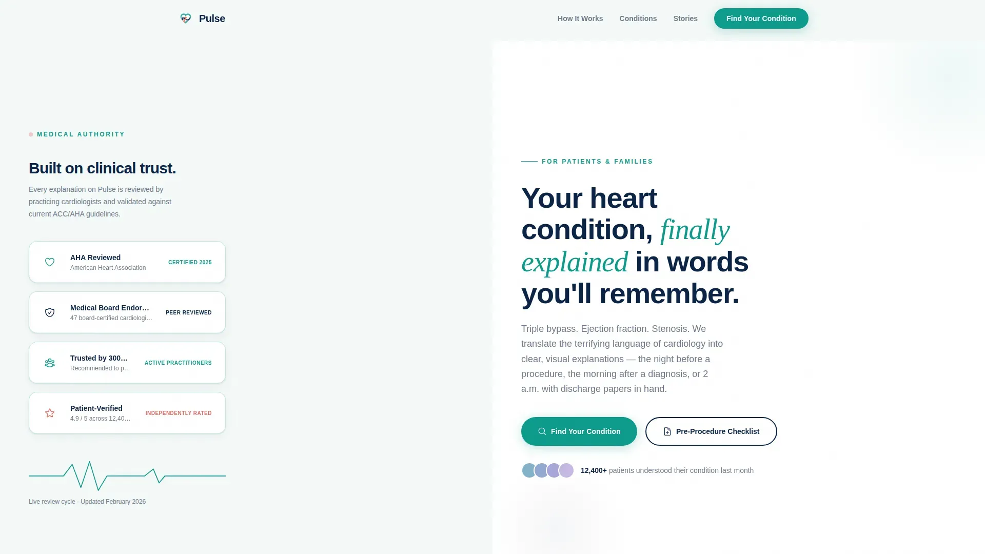
- A split-screen hero section with embossed trust badges on the left and an emotionally resonant headline on the right
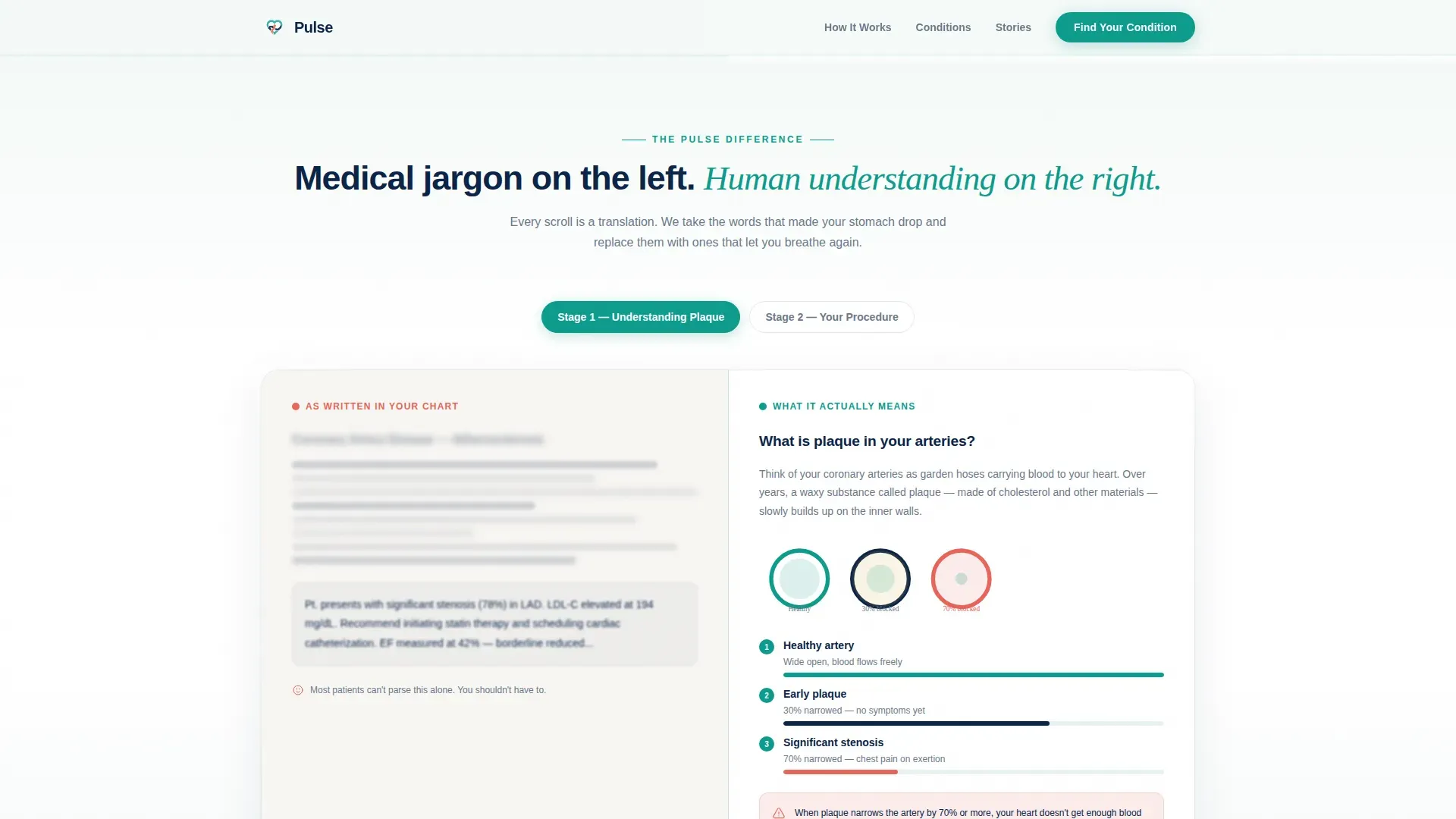
- A scrollable Problem-to-Solution arc that blurs a real medical report and then resolves it into plain visual language
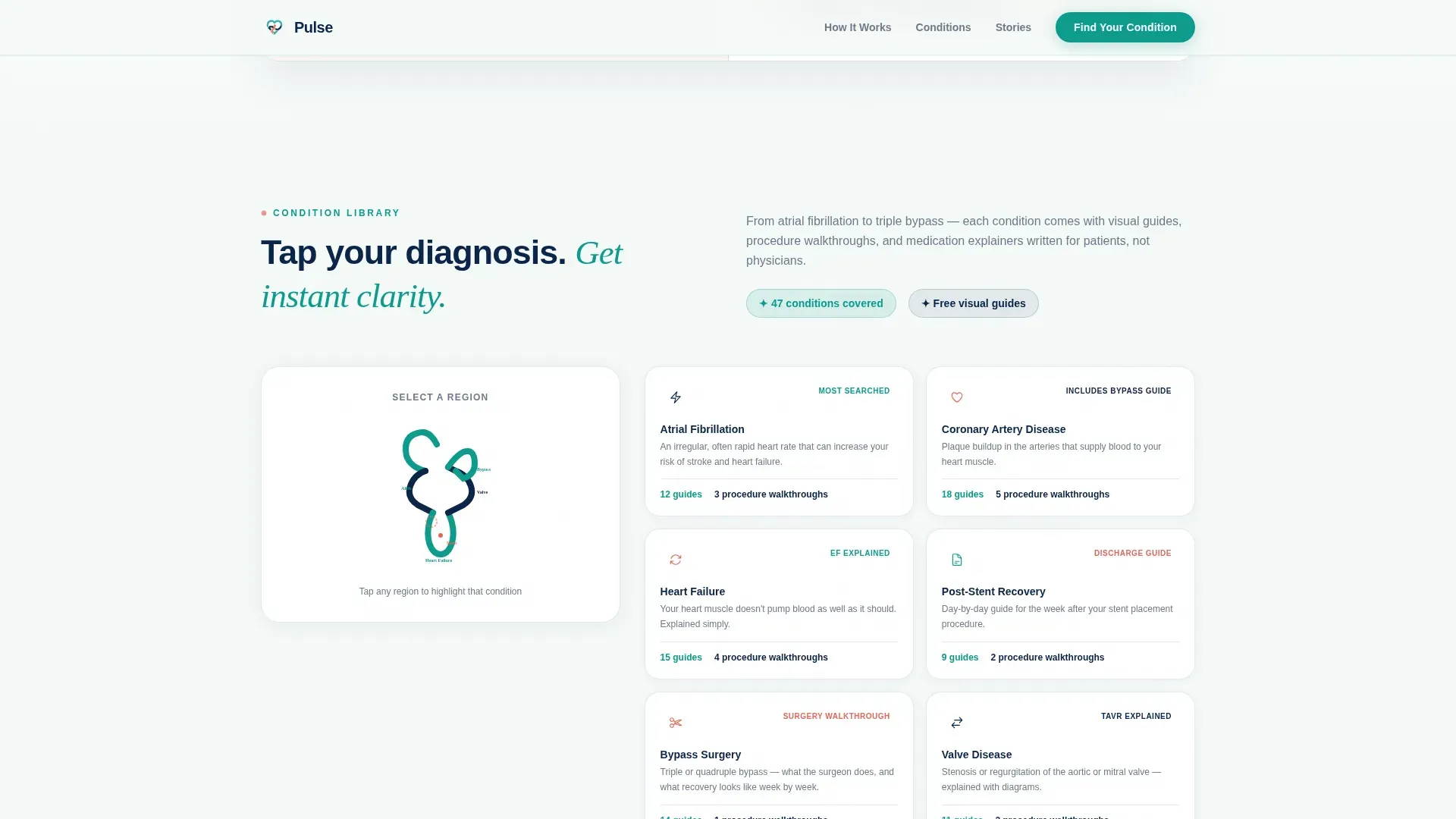
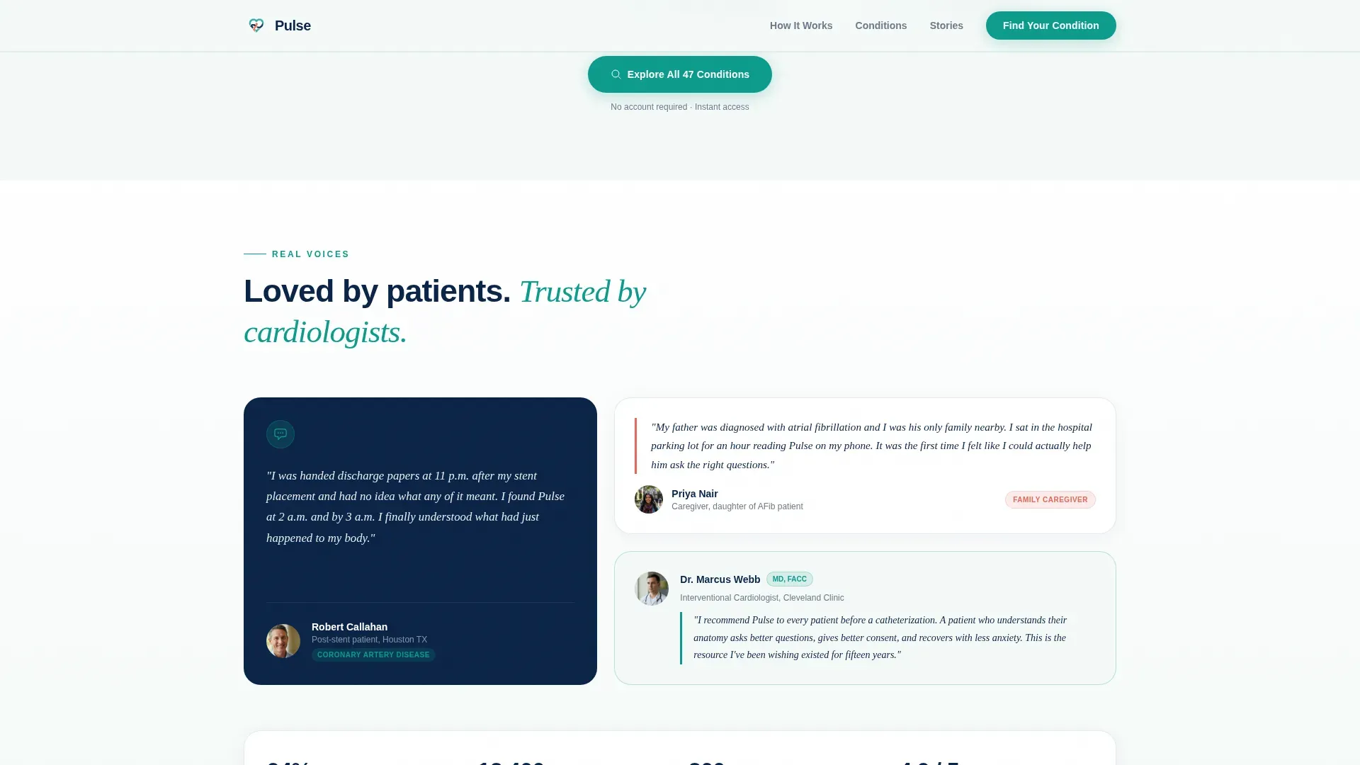
- An interactive heart diagram condition selector, accordion condition cards, a testimonial section, and a dual call-to-action section with an email capture form
Feature list
This template includes a focused set of built-in components tied directly to the patient education use case.
Split-Screen Trust Hero
The hero divides the screen evenly. The left side stacks trust signals, including an American Heart Association-reviewed badge, medical board endorsements, a "Trusted by 300+ cardiologists" seal, and a patient-rated verification mark. The right side leads with a single cardiac navy headline. No stock photography competes for attention.
Problem-to-Solution Scroll Arc
A GSAP ScrollTrigger-powered scroll sequence opens with a blurred, overwhelming medical report. As the visitor scrolls, that same information resolves into a clean, plain-language visual explanation. The left-to-right metaphor is consistent throughout every section of the page.
Interactive Heart Diagram Selector
Visitors tap or click a heart diagram to identify their diagnosis. This opens a curated library of visual guides, procedure walkthroughs, and medication explainers tailored to their specific condition. Hover states animate cleanly on desktop.
Accordion Condition Cards
The condition library uses accordion-style expandable cards. Each card holds a sample explanation for a specific cardiac condition. Visitors can scan titles and open only the cards relevant to their situation.
Pre-Procedure Checklist Download
A secondary conversion path collects an email address and procedure type in exchange for a downloadable pre-procedure checklist. The form is minimal and low-friction, designed to reduce hesitation from anxious visitors.
Testimonial and Endorsement Section
Named patient quotes sit alongside cardiologist endorsement statements. The combination of clinical authority and personal voice provides two layers of social proof in one section.
Page sections overview
| Section | Purpose |
|---|---|
| Hero split screen | Display trust badges and emotional headline |
| Problem-solution arc | Show jargon-to-clarity transformation visually |
| Condition library | Present heart diagram selector and sample cards |
| Testimonials section | Reinforce trust with cardiologist and patient voices |
| Call-to-action section | Drive condition finder sign-up and checklist download |
| Footer row | Provide linear single-row navigation and links |
Design & branding system
The visual identity follows a Medical Clarity theme. It combines clinical precision with human warmth, making the page feel trustworthy without feeling cold.
- Color palette uses Clinical Teal (#0D9B8C) for primary actions, Cardiac Navy (#0B2447) for headers and trust-weight text, Saline White (#F4F9F8) for open backgrounds, and Arterial Coral (#E8655A) sparingly for alerts and critical callouts
- Typography pairs Plus Jakarta Sans for body text and interface labels with Fraunces in serif italic for emotional headlines, creating a clear contrast between clinical clarity and human tone
- Badge treatments use embossed teal and navy with subtle metallic edges to feel institutional without becoming decorative
Mobile & speed optimization
The template is designed desktop-first around the 50/50 split-screen layout. On smaller screens, the split stack collapses into a clean vertical flow that preserves the page's emotional arc.
- Split-screen sections reflow into single-column stacks on mobile, keeping the jargon-to-clarity sequence intact
- Static sections use server components to reduce rendering load, while animations and interactive elements use client components to avoid blocking the initial view
- GSAP ScrollTrigger animations and blur-to-clear CSS transitions are scoped to client components so they do not delay static content delivery
How this template helps you convert
The page is structured to demonstrate value before it asks for anything. By the time a visitor reaches the first call to action, they have already experienced the platform's core promise three times.
- The split-screen hero immediately signals credibility through layered institutional badges, reducing the first instinct to leave for a more familiar source
- The Problem-to-Solution scroll arc shows the transformation in action, letting visitors feel the clarity of plain-language explanations before committing to sign up
- The dual call-to-action section offers two paths, "Find Your Condition" for deeper engagement and the checklist download for quick wins, lowering the barrier for visitors who are not yet ready for a full account
Other information about this template
This template is a strong fit for any team building within the cardiac health content space. A few additional points are worth noting for teams evaluating fit and build scope.
- The page uses a linear single-row footer pattern for a clean, minimal close that does not distract from the conversion sections above it
- The Arterial Coral accent color is intentionally restrained, appearing only for alerts, risk indicators, and critical callouts so it retains meaning when used
- The Fraunces serif italic typeface carries emotional weight in key headlines, while Plus Jakarta Sans keeps body copy clean and legible at small sizes
- The template is localized for English (United States) with standard date formatting and no currency display
- Animation intensity is high by design, with staggered badge reveals and split-screen parallax reinforcing the visual metaphor at every scroll step
Theme
Medical Clarity
Creative direction
Problem→Solution Arc
Color system
Teal Catalyst
Style
Split Screen (50/50)
Direction
Content/Resource
Page Sections
Split-screen Trust Hero with Badge Array
Problem-to-solution Scroll Arc
Interactive Heart Diagram Selector
Accordion Condition Card Library
Pre-procedure Checklist Download Form
Cardiologist and Patient Testimonial Section
Related questions
Who is the primary audience for this landing page template?
Does this template include the interactive heart diagram and condition cards?
What trust signals are built into the hero section?
Can this template be adapted for a general health and wellness platform?
How does the page earn trust before asking for a sign-up?



