New Patient Landing Page Template
A single-column landing page built for hand surgery practices to welcome and convert new patients. The page opens with an interactive Symptom Assessment Calculator, then guides visitors through condition explanations, procedure details, and a recovery milestone arc. Every section is designed to move a hesitant patient toward booking a hand evaluation with confidence.
by Rocket studio
Quick summary
This landing page template is purpose-built for hand surgery practices acquiring new patients. It opens with a personalized Symptom Assessment Calculator, walks visitors through their likely diagnosis in plain language, then details what the procedure involves and what recovery looks like week by week. The single-column flow ends at one clear action: booking a hand evaluation.
Who this template is for
This template is designed for hand surgeons and specialist practices running patient acquisition campaigns. It works especially well when the primary goal is converting first-time visitors into scheduled consultations.
- Hand surgeons looking to replace generic contact forms with a guided patient intake experience
- Specialist clinics targeting adults dealing with grip loss, nerve pain, or wrist dysfunction
- Practices wanting a scroll-driven landing page that carries symptom data directly into a booking system
What problem this template solves
Most medical landing pages lose patients because they lead with clinical terms and buried contact forms. A person searching at 2 a.m. with a numb hand needs to feel heard first and informed second.
- Visitors arrive anxious and unsure; the calculator meets them in their own language before naming their condition
- Patients abandon pages that ask them to re-enter their information; this template carries symptom data into the booking flow automatically
- Generic pages fail to bridge the gap between "something feels wrong" and "I am ready to book"; the Problem to Solution Arc does exactly that
What you get with this template
You get a fully structured, single-column landing page with high interactivity and a clear conversion path. Every section is sequenced to build trust and reduce friction.
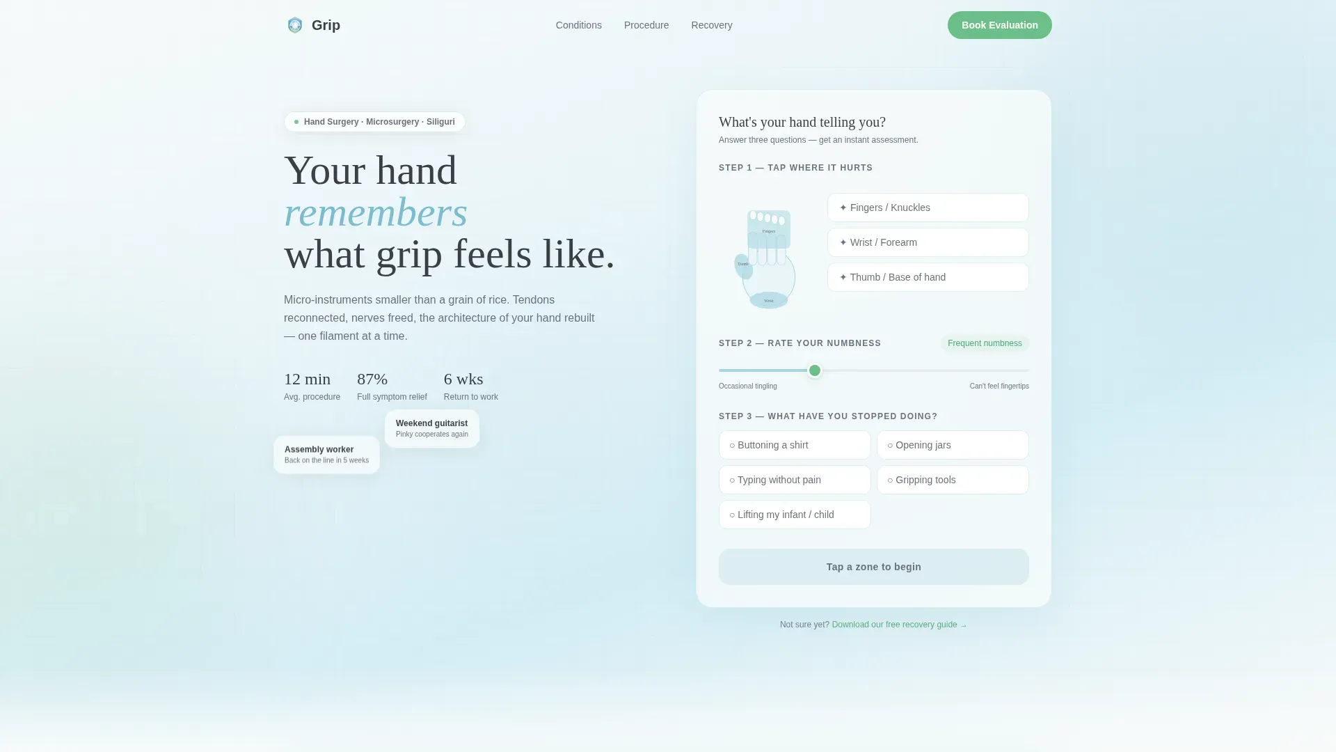
- An interactive Symptom Assessment Calculator with a sliding numbness scale, a three-zone hand illustration, and an instant personalized result summary
- A scroll-driven content arc that moves from condition diagnosis through procedure specifics and into a visual recovery timeline
- A dual conversion path: a primary click-through to the scheduling system and a secondary lead-capture option for visitors not yet ready to book
Feature list
A paragraph introducing the features: this template packs a precise set of functional components drawn directly from the brief. Each one serves the patient's decision journey at a specific moment in the scroll.
Interactive Symptom Assessment Calculator
The calculator sits inside a softly shadowed floating card at the top of the page. Visitors tap one of three hand zones, rate their numbness on a sliding scale, and select which daily tasks have become difficult. The result is a personalized condition summary generated instantly, with a confidence-building line about recovery timelines.
Problem to Solution Scroll Arc
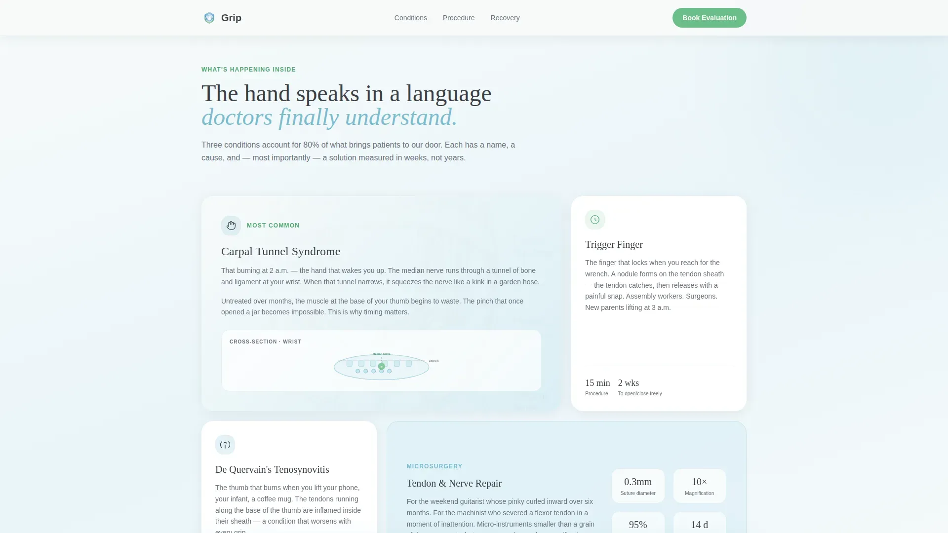
The page is structured so each scroll reveal raises the stakes and then resolves them. After the calculator result, the page names the likely condition using the visitor's own language. It then presents an anatomical cross-section illustration, explains what happens if left untreated, and walks through what the procedure actually involves.
Procedure Details Bento Card Layout
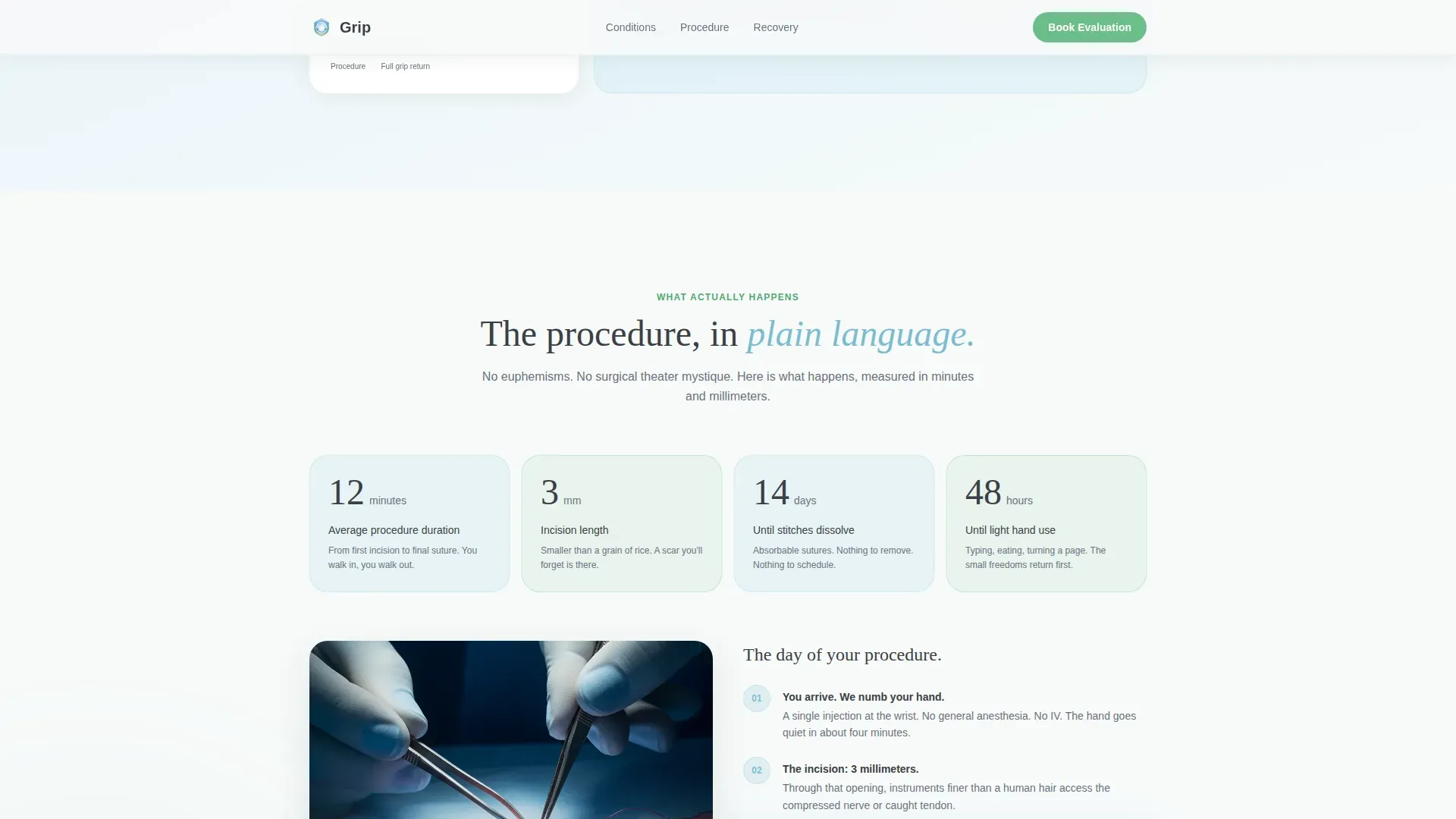
Key procedure information is displayed in a bento card grid: duration in minutes, incision size in millimeters, and days until stitches dissolve. This format lets visitors absorb critical facts at a glance without reading dense paragraphs.
Recovery Milestone Photo Progression
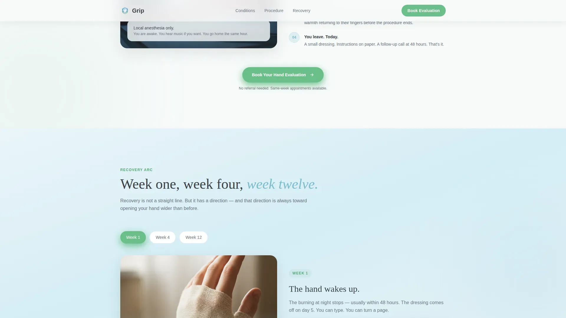
A visual timeline shows real recovery photos at week one, week four, and week twelve. This section grounds the abstract idea of "recovery" in concrete, recognizable progress and reassures patients about what the path ahead looks like.
Scroll-Linked Fixed Call to Action
The "Book Your Hand Evaluation" button appears first beneath the calculator result, then remains fixed at the bottom of the viewport during the entire scroll. This keeps the primary conversion action accessible at every point in the visitor's reading journey.
Secondary Lead Capture Path
Visitors who are not yet ready to book can choose a secondary option: downloading a recovery guide in exchange for their name and email. This captures undecided patients in a low-pressure way and keeps them connected to the practice.
Page sections overview
| Section | Purpose |
|---|---|
| Hero Calculator Card | Collect symptoms and deliver a personalized condition summary |
| Condition Explainer | Name the diagnosis in plain language with an anatomical illustration |
| Procedure Details Cards | Show duration, incision size, and recovery stats at a glance |
| Recovery Arc Timeline | Build confidence with week-by-week milestone photos |
| Patient Outcomes Mosaic | Show real patients gripping, writing, and living normally |
| Footer | Provide minimal navigation and secondary contact options |
Design & branding system
The visual identity blends clinical calm with the freshness of a high-altitude landscape. The result feels clean and reassuring without being cold or corporate.
- Color palette: snow-melt white (#F7FAFA) for backgrounds, glacier stream blue (#A8D5E2) for section gradients, alpine meadow green (#6BBF8A) reserved for interactive elements and progress indicators, and granite charcoal (#3B3F45) for body text
- Typography: Fraunces serif for headlines gives the page warmth and authority; DM Sans for body text keeps readability high and clinical tone in check
- Gradients shift from white to glacier blue behind sections, evoking fog lifting off a mountain lake, while green appears only as a living flash of color on buttons and progress bars
Mobile & speed optimization
The template is built mobile-first, which directly serves its target audience. Patients searching for hand surgery help at 2 a.m. are almost always on a phone, often with a hand that is difficult to use.
- Single-column flow keeps the layout clean and thumb-friendly on small screens with no horizontal scrolling required
- Static sections use server components while the calculator interactivity runs as a client component, keeping initial load lean
- The fixed call-to-action button is sized and positioned for easy one-thumb tapping on mobile viewports
How this template helps you convert
This template is built around a single conversion goal: getting a hesitant patient to book a hand evaluation. Every structural decision supports that goal.
- The calculator result creates a personalized moment early in the scroll, making the visitor feel understood before any ask is made, which lowers resistance to the booking click
- The symptom data collected in the calculator carries forward into the booking system automatically, so the visitor never has to repeat themselves, removing a common drop-off point
- The secondary download path captures visitors who are still weighing their options, giving the practice a second chance to convert them without letting them leave empty-handed
Other information about this template
This template is categorized under Health and Medical, specifically within the hand surgeon website niche. It is designed for patient acquisition in the United States market, with English-language copy and USD pricing context in mind.
- Template style: single-column flow with high animation and interactivity, including blob atmospherics, staggered scroll reveals, and rotating hand zone highlights
- Creative direction follows a Problem to Solution Arc, making it well suited for any specialist medical practice where patients arrive with a problem and need to be walked toward a confident decision
- The Soft Gradient theme using the Alpine Fresh color system can be adapted to other clinical specialties that benefit from a calm, nature-informed visual identity
- The footer follows a Superhuman minimal pattern, keeping the page exit clean and focused
Theme
Soft Gradient
Creative direction
Problem→Solution Arc
Color system
Alpine Fresh
Style
Single Column Flow
Direction
Click-Through
Page Sections
Interactive Symptom Assessment Calculator
Problem to Solution Scroll Arc
Procedure Details Bento Cards
Recovery Milestone Photo Timeline
Scroll-linked Fixed Call to Action
Secondary Lead Capture Path
Related questions
Does this template include a contact form?
Can the secondary lead-capture path be removed?
Is this template suitable for conditions beyond carpal tunnel?
What happens to the symptom data a visitor enters?
Who is the target audience for this landing page template?



