
AI prompts for BI dashboards let any team describe what they need in plain language and get a working, data-connected dashboard without SQL or drag-and-drop. This guide covers prompt types, templates by role, and how to avoid the mistakes that produce cluttered, unfocused output.
AI prompts for business intelligence dashboard design cut reporting time from hours to minutes, letting any team describe what they need in plain language and get a working, data-connected dashboard back without SQL or drag-and-drop configuration.
What Is an AI Prompt for a BI Dashboard?
An AI prompt for a BI dashboard is a natural-language instruction that tells an AI tool what data to show, how to filter it, and how to visualize it. Instead of configuring charts manually or writing SQL queries, you describe the insight you need in plain language and the platform generates the dashboard structure, data connections, and visualization logic from that description.
BI dashboards only work when they answer the right questions at the right time. The problem is that most teams spend hours configuring reports instead of thinking about what they actually need to know. AI prompts flip that model by letting you describe the insight you want and getting a working dashboard back in return.
This guide covers the prompt types, templates, and workflows that turn analytics from a bottleneck into a competitive advantage.
Who Benefits Most from AI Prompts for BI Dashboards?
Different roles use AI prompts for business intelligence dashboard work in different ways. Non-technical teams benefit most because natural language prompts remove the dependency on SQL or data modeling knowledge.
| Role | Primary Use Case | Best Prompt Type |
|---|---|---|
| Founder / CEO | Executive KPI snapshots, revenue health | Descriptive + Comparative |
| Product Manager | Feature adoption, funnel analysis | Diagnostic + Predictive |
| Marketing Leader | Attribution, CAC by channel, campaign ROI | Comparative + Prescriptive |
| Sales Leader | Pipeline velocity, quota attainment, deal risk | Predictive + Prescriptive |
| Operations Lead | SLA compliance, ticket resolution, cost per unit | Descriptive + Diagnostic |
| Data Analyst | Root-cause investigation, anomaly detection | Diagnostic + Predictive |
Rocket's Build pillar organizes prompt starters by role for exactly this reason. Marketing, finance, and operations teams can self-serve by describing their reporting needs in everyday language, reducing dependency on data analysts for routine requests.
Why Your BI Dashboard Needs Smarter Prompt Strategies for Business Context
Most analytics tools force users to think in the tool's language rather than their own. Prompt-driven BI reverses this by putting the business question first.
Pain points with traditional dashboard building:
-
Manual dashboard configuration wastes 5-10 hours per report when teams rely on drag-and-drop interfaces that require constant tweaking
-
Static templates miss context because they cannot adapt to shifting business priorities or seasonal patterns
-
Every new question requires a data analyst, creating a bottleneck for marketing, finance, and operations teams
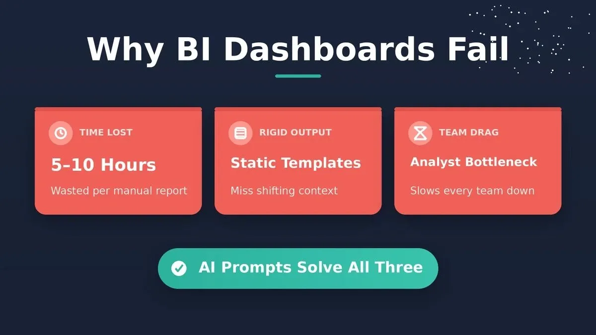
The three root causes that make traditional BI dashboards slow, rigid, and hard to maintain.
Benefits of prompt-driven analytics:
-
Natural language prompts reduce the barrier to entry, so any team member can self-serve without waiting for a data analyst
-
Prompt-based queries surface hidden correlations that rigid, pre-built reports would never reveal on their own
-
Real-time prompt iteration allows faster hypothesis testing compared to rebuilding charts from scratch each time priorities shift
According to Forbes Advisor, 72% of businesses have adopted AI for at least one business function, yet most analytics workflows still depend on manual query writing and static templates. The gap between collecting data and acting on it keeps growing wider every quarter. Gartner research projects that the majority of data and analytics work will be handled by non-technical users by the mid-2020s.
Teams that adopt prompt-driven analytics report faster turnaround on executive dashboards and fewer revision cycles. The shift from "build first, ask later" to "ask first, build automatically" is already underway across data-mature organizations.
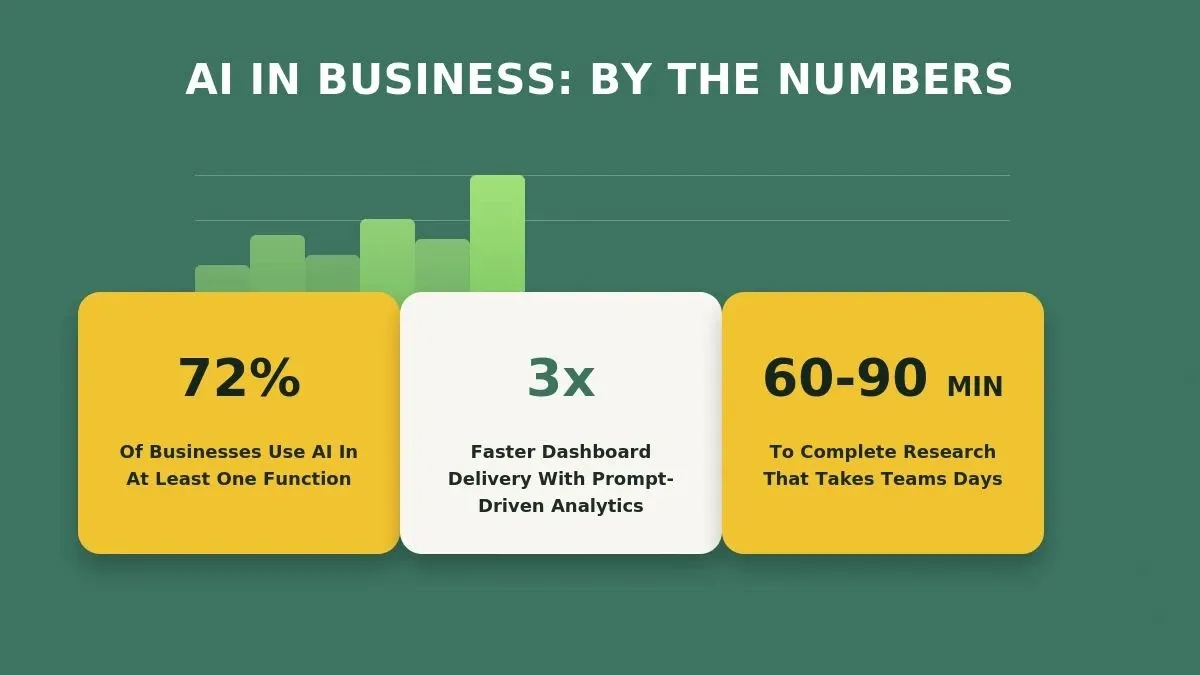
Key statistics on AI adoption and the time savings prompt-driven analytics delivers.
Which Types of Prompts Drive Better Dashboard Insights?
Prompt category determines output quality. Matching the right prompt type to the right business question is the single most impactful change most teams can make to their analytics workflow.
| Prompt Category | Purpose | Example |
|---|---|---|
| Descriptive | Summarize past performance | "Show monthly revenue trends for Q1-Q2 by region" |
| Diagnostic | Identify root causes | "Why did customer churn increase 15% in March?" |
| Predictive | Forecast future outcomes | "Project next quarter sales based on current pipeline velocity" |
| Prescriptive | Recommend actions | "Suggest budget reallocation to improve ROI across ad channels" |
| Comparative | Benchmark against targets | "Compare actual vs planned KPIs for the product team this sprint" |
-
Descriptive prompts work best for executive summaries where leaders need a quick snapshot without drilling into details
-
Diagnostic prompts save hours of root-cause analysis by letting the AI trace anomalies back to their source automatically
-
Predictive and prescriptive prompts turn dashboards into decision engines rather than passive displays of historical data
The strongest dashboards combine multiple prompt types into a single view. A sales dashboard might pair descriptive revenue charts with predictive pipeline forecasts and prescriptive territory recommendations. Understanding prompt engineering best practices is the fastest way to improve output quality across all five categories.
How Can You Write Effective Prompts for Dashboard Analytics Using Historical Data?
Good prompts follow a consistent structure that gives the AI enough context to act like your best analyst would. The five-step framework below applies to any dashboard type.
Five-step prompt structure for building effective AI-driven BI dashboards.
-
Start with the decision the dashboard should support, not the data you have available in your warehouse, and define 2-3 outcome KPIs tied to business results before drafting the prompt
-
Identify 4-6 driver KPIs that predict those outcomes so the AI can analyze leading indicators instead of only lagging results
-
Include explicit context like "for the North America team" or "excluding trial accounts" so the AI does not guess, and set targets for each KPI with a baseline and timeframe
-
Specify the format you want such as line chart, bar chart, table, or scorecard layout
-
Add conditional logic such as "highlight red if below target" to make dashboards self-alerting
-
Iterate in plain language by saying "now break this down by quarter" rather than rebuilding from zero
One metric can also serve as your north star metric when it best captures customer value and predicts long-term growth.
Prompt refinement is an iterative process. The first output rarely matches your vision perfectly, but each follow-up instruction narrows the gap. Prompts should also ask the AI to investigate why KPI values changed, not just report the change. Teams that treat prompts as living documents rather than one-time inputs build consistently better analytics over time. Explore how AI apps for operations teams apply this same iterative approach to workflow automation.
Before trusting the output, include data quality checks for nulls and inconsistencies in your prompting workflow to improve analysis accuracy.
Ready-to-Use Prompt Templates for Common BI Scenarios
These templates cover the most requested dashboard scenarios across industries. Copy and adapt them to your data sources and metrics.
Financial Performance:
-
"Calculate gross margin by product line for the last 6 months and investigate any sudden metric drop before flagging a line below 40%"
-
"Build a cash flow waterfall chart showing operating, investing, and financing activities"
Sales and Pipeline:
-
"Show deal velocity by stage with average days-in-stage for deals over $50K"
-
"Rank sales reps by quota attainment and overlay their activity metrics"
Marketing Attribution:
-
"Map customer journey touchpoints from first touch to closed-won, then segment customers by revenue, purchase frequency, and profitability to uncover channel trends"
-
"Compare cost per acquisition across paid channels with 30-day rolling averages"
-
"Check A/B test significance, confirm sample size assumptions, and summarize whether the result is reliable before interpreting experiment performance"
Operations and Support:
-
"Display ticket resolution time distribution with P50, P90, and P99 percentiles"
-
"Track SLA compliance rate by support tier and highlight breaches in real time"
Dresner Advisory Services' Wisdom of Crowds Business Intelligence Market Study consistently identifies executive dashboards and KPI reporting as the top use cases for BI initiatives. These prompt templates align with what high-performing organizations track most often.
The key is specificity. Vague prompts like "show me sales data" produce cluttered, unfocused dashboards. Adding timeframes, thresholds, comparison points, and grouping criteria dramatically improves output quality.
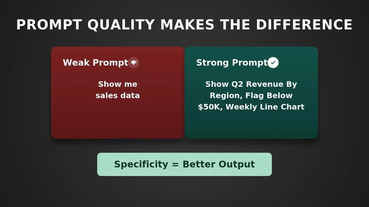
A specific, structured prompt consistently outperforms a vague one. The difference is context, not complexity.
For teams building internal analytics tools from scratch, the AI internal tool generator guide covers how to apply these same prompt patterns to full-stack tool generation.
Build Custom BI Dashboards with Rocket's Build Pillar
Rocket is a vibe solutioning platform with three pillars: Solve (research and structured reports), Build (production-grade web and mobile app generation), and Intelligence (continuous competitor monitoring). Dashboards are one of many things the Build pillar generates, alongside web apps, mobile apps, internal tools, and customer portals.
Here is what a team building a BI dashboard with Rocket's Build pillar actually gets:
-
Full-stack dashboard generation from a natural language prompt - frontend charts, backend API routes, and database queries generated together, not separately
-
Native connectors to Airtable, Notion, and Mixpanel (among 25+ integrations) so data flows in automatically without manual exports or ETL setup
-
Project-level shared context - if your team ran a Solve research task first, those findings carry into the Build task automatically, with no re-explaining the brief
-
One-click deployment to a live URL with staging and production environments, full version history, and one-click rollback
-
Code ownership and GitHub sync - the generated code is yours; export it, push it to a repo, and continue development outside Rocket at any time
That shared context can also help teams align on metric definitions or establish a unified glossary across departments before dashboard generation begins.
One honest limitation: Rocket's Build collaboration model uses role-based workspace access (Admin, Creator, Viewer) with shared project context and inline comments. It is designed for team handoffs and asynchronous review, not simultaneous real-time co-editing of the same component.
Teams that want to see the full range of what Rocket can generate should explore the AI app builder overview, which covers dashboards, SaaS tools, mobile apps, and more. For teams already running research before building, the Solve pillar turns any business question into a structured, evidence-backed report that feeds directly into the Build context.
Platform Comparison: Rocket Build vs. Power BI vs. Tableau
| Factor | Rocket Build | Microsoft Power BI | Tableau |
|---|---|---|---|
| Starting price | Free (20 credits); Pro from $25/mo | Power BI Pro: $10/user/mo | Creator: $75/user/mo |
| Technical skill required | Low - natural language prompts | Medium - DAX formulas, data modeling | High - calculated fields, data prep |
| Setup time to first dashboard | Minutes | Days to weeks | Days to weeks |
| Code ownership | Yes - export full source code | No - proprietary format | No - proprietary format |
| Custom deployment | Yes - one-click, custom domain | No - Microsoft ecosystem only | No - Tableau Server/Cloud only |
| Best for | Custom analytics apps, code ownership, no per-seat licensing | Enterprise Microsoft shops with Power Platform investment | Data teams needing advanced governed BI |
Rocket Build, Power BI, and Tableau serve different needs. The right choice depends on your team's technical depth and ownership requirements.
When Rocket Build is the right choice: You want a custom analytics application with live data connections, code you own, and no per-seat licensing. You are comfortable iterating through prompts rather than a drag-and-drop interface.
When Power BI or Tableau is the right choice: Your organization already runs on Microsoft 365 or has a dedicated data team with SQL and data modeling expertise. Governed enterprise BI with row-level security, certified datasets, and complex data blending is a core requirement.
For a deeper look at how Rocket stacks up against other AI-first platforms, the Rocket vs Lovable comparison covers the key differences in approach, output quality, and use case fit.
Mistakes That Weaken Your BI Dashboard Prompts
Even teams that adopt prompt-driven analytics make avoidable errors. Recognizing these patterns early saves hours of rework.
-
Being too vague with requests like "show me everything about customers" produces cluttered, unfocused output
-
Ignoring data freshness by not specifying whether you need real-time, daily, or weekly aggregations
-
Skipping the "so what" layer where prompts describe data but never ask for the insight or recommended action
-
Overloading a single dashboard with 15+ charts instead of creating focused views for specific audiences
-
Not including comparison context such as period-over-period changes, targets, or benchmarks that give numbers meaning
The fix is straightforward. Before writing any prompt, ask: "What decision will this dashboard help someone make?" If you cannot answer that clearly, the prompt needs more focus. Teams that pair clear business questions with structured prompts consistently ship better dashboards.
Teams building analytics apps for the first time often find it useful to start with a financial reporting dashboard as a reference point, since financial KPIs tend to have well-defined thresholds and comparison structures that translate directly into strong prompts.
Analytics That Start with the Right Question
The difference between a dashboard that gathers dust and one that drives decisions comes down to how you frame the question. Better prompts produce better analytics, and better analytics lead to better outcomes for every team that touches data.
The tools have caught up to the ambition. What used to require a data engineering team and months of development now takes a well-crafted prompt and the right platform to bring it to life.
Stop rebuilding dashboards from scratch every quarter. Rocket.new lets you describe your analytics application in plain language, connect your data sources, and ship a production-ready dashboard with code you own. The Free plan includes 20 credits to get started, with no credit card required.
Table of contents
- -What Is an AI Prompt for a BI Dashboard?
- -Who Benefits Most from AI Prompts for BI Dashboards?
- -Why Your BI Dashboard Needs Smarter Prompt Strategies for Business Context
- -Which Types of Prompts Drive Better Dashboard Insights?
- -How Can You Write Effective Prompts for Dashboard Analytics Using Historical Data?
- -Ready-to-Use Prompt Templates for Common BI Scenarios
- -Build Custom BI Dashboards with Rocket's Build Pillar
- -Platform Comparison: Rocket Build vs. Power BI vs. Tableau
- -Mistakes That Weaken Your BI Dashboard Prompts
- -Analytics That Start with the Right Question