shadcn/ui wins for code ownership, MUI for enterprise apps, and React Aria for full design control. Choosing is only half the work. Rocket.new generates the complete Next.js app so you can layer your preferred component library on top.
How much does a wrong component library choice actually cost? Most teams find out six months in, when migration means rewriting every form, modal, and data table from scratch. shadcn/ui crossed 125,000 GitHub stars in under two years, making it one of the fastest-growing React component libraries in history. That growth signals a shift: developers want code they own, not packages they depend on.
This guide walks through the React component libraries that matter in 2026, with a "best for" verdict, trade-offs, and a "skip if" for each one. The focus is on which ui component libraries work well with Next.js, the App Router, and server-side rendering.
Pick in 30 Seconds
| Situation | Best Pick | Why |
|---|---|---|
| Fast MVP, full code ownership | shadcn/ui + Radix | Copy-paste components, no package to upgrade, Tailwind CSS native |
| Enterprise app, Google material design | MUI | Most downloaded on npm, deep component set, strong docs |
| Accessible prototyping, clean API | Chakra UI | Built-in keyboard nav and ARIA, fast dark mode, composable style props |
| Data-heavy admin or internal dashboard | Ant Design | Richest data table and form set, built-in i18n |
| Full-featured app with utility hooks | Mantine | 100+ components plus form validation, notifications, and dark mode out of the box |
| Custom brand, maximum design control | React Aria or Headless UI | Unstyled, WAI-ARIA compliant, you own every pixel |
What Should You Evaluate Before Picking a Component Library?
Not every React component library fits every project. Before comparing features, you need a framework for the decision itself.
-
Customizability and theming system: Can you override default styles without fighting the library? Does it support your own design system with CSS variables, design tokens, and flexible theming?
-
Accessibility and keyboard navigation: Does the library follow WCAG accessibility standards? ARIA attributes and accessible interfaces built in, or bolted on?
-
Bundle size: A component library with a large bundle size slows initial page loads. Check the cost per component on Bundlephobia before committing.
-
TypeScript support: Strong TypeScript support means fewer runtime errors and better developer experience across your codebase.
-
Next.js and SSR compatibility: Does it work with the App Router, React Server Components, and server-side rendering without workarounds? This is a dealbreaker for modern web applications.
-
Active maintenance and community support: An active community means faster bug fixes, more resources, and lower long-term risk.
-
Design system fit: Will this match your brand's visual design, or will you spend months customizing components to match your own design system?
When you are choosing the right tech stack for a web application, the ui component library is often the single choice that affects every screen.
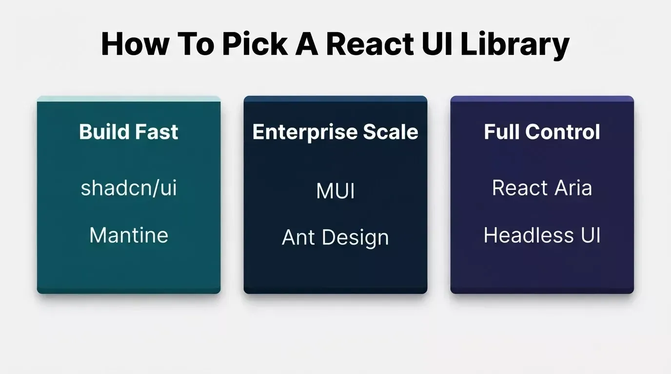
Three decision paths for choosing a react ui library based on your project type and team needs.
Which React Component Libraries Work Best with Next.js and SSR?
Server-side rendering and the Next.js App Router have changed what "compatible" means for react ui component libraries. Some libraries work out of the box with React Server Components, while others require "use client" wrappers on nearly every import, adding client-boundary sprawl that defeats the purpose of SSR.
Here is how the top React component libraries compare for Next.js projects in 2026.
shadcn/ui + Radix: Code Ownership and Heavy Customization
shadcn/ui is the best react ui library for teams that want full control over component code, Tailwind CSS styling, and no external package dependency on npm.
shadcn/ui is not a traditional component library. It is a collection of copy-and-paste React components built on Radix UI primitives. You run a CLI command, and the component code lands directly in your project with no package dependency and no version conflicts.
-
Strengths: Full code ownership, Radix primitives handle accessibility, Tailwind CSS styling by default, strong TypeScript support, works natively with Next.js App Router and React Server Components without "use client" wrappers
-
Trade-offs: You manage updates yourself since there is no package to bump. Note: shadcn/ui relies on Radix UI (or Base UI), Tailwind, and other packages. "No dependency" means no single UI package version to track, not zero dependencies.
-
Skip if: Your team wants a polished design system that works out of the box without touching CSS. shadcn/ui requires more initial setup time for the theming system.
1npx shadcn@latest init
2npx shadcn@latest add button dialog table
shadcn/ui now has over 125,000 GitHub stars and 11,800 forks, with an active community contributing new components and accessible UI components regularly.
Is MUI Still a Top Choice for Enterprise Teams?
MUI is the best react ui library for enterprise applications that need Google's Material Design, advanced components like the data grid, and long-term stability.
MUI (formerly Material UI) implements Google's Material Design specification and is the most downloaded React component library on npm. It ships with a massive collection of production-ready components including data grid, date pickers, autocomplete, and complex forms.
-
Strengths: Comprehensive set of enterprise-grade React components, a built-in theming system for Material Design, strong TypeScript support, excellent documentation, large and active community
-
Trade-offs: Large bundle size compared to lightweight alternatives. Most MUI components require "use client" in the App Router, so plan for client boundaries throughout your app.
-
Skip if: You need a lean bundle for a content site or landing page. MUI ships a lot of code even with tree shaking.
1'use client';
2import Button from '@mui/material/Button';
3
4export default function App() {
5 return <Button variant="contained">Submit</Button>;
6}
Where Does Chakra UI Fit in a Modern Stack?
Chakra UI is the best react ui library for teams that prioritize developer experience, accessible ui components, and fast prototyping with a clean API.
Chakra UI provides a strong set of React components with built-in accessibility, a flexible theming system, and composable style props that make rapid prototyping straightforward. Every Chakra UI component ships with keyboard navigation and aria attributes by default.
-
Strengths: Excellent developer experience, accessible components out of the box, easy dark mode toggling, style props let you customize inline without writing separate CSS
-
Trade-offs: Chakra UI v3 introduced significant API changes from v2. The community is smaller than MUI's. Interactive components require "use client" in the App Router.
-
Skip if: You need data-heavy components like sortable tables, rich text editors, or charts. Chakra UI focuses on foundational ui elements and form elements.
1'use client';
2import { Box, Stack, Text } from '@chakra-ui/react';
3
4export default function Card() {
5 return (
6 <Box p={4} borderWidth="1px" rounded="lg">
7 <Stack gap={2}>
8 <Text fontWeight="bold">Dashboard</Text>
9 </Stack>
10 </Box>
11 );
12}
When Should You Pick Ant Design?
Ant Design is the best react ui library for data-heavy admin apps, internal dashboards, and enterprise applications with internationalization support.
Ant Design is a React component library built specifically for enterprise applications. It ships with complex data tables, form components, tree views, date pickers, and notification systems. If you are building admin panels with AI, Ant Design gives you the richest set of data-oriented ui components.
-
Strengths: Massive collection of advanced components, built-in internationalization support for multiple regions, strong community support especially in Asia, well-documented with examples. Ant Design v5 uses CSS-in-JS for styling.
-
Trade-offs: Ant Design ships a large bundle size. The default styles look distinctly "Ant," and overriding them takes CSS effort. Components require "use client" in the App Router.
-
Skip if: Your project is consumer-facing and needs a unique, brand-forward visual design. Ant Design works best for internal tools where function matters more than brand identity.
1'use client';
2import { Table } from 'antd';
3
4const columns = [
5 { title: 'Name', dataIndex: 'name', sorter: true },
6 { title: 'Role', dataIndex: 'role' },
7];
8
9export default function Users({ data }) {
10 return <Table columns={columns} dataSource={data} pagination={{ pageSize: 10 }} />;
11}
What Makes Mantine Stand Out?
Mantine is the best react ui library for projects that need rich, production-ready components along with utility hooks for form validation, notifications, and more.
Mantine offers one of the largest sets of React components plus a hooks library that handles form validation, local storage, debounce, clipboard, and other common patterns. The library includes a rich text editor, date pickers, a notification system, and customizable components for responsive layouts.
-
Strengths: Over 100 customizable components, React hooks library, built-in form validation, dark mode by default, strong TypeScript support, active maintenance. Uses CSS Modules with no runtime CSS-in-JS cost.
-
Trade-offs: Mantine is less known than MUI or shadcn/ui. Interactive components require "use client" in the App Router, similar to other styled libraries.
-
Skip if: You prefer headless, unstyled components and want to write all the styling from scratch. Mantine ships with default styles and default themes.
1'use client';
2import { useForm } from '@mantine/form';
3
4export default function EmailForm() {
5 const form = useForm({
6 initialValues: { email: '' },
7 validate: { email: (v) => (/^\S+@\S+$/.test(v) ? null : 'Invalid email') },
8 });
9 return <form onSubmit={form.onSubmit(console.log)}>{/* fields */}</form>;
10}
Are Headless Libraries the Smarter Pick for Custom Design?
React Aria and Headless UI are the best react ui libraries for teams with designers who need maximum design control and want accessible, unstyled React components as building blocks.
React Aria (from Adobe) and Headless UI (from the Tailwind team) provide unstyled components with full accessibility baked in. React Aria handles keyboard navigation, focus management, screen readers, and WAI-ARIA compliance. Because they are unstyled, they work natively with React Server Components where needed.
-
Strengths: React Aria is the most thorough accessibility implementation available for accessible interfaces. Headless UI is a lightweight library that pairs naturally with Tailwind CSS. Both give you full control over markup and styles with no external dependencies on design opinions.
-
Trade-offs: You build every visual layer from scratch. No default themes, no default styles. Development takes longer upfront and requires more custom design systems planning.
-
Skip if: You need to ship fast and do not have a dedicated design team. Unstyled React components and headless primitives mean more design work on your side for every screen.
1import { useButton } from 'react-aria';
2import { useRef } from 'react';
3
4function MyButton(props) {
5 const ref = useRef(null);
6 const { buttonProps } = useButton(props, ref);
7 return <button {...buttonProps} ref={ref}>{props.children}</button>;
8}
How Do These Libraries Compare Side by Side?
This table summarizes the key differences across styling approach, bundle size, accessibility, TypeScript, and Next.js App Router compatibility for the most popular react ui component libraries.
| Library | Styling | Bundle | Accessibility | TypeScript | App Router | use client? |
|---|---|---|---|---|---|---|
| shadcn/ui + Radix | Tailwind CSS | Minimal | Radix (good) | First-class | Native RSC | No |
| MUI | CSS-in-JS | Large ~80 KB+ | WCAG compliant | First-class | Client wrappers | Yes |
| Chakra UI | Style props | Medium ~40 KB | Built-in | First-class | Improved v3 | Yes |
| Ant Design | CSS-in-JS v5 | Large ~60 KB+ | Partial | First-class | Needs config | Yes |
| Mantine | CSS Modules | Medium ~35 KB | Good | First-class | Native | Yes |
| React Aria | Unstyled | Minimal | WAI-ARIA best | First-class | Native RSC | No |
| Headless UI | Unstyled + Tailwind | ~10 KB | Good ARIA | Supported | Native RSC | No |
Bundle sizes are approximate as of September 2026. Check Bundlephobia for current figures.
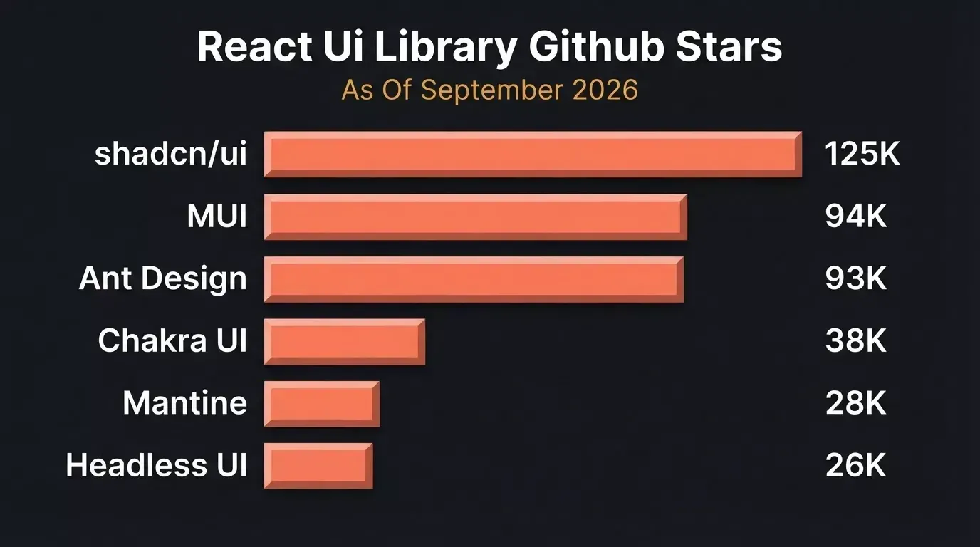
React UI library popularity by GitHub stars as of September 2026.
Which Library Matches Your Project Goals?
Different project goals call for different React component libraries. Here is a quick decision framework based on what you are building.
-
Fast MVP with customizable components: Start with shadcn/ui. Copy in only the React components you need, style with Tailwind CSS, and ship without vendor lock-in.
-
Custom brand system from the ground up: Go headless with React Aria or Headless UI. You control every pixel, and the accessibility layer is already handled.
-
Internal dashboard or admin panel: Pick Ant Design for data tables, form components, and internationalization. For enterprise applications with Material Design requirements, MUI is the safer bet.
-
Full-featured app with hooks: Mantine provides the richest all-in-one package with React hooks, form validation, and dark mode out of the box.
When you are shipping an MVP fast, the component library choice is only step one. The real-time cost comes next.
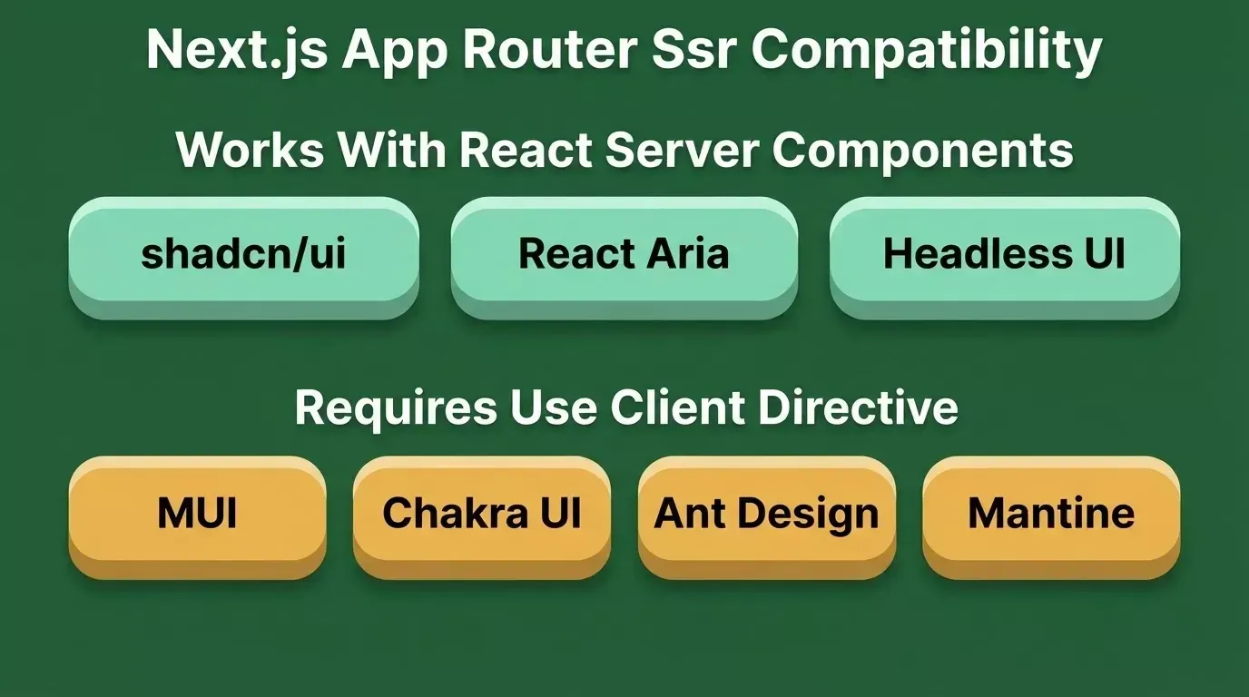
Next.js App Router compatibility: libraries that work natively with React Server Components vs those that require client boundaries.
The Hidden Cost That Comes After Choosing a Library
Picking a React component library takes a few hours. Building a consistent, responsive, accessible application with it takes weeks. Most teams underestimate the assembly work that follows.
The components themselves are building blocks. Assembling those blocks into real layouts, navigation, responsive grid systems, state management, consistent theming across dozens of screens, and accessible form flows is where the real development time goes.
You still need routing, page transitions, data fetching patterns, and a deployment pipeline. The component library handles buttons and modals, but it does not handle your app.
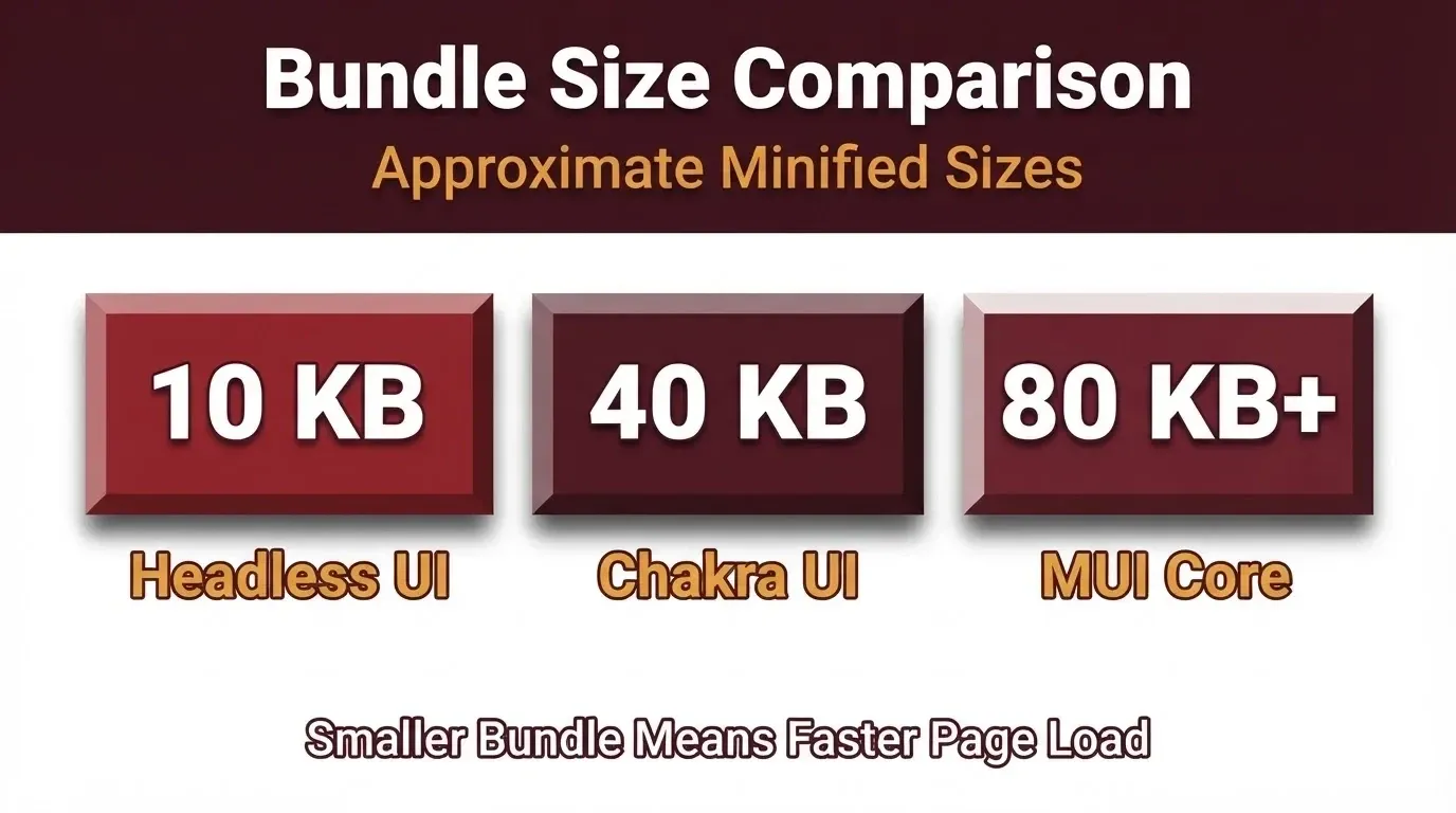
Smaller bundle size means faster initial page load. Headless UI ships roughly 8x less JavaScript than MUI core.
Why Rocket.new Skips the Assembly Step Entirely
What if you did not have to assemble any of it?
Rocket.new generates a complete Next.js application with ui components, routes, and logic already wired together. You describe what you want in plain language, and Rocket.new produces a working, deployable app, not a template, not a wireframe. Generation typically takes a few minutes.
Four ways to start a build:
-
From an idea: describe your app in plain language and Rocket.new generates the UI, routes, and logic
-
From an attachment: upload PDFs, spreadsheets, CSVs, or screenshots, and Rocket.new turns your content into a working app
-
From a template: browse and remix production-ready templates at zero credit cost
-
From GitHub: connect an existing Next.js TypeScript repository and keep iterating with AI chat edits that sync back to your codebase
-
Redesign: paste any website URL and choose one of eight redesign commands (visual refresh, insight-driven, or brand-matched) to rebuild the page with a fresh layout or theme. Available when starting a new Build task from the homepage.
Once your app is generated:
-
The theme panel handles fonts, colors, logos, and imagery site-wide. Change your brand palette once, and every screen updates with a consistent design system.
-
Visual edit lets you click any element and adjust text, style, spacing, or layout directly without manual code required.
-
Code view gives you full access to the generated Next.js and TypeScript source files. You can browse, edit, and download the full project as a .zip (Pro plan or above, web browser only).
-
GitHub sync: on a paid plan, Rocket.new pushes changes to a rocket-update branch and automatically opens a pull request to main for Next.js TypeScript projects. Pull the latest main back into Rocket.new at any time.
A team hand-assembling a dashboard needs to wire up a component library, configure routing, set up form validation, style responsive layouts, connect data fetching, and configure deployment. That takes days to weeks. Rocket.new generates that same dashboard, styled, functional, and responsive, in a few minutes. Then you can layer your preferred react component library on top through code view, or keep what Rocket.new built.
One note: Rocket.new generates Next.js with its own design system. If you need specific ui components from a library like shadcn/ui or MUI, the smoothest path is to start from the generated base, then add the library through code view or chat.
If you want to validate your app idea before choosing a stack, Rocket.new's Solve feature lets you run market and competitive research before writing a single line of code.
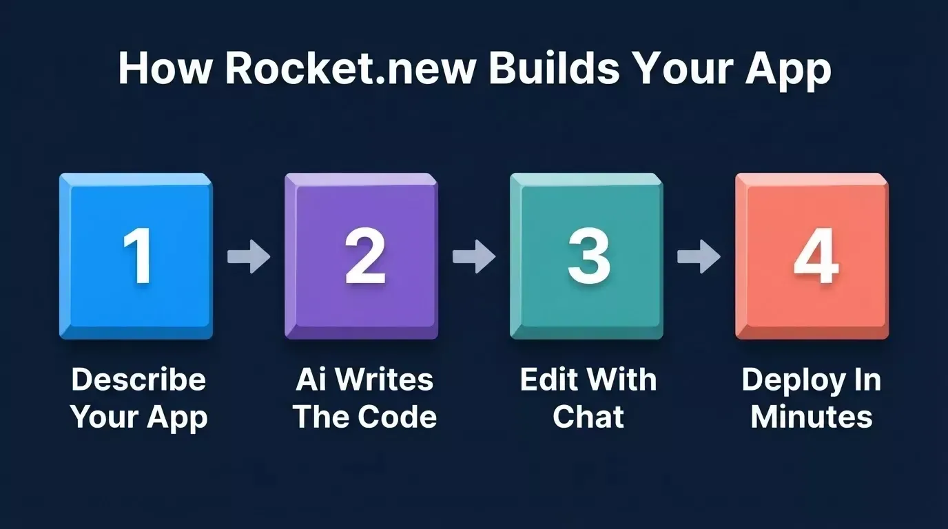
From idea to deployed Next.js app in four steps with Rocket.new Build.
Your Stack Decision Starts Before the First Import
The right React component library depends on your project type, your team's skill set, and how much design control you need. shadcn/ui, MUI, Chakra UI, Ant Design, Mantine, and headless options like React Aria all solve different problems. Match the library to the project, not the other way around.
What most developers miss is that choosing a react ui library is the starting line, not the finish. The assembly work that follows, layouts, theming, state, consistency, is the real bottleneck.
Tools like Rocket.new skip that step by generating the full application, giving you a production-ready base to build on. Start with a generated Next.js base in Rocket.new, then refine it with the component library of your choice. Try Rocket.new free today and ship your next project in a fraction of the time.
Table of contents
- -Pick in 30 Seconds
- -What Should You Evaluate Before Picking a Component Library?
- -Which React Component Libraries Work Best with Next.js and SSR?
- -shadcn/ui + Radix: Code Ownership and Heavy Customization
- -Is MUI Still a Top Choice for Enterprise Teams?
- -Where Does Chakra UI Fit in a Modern Stack?
- -When Should You Pick Ant Design?
- -What Makes Mantine Stand Out?
- -Are Headless Libraries the Smarter Pick for Custom Design?
- -How Do These Libraries Compare Side by Side?
- -Which Library Matches Your Project Goals?
- -The Hidden Cost That Comes After Choosing a Library
- -Why Rocket.new Skips the Assembly Step Entirely
- -Your Stack Decision Starts Before the First Import