
The best AI prompts for settings pages specify layout type, form controls, style direction, and target user. Copy any of the 10 prompts below into Rocket and ship a polished settings page in one session without writing code.
The best AI prompts for settings pages specify layout type, form controls, style direction, and target user. Copy any of the 10 prompts below directly into Rocket and ship a polished settings page in one session.
Why Do Settings Pages Need Structured Prompts?
A settings page prompt is a natural-language instruction that tells an AI builder exactly how to structure a configuration screen: which navigation pattern to use, which form controls to include, and how to group user preferences. Without that structure, AI defaults to a generic flat list with no hierarchy.
Settings pages carry a lot of functional weight for a small amount of screen space. They bundle forms, navigation, toggles, and user preferences into one place.
-
Users expect clear information architecture. A settings page with random grouping and inconsistent buttons feels broken, even when it works
-
Sidebar navigation needs logical categories. Account, notifications, display, security, and billing need obvious visual separation
-
Form elements multiply quickly. Toggle switches, dropdown selectors, radio groups, and text fields all compete for attention on the same screens
-
Visual hierarchy determines usability. Without structured spacing, font weights, and grouping, users scroll aimlessly through features they cannot parse
-
AI defaults to generic layouts. When you give a vague prompt, the output is a flat list of elements with no personality or brand alignment
The fix is not better AI models. The fix is better input. AI website generators perform well when they receive specific design instructions about structure, style, and interaction patterns.
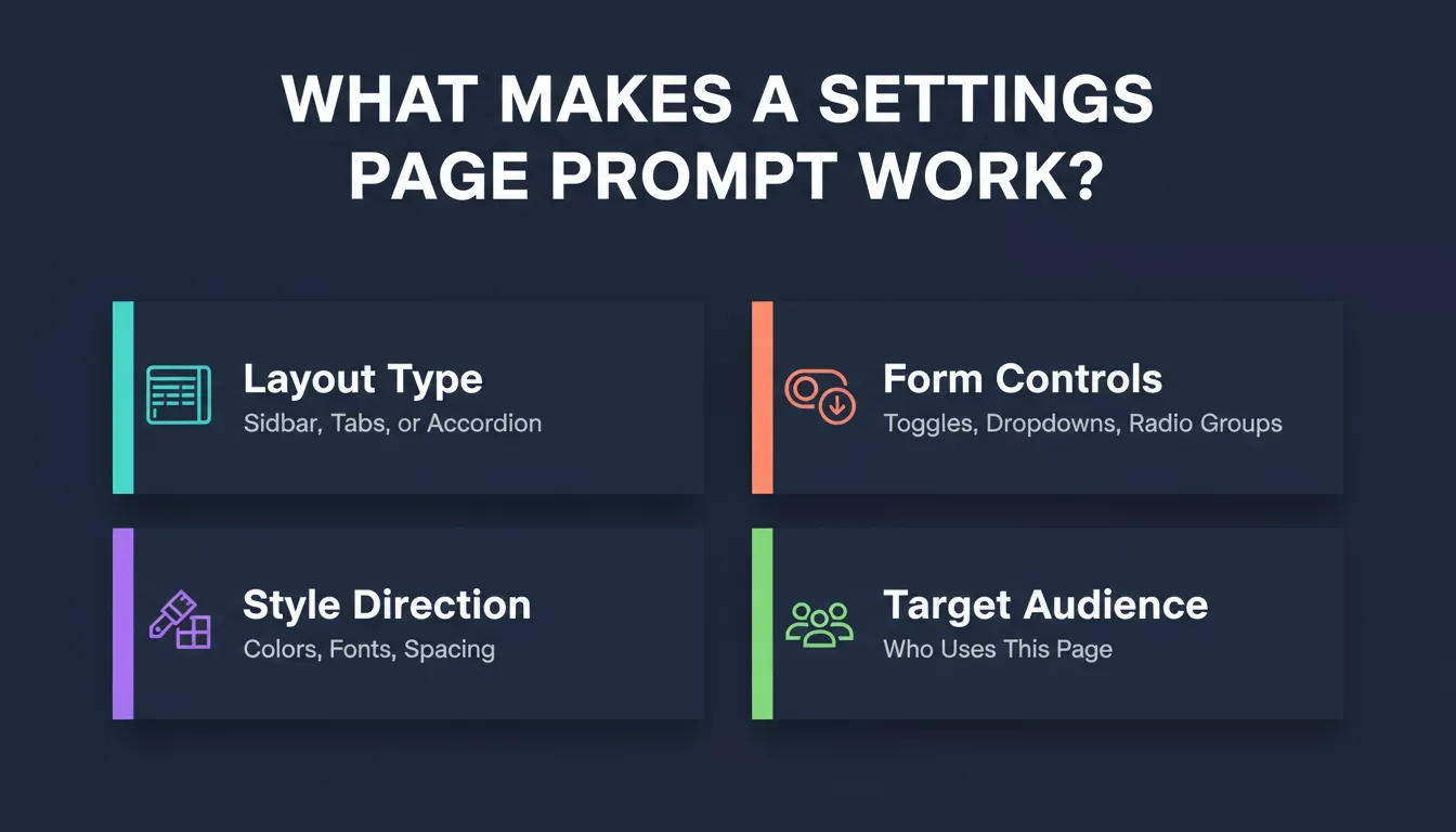
Four elements that separate a polished settings page prompt from a vague one.
How Should You Write an Effective Prompt?
An effective settings page prompt combines four elements: a layout instruction (sidebar or tabs), a list of specific form controls (toggles, dropdowns, radio groups), a style direction (colors, typography, spacing), and a target audience description. Together, these give the AI enough context to produce a usable first draft.
The difference between a good prompt and a vague one is specificity. Effective prompts tell the AI what to build, how it should look, who it serves, and what constraints to follow.
| Element | Vague Prompt | Structured Prompt |
|---|---|---|
| Layout | Make a settings page | Create a two-column layout with sidebar navigation on the left and content panels on the right |
| Style | Modern design | Minimal style with a cream background, one accent color in indigo, and a serif font for headings |
| Components | Add some toggles | Include toggle switches for notifications, dark mode, and auto-save with status badges showing the on/off state |
| Context | (none) | The target audience is SaaS product managers who configure team-level permissions |
The structured version gives AI enough context to generate a usable first draft. Joe Smiley, Design Director at Microsoft, wrote in a January 2026 UX Collective piece on 2026 design trends: "Until these LLMs improve the experience to help users create better outputs, in the short term it's up to us designers to help optimize prompts with good design."
The prompt structure that works best follows a simple framework:
-
Role and tone tell the AI what kind of designer to act as
-
Specific instructions define layout, components, and interactions
-
Constraints limit colors, fonts, and spacing to your brand
-
Output quality improves when you state the target audience and use case
You can refine based on what comes back. The goal is a strong first output, not a perfect one. Check out this prompt engineering best-practices guide for additional frameworks that deliver better results across every design workflow.
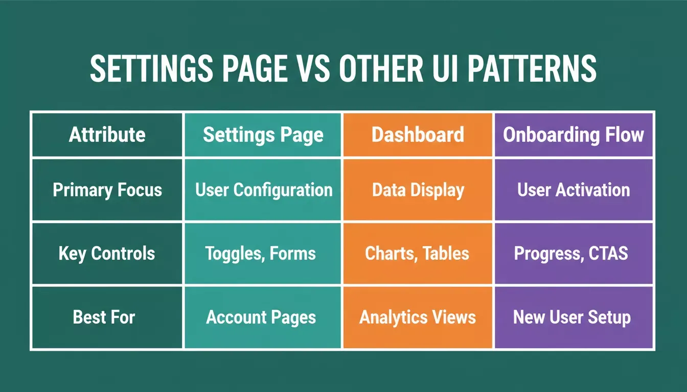
Settings page prompts vs. adjacent UI patterns:
| Prompt Type | Primary Focus | Key Controls | Best For |
|---|---|---|---|
| Settings Page | User configuration and preferences | Toggles, dropdowns, radio groups, form fields | SaaS account pages, mobile app preferences, admin panels |
| Dashboard | Data display and quick actions | Charts, KPI cards, data tables, filters | Analytics views, ops tools, and reporting screens |
| Onboarding Flow | Step-by-step user activation | Progress bars, single-question forms, CTAs | New user setup, profile completion, feature walkthroughs |
For dashboard prompts, see the best AI prompts for SaaS dashboards guide. For onboarding screens, see the best AI prompts for onboarding screens guide.
What Are the Top Prompts for Sidebar Navigation and Layout?
A sidebar navigation prompt tells the AI how many settings categories to show, how the active state should look, and how the content panel should render next to it. Below are three variations for different product types.
Prompt 1: Clean Sidebar with Category Icons
What it does: Generates a classic left-sidebar settings layout with icon-labeled categories and a content panel that updates on selection.
"Design a settings page with a vertical sidebar navigation on the left side. The sidebar should include five categories: Profile, Notifications, Display, Security, and Billing. Each category gets a minimal line icon and label in a sans-serif font. Use a white background with subtle shadows between sections. The selected state uses an indigo accent color fill behind the label. Content area on the right shows the active section with clear headings, form fields, and a primary CTA button at the bottom."
How it's used: Best for SaaS dashboards where users manage account-level preferences across several categories at once. The sidebar keeps navigation visible while the content panel does the work.
Prompt 2: Tabbed Layout with Hero Section Header
What it does: Produces a profile-first settings page with a hero header and horizontal tabs instead of a sidebar.
"Create a settings page that opens with a hero section showing the user's profile photo, name, and email. Below the hero, add a horizontal tab bar with five tabs: General, Appearance, Integrations, Team, and Plan. The active tab uses a bold underline in orange. Each tab panel uses cards with rounded corners on a light cream background. Typography uses a serif font for section titles and a clean sans-serif for body text and form labels."
How it's used: Suits products where the user's identity should feel front-and-center before they configure anything. Profile-driven apps, community platforms, and personal account pages benefit most from this layout.
Prompt 3: Collapsible Sections with Progress Indicators
What it does: Builds a single-column, accordion-based settings flow with a completion progress bar.
"Build a single-column settings page with collapsible accordion sections. Include sections for Account Details, Notification Preferences, Privacy Controls, Connected Apps, and Data Export. Add a progress bar at the top showing setup completion percentage. Use clean lines, generous padding, and one accent color throughout. Each section includes a brief explanation paragraph, relevant form controls, and a save button."
How it's used: Fits onboarding flows where users complete their profile step by step. The progress bar creates momentum, and the accordion keeps a long form scannable.
Generate your sidebar navigation and layout
Which Prompts Generate Toggle Groups and Form Controls?
A toggle group prompt specifies how many switches to show, how to label and describe each one, how to group them by category, and what visual state (active/off) should look like. These details are what separate a polished notification panel from a generic list of checkboxes.
Settings pages live and die by their form controls. These prompts produce specific UI components that handle user preferences with clarity. For a deeper look at building full-stack apps with these components, see the guide on building a full-stack app with an AI prompt.
Prompt 4: Toggle Switch Group with Descriptions
What it does: Generates a card-based notification panel with labeled, described toggle switches and status badges.
"Generate a notification settings panel with eight toggle switches arranged in a card-based layout. Each toggle sits on its own row with a label on the left, a short description below the label, and the switch on the right side. Group toggles under two headings: Email Notifications and Push Notifications. Use status badges next to each toggle showing 'Active' or 'Off' in small colored pills. Include a dark mode compatible color palette with proper contrast."
How it's used: Ideal when users need to understand why a toggle matters, not just flip it. The inline description reduces support tickets from accidental changes.
Prompt 5: Multi-Section Form with Validation States
What it does: Produces a three-section account form (personal, company, preferences) with inline validation and mixed input types.
"Create a settings form with three sections: Personal Info, Company Details, and Preferences. Each section lives inside a bordered card with a section title. Personal Info includes text inputs for name, email, and phone with inline validation states. Company Details adds a logo upload area, company name field, and a size selector dropdown. Preferences uses radio buttons for language, a dropdown for timezone, and a toggle for marketing emails. Add a primary CTA button fixed at the bottom."
How it's used: Fits B2B account setup where personal, company, and preference data all need to be captured in one settings pass without overwhelming the user.
Prompt 6: Dark Mode Settings Panel
What it does: Builds a dark-mode appearance panel with a theme toggle, font slider, accent color picker, and density selector.
"Design a dark mode settings page with a sidebar listing: General, Appearance, Accessibility, Data, and Support. The active page is Appearance. Show controls for: theme toggle (light/dark/system), font size slider with live preview, accent color picker with six preset options, and a density selector with compact/comfortable/spacious modes. Background uses a dark surface color. All text and form elements maintain high contrast."
How it's used: Useful for any product that wants a dedicated appearance and accessibility hub, especially ones where dark mode is a first-class feature rather than an afterthought.
Prompt 7: Data Table Settings with Sortable Columns
What it does: Generates an admin-facing team-management table with sorting, filtering, and a slide-in detail panel.
"Build an admin settings page showing a data table of team members. Include sortable columns for Name, Role, Status, and Last Active. Above the table, add filter buttons and a search bar. Below the table, add pagination controls. On the right side, include a detail panel that slides in when you click a row, showing that member's permission toggles, notification preferences, and an action buttons row with two buttons for save and remove."
How it's used: Built for admin panels managing multiple users or team members. The slide-in detail panel keeps bulk actions and per-user settings on the same screen.
Build your generate toggle groups and form controls
How Can You Prompt for Notification Panels and Preferences?
A notification panel prompt works best when it specifies the category structure (activity, marketing, system), the control type per category (toggles, frequency selectors, checkboxes), and at least one trust signal (last-updated strip, recommended badge). These three elements together produce a panel that users actually engage with rather than dismiss.
Notification settings often convert visitors into long-term users. When someone configures their alerts, they are committing to your product. Research found that 58% of designers now use AI to generate imagery and media assets for these conversion-focused pages.
The gap between AI tool adoption and output satisfaction closes when designers treat prompt writing as a design skill.
Prompt 8: Granular Notification Preferences
What it does: Creates a category-based notification page with a master mute toggle and per-category frequency controls.
"Create a notification preferences page with three main categories: Activity, Marketing, and System Alerts. Each category contains four to six options with toggle switches. Add a master 'Mute All' toggle at the top with a trust strip showing when notifications were last updated. Include frequency selectors (Instant, Daily Digest, Weekly) as radio button groups under each category."
How it's used: Fits products with high notification volume, where users need both a quick "mute everything" escape hatch and fine-grained per-category control.
Prompt 9: Channel-Based Notification Grid
What it does: Builds a matrix layout where notification types are rows and delivery channels (email, push, SMS, in-app) are columns.
"Design a notification settings page using a grid layout. Rows represent notification types: Comments, Mentions, Updates, Promotions, and Security Alerts. Columns represent channels: Email, Push, SMS, and In-App. Each cell contains a checkbox or toggle. Add a 'Recommended' label with a trust badge on the security row."
How it's used: Best when users need to control delivery channel independently from notification type. Common in messaging apps, project tools, and platforms with SMS and push options.
Prompt 10: Smart Notification Summary Card
What it does: Generates a compact dashboard widget summarizing current notification settings with one-tap quick actions.
"Build a notification dashboard card showing a summary of current settings. Display total active notifications, quiet hours schedule, and priority contacts. Below the summary, add quick-action buttons to pause all notifications for one hour, enable Do Not Disturb, or open full settings."
How it's used: Works well as a widget on a home dashboard rather than a full settings page. It gives users fast control without navigating away from their main workflow.
Build your notification panels and Preferences
What Separates a Good Prompt from a Vague One?
The single biggest difference between a prompt that produces a polished settings page and one that produces a generic panel is layered specificity. Start with structure (layout and sections), add style (colors, fonts, spacing), then specify interactions (hover states, validation, transitions). Each layer closes the gap between AI output and your final design.
The refinement process follows a clear cycle: start specific, test the output, identify gaps, and iterate with added detail.
According to Figma's 2026 web design statistics, 91% of designers now use AI tools weekly, yet only 40% feel the output quality actually meets their standards. The gap closes when you treat prompt writing as a design skill.
Most people give up after one vague attempt. The difference between good and bad results is almost always clarity of input.
-
Vague prompts skip the "why." They tell AI what to make but not who uses it, what style to follow, or what constraints apply
-
Good prompts define boundaries. Color palette, typography, spacing, and interaction patterns all reduce guesswork
-
Iterate on what is missing, not what is wrong. When you get a bland output, the prompt lacked specifics. Add them and regenerate rather than trying to fix pixel by pixel
-
Better results come from layered detail. Start with structure (layout, sections), add style (colors, fonts), then specify interactions (hover states, transitions, validation)
Treating AI like a collaborator who needs a brief produces consistently better work across every iteration. For deeper prompt patterns, the Rocket prompt library organizes ready-to-use prompts by what you want to build. You can also explore UI design AI techniques to understand how AI transforms the broader UX process.
Settings page, dashboard, and onboarding prompts each require a different structural approach.
From Prompt to Published Page with Rocket
You have ten prompts now. The question becomes: where do you paste them to get a live site?
-
Rocket's Build pillar turns your prompt into production code. Describe your settings page in natural language, and the AI generates a fully responsive Next.js or Flutter application with proper components, routing, and state management
-
One tool handles the full stack. Some builders give you a template to modify or require manual design work after generation. Rocket ships a complete product from a single prompt
-
Design prompts translate directly into live pages. Your sidebar navigation, toggle groups, and notification panels generate as real, interactive components. Not mockups, not screenshots, but deployable code
-
Conversion rates improve when you ship faster. Every week your settings page sits in Figma is a week users struggle with a broken experience. Rocket takes you from prompt to live site in one session
-
Iteration happens in plain language. After the first generation, refine based on what you see. Say "make the sidebar narrower" or "add a search field to the top." No code editing required
-
Rocket's Build pillar is one of three. If you are still validating the permissions model or settings architecture before building, Rocket's Solve pillar can research and scope that first. Intelligence then monitors how competitors handle similar UX patterns over time.
Rocket generates production-ready Next.js web apps and Flutter mobile apps from a single natural-language prompt. For a complete look at what you can build, see what you can build on Rocket. If you are building a SaaS product that needs settings pages alongside dashboards and auth flows, the best AI prompts for login and signup flows guide cover the adjacent screens.
Stop spending days designing settings pages manually. Rocket's Build pillar takes your prompt and ships a production-ready, fully interactive settings panel in one session. If you need to validate the settings architecture first, Solve can scope it before you write a single line. Paste any of the ten prompts above, describe your product's style, and watch your settings page go live.
Table of contents
- -Why Do Settings Pages Need Structured Prompts?
- -How Should You Write an Effective Prompt?
- -What Are the Top Prompts for Sidebar Navigation and Layout?
- -Prompt 1: Clean Sidebar with Category Icons
- -Prompt 2: Tabbed Layout with Hero Section Header
- -Prompt 3: Collapsible Sections with Progress Indicators
- -Which Prompts Generate Toggle Groups and Form Controls?
- -Prompt 4: Toggle Switch Group with Descriptions
- -Prompt 5: Multi-Section Form with Validation States
- -Prompt 6: Dark Mode Settings Panel
- -Prompt 7: Data Table Settings with Sortable Columns
- -How Can You Prompt for Notification Panels and Preferences?
- -Prompt 8: Granular Notification Preferences
- -Prompt 9: Channel-Based Notification Grid
- -Prompt 10: Smart Notification Summary Card
- -What Separates a Good Prompt from a Vague One?
- -From Prompt to Published Page with Rocket