In an AI app builder, skeleton screens replace blank pages with layout-matching placeholders while content loads, cutting perceived wait time by up to 40%. This guide covers what they are, where to use them, how to prompt for them, accessibility requirements, and how different AI app builders handle loading states.
Skeleton screen UI is the single highest-impact polish step for many AI app builder projects. Instead of showing a blank screen, it previews structure, reduces abandonment, and makes AI-generated apps feel finished from the first interaction.
Below, I break down what skeleton screens are, why they work psychologically, where to place them, how to prompt your builder to generate them, and what to watch for across tools, with specific prompts and practical opinions you can use today.
What Is a Skeleton Screen?
A skeleton screen is a loading UI pattern that shows a placeholder version of a page's layout while real content fetches in the background. Instead of a blank page or spinning circle, users see grey blocks that mirror the final content layout and the actual content: text lines, image rectangles, avatar circles.
This gives the interface a sense of structure and progress and acts as a visual cue while data arrives.
Why Blank Pages Kill User Trust in Seconds
When someone taps a button and the screen goes blank, their brain starts a countdown. Research shows that interfaces without visible loading feedback can increase abandonment by up to 30%. Users do not wait patiently. They assume the system is broken.
Spinners communicate activity, but they create uncertainty. A spinning circle tells users something is happening in the background, yet it provides zero context about what is coming or how long the wait will last.
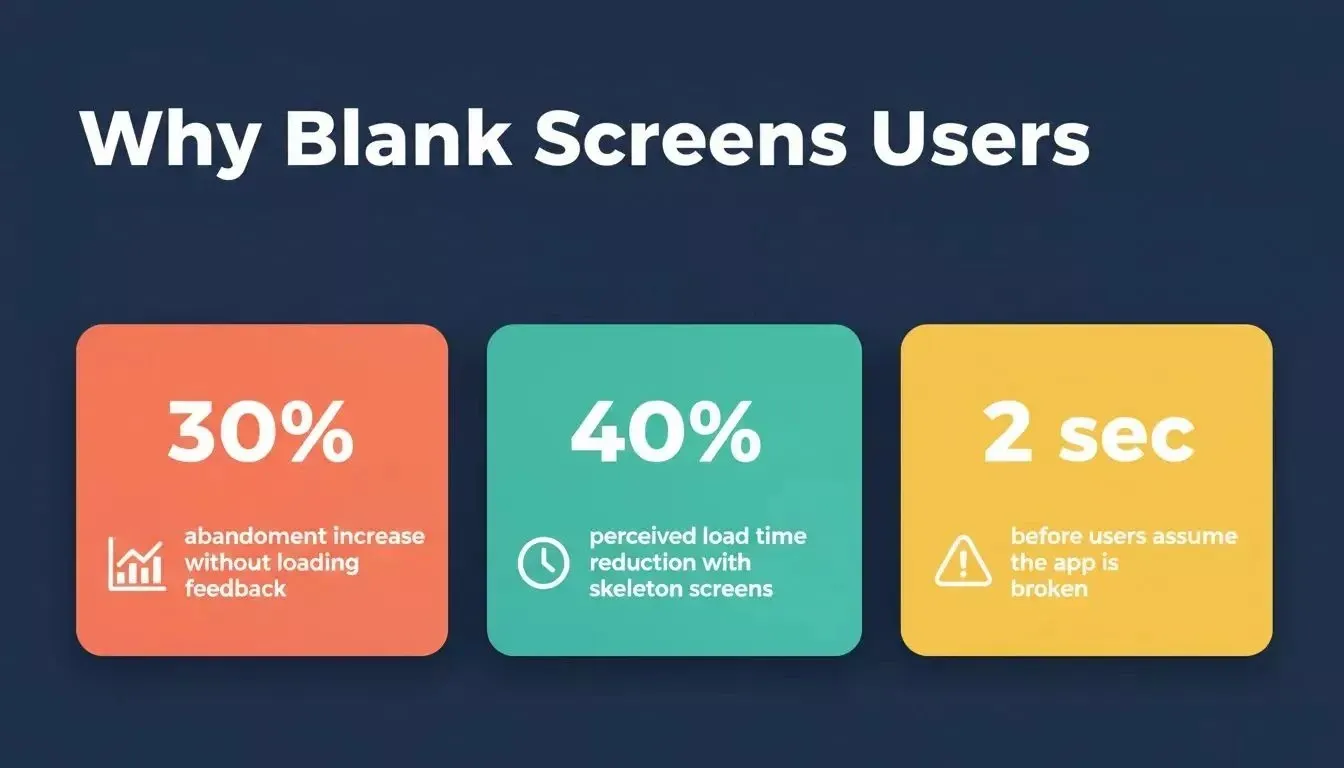
Key loading UX statistics: abandonment rates, perceived speed gains, and the critical 2-second trust window.
Why do spinners fail users?
-
Users cannot estimate the wait time because spinners do not communicate progress or duration, leaving people guessing whether the response will take one second or ten
-
Blank page states trigger the "is it broken?" reaction where users close the tab, refresh, or tap repeatedly, sometimes causing duplicate submissions during payments or form processes
-
Cognitive load increases during uncertainty because the brain works harder to interpret what is happening when the interface provides minimal visual feedback
-
The perceived wait time stretches longer than reality since every second of a spinner loop looks identical to the previous one, making the app feel slower even when actual performance is acceptable
For AI-built apps specifically, this problem compounds. AI inference can take slightly longer than a standard database query. That extra second or two of blank screen during active loading operations is enough to convince users that something went wrong.
How Do Skeleton Screens Reduce Perceived Load Time?
Perceived performance matters more than raw milliseconds. Two apps can load in the exact same time, yet users perceive one as significantly faster.
Research found that skeleton screens reduce perceived load time by 40% compared to blank panels with spinners in user testing. The mechanism is psychological: when users see a page structure appearing, users feel the interface is moving forward, and their brain interprets this as progressive progress, making the perceived wait time feel shorter. That makes skeleton screens a great tool for reducing perceived delay.
Why does psychology work?
-
The brain pre-calculates the final layout when skeleton shapes appear, using progressive disclosure so the interface reveals structure in stages instead of showing everything at once
-
Progressive visual feedback keeps users engaged because every placeholder, paired with subtle animations, transforms into real content as proof that the system is moving forward
-
Occupied attention shortens the perceived duration since skeleton screens give users an explicit area to scan while data is processed in the background
-
Visual continuity between states builds trust because the interface transitions gradually from placeholder to content, rather than showing nothing and then suddenly displaying everything at once
The perceived performance gain is especially powerful for mobile app development, where network variability makes loading times unpredictable.
Skeleton Screens vs Spinners vs Progress Bars: When to Use Each
Not every loading state needs a skeleton screen. According to Nielsen Norman Group, skeleton screens help users focus on the content structure while they wait. The right pattern depends on the operation type and duration, and the choice depends on the task context and user expectations.
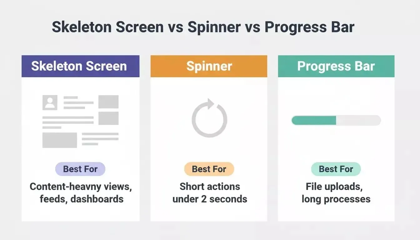
These loading indicators compare well when you need to decide between skeleton screens for content-heavy views, spinners for short actions, and progress bars for measurable processes; skeleton screens are not the right fit for fast-loading pages.
| Loading Pattern | Best For | When to Avoid |
|---|---|---|
| Skeleton screens | Content-heavy views (feeds, dashboards, search results, profiles) where users will browse or scan | Operations under 1 second; actions with no predictable layout |
| Spinners | Short operations under 2 seconds (form saves, settings updates, payment processing) | Long waits where users need progress feedback |
| Progress bars | Long-running operations with measurable duration (file uploads, exports, video processing) | Instant actions; content-heavy page loads; video buffering |
| Optimistic UI | Actions where success is nearly certain (likes, toggles, quick edits) | Irreversible actions; anything that can fail silently |
No single pattern fits every wait state.
The placeholder shapes in skeleton screens should match the final layout dimensions to prevent jarring layout shifts when data arrives. Colour placeholders work best with neutral grey tones paired with a subtle shimmer animation that signals the system is working.
Here is how different skeleton screen types compare:
| Skeleton Type | Visual Pattern | Best For | User Experience Impact |
|---|---|---|---|
| Static content placeholders | Grey blocks matching text and image positions | Article pages, profile pages, product listings | Users build a mental model of the page structure |
| Animated shimmer | Left-to-right shimmer animation on grey shapes | Feeds, dashboards, search results | Communicates the system is actively loading content |
| Card skeleton components | Repeating rectangular cards with placeholder lines | Social media platforms, e-commerce grids | Users understand the number and arrangement of items coming |
| Media colour placeholders | Large shaded rectangles for images and video areas | Gallery views, video platforms, news sites | Prevents layout shifts when images load later |
Where Should You Use Skeleton Screens in Your App?
The general rule: use skeleton screens when the view is content-heavy, and the user is waiting for information or visual content to browse or scan. Use spinners for short system operations where a quick acknowledgement after a user action is all that is needed.
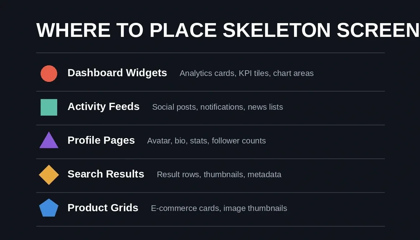
Five high-priority screen types that benefit most from skeleton loading states.
High-priority placements
-
Dashboard views with multiple data widgets are the highest-priority placement because users expect analytics, charts, and KPI cards to populate quickly. Skeleton cards for each widget communicate that content is actively loading from multiple sources simultaneously, which is especially useful in data-driven applications where different inputs resolve at different times.
-
Feed and list interfaces benefit from repeating skeleton cards that maintain scrolling rhythm and keep users engaged while posts, images, and content placeholders appear progressively. Repeating placeholders can also display the expected rhythm of incoming items before the real content arrives.
-
Profile pages with user-specific data should show circle placeholders for avatars and line placeholders for names, bios, and stats to maintain visual continuity while the system fetches personalized content.
-
Search result pages need skeleton rows that mirror the expected result format because users who just submitted a query need immediate visual feedback confirming their input was received.
-
E-commerce product grids use skeleton cards to show the expected number of items and their thumbnail positions, preventing users from assuming the page failed to load products. Image blocks and text lines can stand in for a thumbnail, title, and description.
Where skeleton screens are not the right pattern
Short operations under one second do not need them, since instant responses are better handled with inline spinners or optimistic UI updates. Submit button interactions, settings saves, and form field validations work better with inline spinners or optimistic UI updates. Progress bars remain the better choice for long-running processes like file conversions, uploads, and downloads, and a progress indicator is better when users need duration estimates.
When building apps with AI, it helps to plan your loading states during the initial prompt rather than retrofitting them later. Treating loading states as a Phase 3 polish step, after core functionality is stable, produces the cleanest results.
How to Add Skeleton Loading to Your AI-Built App: Step-by-Step Prompts
Whether you are building a new app or refining an existing one, these prompts show exactly how to instruct an AI app builder to generate skeleton screens for common interfaces and create production-ready loading states, not just mockups.
The Build best practices guide recommends treating loading states as a dedicated polish phase. After core functionality is in place, a focused iteration pass on loading states produces the cleanest results.
Skeleton screen implementation flow: from identifying screens to deploying with loading states.
Prompts by screen type
Use these prompts in any AI app builder. Adapt the layout details to match your specific screens.
-
For a dashboard: "Add skeleton loading cards to each analytics widget. Show grey rectangles where charts will render and shimmer text lines for the stat values. Match the placeholder to the content structure of each widget, and keep dimensions identical to the loaded state."
-
For a feed: "Generate skeleton cards for the activity feed that show three placeholder posts with avatar circles, one primary text line, one shorter line for supporting text, and an image rectangle. Loop the shimmer while data fetches."
-
For profile pages: "Create a skeleton state for the user profile that displays a large circle avatar placeholder, two text lines for name and bio, and four small rectangles for stat counters. Swap to real data when the API responds."
-
For search results: "After the user submits a search query, show eight skeleton result rows before displaying the actual results. Each row should have a small square thumbnail placeholder and three text lines."
The pattern is consistent: describe what the loaded state looks like, then instruct the builder to create a matching skeleton version that displays during the loading phase. For example, the closer the prompt mirrors the final screen, the more believable the loading state will feel.
After implementing skeleton screens, always test on throttled connections. Chrome DevTools lets you simulate slow networks so you can verify the skeleton displays long enough to be visible but swaps to real content without delay once data arrives.
When you need to iterate on your AI-built app, skeleton screens are one of the highest-impact improvements you can make in a single prompting session. They signal to users that your product is polished and intentional.
Accessibility and Skeleton Screens
Properly implemented skeleton screens require more than visual placeholders, and they should not rely on motion alone; even animated skeleton screens still need accessible state announcements, as the Rocket accessibility docs note that WCAG 2.1 AA compliance includes communicating state changes to assistive technologies.
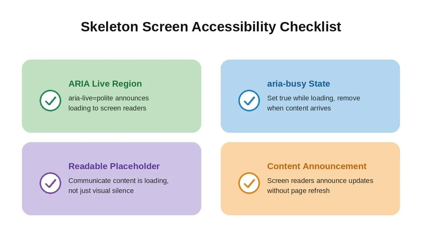
Four accessibility requirements for skeleton screens to meet WCAG 2.1 AA standards.
For skeleton screens to be accessible:
-
Use ARIA live regions (aria-live="polite") to announce loading status to screen readers
-
Set aria-busy="true" on the container while content is loading, then remove it when data arrives
-
Ensure the placeholder communicates "content is loading" to screen readers, not just visual silence
-
When real data arrives, screen readers should announce the updated content without requiring a page refresh
These attributes can be requested explicitly in your prompt: "Add ARIA live regions to the skeleton loading state so screen readers announce when content is loading and when it has finished loading." Screen-reader support matters on mobile devices just as much as on desktop.
Accessibility is not optional for production apps. Rocket.new's performance dashboard scores your app against Core Web Vitals and identifies layout shift issues that skeleton screens directly help resolve.
Rocket.new vs Lovable vs Bolt vs v0: How Each Handles Loading States
Loading states are a useful lens for comparing AI app builders because they reveal how much each platform treats polish as a default versus an afterthought.
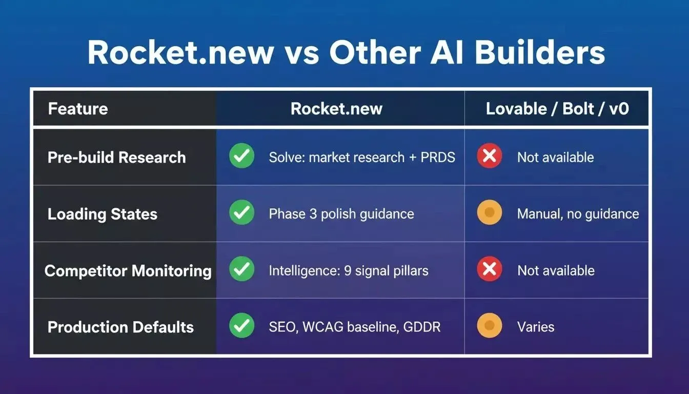
Rocket.new vs other AI builders: the structural differences that go beyond loading states.
| Feature | Rocket.new | Lovable | Bolt | v0 |
|---|---|---|---|---|
| Framework output | Next.js (web), Flutter (mobile) | React | React/Remix | React (components) |
| Production defaults | SEO structure, WCAG baseline, GDPR coverage, performance optimization | Varies | Varies | Component-level only |
| Loading states | Requestable via chat; best-practices guide covers Phase 3 polish | Requestable via chat | Requestable via chat | Component-level only |
| Accessibility baseline | Semantic HTML, heading hierarchy, form labels; full WCAG via /Generate Accessibility Report | Varies | Varies | Component-level |
| Pre-build intelligence | Solve: market research, PRDs, competitive analysis | None | None | None |
| Competitor monitoring | Intelligence: continuous monitoring across 9 signal pillars | None | None | None |
| Iterate on existing apps | Chat, Visual Edit, Code editor, Redesign (8 slash commands) | Chat | Chat | Component replacement |
The structural difference between Rocket.new and Lovable, Bolt, and v0 goes beyond loading states. Those tools start at execution: you arrive with an idea, and they build it. Rocket.new is a vibe solutioning platform that starts before the first prompt with Solve (market research, competitive teardowns, PRD generation) and continues after launch with Intelligence (competitor monitoring across nine signal pillars).
For loading states specifically, all four tools can generate skeleton screens when you ask for them. The difference is that Rocket.new's Build docs explicitly treat loading states as a named polish phase with guidance on when to add them, and its defaults make it easier to ship an aesthetically pleasing loading experience without extra cleanup, while the others leave the pattern entirely up to the builder to discover and implement.
Rocket.new also ships every build with an SEO-ready structure and a WCAG accessibility baseline by default. If you are building a no-code app and want production-quality polish without a second engineering pass, this default quality floor matters.
Your App Deserves Better Than a Blank Stare
Skeleton screens are not a luxury feature. They are the difference between users who trust your app and users who close it after two seconds of silence. The implementation takes one focused prompt, and the perceived speed improvement is felt immediately by everyone who opens your product.
If your AI-built app still shows blank pages or generic spinners while content loads, that gap between your product and a professionally designed one is smaller than you think. One iteration closes it.
Rocket.new is the vibe solutioning platform that combines market research, AI app building, and competitive intelligence in one place, so you build the right thing, then build it well.
Open Rocket.new, sign up, and describe your screens. Your users will feel the difference before you finish your next coffee.
Table of contents
- -What Is a Skeleton Screen?
- -Why Blank Pages Kill User Trust in Seconds
- -Why do spinners fail users?
- -How Do Skeleton Screens Reduce Perceived Load Time?
- -Why does psychology work?
- -Skeleton Screens vs Spinners vs Progress Bars: When to Use Each
- -Where Should You Use Skeleton Screens in Your App?
- -High-priority placements
- -Where skeleton screens are not the right pattern
- -How to Add Skeleton Loading to Your AI-Built App: Step-by-Step Prompts
- -Prompts by screen type
- -Accessibility and Skeleton Screens
- -Rocket.new vs Lovable vs Bolt vs v0: How Each Handles Loading States
- -Your App Deserves Better Than a Blank Stare