Struggling with mobile app navigation? These 15 ready-to-use AI prompts cover bottom tabs, gesture flows, drawer menus, and adaptive layouts, tested against real-world UX patterns shipping in 2026.
Does your app's navigation lose users before they find what they need?
According to recent UX research by Maze, 94% of consumers rate easy navigation as the single most important feature in any digital platform. That number tells you something direct: if your app's navigation feels broken, users leave before they see anything else.
AI-generated prompts are changing how developers and founders approach this problem. Instead of hand-drawing wireframes and arguing over tab placement for weeks, a well-structured prompt produces a complete navigation scaffold in seconds.
The 15 prompts below cover bottom tabs, gesture flows, drawer menus, and adaptive layouts, all tested against real-world UX patterns that will ship in 2026.
What is AI-Generated Mobile App Navigation?
AI-generated mobile navigation is the output of a structured natural language prompt fed into an AI app builder that produces functional navigation code, component logic, and interaction states. Unlike wireframing tools that produce static mockups, AI builders generate deployable code with real bottom tabs, gesture handlers, drawer menus, and adaptive layouts.
The prompt is the specification. The output is the app. Navigation architecture decisions made early are expensive to reverse, so a well-written prompt locks in the right pattern from the first generation.
Why AI-Generated Navigation Patterns Matter
The shift toward AI-driven app architecture is no longer optional for teams that want to stay competitive.
- Apps using AI personalization see 26% longer session times and reduce churn by 35%, according to multiple 2026 industry analyses
- Predictive navigation surfaces the right screen before users search for it, cutting average task-completion paths by two or three taps
- Context-aware interfaces rearrange menu items based on time-of-day, location, and usage frequency
- Teams building with AI prompts ship native mobile app development iterations in hours rather than sprints
The gap between apps that feel smart and apps that feel static is widening fast. Navigation is where users notice that gap first.
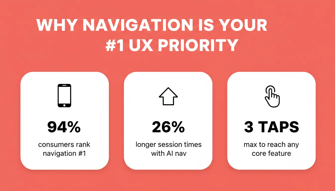 Key navigation statistics: why getting mobile app navigation right is the single highest-leverage UX decision you make
The Anatomy of a High-Quality Navigation Prompt
Before diving into the 15 prompts, it helps to understand what separates a prompt that ships from one that produces throwaway output. Every strong navigation prompt contains five components.
| Component | Weak Version | Strong Version |
|---|---|---|
| Platform | "mobile app" | "iOS app following HIG, targeting iPhone 14 and above" |
| Pattern name | "navigation" | "persistent bottom tab bar, Material Design 3" |
| Interaction states | omitted | "filled icon active, outlined icon inactive, badge counter on Notifications" |
| Conflict rules | omitted | "disable swipe on screens with horizontal carousels" |
| Failure state | omitted | "show empty state with retry CTA when nav data fails to load" |
Strong prompt engineering practices separate prompts that ship from prompts that produce throwaway mockups. The structure matters more than the length, and good prompts can cut development time by 73% while structured prompts reach an 89% success rate.
How Should You Write Prompts That Shape User Flows?
A prompt is only as good as the constraints you give it. In AI-powered prompts, lead with user intent before describing navigation features. Vague instructions will produce vague navigation.
- Start with the user's goal, not the component. "Help a new user find their first workout in two taps" beats "add a bottom navigation bar."
- Specify the platform and screen size. A prompt for a tablet drawer menu needs different spacing rules than a phone bottom tab.
- Well-structured prompts should define the key elements, including the screen type, app behavior, and core features.
- Include accessibility constraints upfront: minimum tap target sizes, color contrast ratios, and screen reader labels, especially for elderly users.
- Reference a navigation pattern by name when you want consistency: "Use a persistent bottom tab bar with four items, Material Design 3 specs."
- Test your prompt output against the three-tap rule: can a user reach any core feature within three interactions?
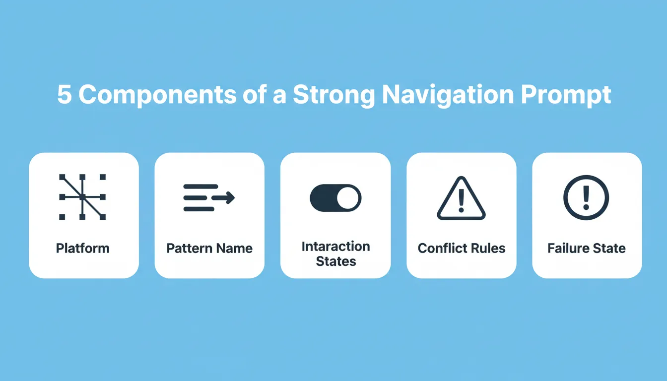
Every navigation prompt that ships contains these five components. Missing any one of them produces output that needs rework.
Quick Reference: All 15 Navigation Prompts
| # | Pattern | Primary Use Case |
|---|---|---|
| 1 | Bottom tab bar with icon states | Standard consumer app |
| 2 | Left-slide navigation drawer | Enterprise or utility app |
| 3 | Bottom nav with center FAB | Social or content app |
| 4 | Auto-hide tab bar on scroll | Feed-based app |
| 5 | Tab and drawer hybrid | Multi-feature SaaS |
| 6 | Horizontal swipe tabs | Content-heavy app |
| 7 | Pull-to-refresh with branded animation | Data-sync app |
| 8 | Swipe-to-delete with undo | List-based app |
| 9 | Long-press context menu | Card-based app |
| 10 | Snap-point bottom sheet | Filter-heavy app |
| 11 | Behavior-based tab reordering | Personalized app |
| 12 | Contextual action bar | Commerce app |
| 13 | Time-based nav variant | Habit or routine app |
| 14 | Onboarding-aware nav state | New user flow |
| 15 | Role-based navigation system | Multi-role app |
Prompt Templates for Bottom Tab and Drawer Navigation
Bottom tabs remain the most common navigation pattern in mobile apps, and for good reason. UX Pilot's trend analysis confirms that 98% of modern mobile navigation is built for one-handed operation.
Here are the first five prompts, ready to paste into any AI builder. The right app type should shape both navigation choices and visual direction from the start.
| # | Prompt | Use Case |
|---|---|---|
| 1 | "Create a bottom tab bar with 4 items: Home, Search, Notifications, Profile. Use filled icons for the active state and outlined icons for inactive. Follow iOS Human Interface Guidelines for spacing." | Standard consumer app |
| 2 | "Build a navigation drawer that slides from the left with grouped menu items: Account, Settings, Help, and a logout button pinned to the bottom. Include a user avatar header." | Enterprise or utility app |
| 3 | "Generate a bottom navigation with a floating action button in the center for 'New Post'. The FAB should animate upward on tap to reveal three sub-actions." | Social or content app |
| 4 | "Design a tab bar that hides on scroll-down and reappears on scroll-up. Include badge counters on the Notifications tab that update in real time." | Feed-based app |
| 5 | "Create a combination pattern: bottom tabs for primary sections, plus a hamburger-triggered drawer for secondary settings and account management." | Multi-feature SaaS app |
Each prompt specifies interaction states, icon styles, and platform conventions rather than just naming components. Consistent visual elements and a minimal layout make mixed navigation patterns easier to use.
If role-based access shows up later in the product, failing to define user roles early can create permission issues in navigation.
Ready to turn Prompts 1 to 5 into a live app? Paste any of these into Rocket and get a production-ready Flutter app with your navigation built in. Start building for free on Rocket, no credit card needed.
Which Prompts Work for Gesture and Swipe-Based Navigation?
Gesture navigation eliminates the need for visible buttons entirely. This is where mobile UX gets interesting, and where prompts need extra precision.
- Prompt 6: "Implement horizontal swipe navigation between three main content tabs. Add a subtle page indicator dot row at the top. Disable swipe on screens containing scrollable carousels to prevent gesture conflicts."
- Prompt 7: "Create a pull-down-to-refresh animation that shows a custom loading indicator branded with the app's accent color. The refresh should trigger data sync from the API."
- Prompt 8: "Build a swipe-to-delete pattern on list items with a red background reveal and an undo snackbar that persists for 5 seconds before confirming deletion."
- Prompt 9: "Add a long-press context menu on card components. The menu should offer Share, Edit, Archive, and Delete. Use haptic feedback on menu appearance."
- Prompt 10: "Design a vertical swipe-up sheet for filters. The sheet should have three snap points: peek (25% height), half (50%), and full. Include a drag handle indicator."
The key with gesture prompts is specifying conflict resolution. What happens when a swipe gesture competes with a scroll? Your prompt needs to answer that. Be explicit about interactive elements, including empty states when a gesture reveals no content.
The same principle applies when you are building login and signup flows. Specifying what happens at every state boundary is what separates prompts that ship from prompts that need rework.
Prompts 6 to 10 cover every gesture pattern your app needs. Describe your gesture flow once in Rocket and get deployable Flutter code with conflict resolution and haptic feedback built in. Try it free on Rocket.
Prompts for Contextual and Adaptive Navigation
Static menus serve every user the same way regardless of behavior. Adaptive navigation changes that. Before asking AI to personalize navigation, however, your app's core idea should be clear.
Moonstack's mobile AI report notes that 70% of mobile apps now use AI features to improve user experience, and navigation reordering is one of the quickest wins.
- Prompt 11: "Reorder bottom tab items based on the user's most-accessed sections over the past 7 days. Keep Home fixed in position one, but allow positions 2 through 4 to shift dynamically."
- Prompt 12: "Show a contextual action bar when the user is in a shopping cart with more than 3 items. The bar should display: Apply Coupon, Saved for Later, and Checkout. Hide it when the cart is empty."
- Prompt 13: "Build a time-based navigation variant: show 'Morning Routine' as the first menu item before 10 AM, 'Focus Mode' between 10 AM and 5 PM, and 'Wind Down' after 8 PM."
- Prompt 14: "Create an onboarding-aware nav state. First-time users see a simplified 3-tab layout. After completing onboarding, expand to the full 5-tab navigation with new items highlighted by a pulse animation, while keeping key elements on the same screen visually consistent."
- Prompt 15: "Generate a role-based navigation system. Admin users see Dashboard, Users, Settings, Reports. Regular users see Home, Activity, Profile only. Derive role from the authenticated session token, and define roles clearly to avoid permission issues."
Here is how adaptive navigation decision logic flows in a typical app:
"We switched from a static 5-tab layout to a behavior-based adaptive nav and saw a 22% increase in feature discovery within the first month. The key was letting the AI prompt handle the reordering logic rather than hard-coding rules." — Product designer on r/UXDesign, March 2026
Prompts 11 to 15 handle the logic that most builders hard-code manually. Paste any adaptive nav prompt into Rocket and get a working Flutter app with role-based routing, behavior-driven reordering, and onboarding states generated in one pass. Build it on Rocket.
Accessibility Checklist for AI-Prompted Navigation
Every navigation prompt should produce output that meets baseline accessibility standards. Including these constraints in your prompt means the generated code handles accessibility from the first build, not as a retrofit.
| Requirement | What to Add to Your Prompt |
|---|---|
| Minimum tap target | "All navigation items must have a minimum 44x44pt tap target" |
| Color contrast | "Navigation labels must meet WCAG AA contrast ratio (4.5:1 minimum)" |
| Screen reader labels | "Add semantic accessibility labels to all tab bar items" |
| Focus indicators | "Include visible focus rings for keyboard and switch access navigation" |
| Reduced motion | "Respect the system's reduced motion preference for all nav transitions" |
The same discipline applies when prompting onboarding screens. Accessibility constraints set upfront prevent costly retrofits later in the build cycle.
How Rocket Turns Navigation Prompts into Production Apps
You have the prompts. The next question is: where do you run them?
Most AI app builders produce wireframes or static prototypes. You still need to convert those into real code, test across devices, and wire up backend logic. That gap between "prompt output" and "shipped app" is where weeks disappear.
Rocket generates production-grade Flutter mobile apps and Next.js web apps from natural language. Here is how the workflow runs.
Step 1: Start a Build task. Go to Rocket.new, sign in, and click New task, then select Build. Choose the Mobile App category tab or type your navigation prompt directly into the chat field. Rocket scores your prompt for clarity automatically. If it is specific enough, generation starts immediately. If it needs more detail, Rocket asks one or two targeted clarifying questions before building.
Step 2: Describe your navigation architecture. Paste any of the 15 prompts above, adapted to your app. Include the app type, target platform (iOS, Android, or both), and the navigation pattern you want. The more specific your prompt, the closer the first generation will be to your vision.
Step 3: Preview in the device simulator. Once generation completes, most apps take 1 to 3 minutes, your app appears in Rocket's live preview panel rendered inside a device simulator. Tap through the navigation, test every tab, trigger the gesture flows, and verify the interaction states match your prompt.
Step 4: Iterate with Chat, Visual Edit, or Code. Rocket gives you three ways to refine navigation without starting over. Chat handles natural language changes. Visual Edit lets you click directly on elements in the preview. Code opens the generated Flutter source for precise edits. There is no change limit.
Step 5: Launch. Click Launch to deploy instantly, or submit directly to the App Store and Google Play from within Rocket.
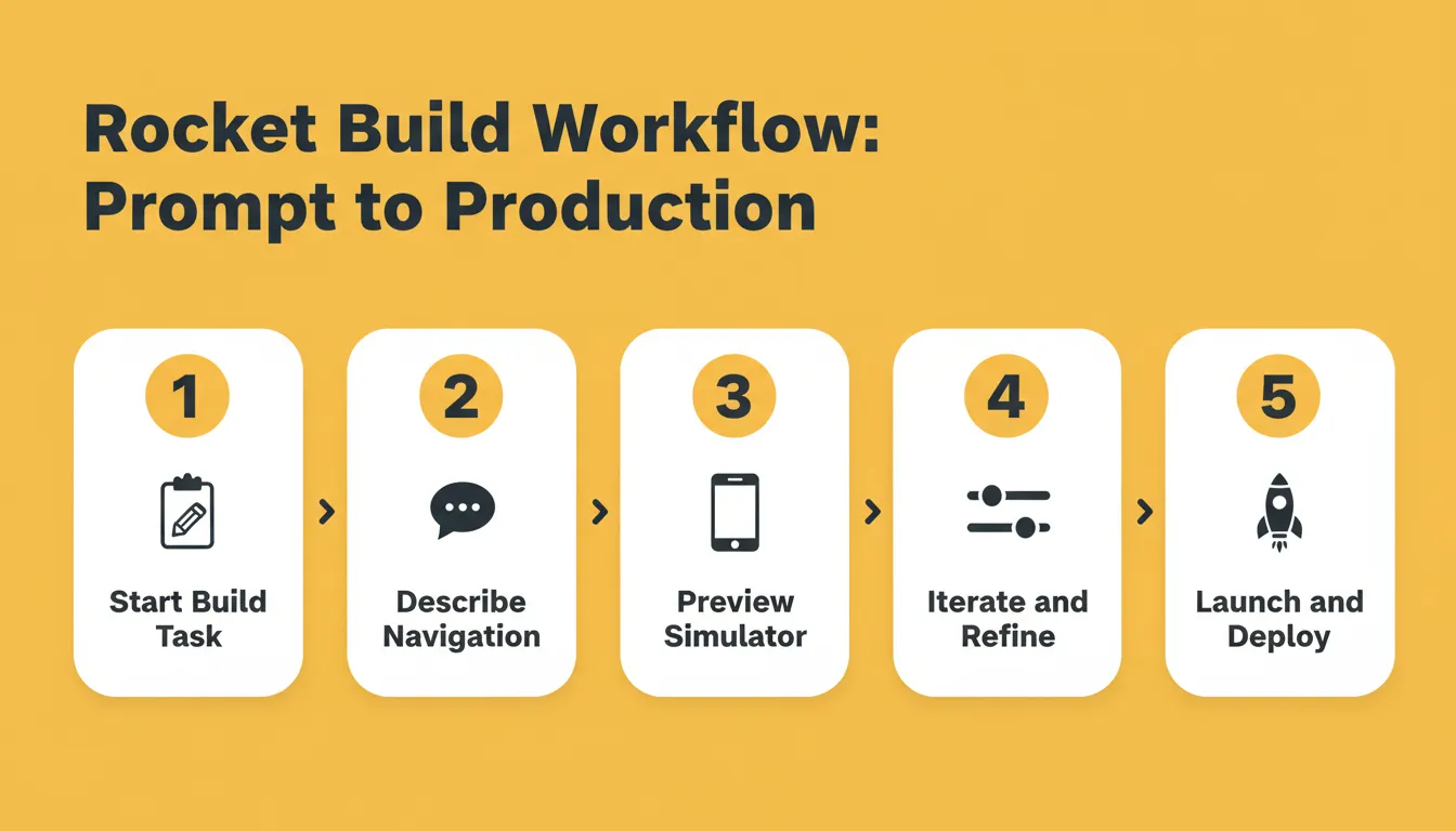
The Rocket build workflow: from a navigation prompt to a deployed Flutter app in a single session, with no wireframes, no handoff, and no waiting.
The same prompt-first approach works across every screen type. If you are building a complete product, the AI prompts for hero sections guide covers the same structured method applied to conversion-focused web layouts.
Rocket Pricing
Rocket uses a credit-based system with no per-seat fees. All plans include unlimited team members.
| Plan | Monthly Fee | Monthly Credits | Best For |
|---|---|---|---|
| Free | $0 | 20 credits | Light, exploratory, personal use |
| Pro | $25 | 100 credits | Production-ready web and mobile apps |
| Rocket | $50 | 250 credits | Full suite for individuals and teams |
| Booster | $250 | 1,500 credits | Power users and fast-moving teams |
Credits never expire. Additional credits can be purchased on any plan.
What Are the Common Mistakes When Prompting for Navigation?
Even well-written prompts fail when they skip foundational details. Here are the patterns that trip up builders most often.
- Forgetting to specify the inactive state. A prompt that says "add a tab bar" without defining unselected icon styles produces inconsistent results across platforms.
- Ignoring thumb reach zones. Prompts should reference bottom-of-screen placement for primary actions, especially on screens larger than 6 inches.
- Over-stuffing tabs. More than five bottom items creates cognitive overload. If your prompt requests six or more, split into tabs plus drawer.
- Skipping transition animations. Users perceive navigation as broken when screens swap without any motion. Add "include a 200ms slide transition between tab screens" to your prompt.
- Not accounting for mobile-first app delivery constraints like slow networks or offline states where navigation needs graceful fallbacks.
In a fitness app, for example, leaving out user authentication requirements can hide progress or profile routes until after sign-in, which makes the navigation feel inconsistent.
If your prompt does not mention what happens when something goes wrong, whether that is no data, a slow load, or a permission denial, your navigation will feel unfinished.
Your Next Step Toward Smoother App Flows
These 15 prompts give you a concrete starting point for every major navigation pattern shipping in mobile apps right now. The difference between an app that retains users and one that loses them in the first session often comes down to how quickly someone finds what they need.
Pick two or three prompts from this list, adapt them to your app's use case, and test the output on a real device. Small adjustments to navigation compound into large engagement gains over time.
Navigation Prompts Are Just the Start
The best AI prompts for mobile app navigation do more than place tabs and drawers. They encode the logic, states, and accessibility rules that make navigation feel native from the first build. The 15 prompts in this guide cover every major pattern shipping in 2026, from simple bottom tabs to behavior-driven adaptive layouts.
As AI-assisted development matures, the teams that invest in prompt discipline now will ship faster, iterate more cleanly, and spend less time retrofitting navigation decisions made too late. The prompt is the specification. Write it well and the app reflects that.
Type your navigation prompt into Rocket and get a production-ready Flutter app with polished nav flows. Start building for free on Rocket.new, no credit card needed.
Table of contents
- -What is AI-Generated Mobile App Navigation?
- -Why AI-Generated Navigation Patterns Matter
- -The Anatomy of a High-Quality Navigation Prompt
- -How Should You Write Prompts That Shape User Flows?
- -Quick Reference: All 15 Navigation Prompts
- -Prompt Templates for Bottom Tab and Drawer Navigation
- -Which Prompts Work for Gesture and Swipe-Based Navigation?
- -Prompts for Contextual and Adaptive Navigation
- -Accessibility Checklist for AI-Prompted Navigation
- -How Rocket Turns Navigation Prompts into Production Apps
- -Rocket Pricing
- -What Are the Common Mistakes When Prompting for Navigation?
- -Your Next Step Toward Smoother App Flows
- -Navigation Prompts Are Just the Start