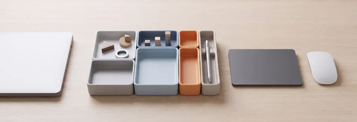
Bento grids are the dominant SaaS dashboard layout in 2026. Rocket.new generates production-ready bento grid dashboards from a single prompt, so you can ship a polished SaaS UI without hiring a designer.
A bento grid layout is a modular tile-based interface where content blocks appear in varying sizes within a consistent grid structure, with larger tiles for high-priority data and smaller tiles for secondary metrics. With Bento Grid UI dashboard no-code tools, any SaaS founder can ship this polished layout from a single prompt, without a designer or a line of CSS.
67% of the top 100 SaaS products on ProductHunt now use bento grid layouts, and the gap between "looks like a $50M product" and "looks like a weekend project" often comes down to this one layout decision.
Who This Is For
This guide is for three types of builders:
-
Solo founders and indie hackers who want their SaaS dashboard to look credible on day one, without hiring a designer or learning CSS grid from scratch.
-
Product managers validating a redesign who need to prototype a bento layout quickly, show it to stakeholders, and iterate before committing to a full frontend rebuild.
-
Agency teams prototyping client dashboards who need to generate a production-ready bento grid layout from a brief, then hand off clean code the client can own.
If you fall into any of these groups, this guide takes you from understanding the pattern to shipping a working dashboard.
Why Does Every Premium SaaS App Use This Layout Pattern?
The bento grid pattern dominates premium SaaS because it solves a real usability problem: it makes information density feel organized rather than overwhelming by using tile size as a visual signal for importance.
Why does every $50M SaaS product look like it was designed by a world-class team, while most indie apps still ship plain list-based dashboards? The answer is a layout pattern called the bento grid. Inspired by Japanese bento boxes, this modular bento grid design organizes content into tiles of varying sizes, giving each data point its own compartment while creating a natural visual hierarchy.
67% of the top 100 SaaS products on ProductHunt now use bento grid layouts. The best part: you no longer need a designer or CSS expertise to build one. Here is how to get there.
What Makes a Bento Grid Different From a Regular Card Layout?
Bento grids and card grids look similar at a glance, but the underlying structure changes how users process information: in a card grid, every item carries equal visual weight, while in a bento grid, tile size communicates priority directly.
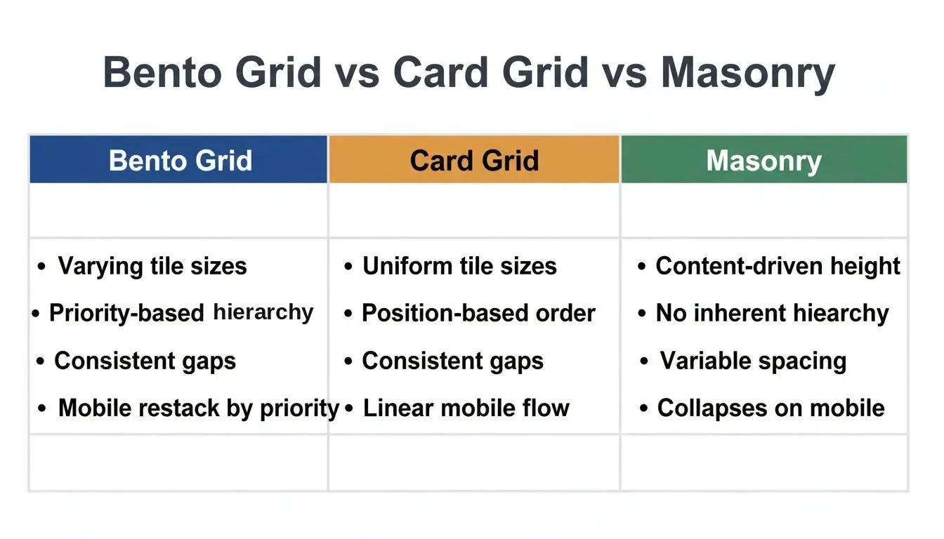
Bento Grid vs Card Grid vs Masonry: key structural differences at a glance
-
Size determines priority. In a standard card grid, every card is identical in dimensions. In bento grids, the most important content gets the largest tile. A larger tile commands proportionally more eye fixation time than a smaller tile, regardless of position, which is a foundational principle of visual weight in interface design.
-
Consistent gaps create rhythm. The gap spacing between all tiles stays uniform at 16-24px on desktop. This consistent structure separates bento grids from masonry layouts, where elements float freely and spacing varies across the page.
-
Compartments contain complexity. Each section holds one distinct piece of data or one action. Like a Japanese bento box with its compartmentalized design, nothing bleeds into neighboring tiles on the grid.
-
Rounded corners signal modernity. Bento grids use squircle-style borders (12-24px radius) that feel softer than rigid rectangles, matching the design language Apple popularized across its product pages.
-
Responsive stacking is built in. On desktop, bento grids display as a mosaic across columns and rows. On mobile, tiles restack into a single column ordered by priority, not by original position on the screen.
| Feature | Bento Grid | Card Grid | Masonry |
|---|---|---|---|
| Tile sizes | Varying, priority-based | Uniform | Content-driven |
| Spacing | Consistent gap | Consistent gap | Variable |
| Hierarchy | Size = importance | Position = importance | None inherent |
| Mobile behavior | Priority restack | Linear flow | Collapses |
| CSS approach | Grid with span classes | Flexbox or grid repeat | JavaScript + CSS |
| Best for | Dashboards, feature pages | Product listings, blogs | Image galleries |
So if you are building a web app without a designer, understanding this difference helps you choose the right layout for your SaaS dashboard from the start.
Why Are Top SaaS Products Choosing Bento Grids in 2026?
The shift toward bento grids is not just aesthetic. It is measurable, and products that adopt bento grid layouts see higher engagement because the layout mirrors how human attention actually moves across a screen.
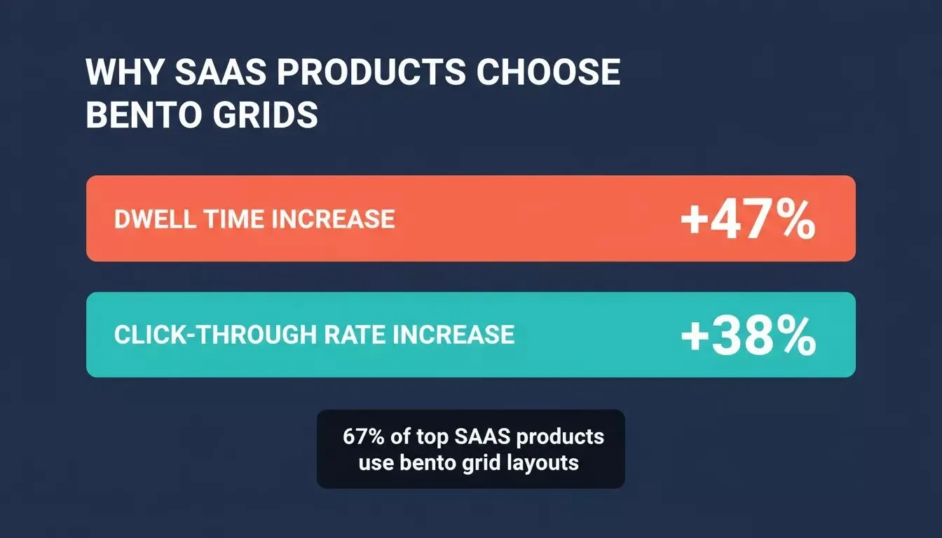
Key engagement metrics showing why bento grid layouts outperform traditional dashboard designs
Sites using bento grids report a **47% increase in dwell time and a **38% increase in click-through rates compared to traditional layouts. The bento grid responsive structure adapts across screen sizes without losing its visual weight on any device.
Because tile sizes vary, the user's attention is naturally guided toward the most important content on the dashboard. This is how Linear arranges sprint progress next to velocity charts, and why Vercel's dashboard gives deployment status the biggest tile in the display. A bento grid system lets you display metrics, charts, activity feeds, and CTAs on one screen without visual noise, because each tile has clear boundaries.
Raycast uses this exact approach for its settings page, fitting six different data categories into a single view. Apple's WWDC pages, iOS widgets, and product feature displays all use bento grids across their websites. When the company that set the responsive design standard for mobile adopts a pattern, the rest of the industry follows within 12-18 months.
For founders building their first startup app without code, choosing bento grids from day one means your product looks polished before you have written any custom CSS code.
How Does a Bento Grid Create Visual Hierarchy Without a Designer?
The strength of bento grids is that hierarchy is structural, not decorative. You decide what matters most and make that tile bigger, and the grid does the rest.
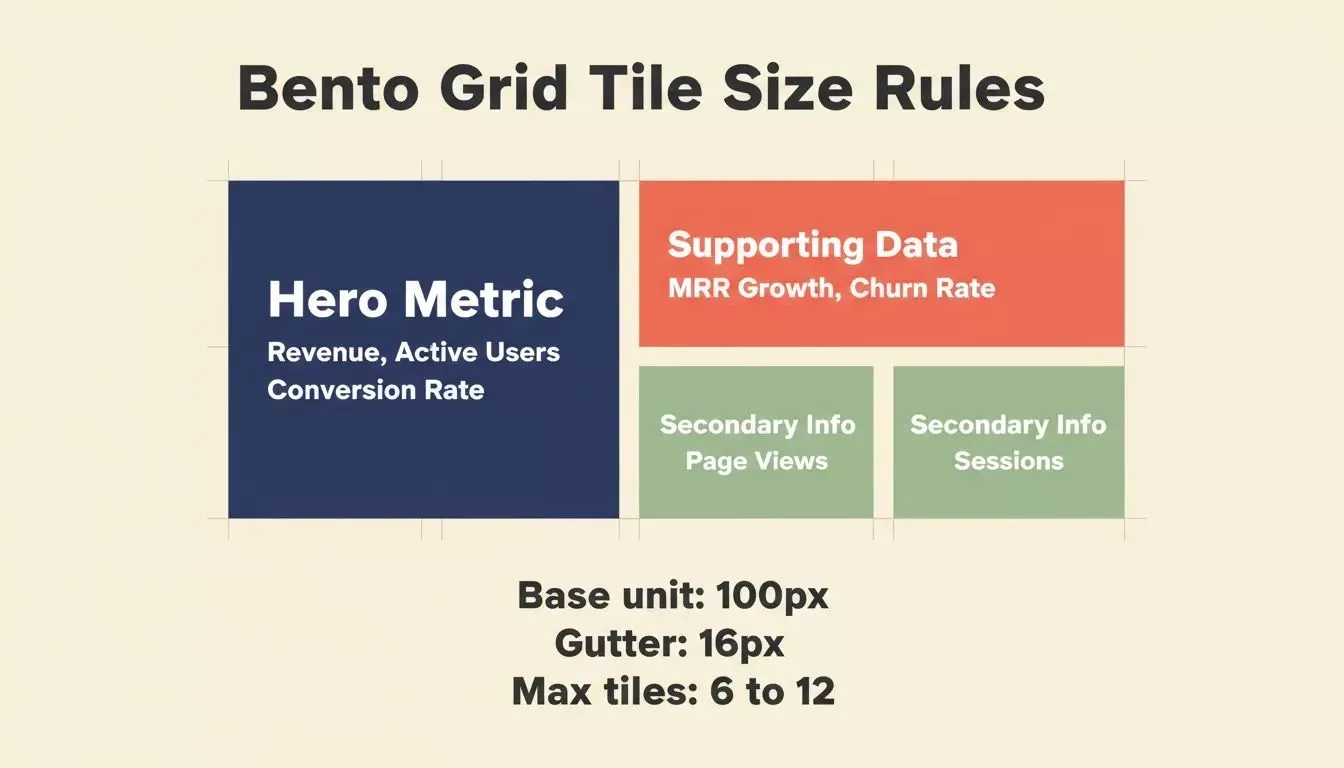
Bento grid tile sizing system: assign tile size based on content priority, not aesthetics
Pick a base unit (commonly 100px) and a gutter (16px). Every tile is then a multiple of that frame: 1x1 for secondary items, 2x1 for mid-tier features, and 2x2 for your hero metric. The grid template columns definition handles alignment automatically in your CSS grid code.
Rank your dashboard widgets by importance. Revenue, active users, or conversion rate gets the 2x2 slot. Secondary metrics like page views or session length get 1x1 tiles. Most SaaS bento layouts use a 4-column grid on desktop, where tiles span 1, 2, or 3 columns and 1 or 2 rows.
Larger tiles need more internal padding (24-32px), while smaller tiles use 16-20px. This proportional padding maintains readability at every tile size. The hierarchy pattern works in both light mode and dark mode because it depends on tile size and spatial position rather than color contrast.
When you use a tool that converts Figma designs to SaaS dashboards, this hierarchy logic is already baked into the output, saving you from calculating column spans manually.
Validate Which Metrics Belong in Your Dashboard Before You Build
Before you assign tiles, you need to know which metrics your users actually want to see. Skipping this step is the most common reason bento dashboards get rebuilt after launch.
Rocket's Solve feature turns this into a structured research step rather than a guessing game. Ask Solve a question like "Which three metrics do SaaS analytics dashboard users check first?" and it returns an evidence-backed report with competitive teardowns, user research signals, and prioritized recommendations, all before you write a single prompt in Build.
The research context carries forward automatically, so when you move to Build, Rocket already knows which metrics belong in your hero tile and which belong in the secondary row. This is the difference between a bento grid that looks polished and one that actually reduces churn.
Prompt Rocket to Generate Your Bento Dashboard in Minutes
Rocket generates a production-ready bento grid dashboard from a plain-language prompt, with no CSS grid knowledge required and no Figma mockup needed first.
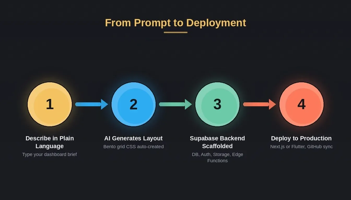
Rocket.new turns a plain-language prompt into a deployed, full-stack bento grid dashboard in four steps
Write a prompt like: "Build a SaaS analytics dashboard with a bento grid layout. The hero tile shows monthly revenue with a line chart. Four smaller tiles display active users, churn rate, MRR growth, and latest signups. Use rounded corners and consistent 16px gaps." That single description is the entire brief for your bento grid design.
Rocket generates a production Next.js application with responsive Bento Grid CSS, real data display components, and a complete Supabase backend including Postgres database, user authentication, file storage, and edge functions, all scaffolded from chat with no API keys needed.
For SaaS dashboards specifically, Rocket also scaffolds row-level security policies so each user sees only their own data, and multi-tenant scoping so organizations stay isolated by default. You can read exactly how this works in the Rocket docs: Supabase connector.
The generated bento layouts automatically restack tiles on mobile, tablet, and desktop without you configuring media queries or column spans by hand. You own the code, with production Next.js and Flutter output you can sync to GitHub, deploy to Netlify, or hand off to a developer. The generated app is yours, not locked into a proprietary builder.
As designer Shay Korin shared on X: "Create a SaaS Dashboard for an AI analytics tool. Use a Bento Grid layout to organize the data charts." That single instruction, typed into Rocket, produces a functional bento dashboard ready to ship (source).
| Rocket | Manual CSS grid | Figma-to-code plugin | Drag-and-drop builder | |
|---|---|---|---|---|
| Deployable output | Next.js or Flutter | Yes, hand-coded | Frontend only | Limited |
| Backend included | Supabase: DB, auth, storage, edge functions | No | No | No |
| Responsive breakpoints | Auto-handled | Manual | Partial | Partial |
| Row-level security | Scaffolded from chat | Manual | No | No |
| Code ownership | Full, GitHub sync | Full | Partial | No |
| Natural language iteration | Yes | No | No | Limited |
Rocket takes your B2B SaaS product idea and ships a bento grid dashboard that looks like a $50M product, built in minutes not weeks. If you want to see the full-stack AI builder in action, the Build page shows exactly what gets generated from a single prompt.
You can also start from a pre-built SaaS dashboard template and customize it through chat rather than starting from scratch. And if you are comparing options before committing, the Rocket vs Webflow comparison breaks down the key differences for teams deciding between a visual builder and a full-stack AI platform.
Five Common Mistakes That Ruin a Bento Dashboard Layout
Bento grids fail in predictable ways. The table below maps each mistake to why it breaks the layout and what to do instead.
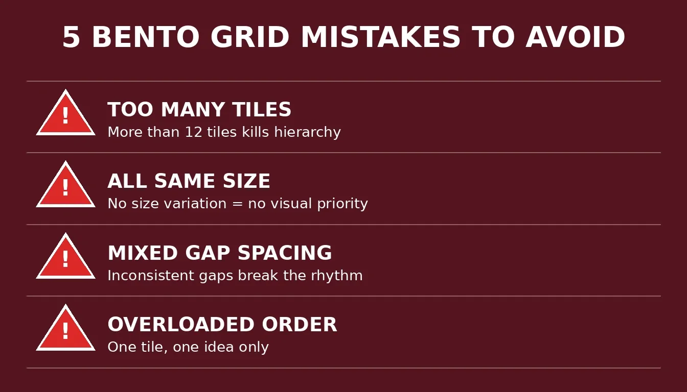
The five most common bento grid mistakes that cause SaaS dashboards to get rebuilt after launch
| Mistake | Why it fails | Fix |
|---|---|---|
| More than 12 tiles | Every tile competes for attention; hierarchy collapses | Limit to 6-12 tiles; move secondary data to a drill-down page |
| All tiles the same size | Removes visual hierarchy; becomes a plain card grid | Ensure at least one tile is 2x2 or 2x1 to anchor attention |
| Inconsistent gap spacing | Destroys the rhythm that makes the layout feel intentional | Pick one gap value (16px standard) and apply it everywhere |
| Wrong mobile restack order | Hero content appears mid-scroll on small screens | Set mobile order by content priority; test on a real device before shipping |
| Multiple ideas in one tile | Creates internal clutter; forces users to parse instead of scan | One tile, one metric or action; if a tile needs a scrollbar, move content to its own page |
When prompting an AI builder with the right dashboard UI component instructions, specifying tile count and tile sizes prevents most of these Bento Grid mistakes automatically. For a broader look at how no-code and low-code development fits into modern SaaS workflows, that guide covers the full landscape.
Your SaaS Dashboard Deserves Better Than a Generic CRUD Panel
Bento grids give your SaaS product the visual weight and scannability that users expect from modern tools. The pattern works because it mirrors how attention moves, guides decisions through tile sizes, and stays readable on every device and screen.
The gap between "looks like a $50M product" and "looks like a weekend project" often comes down to one layout decision. Bento grids close that gap without requiring a design team or months of frontend work on your end.
Rocket is the fastest way to ship a polished bento grid UI dashboard no-code for your SaaS product. Describe your dashboard in plain language and get a fully responsive, production-ready bento grid layout with Supabase backend, row-level security, dark mode support, and mobile-first responsive stacking, with no designer, no CSS debugging, and no months of frontend work.
Table of contents
- -Who This Is For
- -Why Does Every Premium SaaS App Use This Layout Pattern?
- -What Makes a Bento Grid Different From a Regular Card Layout?
- -Why Are Top SaaS Products Choosing Bento Grids in 2026?
- -How Does a Bento Grid Create Visual Hierarchy Without a Designer?
- -Validate Which Metrics Belong in Your Dashboard Before You Build
- -Prompt Rocket to Generate Your Bento Dashboard in Minutes
- -Five Common Mistakes That Ruin a Bento Dashboard Layout
- -Your SaaS Dashboard Deserves Better Than a Generic CRUD Panel