
Progressive disclosure shows users only what they need at each moment. Rocket builds these layered SaaS interfaces from a plain-language prompt, no code required.
Progressive disclosure UI no-code SaaS patterns let founders build layered interfaces that show users only what they need at each moment, reducing cognitive load and lifting feature discovery without writing a single line of code.
What is progressive disclosure? Progressive disclosure is an interaction design principle that divides a user interface into layers, showing the most frequently needed options upfront on Level 1, and revealing advanced features on Level 2 only when a user actively requests them. It reduces cognitive load, lowers error rates, and improves feature discovery by matching interface complexity to the user's current task.
What Is Progressive Disclosure and Why Do SaaS Founders Need It?
Progressive disclosure is an interaction design principle that divides features into layers. The first layer (Level 1) shows users the most frequently needed options on a single screen. The second layer (Level 2) holds advanced features behind a clearly labeled control that users access only when they request it.
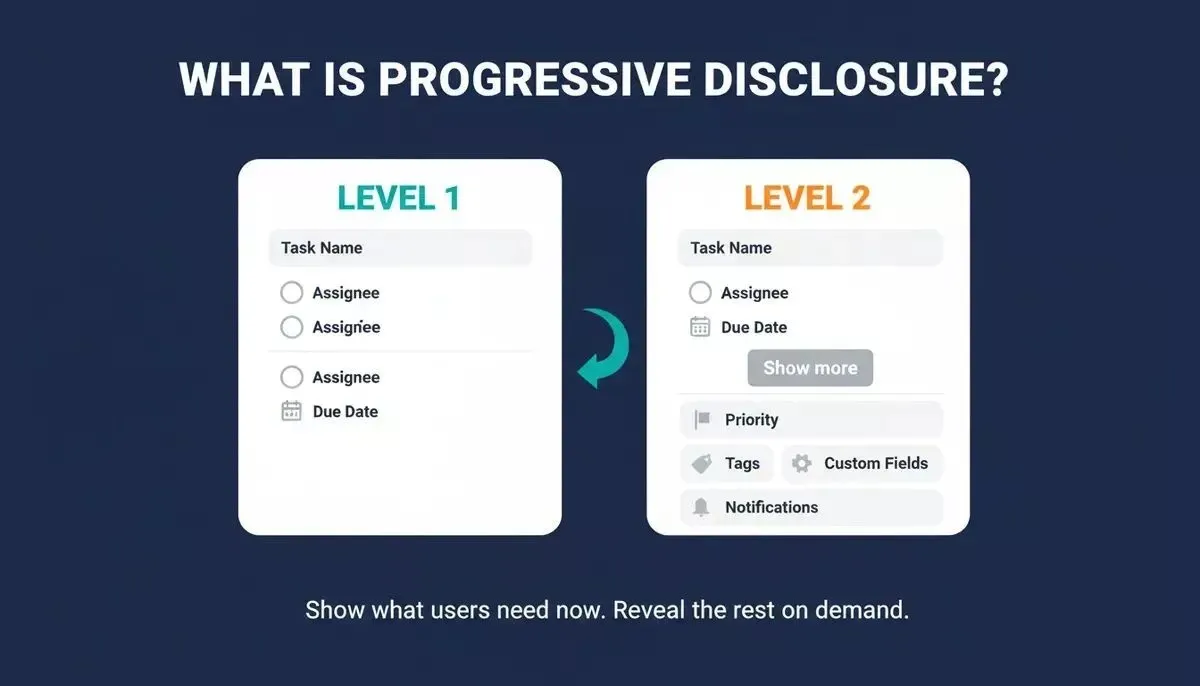
Level 1 shows core controls. Level 2 reveals advanced options only when the user asks for them.
Here is what progressive disclosure looks like in practice:
-
Level 1 displays the core controls that serve most users during most tasks. A project management app showing task name, assignee, and due date on the main interface is a classic example of presenting only relevant information first.
-
Level 2 reveals secondary features like custom form fields, priority tags, and advanced settings when a user clicks "Show more options." The progressive disclosure pattern keeps these behind a secondary screen, so most users can complete their task without confusion.
-
The print dialog is a classic example. The initial view shows copy count and printer selection. Advanced options like page scaling sit behind a button labeled "Advanced." Users who rarely need those settings never see them cluttering the main screen.
This is not about hiding features from users or preventing users from reaching advanced features. Progressive disclosure is about gradually revealing complexity at the pace users actually need it. Rich functionality stays accessible, just one click away, rather than cluttering the main interface.
For SaaS products, the stakes are high. When new users land on a product page showing 30+ features on a single screen, they face too much information that does not match their mental model. They cannot determine what matters, so they leave. The progressive disclosure pattern solves this by presenting information in layers, giving users only what matters at each stage of their journey through complex systems.
According to Nielsen Norman Group's original progressive disclosure guidelines, progressive disclosure improves three of five core usability components - learnability, efficiency of use, and error rate - by showing users only what they need right now and revealing the rest on demand.
The UX design technique has been validated since 1984, when IBM researchers Carroll and Carrithers published the Training Wheels study. New users learned faster and made fewer user errors when advanced features were walled off during early interactions.
Apple codified progressive disclosure in its 1992 Macintosh Human Interface Guidelines, and it remains a core interaction design principle in every major design system today. Progressive disclosure's goal has always been the same: to help users focus on one task at a time by gradually revealing only the content that matters for their current step.
For SaaS founders ready to build production apps from a prompt, progressive disclosure is the single most impactful UI pattern to implement first.
How Does Cognitive Load Block Feature Discovery?
Every additional option displayed on a screen demands attention from users, whether they need it or not, and that cumulative demand is what blocks feature discovery in SaaS products.
-
Hick's Law quantifies the damage. Decision time grows with the number of choices. When users face 30 options on a single screen instead of 3, the cognitive load required to choose increases dramatically. Progressive disclosure reduces cognitive load by presenting fewer choices at each step, making the path forward obvious rather than paralyzing.
-
The Training Wheels study proved that error prevention works. In Carroll's 1984 experiment, the control group (full interface displayed) burned nearly 25% of their time recovering from errors that the training-wheels interface simply made unreachable. Errors users cannot reach are errors they cannot make, and this reduces the error rate for new users dramatically.
-
Feature overload leads directly to drop-off. When too many options appear simultaneously on a cluttered interface, users experience visual clutter that confuses and overwhelms them, who just want to complete a simple task. New users cannot distinguish between primary actions and secondary features, which creates user errors and a frustrating experience.
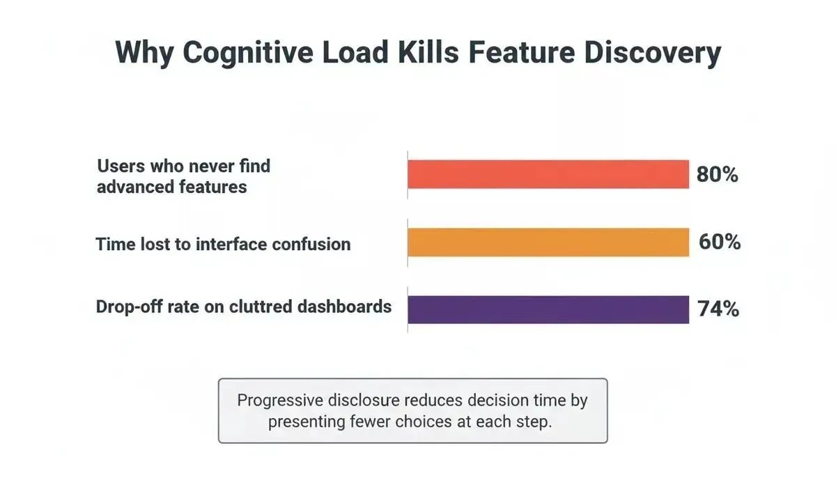
Data on user drop-off and confusion rates when interfaces exceed cognitive capacity.
Jakob Nielsen's 2026 analysis of disclosure levels introduces the "workbench test" for progressive disclosure. The rule states users should complete about 80% of their top tasks without opening any secondary drawer or menu. Each additional disclosure level multiplies clicks and halves discoverability for users.
Progressive disclosure reduces cognitive load for new users while keeping advanced features accessible for experienced users and power users who need them. The error rate drops, completion rates rise, and product pages stop feeling like complex systems that frustrate users on first contact. This makes sense for any SaaS product where users interact with complex features across multiple pages and screens.
Understanding how cognitive load shapes product decisions is essential before designing any SaaS interface layer.
Which UI Patterns Drive Progressive Disclosure in SaaS?
Three primary UI patterns implement progressive disclosure in SaaS products, and choosing the right one depends on the type of content being disclosed, the user's task flow, and how much complexity should be hidden behind a secondary screen.
| Pattern | Trigger | Best For | Progressive Enabling |
|---|---|---|---|
| Collapsed sections / Accordions | User clicks a header | Settings panels, FAQs, product pages | No |
| Conditional form fields | User selects an option or completes a prior step | Checkout flows, onboarding, complex forms | Yes |
| Multi-step wizards | User completes each stage in a sequence | Account setup, data import, staged disclosure flows | Yes |
Collapsed Sections and Accordions
Accordions let users expand and collapse content sections on a single screen. When a user clicks a section header, the content below appears. When they click again, it collapses, showing users only the content they actively want.
-
Settings panels in SaaS use accordions to organize groups of advanced options and advanced settings without displaying them all at once. Users navigate to the category they need and leave the rest collapsed, reducing visual clutter on the main interface.
-
Product pages on SaaS products show specifications, contextual help text, and additional details behind expandable headers. This keeps the main screen focused on price and the primary call to action while allowing users who want more information to find it easily.
-
Help documentation uses collapsed sections so users can scan headings and expand only the content that matches their question. This reduces scrolling through multiple pages of irrelevant text and lets users find what they need faster.
The key design constraint: labels must be specific. "Advanced color settings" works as a label. "More..." does not. Users need clear information scent to decide whether the click makes sense for their current task. A question mark icon next to a collapsed section can provide contextual help without cluttering the interface.
Conditional Form Fields and Progressive Enabling
Conditional disclosure reveals form fields only when a user selects an option that makes additional details relevant. Progressive enabling restricts certain actions until users complete prerequisite steps, guiding users through complex tasks by making the next step obvious only when they are ready.
-
A checkout flow shows payment details only after a user selects their payment method. Credit card fields appear when a user selects "Credit Card." Bank routing fields appear for ACH transfer. Users never see form fields they do not need, which prevents user errors and speeds up task completion.
-
An onboarding wizard uses progressive enabling to disable the "Continue" button until a user completes all required form fields in the current step. This guides users through complex tasks by making the path forward clear only when they have provided the needed information.
-
A project creation form reveals advanced settings (access control, notification preferences) only when a user clicks "Configure advanced options" after filling basic fields. This is progressive disclosure, allowing users to complete the simple version of the task without being distracted by advanced features they may never need.
Conditional form fields reduce the visible inputs on a single screen, which directly lowers user errors and helps users complete tasks with less confusion. Progressive enabling adds a second layer: even after fields appear, certain actions remain disabled until the user completes prerequisite steps.
Multi-Step Wizards and Staged Disclosure
Staged disclosure breaks complex tasks into a linear sequence displayed one step at a time across multiple pages. Each step shows only the content relevant to that specific stage, allowing users to focus on one decision at a time.
-
Account setup wizards split personal details, company information, team invitations, and billing into separate screens. A user completes one step, sees their progress, and moves forward. Breaking complex tasks into manageable steps prevents overwhelm.
-
Data import flows walk users through file selection, column mapping, validation, and confirmation as distinct stages. Staged disclosure guides users step by step through what would be an error-prone process if displayed on a single screen with all options visible at once.
-
Configuration wizards guide users through product setup by presenting one decision per screen. When a user selects "Team plan," the next screen shows only team-relevant settings. Staged disclosure keeps complex workflows manageable for both new users and experienced users.
The difference between progressive and staged disclosure matters for designers: progressive disclosure is hierarchical (Level 1 and Level 2 exist simultaneously on the same screen), whereas staged disclosure is linear (users move through a sequence, one step at a time). Both reduce cognitive load by showing users only what is needed at each moment, but they solve different interaction design problems.
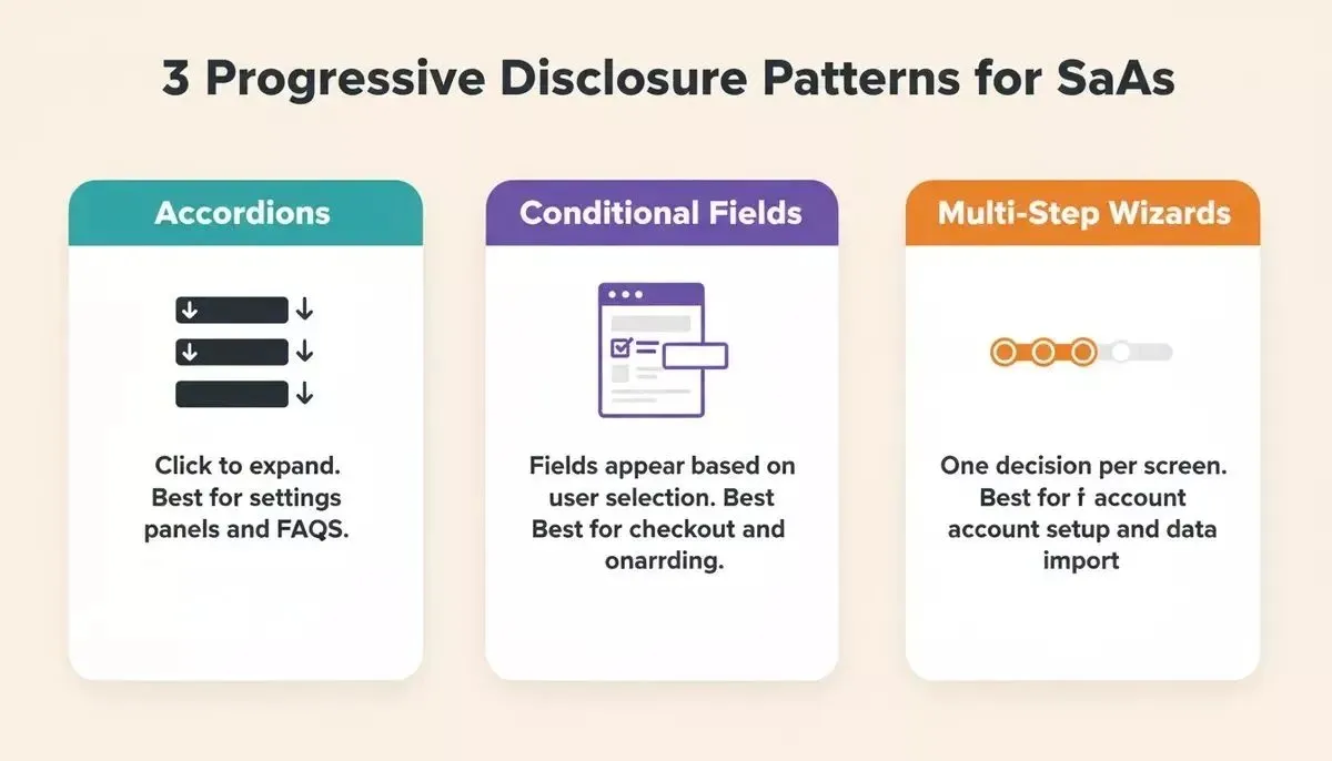
Accordions, conditional fields, and multi-step wizards each solve a different progressive disclosure problem.
This step-by-step guide to building with AI shows how these progressive disclosure patterns appear in production apps created without code.
Founders building B2B SaaS products with AI consistently find that progressive disclosure is the first UX pattern worth getting right before adding any other complexity.
How Rocket Builds Progressive Disclosure Without Writing Code
Traditional no-code tools offer drag-and-drop builders, but adding progressive disclosure patterns usually means hunting for accordion plugins, configuring conditional logic through visual rule editors, and wiring together multi-step form add-ons. The process is error-prone, time-consuming, and rarely produces the polished result that makes sense for a production SaaS product.
This section covers Rocket's Build pillar, the part of the platform that generates production-grade web apps (in Next.js) and mobile apps (in Flutter) from plain-language descriptions. Build sits alongside Solve, which validates what to build before a single screen is designed, and Intelligence, which monitors competitive signals continuously after launch. For this article, the focus is on how Build handles progressive disclosure specifically.
Rocket takes a fundamentally different approach to implementing progressive disclosure. You describe the interface you want in plain language, and Rocket generates a working application with the progressive disclosure patterns already built in.
-
For collapsed sections: Prompt Rocket with something like "Build a settings page where advanced options are hidden behind expandable sections. Show only the most important settings first, and let users click to reveal the rest." Rocket creates the accordion pattern with proper labels, smooth animations, and accessible markup, all from a single prompt.
-
For conditional form fields: Tell Rocket "Create a checkout form where payment details only appear after the user selects their payment method. If they choose a credit card, show card fields. If they choose bank transfer, show routing fields." The conditional progressive enabling logic generates instantly.
-
For multi-step wizards: Describe "Build an onboarding flow that guides new users through four stages: profile setup, team creation, preferences, and welcome dashboard. Show a progress bar and let users complete one step at a time." Rocket produces the full staged disclosure flow with navigation, validation, and progress indicators.
Before you write a single prompt, consider running a Solve research task first. Solve analyzes your market, your users, and your competitors to surface which features actually belong on Level 1 versus Level 2 based on real usage patterns and competitive gaps, not internal assumptions. The output feeds directly into Build so the first generation already reflects validated product thinking.
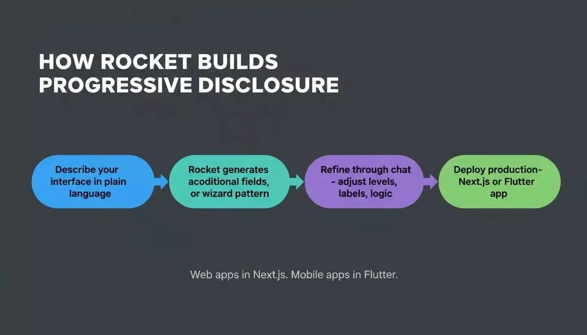
Describe your interface; Rocket generates the pattern, refines through chat, deploy production-ready code.
The difference shows up in three ways that matter for SaaS founders who want to implement progressive disclosure without hiring designers or developers:
-
Speed. What takes hours of plugin configuration in other tools takes one prompt and a few minutes on Rocket. You describe what you want, and the progressive disclosure interface appears with all interaction patterns working.
-
Production quality. Web apps are generated in Next.js with real component architecture; mobile apps in Flutter with full design systems. The design system includes dark/light theming, accessibility, and responsive layouts by default, not a visual builder that breaks when users interact with it on mobile devices.
-
Iteration through conversation. After the first generation, refine through chat. "Move billing into a secondary screen" or "Add progressive enabling so the submit button activates only after required fields are filled." Each change builds on existing context.
For best AI tools for non-developers, this prompt-based workflow eliminates the gap between knowing what progressive disclosure should look like and actually building it into a working product. When comparing AI builders for SaaS, Rocket stands apart because it produces deployment-ready applications with real progressive disclosure patterns rather than prototypes that need a developer to finish.
Rocket also ships every build with SEO-ready structure, WCAG accessibility compliance, and GDPR coverage as defaults, not optional extras you configure later.
What Mistakes Should You Avoid When Adding Progressive Disclosure?
Getting progressive disclosure wrong is worse than not using it at all. These are the most common failure modes that Lollypop Design's SaaS UX breakdown and Nielsen's research identify in production SaaS products.
-
The wrong split. Burying a daily-use feature behind a secondary screen creates what Nielsen calls "disclosure debt." Users pay an interaction tax on every single visit. Your task analysis must determine what belongs on Level 1 based on frequency-of-use data from analytics and support logs, not internal team opinions.
-
Too many levels. Two levels serve almost every design. Each additional level multiplies clicks and halves discoverability for users. If your product needs three or more disclosure levels, the real problem is feature complexity that needs simplifying, not more hiding.
-
Mystery-meat labels. A button labeled "More..." tells users nothing about what it reveals. Specific language like "Advanced scheduling settings" communicates what users will find on the secondary screen. Good labels provide a strong information scent that helps users decide without guessing.
-
Hiding critical information. Price, security requirements, and privacy terms must stay on Level 1 before users commit to any action. Progressive disclosure is about deferring complexity for users, not concealing information they need for decisions.
-
Skipping usability testing. Five novice users should complete Level 1 tasks unaided. Five experienced users should reach Level 2 within seconds. A design that passes one test but fails the other has merely relocated the pain for users rather than solving it.
-
Never pruning. Features accumulate over time, and screens fill with interface clutter. Schedule a review every release cycle: check analytics, identify what nobody touches, and demote or remove it from the main screen.
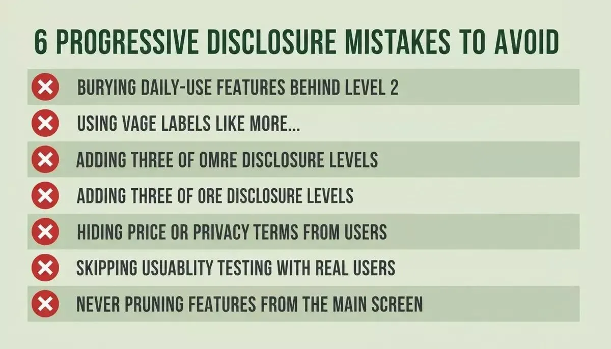
Six failure patterns that make progressive disclosure worse than having no layers at all.
The fix for these failure modes is straightforward: collect real usage data through analytics and field research, run usability testing with both user audiences, and iterate based on what users actually do rather than what your team assumes they need. Task analysis tells you the truth about which features belong on the primary screen and which deserve a secondary screen.
Check Rocket documentation for guides on building and testing these progressive disclosure interaction patterns with real user feedback loops built into your product.
Founders who have already validated their idea before building find it far easier to make the right Level 1 vs Level 2 split, because they have real user evidence rather than assumptions.
Ship the Right Amount of Interface at the Right Moment
Progressive disclosure has survived 40 years of interface evolution because human attention has not changed. Your SaaS users still process a limited amount of information at a time, still make fewer errors when complexity is staged, and still discover more features when the path forward is clear rather than cluttered with options they do not need.
The gap between knowing this UX design principle and applying it used to require a designer, a developer, and weeks of iteration. That gap no longer exists for founders who want to ship a clean product fast.
Rocket is the fastest way to go from knowing what progressive disclosure should look like to shipping it in a production SaaS product. Describe your interface in plain language, specify what belongs on Level 1 and what reveals on demand, and Rocket generates deployment-ready code with every interaction pattern built in, no plugins, no drag-and-drop configuration, no developer required.
Start building on Rocket.new for free with 20 credits and ship your first progressive disclosure interface today.
Table of contents
- -What Is Progressive Disclosure and Why Do SaaS Founders Need It?
- -How Does Cognitive Load Block Feature Discovery?
- -Which UI Patterns Drive Progressive Disclosure in SaaS?
- -Collapsed Sections and Accordions
- -Conditional Form Fields and Progressive Enabling
- -Multi-Step Wizards and Staged Disclosure
- -How Rocket Builds Progressive Disclosure Without Writing Code
- -What Mistakes Should You Avoid When Adding Progressive Disclosure?
- -Ship the Right Amount of Interface at the Right Moment