
The best AI prompts for dashboard UI components use a three-layer framework: context, design intent, and specifics. This guide covers 12 copy-paste prompts across KPI cards, data tables, charts, and navigation patterns with CTAs to test each one live on Rocket.
Writing structured, specific prompts is the real skill behind great AI-generated dashboards. The best AI prompts for dashboard UI components follow a three-layer framework covering context, design intent, and specifics, producing cleaner layouts, fewer revisions, and production-ready screens in minutes.
Why Do Most Dashboard Prompts Return Generic Layouts?
Why do 42% of AI-generated interfaces look nearly identical? According to an Adobe study from 2025, most people write vague prompts that give the AI almost nothing to work with. The output quality drops fast when you skip specificity.
A bad prompt like "create a dashboard" tells the AI to guess. It fills the screen with lorem ipsum text, placeholder cards, and a generic layout that could belong to any app type in any industry. Most people make the same mistake repeatedly: they forget to describe what the dashboard should actually do.
-
Vague prompts produce vague screens, without context about the product type or user role, AI defaults to the safest, most generic patterns it learned from training data
-
Forgetting states like empty state, loading, and error views means the prompt generates only the "happy path" and nothing else
-
Not telling the AI about the design intent or visual direction leaves layout decisions entirely to the model
-
A bad prompt rarely mentions data context, so the AI cannot pick the right chart type or table structure
-
The output becomes garbage when you skip describing specific elements like sidebar navigation, search input, or status indicators
The difference between a good prompt and a bad prompt is not about length. It is about structure and the right level of detail. When you describe the wrong things or describe nothing at all, AI makes assumptions that rarely match your vision.
What Makes a Well-Structured Prompt for Dashboards?
So what separates good prompts from bad ones? The answer comes down to a prompt framework that gives the AI clear instructions across three layers. A well-structured prompt communicates your design intent, data context, and visual direction in a format the AI understands without ambiguity.
Here is a prompt framework you can apply to any dashboard prompt you write:
| Layer | What It Covers | Example Details |
|---|---|---|
| Context | App type, industry, user role, screen type | SaaS analytics dashboard for a marketing team lead |
| Design Intent | Visual hierarchy, layout patterns, style reference | Clean layout with Inter font, subtle borders, indigo accent color |
| Specifics | Components, data types, interactive elements, states | KPI cards with percentage change, line chart for revenue, date range filter |
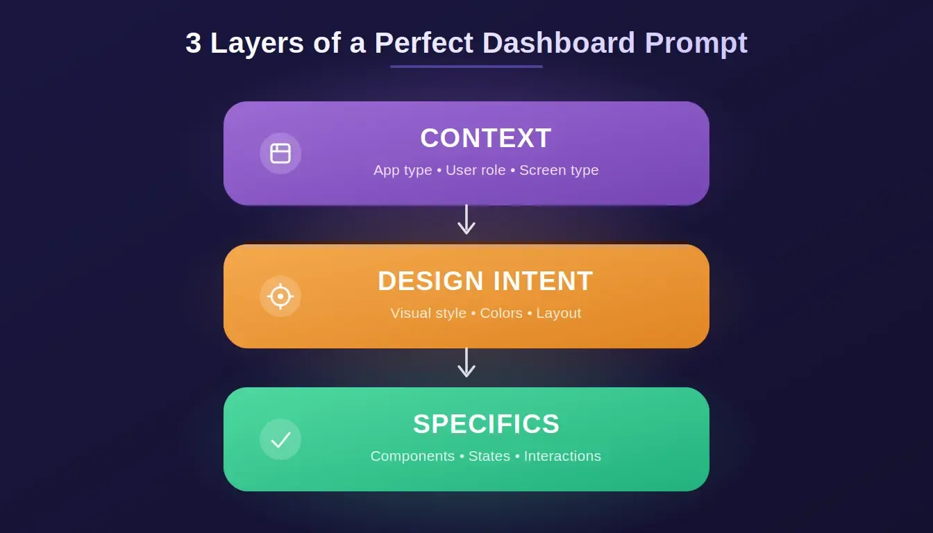
The three-layer framework — context, design intent, and specifics — is what separates production-ready dashboard output from generic layouts.
This framework actually works because it gives the AI enough data context to select the right components. When you specify that this is a saas analytics dashboard for tracking monthly revenue, the AI understands it needs metric cards, line charts, and comparison toggles. Without that context, it just produces a generic layout with placeholder content.
-
Context layer tells the AI who uses this screen: a customer-facing pricing page needs different navigation patterns than an admin settings panel
-
Design intent layer controls the visual output: mentioning dark theme with deep navy background and green accent color produces dramatically different results than "make it look modern"
-
Specifics layer names every component: listing individual components like notification bell, user avatar, collapsible sidebar navigation, and breadcrumbs, leaves no room for the AI to guess
-
Good prompts reference real products as style anchors: saying "Stripe-style dashboard with clean white background" gives the AI a reference point
The real skill is learning which details matter most for each screen type. A prompt for a SaaS dashboard needs different specifics than a prompt for a meditation app home screen or an e-commerce product detail page.
Prompts for KPI Cards and Analytics Dashboard Screens
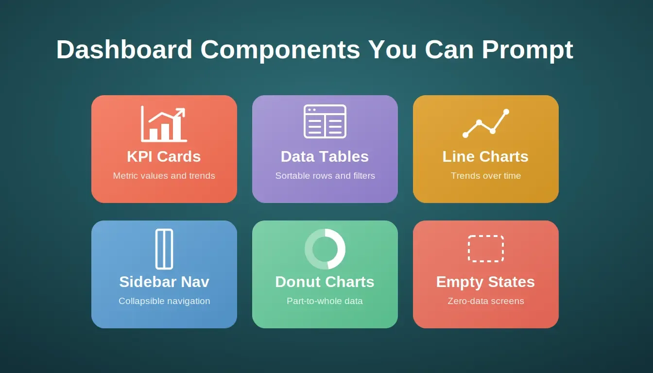
KPI cards are the most requested component in any analytics dashboard. They sit at the top of the screen, display key metrics at a glance, and set the tone for everything below. Yet most prompt templates skip the details that make metric cards feel real.
Here are three dashboard prompt examples that produce professional results for KPI cards and analytics screens:
Prompt 1: SaaS Analytics Dashboard
Generates a complete SaaS analytics screen with four metric cards, a revenue trend chart, and date-range controls in a single pass.
Example prompt:
"Generate a saas analytics dashboard with four KPI cards showing total revenue, active users, signups this month, and churn rate. Each card shows the metric label, current value, and percentage change compared to the previous year. Use the line chart below for monthly revenue trends. Include a date range picker and comparison toggle. Style: clean white background, Inter font, indigo as primary color, subtle borders between sections."
The AI will produce:
-
Four KPI cards with metric labels, live values, and percentage change indicators
-
A line chart component for monthly revenue with a comparison overlay toggle
-
A date range picker and section borders matching the indigo color system
Prompt 2: Marketing Campaign Tracker
Produces a dark-themed marketing dashboard with channel-level performance bars and preset date filters for campaign analysis.
Example prompt:
"Create a marketing analytics dashboard with metric cards for ad spend, click-through rate, cost per customer, and total conversions. Add a bar chart comparing campaign performance by channel. Include a date range filter with preset options for today, yesterday, this month, and custom. Dark theme with deep navy background, green for positive stats, red for negative."
The AI will produce:
-
Marketing KPI cards with color-coded positive and negative stat indicators
-
A bar chart comparing performance across paid, organic, social, and email channels
-
A date range filter bar with preset quick-select options
Prompt 3: Team Performance View
Creates a team-level dashboard with a donut chart for task distribution and a tab bar for switching between daily, weekly, and monthly views.
Example prompt:
"Design a team dashboard showing daily active users, tasks completed, average response time, and customer satisfaction score as KPI cards. Below the cards, add a donut chart for task distribution by category. Include a tab bar to switch between daily, weekly, and monthly views."
The AI will produce:
-
Four KPI cards covering team activity, completion rate, response time, and satisfaction score
-
A donut chart breaking down task volume by category, with labeled segments
-
A tab bar component with active state styling for view switching
The key elements that make these prompts generate better results are the specific metric labels, the chart type selections, and the color descriptions. The AI understands exactly what each card shows and how the data visualization connects to the numbers above it.
According to research on BI tools, the business intelligence market reached $38.15 billion in 2025, which means more teams are building dashboards with AI tools every day.
-
Always name the exact metrics you want displayed in each card
-
Specify the comparison period (previous month, previous year, same period last year)
-
Define the chart type that supports the data: line chart for trends, bar chart for comparisons, donut chart for part-to-whole
-
Include filtering options like a date range filter, a comparison toggle, or a category select
-
Good prompt engineering patterns consistently produce cleaner output than vague descriptions
Notice how each prompt generates a complete screen layout rather than individual components. That is the difference between writing prompts that work and writing prompts that return disconnected pieces.
Ready to turn these KPI card prompts into a live, deployed analytics dashboard? Rocket builds full-stack production apps directly from your description, with database, authentication, and responsive design included.
How Do You Prompt for Data Table Components?
Data tables are where most dashboard prompts fall apart. The AI needs to know about columns, rows, filtering, sorting, pagination, search input fields, bulk actions, and empty state handling. Skip any of these and the output feels incomplete.
Every major dashboard component — from KPI cards to empty states — can be generated with a well-structured AI prompt.
Here are three prompts that generate production-ready data table components:
Prompt 4: User Management Table
Generates a sortable, searchable user table with status badges, bulk actions, pagination, and an empty state, all in one prompt.
Example prompt:
"Create a user management data table with sortable columns for name, email, role, status, and last login date. Include a search input at the top left, a date range filter on the right, and bulk actions (delete, export, change role) that appear when table rows are selected. Each row should have a status indicator badge showing active, inactive, or pending. Add pagination at the bottom with page numbers. Include an empty state screen for when no results match the search. Style: clean layout, minimal borders, Inter font, responsive design."
The AI will produce:
-
A five-column sortable table with clickable column headers and ascending/descending sort arrows
-
A search bar and date range filter are positioned at the top of the table
-
Bulk action toolbar that activates on row selection, status badges per row, numbered pagination, and a styled empty state screen
Prompt 5: Orders Dashboard Table
Produces a multi-filter orders table with quick-action row menus and a hover state, ready for an e-commerce or operations dashboard.
Example prompt:
"Generate an orders management table with columns for order ID, customer name, product, quantity, total price, payment status, and fulfillment status. Add a multi-select filter for payment status and fulfillment status. Include a search bar that filters by customer name or order ID. Show a row hover state with a quick-action menu for view, edit, and cancel. Pagination at the bottom. Light theme, clean white background."
The AI will produce:
-
A seven-column orders table with multi-select filter dropdowns for status fields
-
A dual-field search bar filtering by customer name or order ID
-
Row hover state revealing a contextual quick-action menu with view, edit, and cancel options
Prompt 6: Analytics Events Log
Creates a real-time events log table with live refresh, alternating row colors, skeleton loading, and an empty state for monitoring dashboards.
Example prompt:
"Design a real-time events log table showing event name, user ID, timestamp, device type, and event value. Include a live refresh toggle in the header. Add column-level sorting and a global search. Rows should alternate background colors for readability. Include a loading skeleton state and an empty state with a message 'No events recorded yet.' Dark theme with monospace font for event names."
The AI will produce:
-
A five-column events log with alternating row backgrounds and a monospace font for event name cells
-
A live refresh toggle in the table header alongside column sort controls and a global search input
-
A shimmer skeleton loading state and a centered empty state message for zero-data scenarios
Always specify sortable columns; without this, the AI generates static table rows with no interactive sort functionality. Name your bulk actions explicitly: bulk selection with checkboxes, bulk delete, bulk export are separate patterns the AI needs to know about.
Describe the empty state. Most people forget that tables need a view for when there are zero results or zero entries. Specify pagination style: numbered pages, load more button, or infinite scroll. Include the search input placement and describe whether it filters by all columns or specific ones
The difference between a data table that feels ready for production and one that feels like a homework assignment comes down to the states and interactions you describe. Real data tables have loading states, error states, empty states, and hover states on each row.
You can also build full-stack apps with an AI prompt to connect these tables to a live database without writing backend code.
Want your data table prompts to become a working app with real database connections? Rocket generates production-ready Next.js and Flutter apps from a single description. Try Rocket free.
Prompts for Chart and Data Visualization Components
Charts are where dashboard design gets creative. The chart type you specify in your prompt completely changes what the AI generates. A line chart tells a story about change over time. A bar chart compares categories. A donut chart shows proportions. Most people just write "add a chart" and wonder why the output looks wrong.
Here are three prompt templates that produce specific chart components:
Prompt 7: Revenue Line Chart
Generates a monthly revenue line chart with a year-over-year comparison overlay and a hover tooltip showing exact values and percentage change.
Example prompt:
"Generate a line chart component showing monthly revenue over the past twelve months. The y-axis displays currency values. Include a comparison toggle to overlay the previous year's data as a dashed line. Add a tooltip that appears on hover showing the exact value and percentage change. Background: white card with subtle borders."
The AI will produce:
-
A twelve-month line chart with a currency-formatted y axis and labeled x axis months
-
A toggle control that overlays the previous year as a dashed secondary line
-
An interactive hover tooltip displaying the exact revenue value and year-over-year percentage change
Prompt 8: Bar Chart for Comparisons
Produces a horizontal bar chart comparing sales across product categories with a period comparison using dual-shade indigo fills.
Example prompt:
"Create a horizontal bar chart showing sales by product category. Display five to seven categories with labels on the left side. Use indigo fill for the current period and a lighter shade for the comparison. Include a legend and total at the top."
The AI will produce:
-
A horizontal bar chart with five to seven labeled category rows and dual-shade indigo bars for period comparison
-
A legend identifying current versus comparison period bars
-
A summary total is displayed at the top of the chart card
Prompt 9: Donut Chart with Details
Creates a traffic-source donut chart with percentage labels per segment and a center label showing total visitor count.
Example prompt:
"Design a donut chart component showing traffic sources: organic search, paid ads, social media, email, and direct. Each segment should have a distinct color from a calm palette. Display percentage labels inside or beside each segment. Add a center label showing total visitors."
The AI will produce:
-
A five-segment donut chart with distinct calm-palette colors for each traffic source
-
Percentage labels positioned inside or adjacent to each segment
-
A center label displaying the total visitor count as a summary figure
Always name the chart type explicitly in your prompt: line chart, bar chart, donut chart, area chart, or scatter plot. Describe what the axes show: time periods, categories, values, or percentages. Specify the comparison element: overlay lines, stacked bars, or side-by-side columns.
Include interaction details like tooltips on hover, click to filter, or zoom on selection. Reference the data visualization style you want, minimal with few gridlines, or detailed with every label displayed.
Charts generated from specific prompts look like they came from a real product. Charts from vague prompts look like stock illustrations.
Rocket also supports connecting Mixpanel to your app so your chart components pull from real analytics data rather than static mock values.
Skip the chart prompt iteration cycle entirely. Rocket builds complete data visualization dashboards with real data connections, not static mockups.
Prompts for Navigation, Sidebar, and Layout Patterns
Navigation is the skeleton of every dashboard. The sidebar navigation, header, tab navigation, and bottom tab navigation all need to be specified clearly, or the AI picks whatever pattern it sees most in its training data. That usually means a basic collapsible sidebar with zero customization.
Here are three navigation patterns and how to prompt for them:
Prompt 10: Collapsible Sidebar Navigation
Generates a dark-themed collapsible sidebar with icon-only mobile collapse, a notification bell, and a user avatar, all from a single prompt.
Example prompt:
"Create a dashboard with a collapsible sidebar navigation on the left side. The sidebar should include: company logo at the top, navigation links with icons for Dashboard, Analytics, Customers, Settings, and Reports. Add a notification bell and user avatar at the bottom. The sidebar collapses to icon-only on mobile. Use a dark theme with a deep navy background for the sidebar and white for the main content area. Include a hamburger menu button to toggle."
The AI will produce:
-
A dark navy collapsible sidebar with five labeled icon-navigation links and a logo at the top
-
A notification bell and user avatar are anchored to the bottom of the sidebar
-
A hamburger toggle button and icon-only collapsed state for mobile viewports
Prompt 11: Tab Navigation Dashboard
Produces a top-header dashboard layout with a centered search bar, profile avatar, and an indigo-accented tab bar for multi-section navigation.
Example prompt:
"Design a web dashboard with a top header containing the app logo on the left, a search input in the center, and a profile avatar on the right. Below the header, add a tab bar with sections: Overview, Analytics, Team, Billing, Settings. The active tab has an indigo accent color underline. Main content area below shows cards in a grid layout."
The AI will produce:
-
A fixed top header with logo, centered search input, and right-aligned profile avatar
-
A five-tab navigation bar with an indigo underline active state indicator
-
A card grid layout in the main content area below the tab bar
Prompt 12: Breadcrumb and Multi-Level Navigation
Creates a full dashboard shell with a fixed header, collapsible grouped sidebar, and breadcrumb path navigation for deep multi-level layouts.
Example prompt:
"Build a dashboard layout with a fixed top header showing the app logo, global search, notification bell, and user avatar with dropdown. Below the header, add a left sidebar with collapsible menu groups: Workspace, Reports, Integrations, and Admin. Each group expands to show sub-items. Add breadcrumb navigation below the header showing the current page path. Light theme, gray sidebar background, white content area."
The AI will produce:
-
A fixed top header with logo, global search, notification bell, and a user avatar dropdown
-
A left sidebar with four collapsible menu groups, each expanding to reveal sub-navigation items
-
A breadcrumb trail below the header reflects the current page path, with a light gray sidebar and white content area
Always specify the navigation pattern by name: collapsible sidebar, fixed sidebar, bottom tab navigation, top tab bar, or breadcrumb navigation. List every navigation item with its icon reference or label text.
Describe the dark mode toggle placement and behavior if the dashboard supports both themes. Specify what happens on mobile: does the sidebar collapse, switch to a bottom tab bar, or become a hamburger menu? Design-focused prompt patterns help designers get layout decisions right on the first attempt
The navigation patterns you choose affect how the entire dashboard feels. A collapsible sidebar navigation works for admin panels with many sections. A tab bar works for simpler screens with fewer pages. Describing both the default state and the collapsed state in your prompt prevents rework later.
Turn your navigation prompts into a fully deployed dashboard app. Rocket handles the full stack, frontend, backend, and deployment, so your layout ships as a working product.
How Rocket Turns Dashboard Prompts into Production Apps
Writing good prompts is one skill. Turning those prompts into production code that actually ships is another problem entirely. Most AI tools generate screens that look right in a preview but break the moment you try to connect real data, add hover states, or deploy to a live domain.
Rocket takes a fundamentally different approach. Instead of generating one-shot static mockups from a prompt, Rocket starts with market research and strategic context before writing a single line of code. It understands your industry, analyzes competitor apps, and creates full-stack production code in Next.js or Flutter.
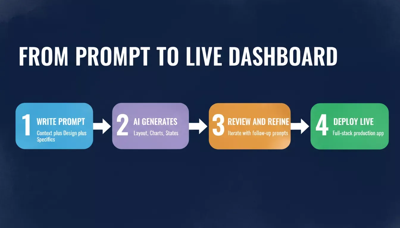
Rocket takes your dashboard prompt through four stages: structured input, AI generation, iteration, and live deployment.
-
Rocket generates production-ready apps, not just screens. The platform creates working landing pages, pricing pages, product detail pages, onboarding screens, and complete admin dashboards from a single description
-
Every build includes a database, authentication, responsive design, and SEO as defaults, features that other tools like v0 and Bolt treat as afterthoughts
-
The platform retains context between sessions, unlike tools where you start from scratch every time- Rocket remembers your product decisions and builds on them
-
Rocket supports 26+ connectors, including Stripe, Supabase, HubSpot, and Mixpanel, all wired up from chat without manual API setup
-
67% of design teams use AI to accelerate interface creation, but most still need a separate tool to ship production apps
The real value of Rocket is that your dashboard prompt becomes a deployed application, not a Figma file that needs months of development. You describe a saas analytics dashboard with KPI cards, chart components, and user management tables, and Rocket delivers a working app with real data connections.
Where other platforms generate individual components and hope you can stitch them together, Rocket handles the full stack. That means your dashboard prompt produces code you can actually deploy, iterate on, and ship to customers today.
You can also explore how Rocket builds production-grade apps to understand what happens after your prompt is submitted.
Prompts for Empty States, Loading, and Onboarding Screens
The screens most people forget to prompt for are the ones that make or break the user experience. Empty state screens, loading views, onboarding flows, and error pages all need dedicated prompts. Without them, the AI only generates the "data loaded" version of your dashboard.
Here is how to prompt for these overlooked screen types:
Empty State Prompt: "Generate an empty state screen for a dashboard analytics section. Show a calm illustration centered on the page with a headline saying 'No data yet' and a secondary text explaining that results will appear after the user connects their first data source. Include a primary CTA button labeled 'Connect Data Source' in indigo. Clean white background with playful but minimal illustration style."
Onboarding Screen Prompt: "Create a three-step onboarding screen for a dashboard app. Step one: select your app type (SaaS, e-commerce, mobile). Step two: connect data sources with icons for Stripe, Google Analytics, and custom API. Step three: choose your home screen layout from three preset options displayed as cards. Include a progress indicator, skip link, and next button. Dark mode with deep navy background."
-
Empty states need a clear CTA; every empty state screen should tell users what to do next with a visible button
-
Onboarding screens should show progress, step indicators, percentage bars, or numbered pages to keep users moving forward
-
Loading states deserve their own prompt, skeleton screens, shimmer animations, or progress bars, all need a description
-
Login screens often get overlooked. Specify whether you want social login buttons, email plus password, or magic link flows
-
Dashboard builders that understand state management handle these automatically
The best dashboard prompts account for every state a user might see. That includes the first visit with no data, the loading moment between pages, and the error view when something breaks. These screens represent the visual hierarchy of your app just as much as the main dashboard view does.
Ready to ship dashboards that handle every state automatically? Rocket builds complete apps with empty states, loading screens, and onboarding flows built in from the start.
Start building for free on Rocket.
Prompt Comparison: Vague vs. Specific Dashboard Prompts
Understanding why specific prompts outperform vague ones helps you write better inputs every time. The table below shows how the same request changes output quality based on prompt structure.
Specific prompts eliminate guesswork at every layer, role, metric, chart type, and states are all defined before the AI starts generating.
| Prompt Type | Example Input | Output Quality | What Is Missing |
|---|---|---|---|
| Vague | "Create a dashboard" | Generic layout, lorem ipsum | Role, metrics, chart type, states |
| Partial | "Create a SaaS dashboard with charts" | Better layout, random charts | Specific metrics, interactions, colors |
| Structured | "SaaS analytics, 4 KPI cards, line chart, date filter, indigo theme" | Production-ready screen | Nothing critical |
| Full Framework | Context + Design Intent + Specifics | Deployment-ready UI | Nothing |
The gap between a vague prompt and a structured prompt is not about word count. It is about the three layers: context, design intent, and specifics. Each layer removes one category of guesswork from the AI.
Dashboard AI Adoption: What the Data Shows
AI-assisted dashboard building is accelerating across every team type. The business intelligence market reached $38.15 billion in 2025, driven by teams that need faster iteration cycles and fewer developer dependencies.
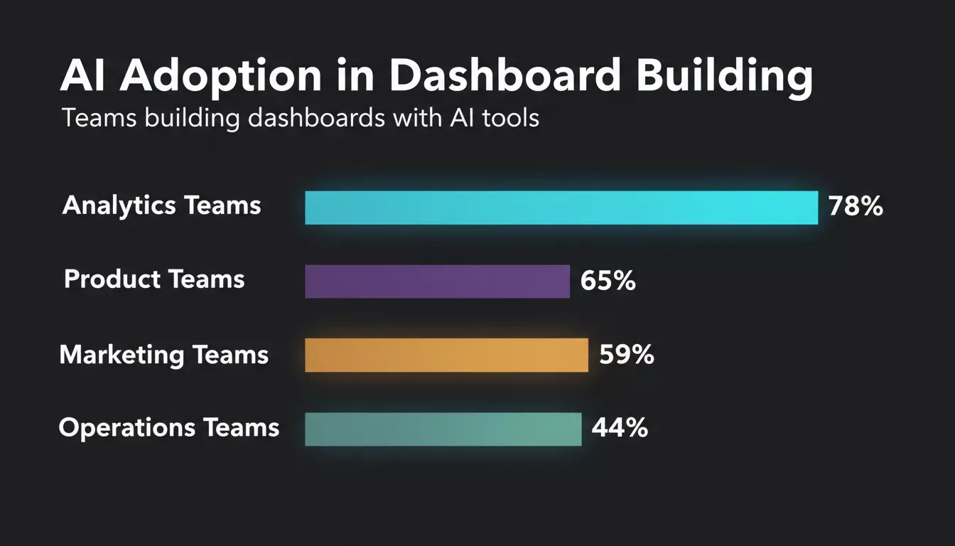
Analytics and product teams lead AI adoption for dashboard UI components, with operations teams catching up rapidly.
Teams that adopt structured prompt frameworks ship dashboard components significantly faster than those relying on manual design-to-code workflows. Rapid prototyping with AI reduces the gap between an idea and a testable screen from days to minutes.
The pattern is consistent: teams that describe more, revise less. Specificity at the prompt stage is the single highest-leverage investment in any AI-assisted dashboard workflow.
Build Dashboards That Match Your Vision
The gap between writing a prompt and shipping a working dashboard is where most projects stall. Good prompts give you better starting points, clearer layout patterns, and faster iteration cycles. But the goal was never the prompt itself, it was always the finished product your users interact with.
Every technique in this guide applies whether you are prompting for a single chart component or an entire analytics platform with multiple screens. Start with context, layer in design intent, and name your specific elements. The twelve prompts above cover KPI cards, data tables, charts, navigation patterns, and empty states, every major component category a production dashboard needs.
Rocket takes the best AI prompts for dashboard UI components further than any other platform. Your description becomes a deployed, production-ready application with real data connections, authentication, and responsive design built in from the start.
Start building on Rocket.new for free and ship your dashboard today.
Table of contents
- -Why Do Most Dashboard Prompts Return Generic Layouts?
- -What Makes a Well-Structured Prompt for Dashboards?
- -Prompts for KPI Cards and Analytics Dashboard Screens
- -Prompt 1: SaaS Analytics Dashboard
- -Prompt 2: Marketing Campaign Tracker
- -Prompt 3: Team Performance View
- -How Do You Prompt for Data Table Components?
- -Prompt 4: User Management Table
- -Prompt 5: Orders Dashboard Table
- -Prompt 6: Analytics Events Log
- -Prompts for Chart and Data Visualization Components
- -Prompt 7: Revenue Line Chart
- -Prompt 8: Bar Chart for Comparisons
- -Prompt 9: Donut Chart with Details
- -Prompts for Navigation, Sidebar, and Layout Patterns
- -Prompt 10: Collapsible Sidebar Navigation
- -Prompt 11: Tab Navigation Dashboard
- -Prompt 12: Breadcrumb and Multi-Level Navigation
- -How Rocket Turns Dashboard Prompts into Production Apps
- -Prompts for Empty States, Loading, and Onboarding Screens
- -Prompt Comparison: Vague vs. Specific Dashboard Prompts
- -Dashboard AI Adoption: What the Data Shows
- -Build Dashboards That Match Your Vision