Glassmorphism uses backdrop filter blur, semi-transparent backgrounds, gradient borders, and box shadow to create floating glass panels. Rocket's Build pillar generates these as production-ready Next.js or Flutter code from a plain-language prompt, with WCAG-compliant contrast built in.
Rocket generates production-grade glassmorphic cards, modals, and nav bars from a single prompt. No CSS expertise needed, no designer required. Describe the glass effect you want and ship a premium-looking app in minutes using Rocket's glassmorphism UI AI app builder.
What Makes Frosted Glass Panels Feel Premium in Apps?
Glassmorphism is a UI design style that simulates frosted glass surfaces floating above background content, using CSS transparency, blur, and layering to create visual depth. It relies on four specific properties working together, and understanding them helps you write more precise prompts when using any glassmorphism UI AI app builder.
The four properties are backdrop filter blur, semi-transparent background, gradient border, and box shadow, and each one plays a distinct role in making glass feel real.
-
Background blur via backdrop filter: The backdrop-filter:
blur()property applies a Gaussian blur to everything behind the glass panel. Most implementations use between 8px and 20px of backdrop filter blur depending on the composition. -
Semi-transparent background with low opacity: A semi-transparent background using rgba color values at 10–30% opacity gives the glass surface its translucent look. This lets users perceive depth without losing focus on foreground content.
-
Gradient borders for definition: A subtle gradient border running along panel edges mimics how light catches real glass. These gradient strokes help the eye distinguish glassmorphic elements from other design elements on the page.
-
Box shadow for floating depth: Soft box shadow values create the illusion that glass panels are floating above background elements. Combined with border radius for rounded shapes, this gives buttons, cards, and icons that characteristic modern glassmorphism look.
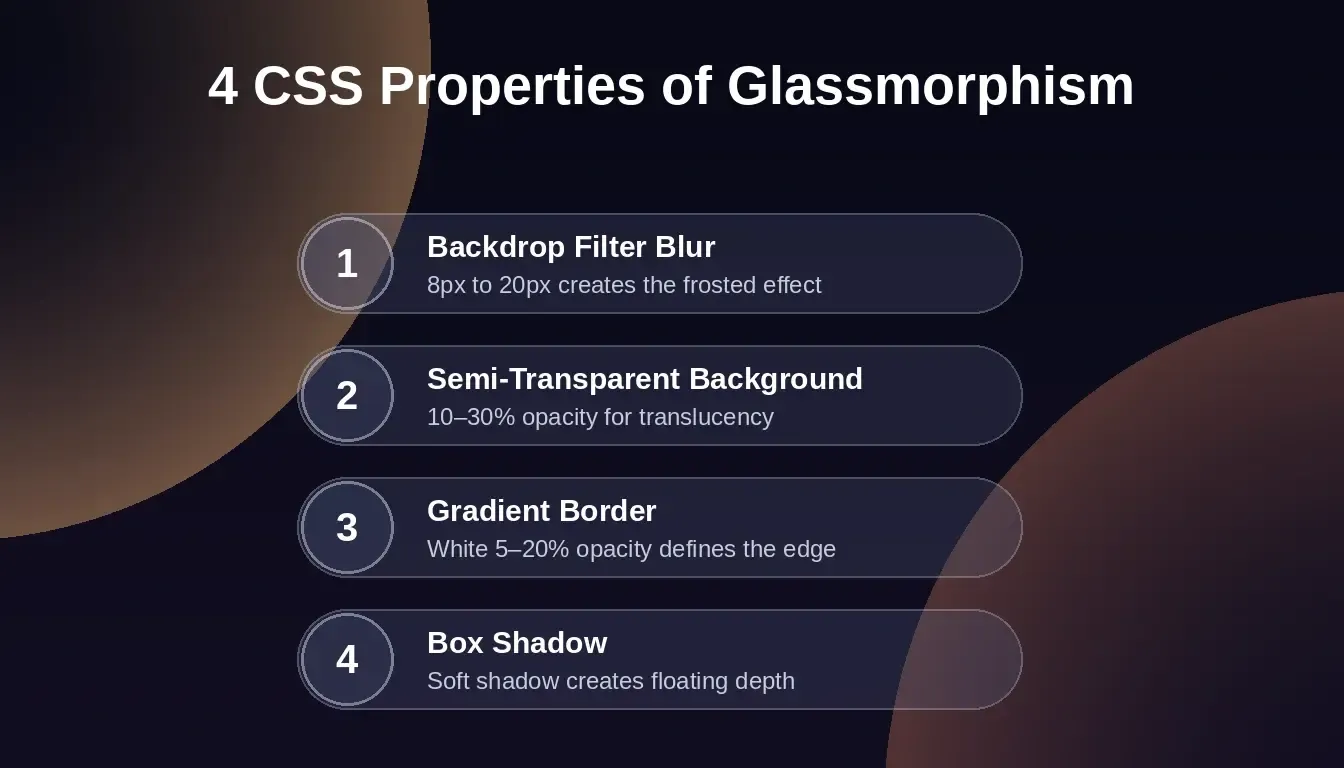
The four CSS properties that combine to produce the glassmorphism frosted panel effect.
When you stack these four properties on a vivid dark background or gradient, the glassmorphism effect feels intentional and premium rather than decorative. Learning to specify these values precisely in your prompts is what separates generic AI output from polished glass UI, a skill covered in depth in the AI prompts guide for designers.
How Did Glass UI Evolve from macOS to Apple Vision Pro?
The glassmorphism trend traces a clear line from early Apple design decisions through spatial computing. Understanding that history helps you know which glass patterns hold up over time and which are purely decorative.
-
iOS 7 and early transparency (2013): Apple introduced translucent panels and background blur across the user interface. Design systems shifted toward layered depth for the first time in mobile.
-
macOS Big Sur and refined glass (2020): Apple pushed glassmorphism further with frosted glass sidebars, menus, and overlapping elements. This release showed many designers that glass could work as a functional design style, not just an aesthetic one.
-
visionOS and spatial glass (2024–2025): Apple Vision Pro made glass the default interface material. Every panel, menu, and modal in visionOS uses background blur, semi-transparent layers, and light refraction to add depth.
-
Liquid Glass and design systems (2026): Apple's Liquid Glass release turned glassmorphism into a dynamic visual system rather than a static style. Cards, buttons, and panels now respond to motion, context, and lighting conditions.
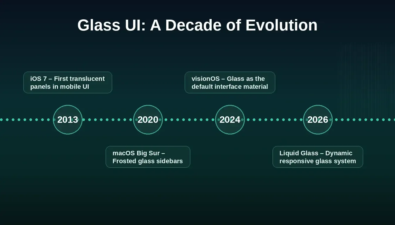
Glassmorphism has been reinforced by Apple's platform decisions across more than a decade.
This timeline matters because glassmorphism is not a passing ui design trend. It is the visual design language of spatial computing. If you are building apps that need to feel current in 2026 and beyond, glass UI is the direction the entire platform ecosystem is moving. Understanding how to build web apps without a traditional design workflow becomes especially valuable when the design language itself is this well-established.
Why Do Dark Interfaces and Glass Layers Work So Well Together?
Dark glassmorphism pairs semi-transparent background panels against deep gradient backgrounds, producing stronger visual hierarchy with less visual noise. The combination works because dark themes amplify every strength of the glass effect while minimizing its weaknesses.
-
Higher contrast creates better readability: White or light text against a dark background with glass overlay achieves a high contrast ratio that meets accessibility standards. Dark mode glassmorphism naturally produces sufficient contrast without extra work.
-
Background blur adds depth without noise: When background elements are dark gradients or deep color fields, applying backdrop filter blur creates smooth, elegant depth. Dark themes soften busy backgrounds because the blur blends into already-muted tones.
-
Layers feel more distinct: Semi-transparent panels over a dark background create a clear sense of depth that users can quickly parse. Dark mode glassmorphism reduces cognitive load by establishing obvious hierarchy through subtle shadows.
-
Monochromatic color schemes unify the composition: Dark glassmorphism typically uses monochromatic color schemes with one or two accent colors, keeping the design style clean and preventing glass panels from competing with interactive elements.
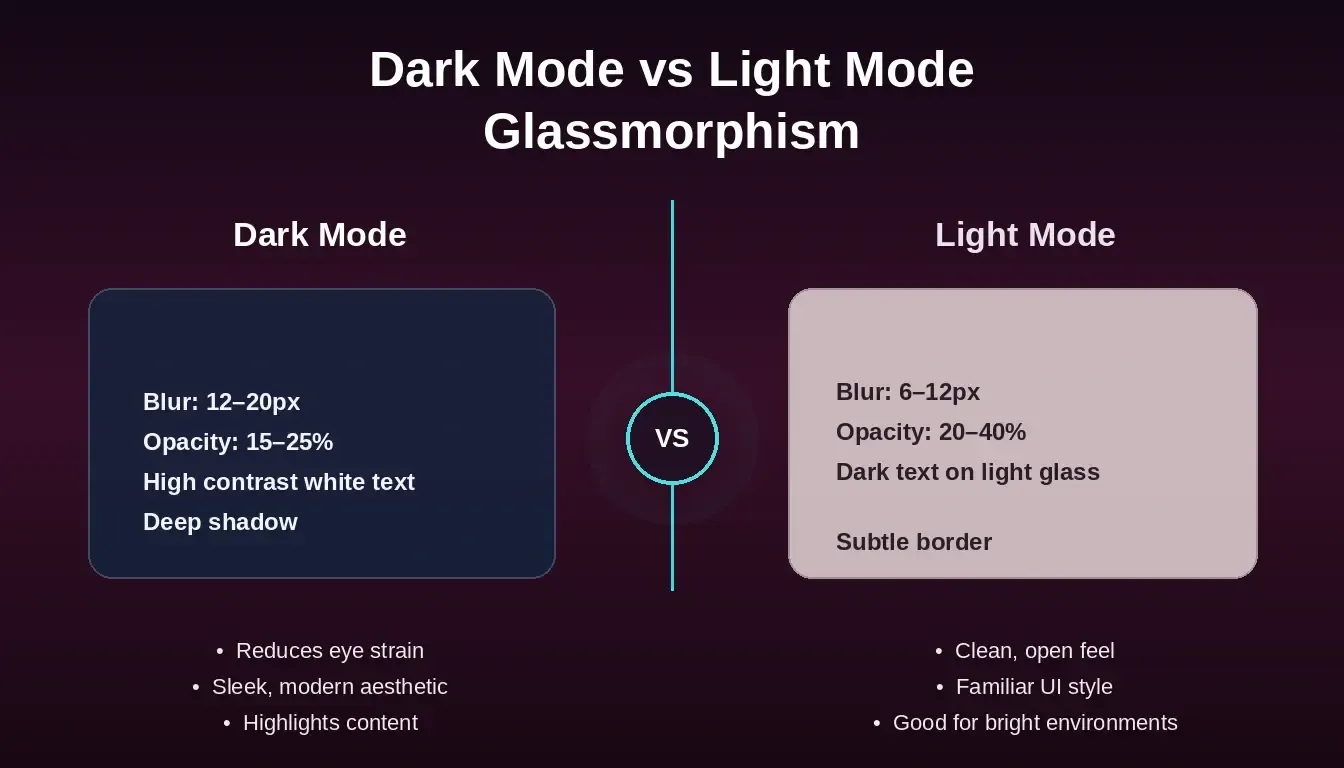
Dark mode uses deeper blur and lower opacity; light mode requires higher opacity and lighter blur to maintain readability.
1flowchart LR
2 A[Pick Interface] --> B{Dark or Light?}
3 B -->|Dark| C[Blur 12-20px\nOpacity 15-25%]
4 B -->|Light| D[Blur 6-12px\nOpacity 20-40%]
5 C --> E{Contrast 4.5:1?}
6 D --> E
7 E -->|Pass| F[Ship It]
8 E -->|Fail| G[Add Border\nor Shadow]
9 G --> E
10
11 classDef dark fill:#1E1B4B,stroke:#4F46E5,color:#EEF2FF
12 classDef light fill:#FFF7ED,stroke:#F97316,color:#1E293B
13 classDef check fill:#F0FDF4,stroke:#059669,color:#1E293B
14 classDef ship fill:#0F172A,stroke:#6366F1,color:#F8FAFC
15
16 class A,B dark
17 class C dark
18 class D light
19 class E,G check
20 class F ship
Glassmorphism decision flow for blur, opacity, and contrast.
What Prompt Creates Glassmorphic Cards and Modals?
Getting a specific glassmorphism effect from a glassmorphism UI AI app builder comes down to how precisely you describe it. Specific prompts that reference actual CSS properties produce exactly the component you picture, in minutes instead of hours. The following three templates follow the pattern that works: name the component, specify the glassmorphism properties, and describe its position in the interface.
Generates: a pricing card with frosted glass styling
1Build a pricing card component with glassmorphism styling.
2Use a semi transparent background with rgba white at 10% opacity.
3Apply backdrop-filter: blur(16px) for the frosted glass effect.
4Add a 1px gradient border from white at 20% to white at 5%.
5Include a soft box shadow at 0 8px 32px with black at 10% opacity.
6Set border radius to 16px.
7Place it on a dark gradient background from deep indigo to dark purple.
Generates: a centered modal with glass overlay
1Create a centered modal with glassmorphism design style.
2Background: semi transparent dark panel at 15% opacity with backdrop filter blur at 20px.
3Include a close button with glass effect, gradient border, and subtle box shadow.
4Modal content: bold typography for headings, regular weight for body text.
5Overlay background should blur the page content behind it.
Generates: a sticky nav bar with frosted glass effect
1Build a sticky navigation bar with frosted glass effect.
2Use backdrop-filter: blur(12px) on a semi transparent background.
3Logo on the left, menu items centered, CTA button on the right.
4Buttons: glass effect with slight gradient and border radius 8px.
5The nav should work in both dark mode and light mode with proper contrast.
The more specific you are about backdrop filter blur values, transparency levels, and color, the closer the output matches what you picture. For broader prompting patterns across component types, the Build overview in the docs covers how to structure prompts for any app type. You can also explore how micro-interactions layer on top of glass components to make the UI feel even more polished.
Why Rocket Ships Glass UIs That Look Designed, Not Generated
Product pages with interactive glass-effect panels show up to a 20% increase in user interactivity. That number explains why glassmorphism shifted from a visual design experiment into a production-ready ui design trend in under two years.
Rocket is a vibe solutioning platform that combines three capabilities: Solve for market and design research, Build for AI-generated production apps, and Intelligence for competitor monitoring. Within Build, Rocket approaches glassmorphism differently because it starts from design thinking, not just code generation.
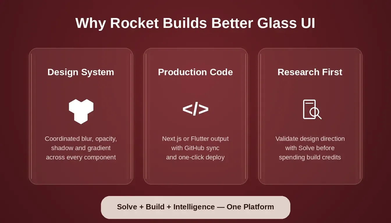
Rocket's three-pillar platform means glass UI is validated, built, and monitored, not just generated.
-
Design systems built into generation: Every glassmorphism component Rocket creates follows a consistent design system with coordinated opacity, blur, gradient, and shadow values. Cards, buttons, modals, and icons share the same glass language rather than each getting random values.
-
Dark and light mode variants on request: When you specify both modes in your prompt, Rocket generates dark and light variants of glass components. The backdrop filter blur, semi-transparent background values, and contrast ratios adjust for each context.
-
Real visual hierarchy, not flat layers: Rocket varies opacity, blur level, and box shadow across different interface layers. A nav bar gets lighter blur than a modal overlay. A card gets less depth than a popup menu.
-
Production-grade code you can copy: The output is production Next.js code with proper CSS, accessible markup, and performance-optimized backdrop filter blur. You can download the source, push to GitHub, or ship it live in one click.
-
Component variety with personality: Buttons get different opacity and border radius than cards. Navigation panels use different background blur intensity than modal overlays. Each element feels part of the same design style while remaining distinct.
Before committing to a glass-heavy design direction, use Rocket's Solve pillar to validate whether that aesthetic fits your target audience. Research informs the build rather than following it. If you are building a SaaS product with a glass dashboard, the bento grid UI guide shows how glass panels map onto modern dashboard layouts.
How Rocket Compares to Generic AI Builders for Glass UI
| Capability | Rocket Build | Generic AI Builders |
|---|---|---|
| Design system consistency | Coordinated opacity, blur, shadow per system | Values assigned per component independently |
| Dark and light mode | Generated when specified in prompt | Depends on prompt; no system-level adjustment |
| Code ownership | Full source download, GitHub sync | Varies by tool |
| Deployment | One-click launch, custom domain | Varies by tool |
| Pre-build validation | Solve research available before building | Not available |
| Competitor monitoring | Intelligence pillar tracks design trends | Not available |
Which Accessibility Traps Should You Avoid with Glass Effects?
Glassmorphism introduces specific accessibility challenges that many implementations get wrong. Real-world examples from design agencies show both excellent and poor applications of the glassmorphic effect.
The most common glassmorphism accessibility issue is inconsistent readability where text contrast drops below WCAG 4.5:1 ratios. This appears when designers apply the same opacity and blur settings across different background colors without testing each context.
| Do | Don't |
|---|---|
| Use bold typography with high contrast on glass panels | Use thin fonts on semi-transparent backgrounds |
| Test blur level against multiple background images and colors | Assume one blur value works for every background |
| Keep interactive elements like buttons clearly visible with border contrast | Place low-opacity buttons on a busy background |
| Increase contrast on text overlapping glassmorphic elements | Rely on blur alone to create readability |
| Provide a non-glass fallback for users who enable reduced transparency | Ignore accessibility preferences in the operating system |
| Test on lower-end devices where backdrop filter blur affects performance | Ship heavy blur effects without testing on mobile screens |
A simple rule: if you can't read the text clearly when you squint, the contrast isn't high enough. Add a slightly darker semi-transparent background, increase the blur, or add subtle shadows behind the text to fix it.
Rocket's Build output includes WCAG 2.1 AA accessibility checks. The accessibility polish tools in the editor can audit contrast ratios and ARIA labels after generation. For complex interfaces where progressive disclosure matters, understanding how progressive disclosure UI works helps you decide which glass layers to show and when.
Glassmorphism UI Properties: Reference Data
Key numeric ranges for backdrop filter blur, background opacity, and contrast across light and dark modes.
| Property | Light Mode Range | Dark Mode Range | Effect on Glass Quality |
|---|---|---|---|
| Backdrop filter blur | 6px to 12px | 12px to 20px | Higher blur = stronger frosted effect |
| Background opacity | 20% to 40% | 15% to 25% | Lower opacity = more transparent glass |
| Border radius | 8px to 24px | 8px to 24px | Larger radius = softer, more modern feel |
| Gradient border opacity | 10% to 30% | 5% to 20% | Subtle border = refined glass edge |
| Box shadow spread | 8px to 16px | 16px to 32px | Larger spread = more floating depth |
| Text contrast ratio | 4.5:1 minimum | 4.5:1 minimum | Below 4.5:1 fails WCAG accessibility |
Describe Your Glassmorphic UI to Rocket
If your next app deserves that Apple-grade glass finish, Rocket is the glassmorphism UI AI app builder that ships it right.
Describe your glassmorphic interface, get production-ready frosted glass cards, modals, and nav bars in minutes, and skip the CSS headaches entirely.
Start building on Rocket.new and see the difference in your first generation.
Table of contents
- -What Makes Frosted Glass Panels Feel Premium in Apps?
- -How Did Glass UI Evolve from macOS to Apple Vision Pro?
- -Why Do Dark Interfaces and Glass Layers Work So Well Together?
- -What Prompt Creates Glassmorphic Cards and Modals?
- -Why Rocket Ships Glass UIs That Look Designed, Not Generated
- -How Rocket Compares to Generic AI Builders for Glass UI
- -Which Accessibility Traps Should You Avoid with Glass Effects?
- -Glassmorphism UI Properties: Reference Data
- -Describe Your Glassmorphic UI to Rocket