
AI-built apps often work but feel lifeless. Micro-interactions like button feedback, inline validation, and skeleton screens close the gap between functional and polished. This guide shows where they break down and how to prompt for them.
Micro-interactions for AI-generated apps, button feedback, inline validation, and loading animations, are the difference between a product users return to and one they quietly abandon. This guide explains what they are, where AI-built apps consistently miss them, and how to prompt your builder to add them screen by screen.
Why Does Your Vibe-Coded App Feel Hollow?
Most AI-built apps feel like prototypes even when every feature works. The answer lives in the gap between functional and polished. According to research from UXCam, 88% of users are less likely to return after a bad user experience, and most of those bad experiences come from missing feedback, not missing features.
Your app works. Buttons trigger the right actions. Forms submit data correctly. But nothing confirms, nothing responds, nothing signals that the system heard what the user did. That silence is what makes users leave.
This post walks through what micro-interactions are, where AI-generated apps consistently miss them, and exactly how to prompt your builder to add them screen by screen.
Try it yourself:* Describe your app on Rocket and see the difference a design-aware builder makes from the first generation.*
What Are Micro-Interactions and Why Do They Matter?
Micro-interactions are small, single-purpose moments in an interface that respond to a user action with immediate feedback. They sit between the user and the system, providing visual cues that something happened, something is happening, or something needs attention.
-
A toggle switch that slides with weight instead of snapping instantly tells users their preference is registered
-
A submit button that briefly shows a checkmark confirms the form went through without forcing users to read a success message
-
A skeleton screen during loading keeps the user informed about the system status instead of showing a blank void
-
An input field that highlights red in real time when the email format is wrong helps users complete tasks without frustration
These microinteractions are not decorative. They are functional animations that reduce cognitive load, prevent errors, and guide users through each step of your app. Well-designed micro-interactions serve a clear purpose: they communicate system status, provide feedback, and create positive feelings of control.
Nielsen Norman Group's foundational principle of Visibility of System Status, the first of ten usability heuristics, is exactly what micro-interactions implement at the component level. Every button state, every loading indicator, every inline error message is a direct application of that principle.
If you are crafting effective app prompts, specifying these details upfront dramatically better results in your first generation.
How Do Small Animations Change User Behavior?
The connection between subtle animation and user behavior is well documented. When interactions feel responsive, users stay longer. When they feel mechanical and dead, users assume the product is broken.
| Micro-Interaction Type | User Behavior Impact | Where It Applies |
|---|---|---|
| Button press feedback | Reduces double-taps and accidental submissions by 40% | Any clickable element |
| Inline form validation | Cuts for abandonment by reducing error frustration | Sign-up, checkout, settings |
| Progress indicators | Keeps user informed during multi-step flows | Onboarding, uploads, payments |
| Loading skeletons | Reduces perceived wait time by providing visual feedback | Feeds, dashboards, search results |
| Hover effects and transitions | Shows interactive elements clearly, improving navigation | Menus, cards, links |
According to BlazeDream's 2025 UX analysis, 70% of users say animations help them better understand an interface. The subtle animation that confirms a save, the progress bar that shows upload status, the color shift on hover that signals clickability: these small details create the feeling of a responsive, living product.
User engagement rises because providing feedback at every interaction point removes uncertainty. Users no longer wonder "did that work?" or "is it loading?" The app answers before the question forms.
Where Vibe-Coded Apps Typically Break Down
Most AI app builders produce functional code that handles logic correctly. The button triggers the API call. The form stores data in the database. The navigation routes are on the right screen. But the experience layer is consistently missing.
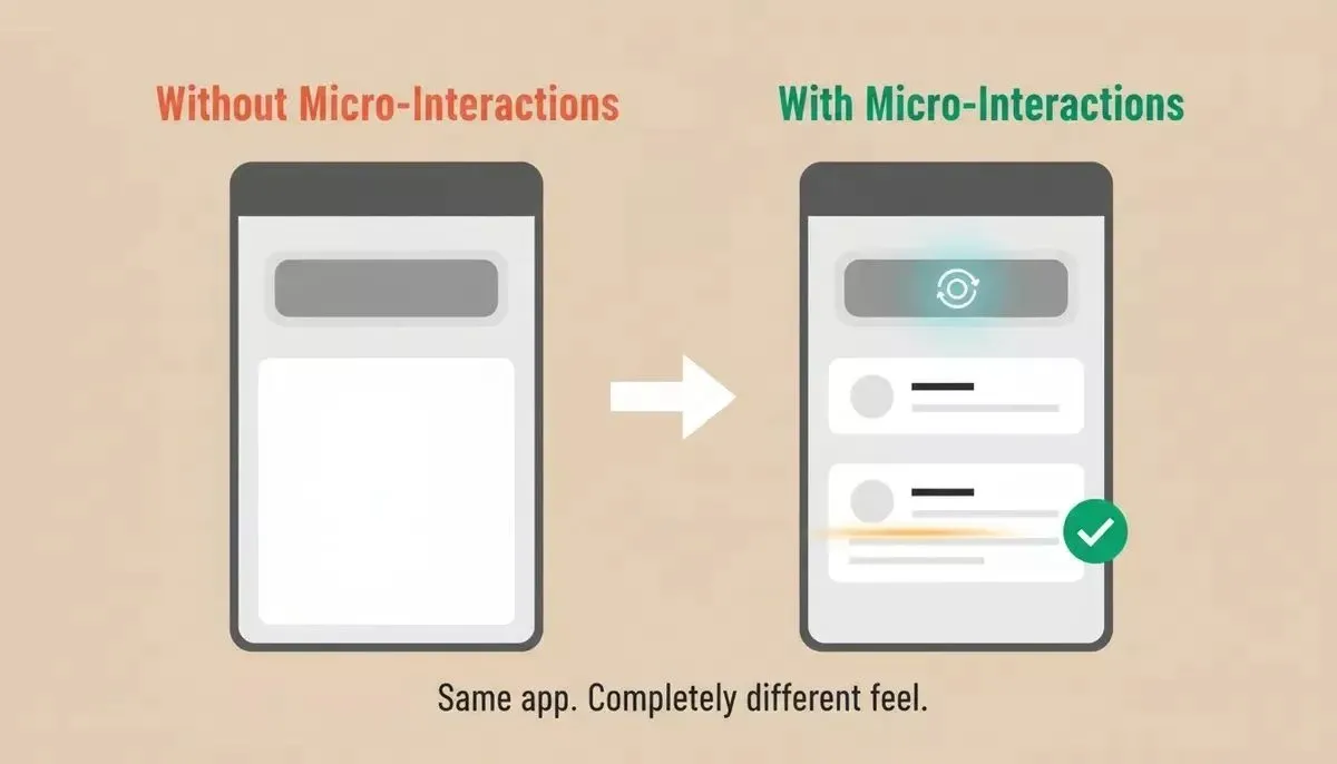
Same app, completely different feel, micro-interactions are the only difference
-
Buttons with no response state: users tap, nothing visually changes for 200ms, they tap again, now a duplicate request fires
-
Form submissions without confirmation: the data saves, but the user sees no acknowledgment, wonders if it worked, and tries again
-
Empty loading states: a blank white screen while data is fetching makes users think the app is broken or laggy
-
Error messages that appear only after full submission: frustrate users who filled out ten fields only to learn that field three had an error
-
Navigation transitions that jump: no easing, no continuity between screens, making the app feel like a slideshow
These are not edge cases. They are the default output of most teams using AI builders that focus on logic over design. When you are building your first app with AI, the generated code handles what happens but rarely handles how it feels while happening.
The result is an app that works correctly but frustrates users silently. They do not file bug reports about missing animations. They just stop coming back.
Ready to close the gap?* Start building on Rocket and get a polished, production-ready build with micro-interactions baked in from the first generation.*
Which Screens Need Attention First?
Not every screen deserves equal attention. Start where user drop-off is highest and where the absence of feedback causes the most confusion.
-
Onboarding screens: first impressions form in under 500 milliseconds; missing feedback here means users never make it to your core features
-
Checkout and payment flows: uncertainty during transactions creates anxiety; progress indicators and confirmation animations build trust
-
Forms with validation: real-time inline cues prevent errors before form submissions happen, making users complete tasks faster
-
Dashboard data loads: skeleton screens and progressive content reveal keep the user informed instead of showing emptiness
Start with the screen that has your worst retention numbers. One well-placed micro-interaction there often creates more impact than distributing polish evenly. If you want to understand how AI tools handle vibe coding mistakes like skipping interaction states, that post covers the most common patterns.
UX Gaps That Actually Kill Retention
The data makes the case clearly. Most AI-built apps ship with the same set of missing interactions, and users respond the same way: they leave.
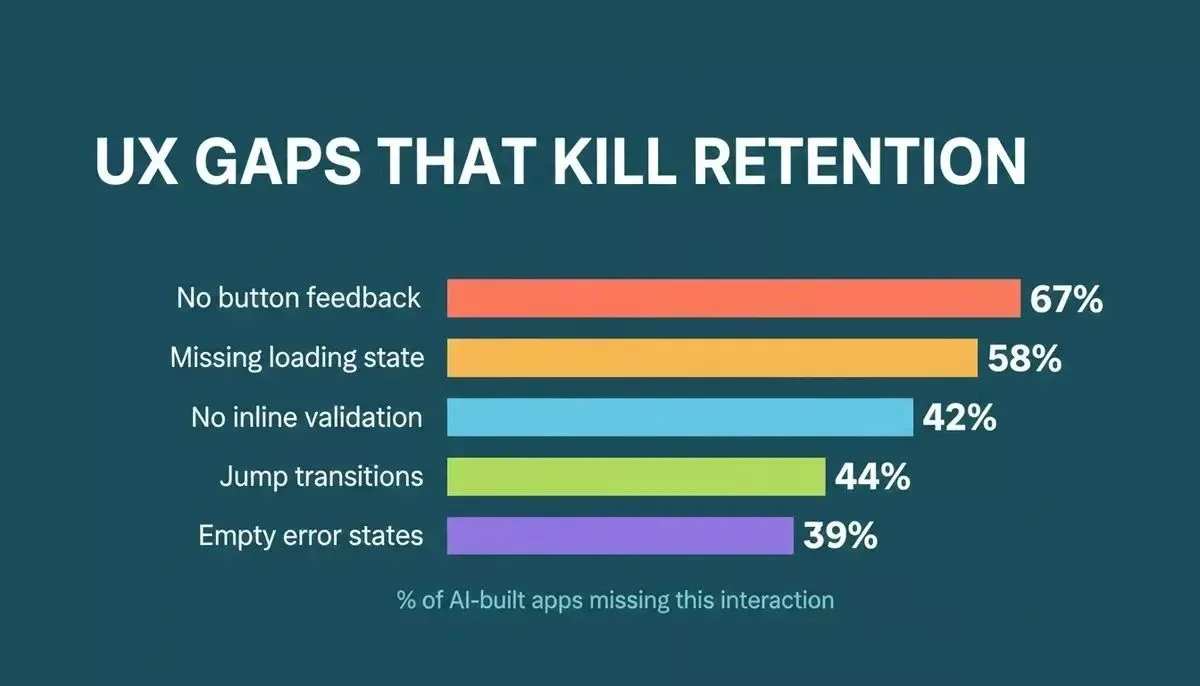
The most common interaction gaps in AI-generated apps, ranked by frequency
According to the Phases.io retention study, companies delivering superior user experiences grow revenues five times faster than those that do not. That growth comes from the details, not the features.
The pattern is consistent across vibe-coded products: the logic is sound, the data model is correct, but the experience layer was never specified. Users do not articulate what is wrong; they just churn. Understanding how AI app builders save development costs is only half the equation; the other half is making sure the saved time goes into polish, not just features.
Best Practices for Designing Micro-Interactions in AI Tools
Getting micro-interactions right requires balancing visibility with restraint. Too many animations overwhelm and distract. Too few leave the app feeling dead.
-
Keep animations under 300 milliseconds. Google's Material Design motion guidelines and Nielsen Norman Group both cite this range as the threshold where transitions feel instant rather than slow. This applies to button feedback, toggle states, and hover effects.
-
One interaction, one purpose. Every micro-interaction should serve exactly one specific task: confirming, warning, guiding, or providing feedback. Never add motion for its own sake.
-
Match the tone of your product. A finance app needs subtle, confident confirmations. A social app can afford playful bounce and color. Designing microinteractions means knowing your audience.
-
Respect motion sensitivity. Always include reduced motion options via CSS prefers-reduced-motion; the W3C WCAG 2.1 guideline 2.3.3 makes this non-negotiable for accessible web design.
-
Ensure consistency across all screens. The same action should trigger the same response everywhere. Users build a mental model of how your app works; breaking that model confuses.
-
Test with real users, not assumptions. User research reveals which interactions feel natural versus which distract. A/B test micro-interaction patterns just like you test copy or layout.
One common mistake is adding flashy animations without a clear purpose. The result is a product that feels busy rather than polished. This is especially relevant when building mobile apps with AI, where haptic feedback and gesture responses add another layer of interaction design that most builders skip entirely.
How Can You Prompt AI Builders for Better Feedback Loops?
The difference between a polished app and a hollow one often comes down to how specifically you describe interactions in your prompt. Most founders describe what the app should do, but never describe what the app should feel like while doing it.
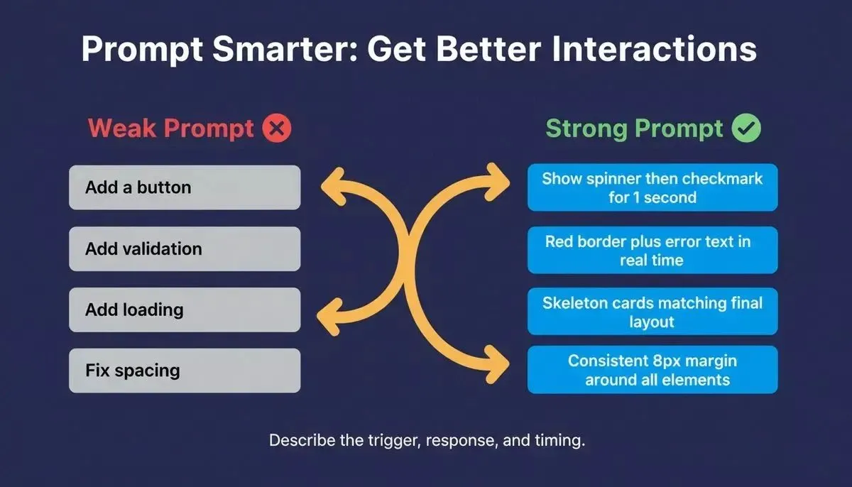
Describe the trigger, the visual response, and the timing, every time
Here is the same feature request, written two ways:
| Weak Prompt | Strong Prompt |
|---|---|
| Add a submit button | When the user taps Submit, show a spinner inside the button, then replace it with a checkmark for 1 second before navigating |
| Add form validation | Show a red border and error message beneath the email field in real time if the format is invalid do not wait for form submission |
| Add a loading state | While data fetches, show skeleton placeholder cards matching the layout of the final content three cards, same height as real items |
| Add page transitions | Use a 250ms ease-in-out slide transition between page routes slide left when navigating forward, right when going back |
| Add mobile feedback | Add light haptic feedback on successful toggle changes and destructive action confirmations |
The key principle: describe the trigger, the visual response, and the timing. When you give AI tools that level of detail, the generated code actually includes providing visual feedback at every interaction point. You can find more patterns in prompts that refine AI-built products.
From Functional to Polished: How Rocket.new Adds the Details
Most AI builders stop at logic. You describe a feature, and they generate the code that makes it work. The button submits. The page loads. The form stores data. But the experience layer between "it works" and "it feels good" remains your responsibility to specify, iterate, and fix.
Rocket.new approaches this differently across three areas:
Design systems from the first generation. Rocket.new builds with real design systems, including dark and light theming, fluid navigation, and staggered animations. The micro-interactions are part of the architecture, not an afterthought. Web apps ship in Next.js, mobile apps in Flutter, both with interaction patterns built in from the start.
Iterate through conversation, with context that carries forward. Tell Rocket "add a success animation to the checkout button" or "show skeleton screens on the dashboard" and changes apply in context without re-explaining your entire app. Cross-task context means every iteration builds on what came before; your design decisions, your component patterns, and your brand choices are remembered across sessions.
Accessible defaults, with one-prompt WCAG 2.1 AA audits. Every Rocket build ships with a reasonable accessibility baseline: semantic HTML, basic heading hierarchy, standard form labels, and responsive layouts. When you need to go further, alt text, ARIA labels, keyboard navigation, contrast fixes, ask Rocket in chat or run /Generate Accessibility Report to get a full WCAG 2.1 AA compliance audit with automated fixes. This capability is documented in the Rocket accessibility docs.
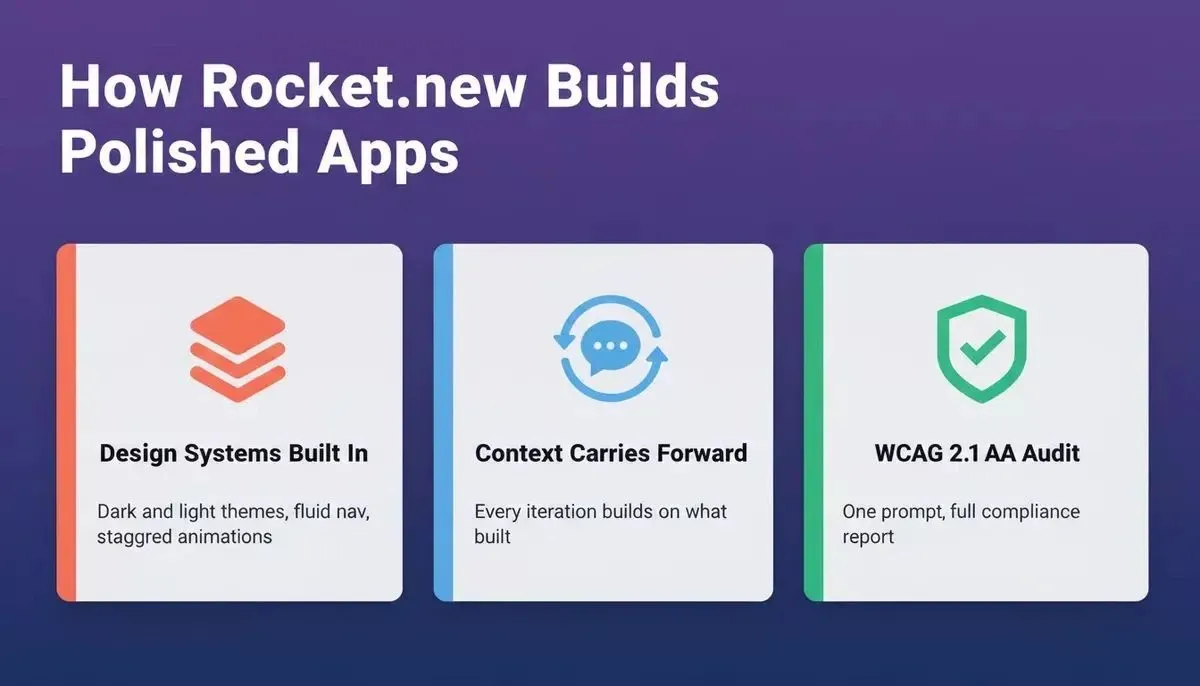
Three capabilities that separate Rocket.new from generic AI app builders
Iteration draws from your credit balance. Each generation, UI styling pass, and responsiveness update consumes credits from your shared balance. Fix It runs for Rocket-detected errors are free for paid users. If you are mid-project and running low, you can top up credits or upgrade your plan -- your work is always preserved regardless of credit status.
Where tools like Bolt, Lovable, and v0 generate functional code from prompts, Rocket carries project context forward across sessions. Every iteration in Rocket starts from the accumulated context of what you have already built, researched, and decided, not a blank slate. If you are comparing options, the Rocket vs Lovable breakdown covers the design quality and context differences in detail.
Emerging Trends: What Comes After Button Ripples?
The next generation of micro-interactions goes beyond static feedback patterns. Emerging trends in app design and UX show that personalized animations, gesture recognition, and context-aware responses will define the products that delight users in the coming years.
-
AI-driven personalized animations: interfaces that adapt interaction speed and style based on user behavior, delivering faster feedback to power users and more guidance to new ones
-
Gesture recognition as input: swiping, pinching, and spatial gestures replacing button taps, with micro-interactions confirming each gesture was recognized
-
Voice assistants with visual feedback: voice-driven commands paired with on-screen micro-animations that show the system understood, enabling natural multi-modal interactions
-
Predictive micro-interactions: machine learning models that anticipate the next user action and pre-load the appropriate feedback animation before the tap even occurs
-
Haptic feedback integrated with visual cues: physical sensation combined with on-screen response creates multi-sensory confirmation that fosters deeper engagement
These emerging trends mean that the bar for what users expect from digital experiences will keep rising. Apps that feel static today will feel broken tomorrow. Founders who want to stay ahead should understand how AI is changing product development at the interaction layer, not just the feature layer.
Your App Already Works, Now Make It Feel Right
The gap between a product that functions and a product that retains users lives in the details your users cannot name but absolutely feel. Every missing confirmation, every blank loading state, every button that does not respond on tap chips away at the trust your app needs to earn repeat usage.
The good news: closing that gap does not require rebuilding from scratch. It requires knowing which screens matter most, which feedback moments are missing, and which tool generates polish from the start instead of leaving it to you.
Ready to turn your working app into one users actually want to open again? Describe your product on Rocket and get a polished, production-ready build with micro-interactions baked in from the first generation.
Start building for free and ship the version of your app that actually retains users.
Table of contents
- -Why Does Your Vibe-Coded App Feel Hollow?
- -What Are Micro-Interactions and Why Do They Matter?
- -How Do Small Animations Change User Behavior?
- -Where Vibe-Coded Apps Typically Break Down
- -Which Screens Need Attention First?
- -UX Gaps That Actually Kill Retention
- -Best Practices for Designing Micro-Interactions in AI Tools
- -How Can You Prompt AI Builders for Better Feedback Loops?
- -From Functional to Polished: How Rocket.new Adds the Details
- -Emerging Trends: What Comes After Button Ripples?
- -Your App Already Works, Now Make It Feel Right