
Build a data comparison tool for business reporting by describing your metrics and data sources to Rocket.new. It generates a full-stack Next.js dashboard with dual columns, variance highlighting, and synchronized date pickers, no developer needed.
Building a data comparison tool for business reporting no longer requires a developer or a BI configuration project. Describe what you need to compare, and Rocket generates the full-stack application with dual data columns, variance highlighting, synchronized date pickers, and real-time data from a single prompt. For operations teams, finance teams, sales managers, analysts, and other non-technical business users, that means faster side-by-side reporting without manual spreadsheet work or delayed dashboard requests.
What is a data comparison tool?* A data comparison tool is a reporting application that displays two sets of business metrics side by side, calculates the delta between them, and highlights significant variances, enabling teams to spot trends, anomalies, and performance gaps in seconds rather than hours.*
This guide explains how these tools work, the five dashboard components that make comparisons useful, where traditional reporting slows teams down, how Rocket’s AI-generated dashboards remove that friction, how to write prompts for custom reports, and how faster comparisons improve business decisions.
How Do Growing Teams Actually Compare Business Data Today?
How do operations teams compare Q1 revenue against Q2 when their reporting tools only show one time period at a time? According to a Market.us study, 94% of organizations rate business intelligence and analytics as critical to success. Yet most teams still toggle between spreadsheet tabs, juggling two exports in two windows, copying numbers into a shared doc just to see them side by side.
That gap between how critical comparison reporting is and how clunky the process remains represents a real opportunity. This guide walks through what a proper side-by-side reporting interface actually requires, why traditional reporting tools struggle with comparisons, and how to prompt an AI platform to generate one for your team in minutes.
What Is a Side-by-Side Reporting Interface?
Before writing a single line of code or drafting a prompt, it helps to understand the five components that make a comparison dashboard functional. Each one serves a distinct role in transforming raw data into actionable insights.
What Does a Data Comparison Tool Need for Effective Data Integration?
-
Dual Query Engine: Executes two parallel data pulls from the same or different data sources. Without parallel execution, users wait twice as long for results.
-
Synchronized Date Pickers: Locks both data columns to matching or user-defined time ranges. Prevents accidental mismatches that corrupt comparison accuracy.
-
Delta Calculator: Computes the numeric difference between each metric pair. Shows the absolute gap between two periods or segments.
-
Percentage Change Display: Converts raw deltas into relative growth or decline rates. Makes changes meaningful regardless of data volume.
-
Variance Highlighting: Applies color-coded visual indicators to flag significant differences. Lets users spot problems in seconds without reading every row.
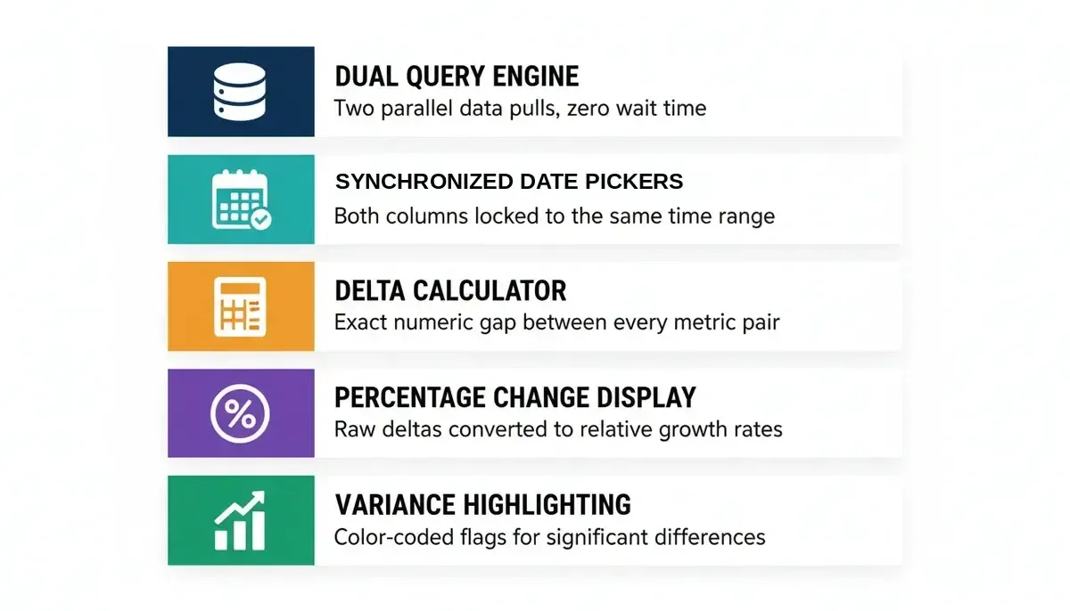
Five components every data comparison tool for business reporting needs to function effectively.
| Component | What It Does | Why It Matters |
|---|---|---|
| Dual Query Engine | Executes two parallel data pulls | Users wait twice as long without parallel execution |
| Synchronized Date Pickers | Locks both columns to matching time ranges | Prevents mismatches that corrupt comparison accuracy |
| Delta Calculator | Computes the numeric difference between each metric pair | Shows the absolute gap between two periods |
| Percentage Change Display | Converts raw deltas into relative growth or decline rates | Makes changes meaningful regardless of data volume |
| Variance Highlighting | Applies color-coded visual indicators to flag differences | Lets users spot problems in seconds |
Good reporting tools combine these components into a single interactive view, using interactive visualizations and drill-down interactive dashboards to help users investigate variances in more detail.
The right reporting tool should let non-technical users and data analysts alike run comparisons, create reports, and present data clearly without extensive technical knowledge or waiting for engineering support. Key metrics like revenue, conversion rates, and operational throughput should appear in real-time data views, updated as new information flows from connected data sources.
How Does Period-Over-Period Comparison Drive Decisions?
The business intelligence software market reached $40.1 billion in 2025 and is projected to grow to $43.7 billion in 2026 at a 9% compound annual growth rate. That growth is driven largely by organizations demanding real-time data analysis capabilities that traditional reporting software never provided.
Period-over-period comparison is the most common use case inside this market. Sales managers compare this quarter against last quarter. Finance teams compare actual spend against budgeted spend. Operations leaders compare regional performance across branches.
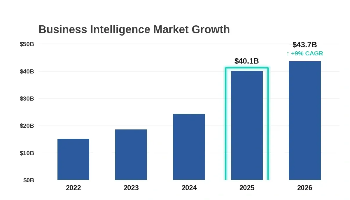
Business Intelligence software market growth: $40.1B in 2025, growing to $43.7B in 2026 at a 9% CAGR.
When these comparisons occur within interactive dashboards rather than static exports, teams identify trends faster and make informed decisions before the window closes. The ability to analyze data across time periods in a single view turns reporting from a passive summary into an active decision tool.
-
Revenue comparison: This month vs. same month last year reveals seasonality patterns that key performance indicators alone miss
-
Cost tracking: Budget vs. actual across departments highlights where spending drifts before it becomes a crisis
-
Conversion analysis: Landing page A vs. landing page B with real-time data shows which creative performs better within hours, not weeks
-
Branch-vs-branch reporting gives regional managers clear visibility into where operations need attention
What Is Variance Highlighting?
Variance highlighting is a reporting feature that applies configurable color-coded thresholds to metric differences, flagging positive deviations in green, negative deviations in red, and neutral changes in gray, so users can identify significant changes at a glance without reading every row.
How Do You Calculate Percentage Change Between Two Periods?
A delta calculation takes each metric in column A, subtracts the corresponding metric in column B, and stores the result. Then a percentage change formula converts that absolute number into a relative rate: ((Period A - Period B) / Period B) x 100. A 10% drop in a $50M revenue line means something very different than a 10% drop in a $5K expense line.
Period A and B metrics flow through the delta calculator and percentage converter, then split into green, red, or gray variance outputs based on a 5% threshold.
Variance highlighting applies configurable thresholds. You set rules: anything above 5% gets flagged green, anything below -5% gets flagged red, and everything else stays neutral. This turns an automated report into a signal detector. When reporting capabilities include variance highlighting, even non-technical users can identify patterns and identify areas that need attention at a glance.
Why Do Traditional Reporting Platforms and Business Intelligence Solutions Struggle With Comparisons?
Most BI tools were designed for single-view dashboards. You pick a date range, you see your numbers. Comparing two ranges means running two separate queries, exporting both results, and manually aligning them in a spreadsheet.
According to Velixo research, the hidden cost of this manual reporting process is not just the hours spent on data preparation, but the analysis you never get to do because your time is consumed by data wrangling. Here is what makes traditional reporting software fall short when comparison is the goal:
-
Most reporting tools treat each report as a standalone document, not a comparison pair
-
Data integration gaps force users to pull from multiple data sources manually and reconcile formats before any comparison begins
-
BI reporting tools like Microsoft Power BI and Tableau offer comparison features, but configuring them requires significant technical expertise and custom calculated fields
-
Even the best reporting tools often generate reports that are static by the time they reach the stakeholder who needs them
-
Generating custom reports with dual-column layouts typically requires SQL knowledge or developer involvement
"We were spending 12+ hours per week building comparison reports manually. The data was always stale by the time leadership saw it." — Operations manager (illustrative composite from r/analytics community feedback)
The result is that most teams settle for basic reporting instead of the comparison-first view that would actually drive faster, more informed decisions. Good reporting software should make comparison the default mode, not a feature buried three clicks deep.
Rocket vs. Traditional BI Tools vs. Manual Spreadsheets
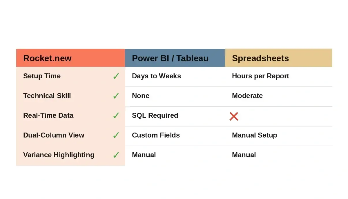
Rocket.new generates a full comparison dashboard from a single prompt, no SQL, no configuration, no developer required.
| Capability | Rocket | Power BI / Tableau | Manual Spreadsheets |
|---|---|---|---|
| Setup Time | Minutes (single prompt) | Days to weeks | Hours per report |
| Technical Skill Required | None | Significant (DAX, SQL) | Moderate (formulas) |
| Real-Time Data | Yes (26+ live connectors) | Yes (with configuration) | No (manual export) |
| Dual-Column Comparison | Built-in from prompt | Custom calculated fields | Manual side-by-side |
| Variance Highlighting | Auto-generated | Custom conditional formatting | Manual color coding |
| Post-Build Editing | Visual Edit (click-to-edit) | Drag-and-drop canvas | Cell-by-cell editing |
How Rocket Generates Your Comparison Dashboard From a Prompt
This is where the traditional approach breaks down completely. Instead of configuring a BI tool, wrestling with existing systems, mapping existing data sources, and fixing data connectivity issues manually, writing calculated fields, and designing layouts, you describe what you want in plain language, and Rocket produces the working application.
Rocket is a vibe solutioning platform that combines strategic research (Solve), AI app building (Build), and competitive intelligence (Intelligence) into a single product. When you use the Build pillar to create a data comparison tool for business reporting, Rocket handles the data integration, builds the dual-column layout, implements delta calculations, and adds variance highlighting automatically. It generates production-ready Next.js web apps and Flutter mobile apps from your prompt.
Before generation begins, Rocket's prompt intelligence feature scores your prompt quality and asks clarifying questions to sharpen scope, ensuring the generated dashboard matches what you actually meant. This is a key differentiator from tools that simply run whatever you type.
-
Dual query execution is generated as part of the application architecture from the start
-
Synchronized date pickers are included as interactive UI components that lock both data columns
-
Automated insights can apply predictive analytics to forecast future trends and surface valuable insights
-
The generated app connects to your data sources through 26+ service integrations including Supabase, Google Workspace (Sheets, Docs, Calendar), and Airtable, while many business intelligence platform options compete on connector breadth, such as Domo with over 1,000 pre-built connectors
-
Real-time data flows into both columns as new entries arrive, keeping comparisons current
-
After generation, Visual Edit lets you click any element in the preview to update text, tweak spacing, swap images, or adjust styling directly with no code required
What makes this different from top reporting tools is that, unlike a conventional business intelligence stack built around self-service business intelligence, you are not configuring someone else's framework.
You can combine data from multiple sources like Google Analytics or Google Sheets and generate custom reports through an intuitive interface tailored to your specific reporting needs. The interactive dashboards Rocket produces are built on production-grade Next.js, so they are deployable, scalable, and fully owned by your team.
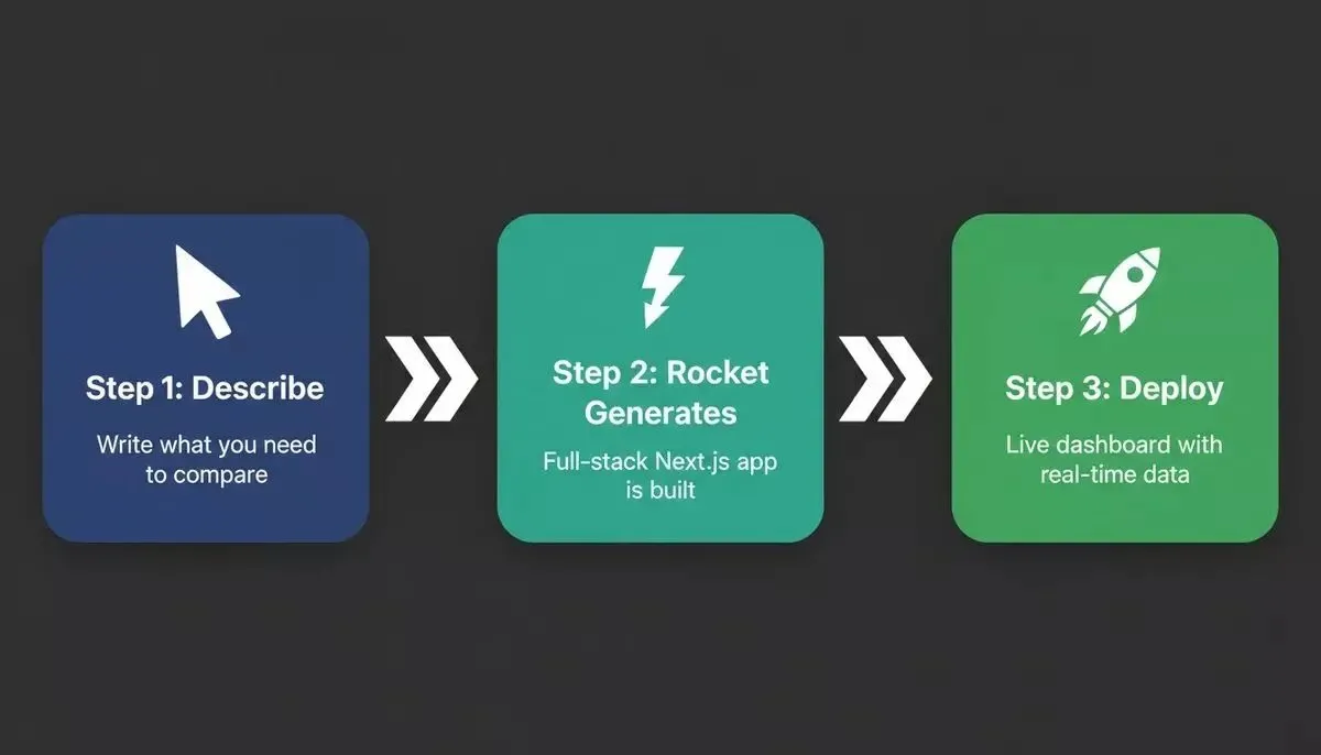
Rocket's three-stage workflow: describe your comparison reporting needs, generate the full-stack Next.js app, and deploy instantly.
The reporting capabilities extend beyond simple two-column views. You can prompt for multi-region comparisons, team-vs-team metrics, product-line analysis, or any combination where seeing things side by side produces better decisions than looking at them in isolation. For mobile-first operations teams, the same prompt generates a Flutter app alongside the web dashboard. Like modern reporting tools, it can also automate scheduled report generation, saving time, and some platforms such as Zoho Analytics add AI for alerts and future trends forecasting.
How Rocket's Three Pillars and Real-Time Data Strengthen Your Reporting Workflow
Building a data comparison tool is one step. Rocket's full platform makes the entire reporting workflow smarter.
-
Solve: Before you build, use Solve to validate what metrics matter most, size the reporting gap across your team, or research how comparable companies structure their BI dashboards. Solve runs parallel research streams and returns a structured, evidence-backed report in minutes. Teams that research before they build consistently ship better products.
-
Build: Generate your comparison dashboard from a prompt. Rocket handles the architecture, connectors, delta logic, and UI, with automated data collection from multiple sources that can cut reporting task time by 50%. It also adds data collection quality checks such as duplicate detection and missing record identification, which support business operations by making relevant data easier to analyze consistently. Iterate with Visual Edit and chat without touching code.
-
Intelligence: After launch, use Intelligence to monitor competitor reporting capabilities and market BI trends continuously, so you know when to evolve your dashboard before your team asks for it.
All three pillars share context within a project, so findings from a Solve research task feed directly into your Build prompt. No copy-pasting, no lost context. This is what makes Rocket a vibe solutioning platform rather than just another app builder.
What Key Features Should Your Comparison Tool Prompt Include?
The quality of your generated comparison dashboard depends entirely on how well you describe what you need. Here is a practical structure for writing prompts that produce usable reporting tools on the first generation, including support for ad hoc analysis when needed. Rocket's prompt intelligence will ask clarifying questions if your prompt is ambiguous, but a strong initial prompt gets you there faster.
A strong prompt for a comparison tool should specify these elements:
-
What you are comparing: Two time periods? Two products? Two teams? Two regions? Name the dimension explicitly.
-
Which key metrics matter: Revenue, conversion rate, ticket volume, response time; list the specific numbers you need side by side.
-
Where the data lives: Mention your data sources by name (Supabase, Google Workspace/Sheets, Airtable, CSV upload), including pulls from multiple sources or existing systems.
-
Who will use it: Executives who need a summary? Analysts who need drill-down? Business users who need simple filters? Prompts may also need to support data scientists when the dashboard must work with complex data.
-
What actions should it trigger: Variance alerts when metrics cross thresholds? Automated reports sent weekly? Concise forecasting for future trends?
Here is an example prompt that generates a solid comparison dashboard:
"Build a comparison dashboard that shows sales performance for two selected time periods side by side. Include total revenue, average deal size, close rate, and pipeline velocity as key metrics. Add percentage change between periods with green/red variance highlighting when the delta exceeds 5%. Connect to Supabase for the data source. Include date range pickers that sync both columns. Add a region filter dropdown. Make it accessible to non-technical users with clean data visualization."
A well-scoped prompt can support ad hoc reports without turning the dashboard into an ungoverned ad hoc workflow.
The more specific you are about your reporting needs, the closer the first generation will match your expectations. Report generation that once took weeks of developer time now takes minutes of thoughtful prompting. Customizable reports mean you can iterate on the output without starting from scratch.
For operations teams specifically, building AI apps that scale starts with a well-scoped prompt and a platform that handles the backend automatically. For finance teams, a financial reporting dashboard built on Rocket connects directly to your live data sources without manual exports.
When a Generated Comparison Tool May Not Be the Right Fit
Rocket's generated dashboards are the fastest path to a working comparison tool for most teams. That said, a few scenarios call for a different approach:
-
Heavy enterprise data governance: If your organization requires SOC 2 Type II audit trails on every data query, mandates on-premise data residency, or needs role-based access controls so financial reports aren't modified by unauthorized users, a generated app may need additional compliance configuration before deployment.
-
Very large data volumes: Dashboards comparing hundreds of millions of rows benefit from a dedicated data warehouse layer before the Rocket-generated UI layer connects to it.
-
Existing BI investment: If your team has already built significant Power BI or Tableau infrastructure and has dedicated BI engineers, extending that investment may be faster than generating a new tool from scratch.
For the vast majority of operations, sales, and finance teams who need a working comparison dashboard without a six-week development cycle, Rocket's generated approach is the right path. You can also build internal tools without a developer for related reporting needs across your organization.
Your Next Report Should Show Both Sides of the Story
The shift from single-view dashboards to comparison-first reporting is not a nice-to-have. It is the difference between teams that react to problems after they compound and teams that catch variance the moment it appears. Management reports, financial reports, operational reviews, and sales pipeline checks all become sharper when teams can compare two states at once.
For founders and operations leaders who need this kind of tool built for their specific data, the fastest path is a clear prompt and a platform that handles the rest. Rocket is the most capable vibe solutioning platform for building data comparison tools for business reporting, generating production-ready Next.js dashboards with real-time data, variance highlighting, and synchronized date pickers from a single prompt, with Solve to validate your approach and Intelligence to keep your reporting competitive.
Table of contents
- -How Do Growing Teams Actually Compare Business Data Today?
- -What Is a Side-by-Side Reporting Interface?
- -What Does a Data Comparison Tool Need for Effective Data Integration?
- -How Does Period-Over-Period Comparison Drive Decisions?
- -What Is Variance Highlighting?
- -How Do You Calculate Percentage Change Between Two Periods?
- -Why Do Traditional Reporting Platforms and Business Intelligence Solutions Struggle With Comparisons?
- -Rocket vs. Traditional BI Tools vs. Manual Spreadsheets
- -How Rocket Generates Your Comparison Dashboard From a Prompt
- -How Rocket's Three Pillars and Real-Time Data Strengthen Your Reporting Workflow
- -What Key Features Should Your Comparison Tool Prompt Include?
- -When a Generated Comparison Tool May Not Be the Right Fit
- -Your Next Report Should Show Both Sides of the Story