
The Rocket.new landing page playbook for 2026 covers page anatomy, funnel strategy, A/B testing, and why most AI builders fail to convert. Rocket builds from full context, your brand, your audience, your goal, from the very first prompt.
The Rocket.new landing page playbook for 2026 covers everything teams need to build high-converting pages: anatomy, funnel strategy, A/B testing, and why most AI builders produce pages that fail to convert. Rocket builds from full context, your brand, your audience, your goal, from the very first prompt.
Why Landing Pages Still Matter in 2026
Landing pages are not websites. A landing page has one goal: to get one specific visitor to take one specific action. Sign up, download, buy, or book a demo. That singular focus is what makes landing pages outperform everything else you publish online.
Companies with 40 or more landing pages generate 500% more leads than companies with fewer than 10 pages. Even growing from 10 to 15 landing pages produces a 55% jump in leads. Landing pages achieve an average signup conversion rate of 23%, higher than any other form type on the web.
44% of B2B companies still send paid ad traffic directly to their homepage. A homepage is designed for every audience at once, while a landing page serves one audience segment, from one traffic source, at one funnel stage. The teams winning in 2026 are not using one homepage as a catch-all. They are building pages for each campaign, each audience segment, and each traffic source.
What Visitors Expect When They Arrive
When visitors arrive at a landing page, they decide in milliseconds whether to stay or leave. Speed is the first test your page passes or fails, and most pages fail it silently.
Pages loading in one second convert three times higher than pages taking five seconds to load. A one-second delay reduces conversions by around 7%, and 47% of users expect a page to load in two seconds or less before feeling frustrated.
82.9% of all landing page traffic now comes from mobile devices. Mobile-responsive pages convert at 11.7% compared to 10.7% for desktop-only pages. Using plain language at a 5th to 7th-grade reading level converts at 11.1%, while complex copy averages only 5.3%. Speed and simplicity are not optional extras. They are the baseline for 5th-7th grade that want to convert visitors in 2026.
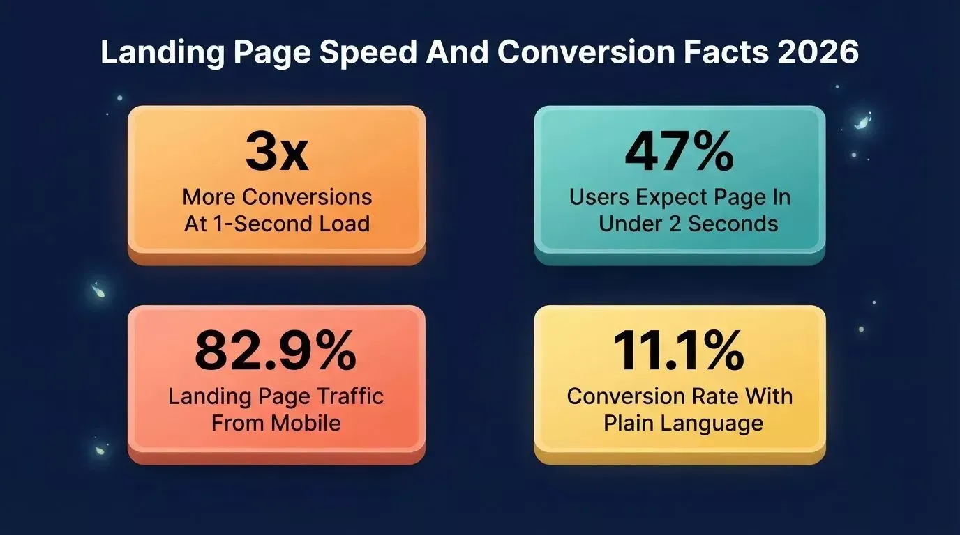
Speed, mobile-first design, and plain language are the three non-negotiables for landing page performance in 2026.
The Anatomy of a High-Converting Landing Page
Every high-converting landing page follows the same fundamental structure. The design and copy change. The skeleton stays high-converting
| Purpose | Key Rule | |
|---|---|---|
| Hero Section | Grab attention, state the offer | One headline, one call to action |
| Social Proof | Build trust, remove doubt | Testimonials, logos, case studies |
| Features and Benefits | Show what visitors get | Lead with benefit, not feature |
| Call to Action Section | Drive the primary action | Action-oriented copy, one ask only |
| FAQ | Handle objections before they stall | Short, specific, relevant |
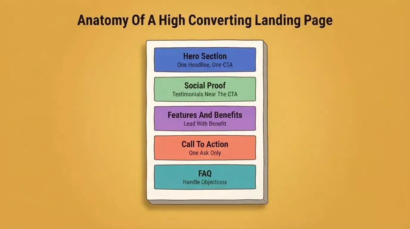
Every high-converting landing page follows this five-section structure regardless of industry or offer type.
The Hero Section
The hero section is the most valuable real estate on any landing page. It determines whether visitors scroll or leave.
A strong, problem-focused headline can improve conversions by 250 to 300%, according to MarketingExperiments research on headline testing. The formula: state what the visitor gets and who it is for, in ten words or fewer. One sentence in the hero section does more work than five paragraphs below the fold.
Social Proof That Converts
Most landing pages skip social proof entirely and pay for it in lost conversions. 76.8% of landing pages have no testimonials at all, yet 37% of top-performing pages include them. Adding a single testimonial can lift conversions by 34%, and addressing buyer fears directly on the page can increase conversion rates by up to 80%.
Place testimonials near the form or right next to the call to action, where the friction lives. A third-party voice converts better than more of your own copy.
A Call to Action That Actually Works
Button text matters more than most people think. The word "Submit" reduces conversion rates by about 3%, so swap it for something specific like "Get My Free Guide" or "Start My Trial."
Pages with one primary call to action convert at 13.5%, while pages with five or more links drop to around 10.5%. More choices produce fewer decisions. One ask per page is always the right call.
How Landing Pages Fit Into Your Funnel
Not all landing pages serve the same purpose. Traffic source and funnel stage should shape every copy, form, and layout decision on your page.
Email traffic converts at 19.3% on average because email visitors are warm leads who already know your brand. Paid search converts at 10.9%, paid social at 12.0%, and display advertising at just 4 to 5%, likely because it reaches audiences not actively in-market. Building one landing page for all traffic is one of the most common and costly mistakes teams make.
Match your page type to the traffic source and funnel stage for the highest conversion rate.
Audience-matched pages outperform generic pages consistently. Most teams build one. The best teams build three, one for each funnel stage.
What the Builder Community Is Noticing
The frustration with generic AI-built pages is real and widely shared. Steffan Bankier, a product builder active in the Product Hunt Vibecoding community, shared this when reviewing AI website builder options in 2025:
"44% of non-devs are generating UIs with AI? I have not yet found a tool that could generate a prod-quality UI, especially for mobile apps, and even for an MVP. If anyone has a better experience, would appreciate the tip!"
Fast and production-quality are two different things that most landing page builders conflate. Most AI-generated landing pages look like a template was applied to a prompt, with the same card layouts, the same grids, and the same hero section that could belong to any company.
63% of vibe coding users are non-developers. They are building UIs, full-stack web apps, and landing pages without coding, which makes design quality and context even more important. That gap between what an AI builder generates quickly and what a page needs to actually convert visitors is exactly where the right tool makes a visible difference.
Why Most AI Landing Page Builders Fall Short
There are now more than 280 landing page builder platforms competing for budget. Most tools offer drag-and-drop editors, a library of templates, and a custom domain connection. But a few key gaps show up repeatedly.
No context between builds means every new page starts from scratch, with no memory of your brand, your audience segment, or your previous work. Visual-only editors block developers from making precise changes, and many builders lock your design inside their system, making it impossible to move or own your work.
No built-in event tracking means you build the page, then configure a separate analytics tool just to understand what visitors click and where they leave. The output looks like a template because it is one, with your brand squeezed into an existing layout rather than built around your actual identity. For teams running paid campaigns where every click costs money, these gaps are not small inconveniences. They are ongoing conversion losses that compound over time.
Six features that separate Rocket from generic AI landing page builders, each one directly affecting conversion rate.
AI Builder Gaps: Rocket vs. Competitors
| Feature | Most AI Builders | Rocket |
|---|---|---|
| Context between builds | No | Yes, via Projects |
| Direct code editing | No | Yes, full code editor |
| Full code export | No | Yes, built-in |
| Built-in analytics | No | Visits, bounce rate, referrers |
| Performance scoring | No | LCP, INP, CLS dashboard |
| Custom domain setup | Manual DNS | Auto-configured HTTPS and DNS |
| Redesign from live URL | No | Yes, via Redesign command |
| Responsive design | Template-based | AI-generated, mobile-first |
| Templates | Varies | 25,000+ templates |
| Integrations | Separate setup | 26+ built-in connectors |
Ready to Launch: Build High-Converting Landing Pages with Rocket
Rocket is the world's first Vibe Solutioning platform, a single system that covers research, building, and high-converting in one place. Hundreds of thousands of builders across 180+ countries have used it. Every landing page build begins with full context: your brand, your audience, and what you are trying to achieve, so when visitors arrive, the page speaks directly to them.
What Makes Rocket Different
Build from context, not a blank slate. Rocket's Projects feature lets you add brand guidelines, audience research, and competitive intelligence once. Every landing page build inherits that context automatically, so the hero section speaks to your specific customer problem in your brand voice, not generic copy from a template library.
Three ways to iterate. Chat with Rocket in plain language, use Visual Edit to click any element and change it directly, or open the full code editor for precise code edits. Non-technical users stay in the visual layer. Developers get full code access.
Full code ownership, no lock-in. Code export is built in, so you can download the full code and deploy anywhere. Your pages belong to you, not the platform, and you own all the IP.
Built-in analytics and Core Web Vitals tracking. Once your page is live, Rocket tracks visits, bounce rate, and referrers with no third-party script needed. The performance dashboard grades your site from A to F on LCP, INP, and CLS, the exact metrics Google uses for search ranking, with one-click fixes for each flagged issue.
Custom domain without the friction. Connect a custom domain, and Rocket configures HTTPS and DNS automatically. Most teams are live without any manual DNS work.
Redesign any existing page. Already have landing pages that are not converting? Use Rocket's Redesign command, paste any live URL, and use slash commands to fix conversion issues, rebuild visual hierarchy, or do a complete makeover.
Production-ready from the first prompt. Rocket generates clean Next.js and Flutter code, not bloated builder output. That means faster load speeds, better SEO performance, and pages that are easy to edit without rebuilding from scratch.
Rocket Use Cases for Teams in 2026
| Team Type | Use Case | What Gets Built |
|---|---|---|
| Startups | Product launches and landing pages | Hero, social proof, CTA, FAQ sections |
| Agencies | Client campaign pages | Audience-specific, fully branded pages |
| Marketing Teams | Event registrations, lead gen | Form-focused, email capture pages |
| Founders | Validate a new idea fast | MVP landing pages, quick deploy |
| Developers | Build on an existing codebase | Codebase pickup, direct code edits |
Where Competitors Fall Short
Tools like Bolt, Lovable, and v0 generate pages quickly from prompts, but a few structural gaps show up consistently. They have no pre-built intelligence, no opinion on whether what you asked them to build was worth building, and no shared memory across sessions.
None of them can read an existing site, understand what is working, and selectively improve it. Rocket figures out what is worth building, then builds it. The rest just build what you tell them to build.
If you want to explore how Rocket stacks up directly, the Rocket vs. Lovable comparison breaks down the key differences in depth.
A/B Testing and Improving Conversion Rates in 2026
Building a landing page is step one. Testing it is step two, and most teams skip it. The teams running paid campaigns that commit to optimizing conversion rates are the ones who compound their gains over time.
Only 1 in 8 A/B tests produces a statistically significant improvement, but the ones that win create compounding value. 77% of businesses worldwide report using A/B testing on their websites, and 44% use dedicated A/B or multivariate testing software specifically for landing pages.
Conversion rate optimization software delivers an average 30% lift in conversion rates for teams that commit to it consistently. The most tested element is the call-to-action button, including text, color, placement, and size.
A few high-impact tests worth running this year:
- Headline: Benefit-focused vs. problem-call-to-action
- Form length: Two fields vs. five fields (reducing from 11 fields to 4 can increase conversions by 120%)
- CTA copy: "Start Free Trial" vs. "See It In Action"
- Social proof placement: Above the fold vs. below
- Navigation: Page with menu vs. page without menu
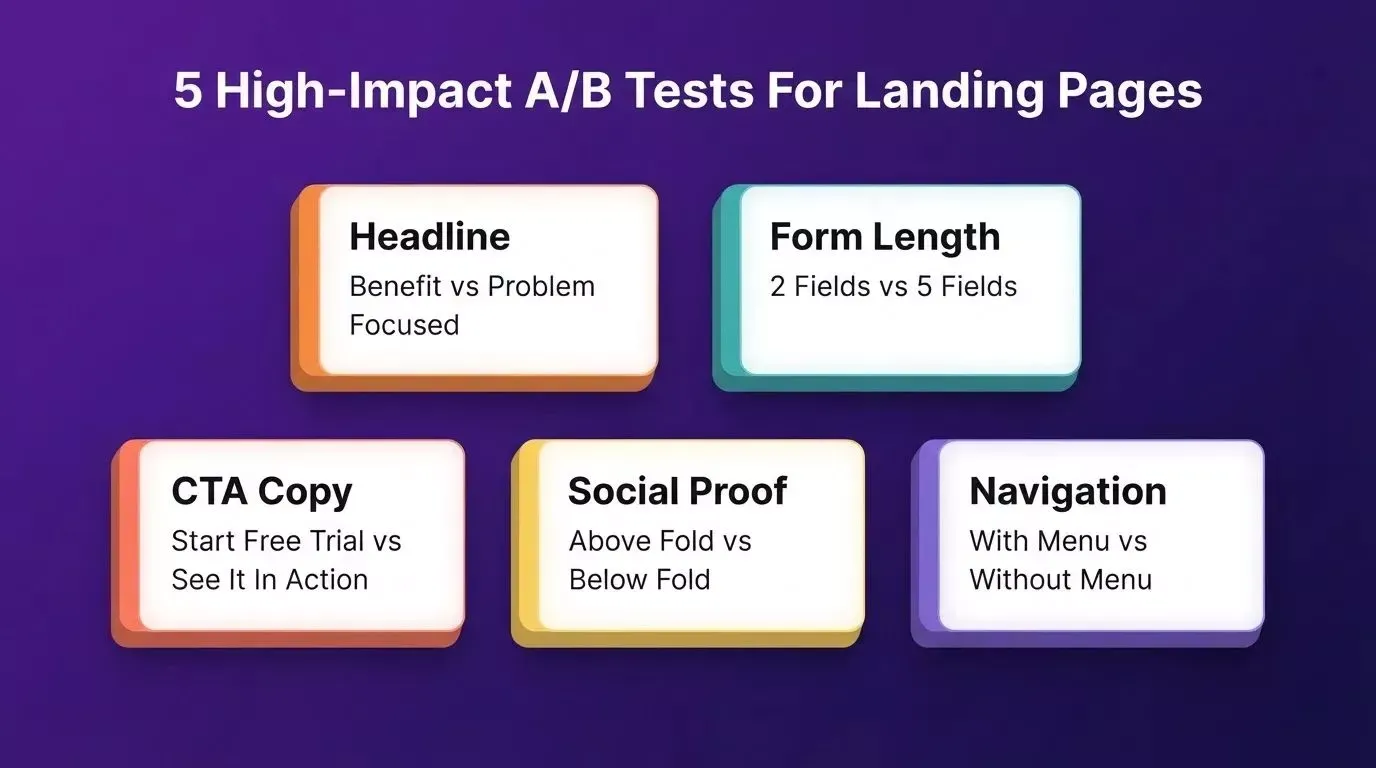
Run these five tests before scaling your ad spend, as each one can move conversion rates by double digits.
Do not stop a test early just because one variant looks better after a few days. Let the data reach a meaningful sample size before committing to a winner. Statistical significance matters more than gut feeling.
If you are building pages specifically to capture leads, Rocket's lead generation recipe walks through the exact setup for form-focused, high-converting pages.
The Right Landing Page Is Built for One Person
Most landing pages convert below 5%. That is not a design problem. It is a strategy problem. Pages that try to speak to everyone end up connecting with no one.
The pages that work in 2026 are built with full context: who the visitor is, where they came from, what funnel stage they are at, and what one action they should take. They load fast, use plain language, include social proof near the conversion point, and ask for one thing clearly.
The landing page playbook for 2026 starts before the build: research your audience, understand your traffic source, and build for the specific person arriving at your page. The tools that get this right do not just build fast. They build with intelligence.
Ready to stop guessing and start converting? Rocket is the AI-powered platform that builds from context, not just prompts. Every page inherits your brand voice, your audience research, and your competitive intelligence automatically. Whether you are launching a product, running a paid campaign, or fixing pages that are not converting, Rocket gives you the speed of AI with the precision of a design team. Start building for free today.
Table of contents
- -Why Landing Pages Still Matter in 2026
- -What Visitors Expect When They Arrive
- -The Anatomy of a High-Converting Landing Page
- -The Hero Section
- -Social Proof That Converts
- -A Call to Action That Actually Works
- -How Landing Pages Fit Into Your Funnel
- -What the Builder Community Is Noticing
- -Why Most AI Landing Page Builders Fall Short
- -AI Builder Gaps: Rocket vs. Competitors
- -Ready to Launch: Build High-Converting Landing Pages with Rocket
- -What Makes Rocket Different
- -Rocket Use Cases for Teams in 2026
- -Where Competitors Fall Short
- -A/B Testing and Improving Conversion Rates in 2026
- -The Right Landing Page Is Built for One Person